From Water to Poster
Out of Water: Zurich Design Weeks Postersafari 2026
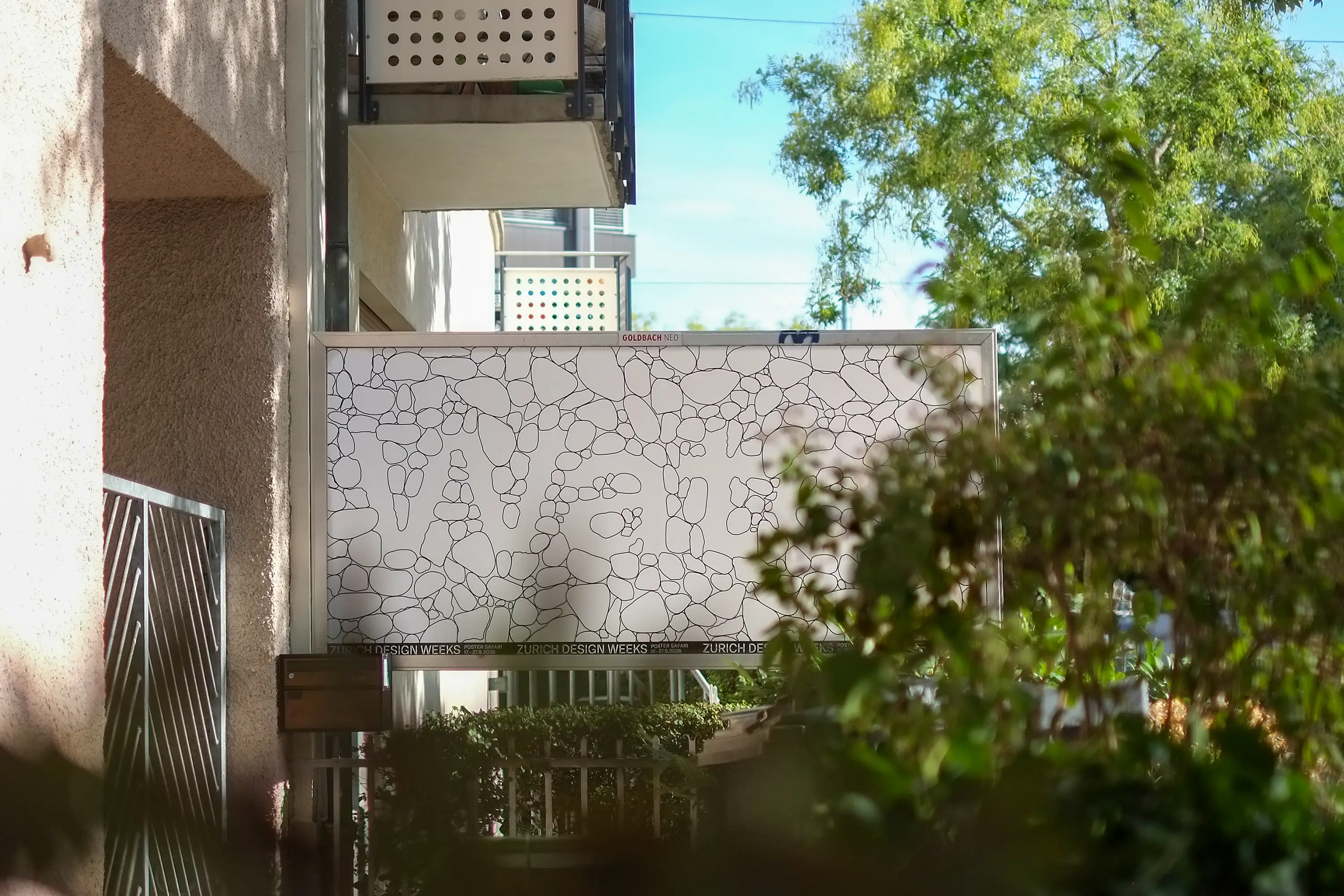
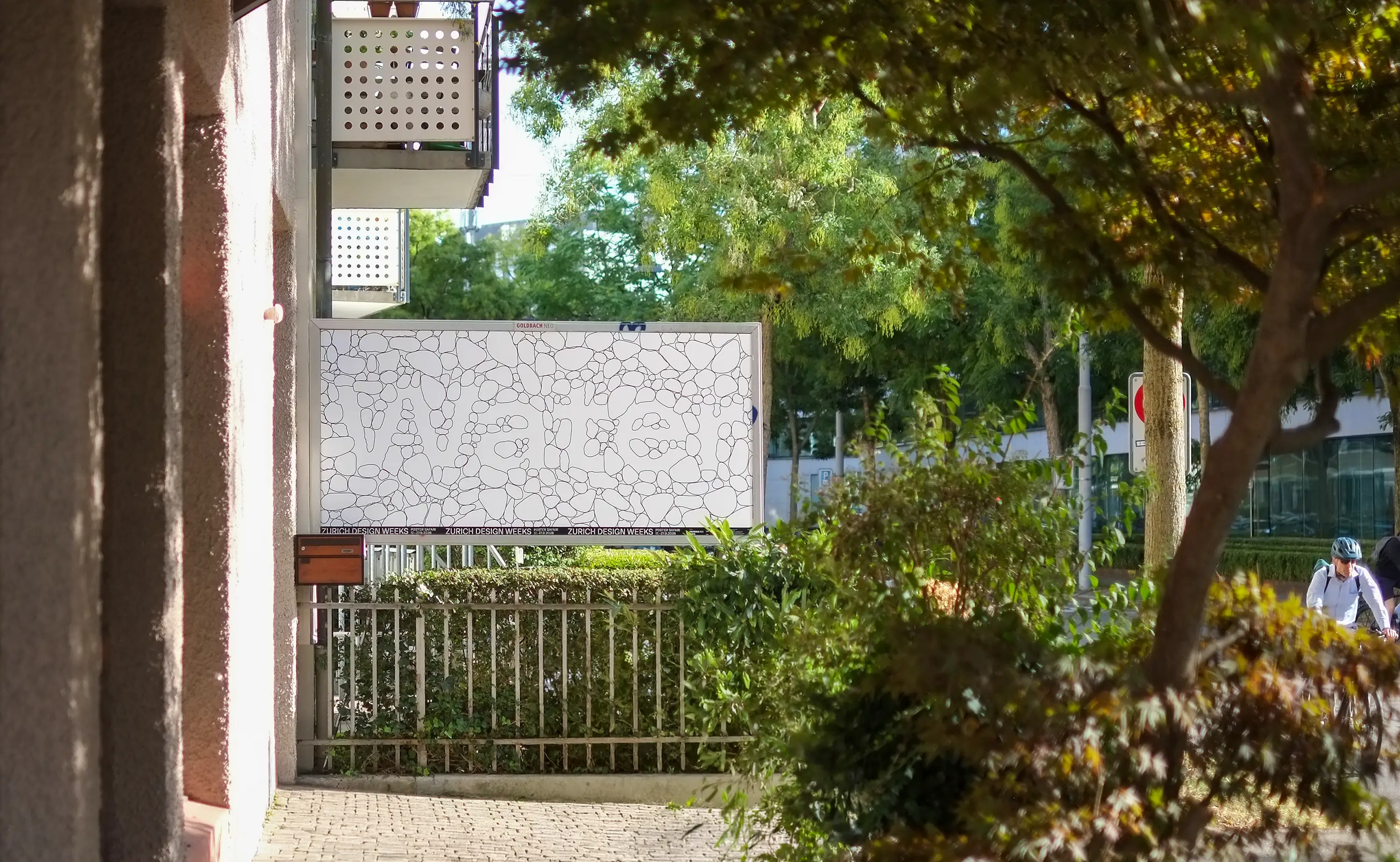
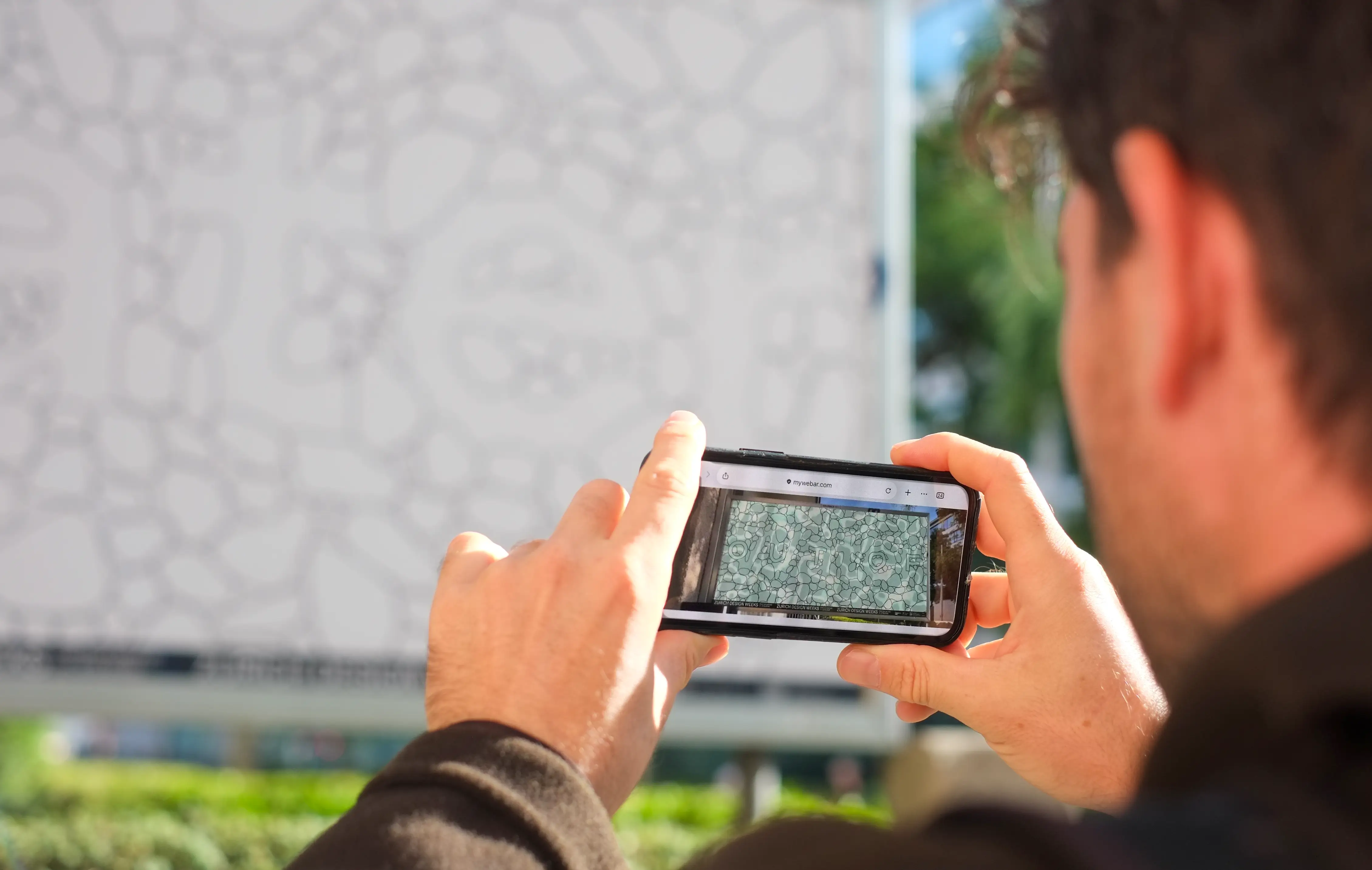
The Postersafari is a group exhibition in public space that brings contemporary graphic design to life both analog and digitally, transforming Zurich’s District 5 into an open-air gallery during the Zurich Design Weeks. Large-format posters by various graphic designers make the theme «Out Of» visually tangible while bringing it to life via augmented reality on your smartphone.
In 2026, I had the privilege of creating a poster as part of this unique safari through the urban space. Here, I’m taking you behind the scenes to show you how my work and the stories behind it came to be.
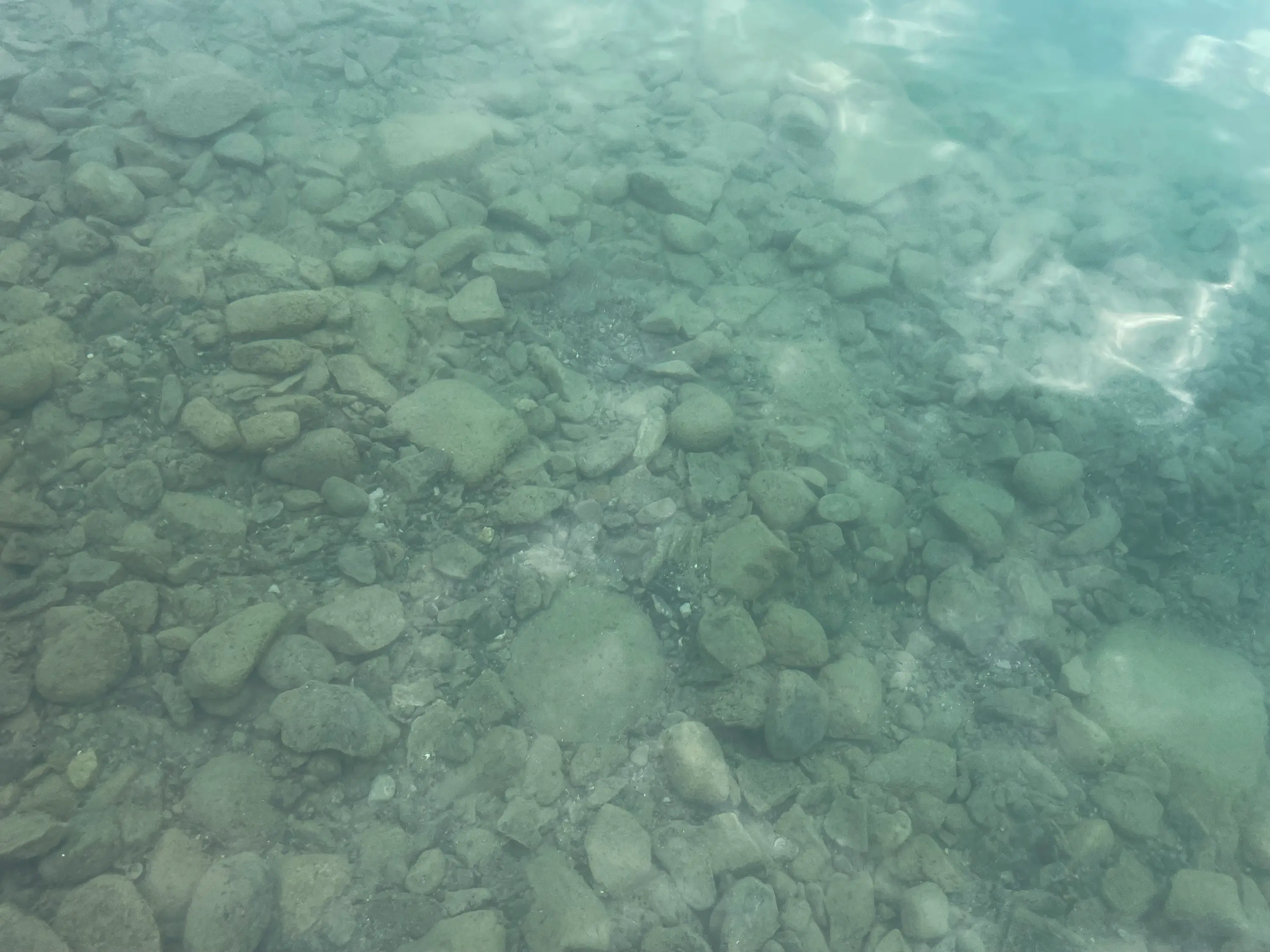
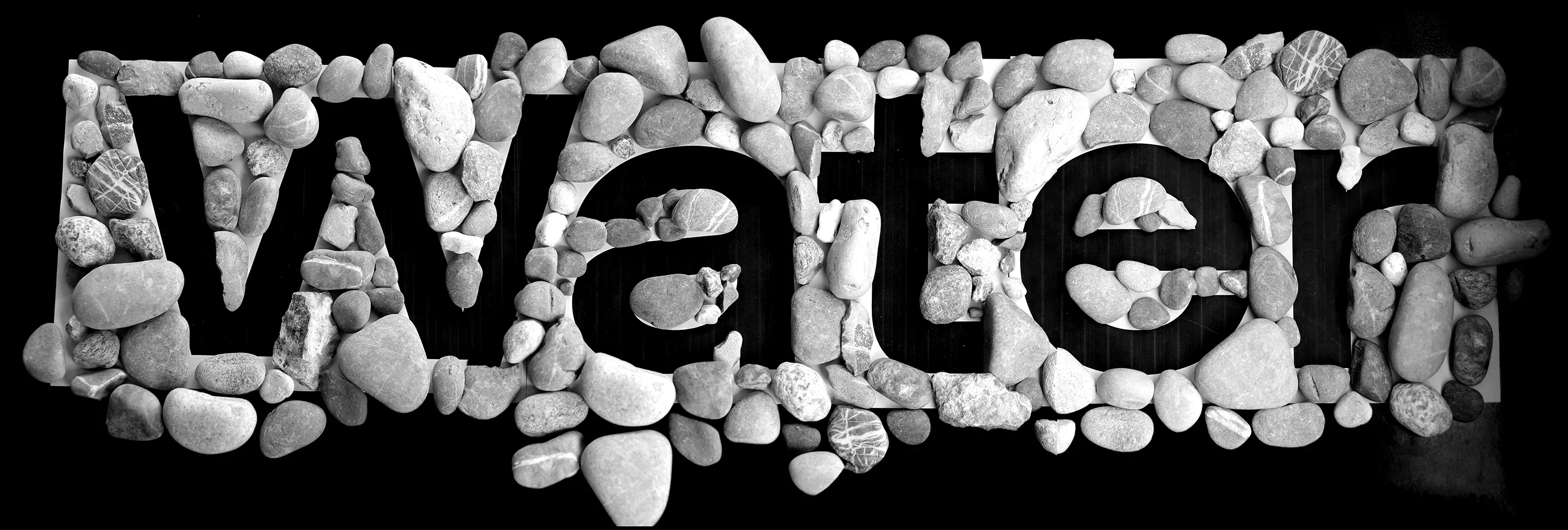
The theme «Out of» hit right in the middle of the hot summer of 2026 and stayed on my mind during my evening swims in the Aare River. As my head cooled down in the water, the pebbles of the Aare sang their song, and the surroundings floated past me, I knew this was my poster topic: Out of Water. With rising temperatures and a deep fascination for the beautiful visual world of water, I wanted to create an accessible snapshot of this summer as both a poster and an animation. From a dried-up riverbed to the stunning reflections and distortions of water, the absence of water in the printed piece highlights the change we are experiencing. Only with the rising water in the animation does the theme Out of Water truly reveal itself—meditative, calm, yet raising the speculative question: «What would our landscape look like without water?»
Creation Process
From Water to Animation
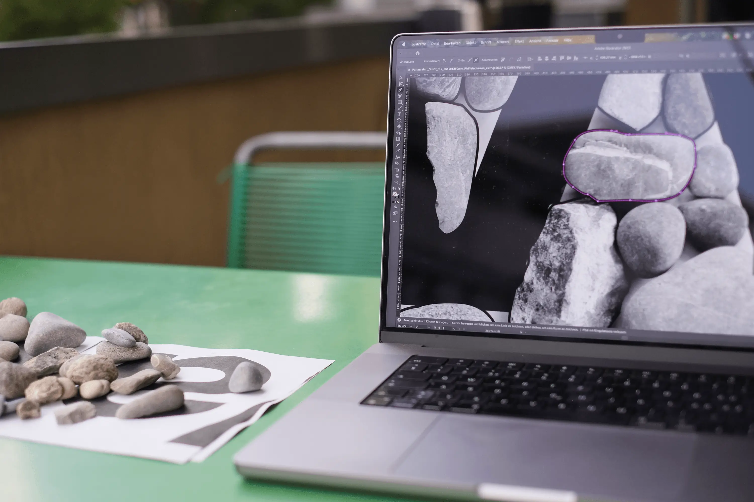
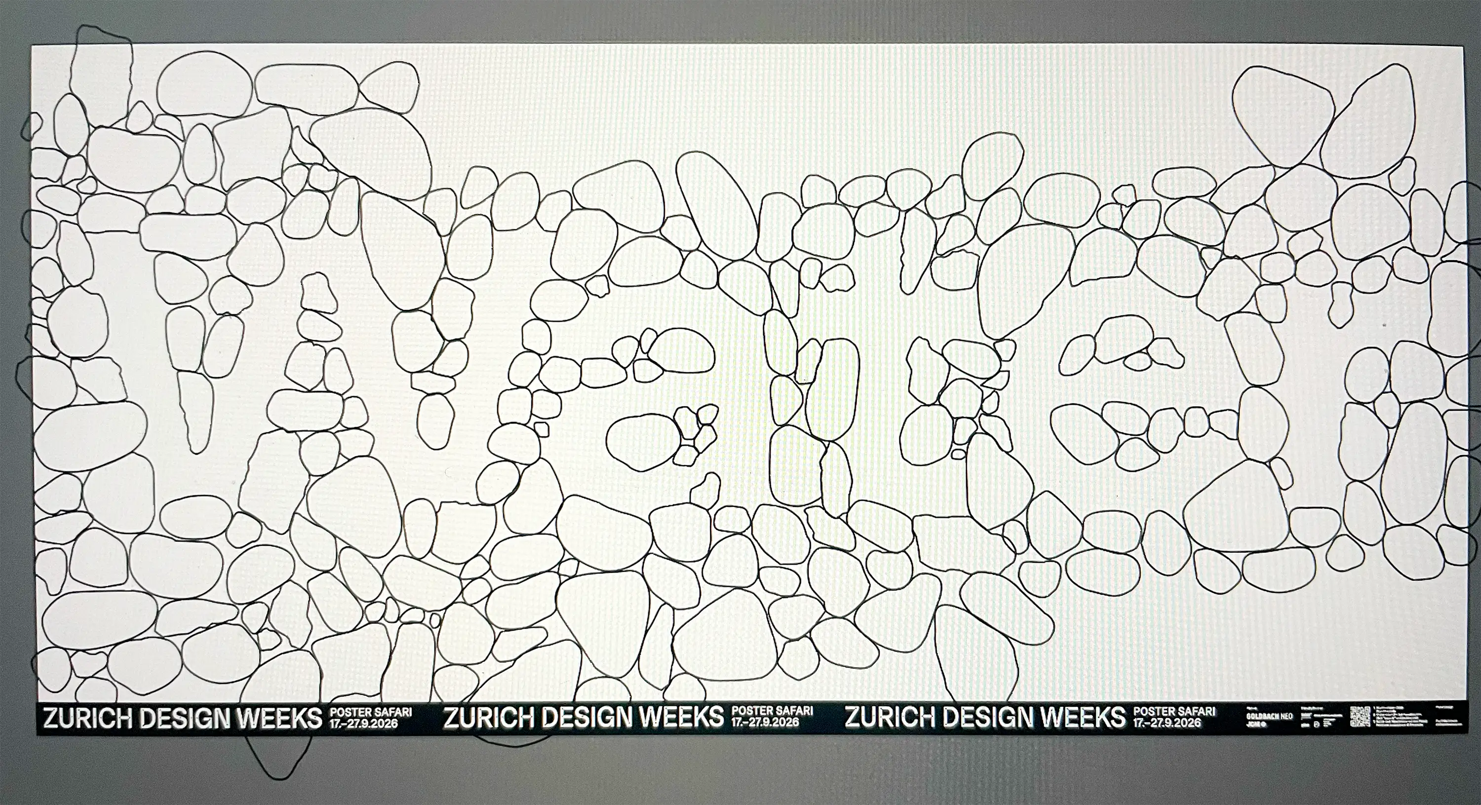
Inspired by the movement, transparency, distortion, and swirling of water, I packed up a few stones and began shaping the word WATER. I arranged the beautiful forms of the stones on my balcony, shaded by the blinds, amidst the heat of the city. Tracing the outlines of the stones digitally felt almost therapeutic as they slowly formed the overall composition of the poster. To achieve a deliberate reduction in print, I chose to leave only the abstracted contours of the stones, evoking the very absence of water.
Only in the animation was I able to capture the lively, mesmerizing world of water with calmness and beauty, without shouting or pointing fingers, but as a quiet process. A shift we are experiencing more and more: Out of Water is not yet our reality, but this summer showed the transformation already underway.
Trees drift past, bridges appear and vanish again. Impermanence suddenly becomes floatable, at least as long as we enjoy the privilege of flowing water. We need it to survive, to cool data, to keep our systems going, to flow, relax, and stay active. We consist of water and will eventually return to water. It carries us along, stays in motion, and adapts. It flows around obstacles, finds paths, quenches, and seeps away. It calms and revitalizes all at once. Through its absence, it reveals what we have long known yet often ignore: We are in the middle of a major shift. Just like being in the Aare River—only far less refreshing.
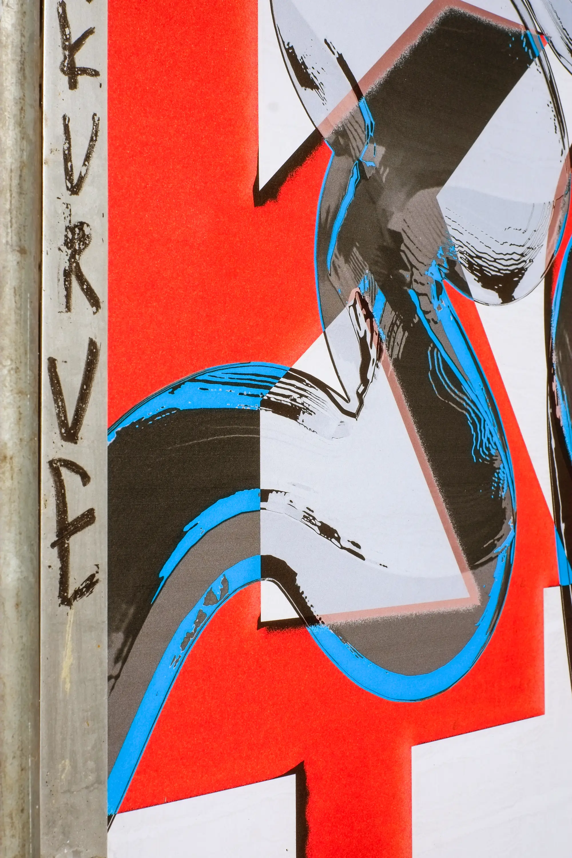
Bern needs media diversity
poster competition
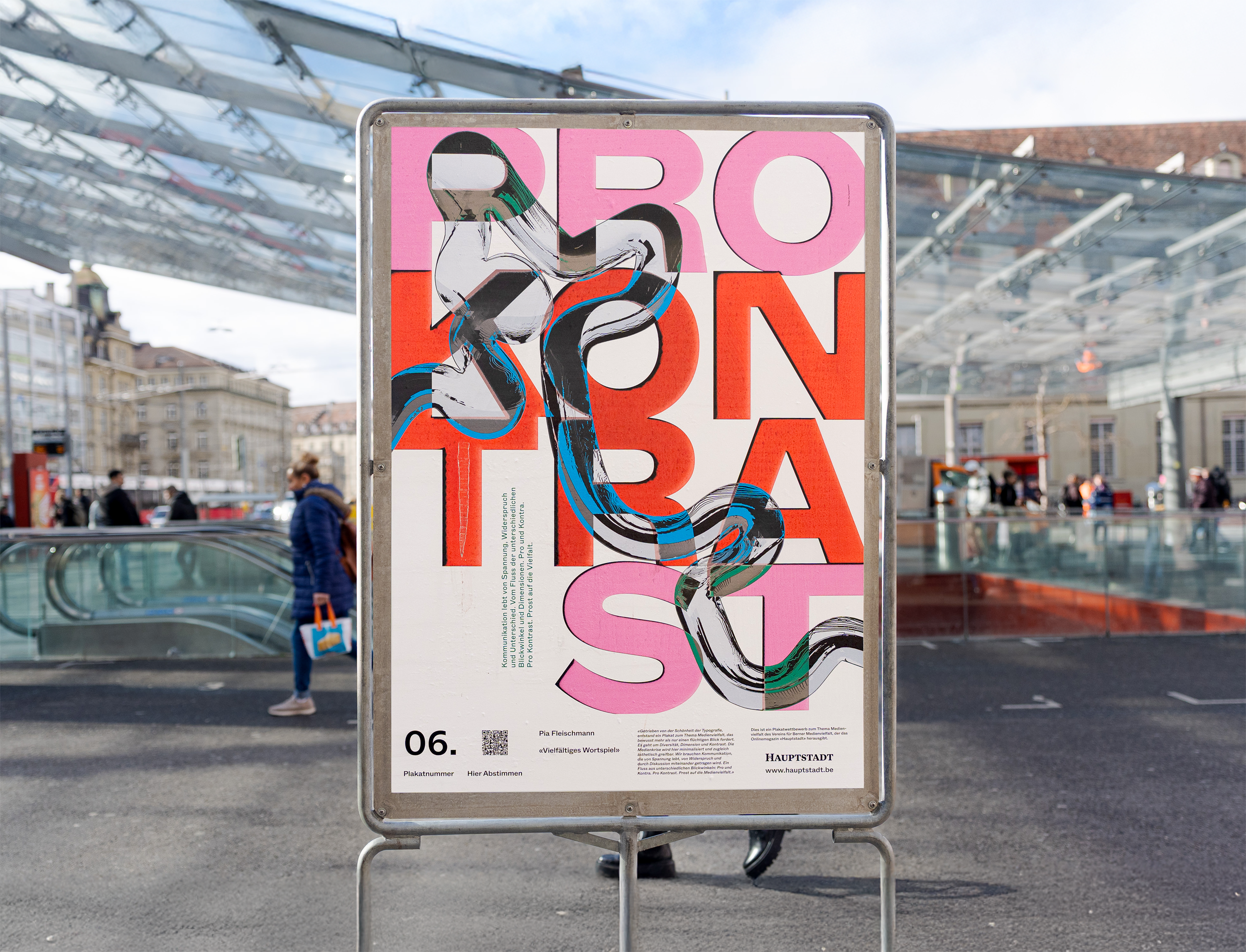
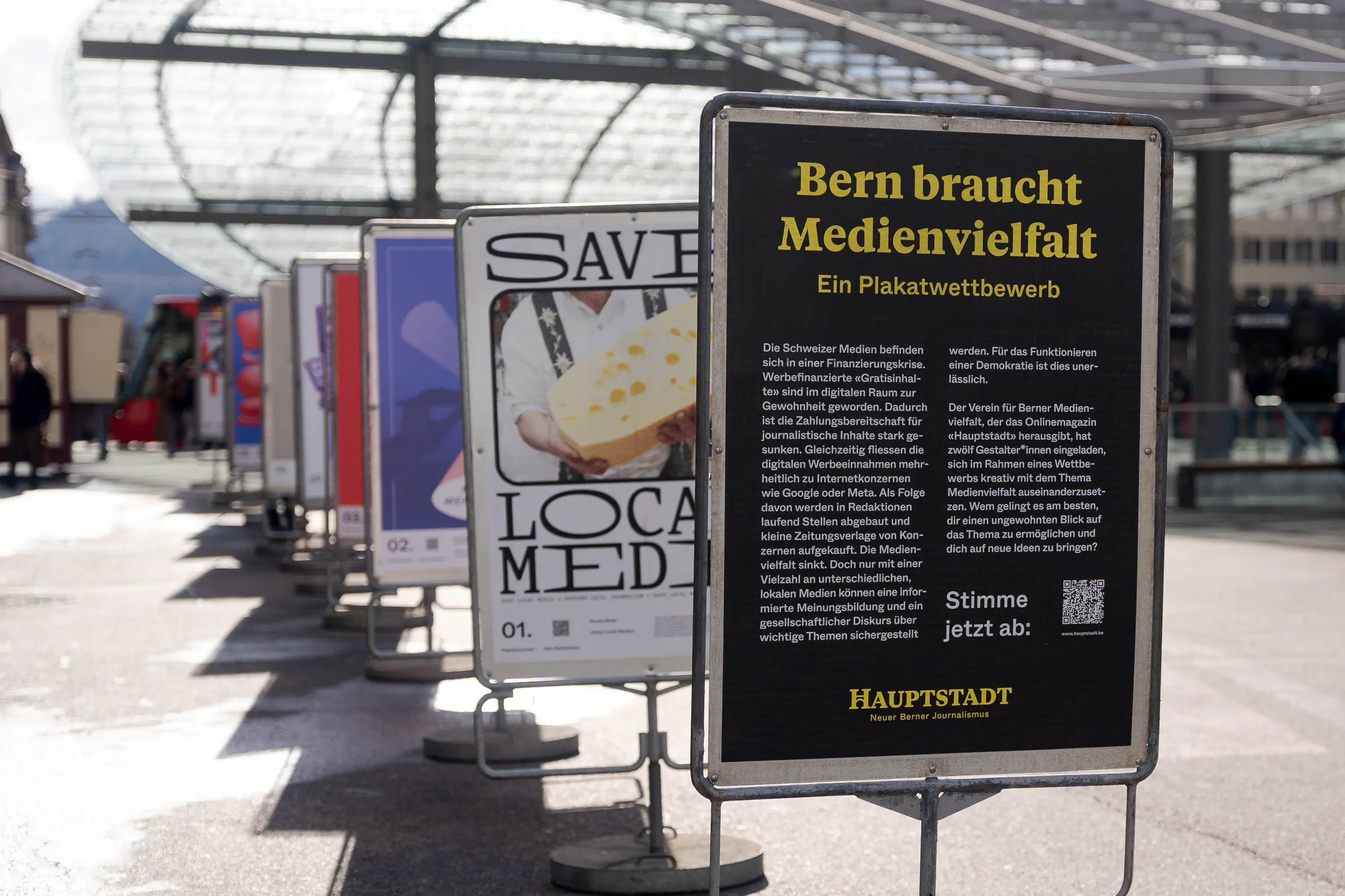
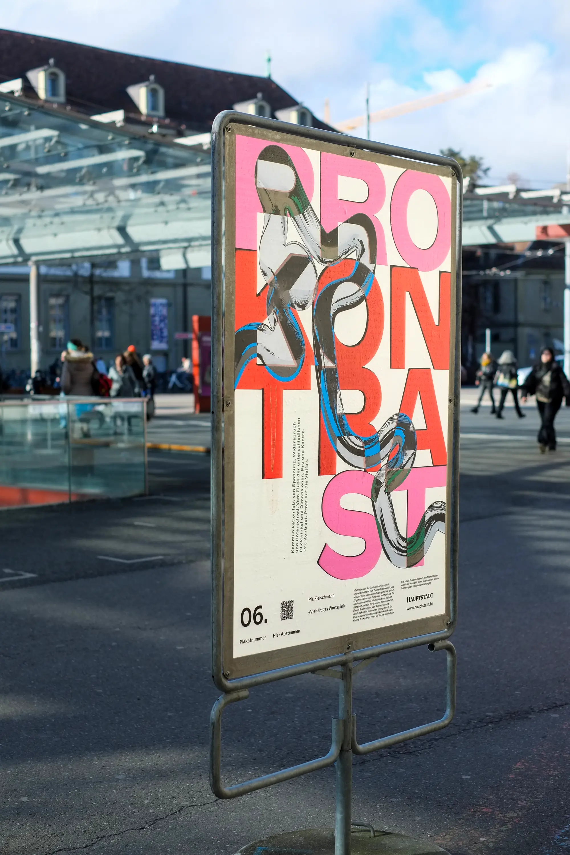
Bern needs media diversity, which is why Hauptstadt (New Bern Journalism) launched a poster competition.
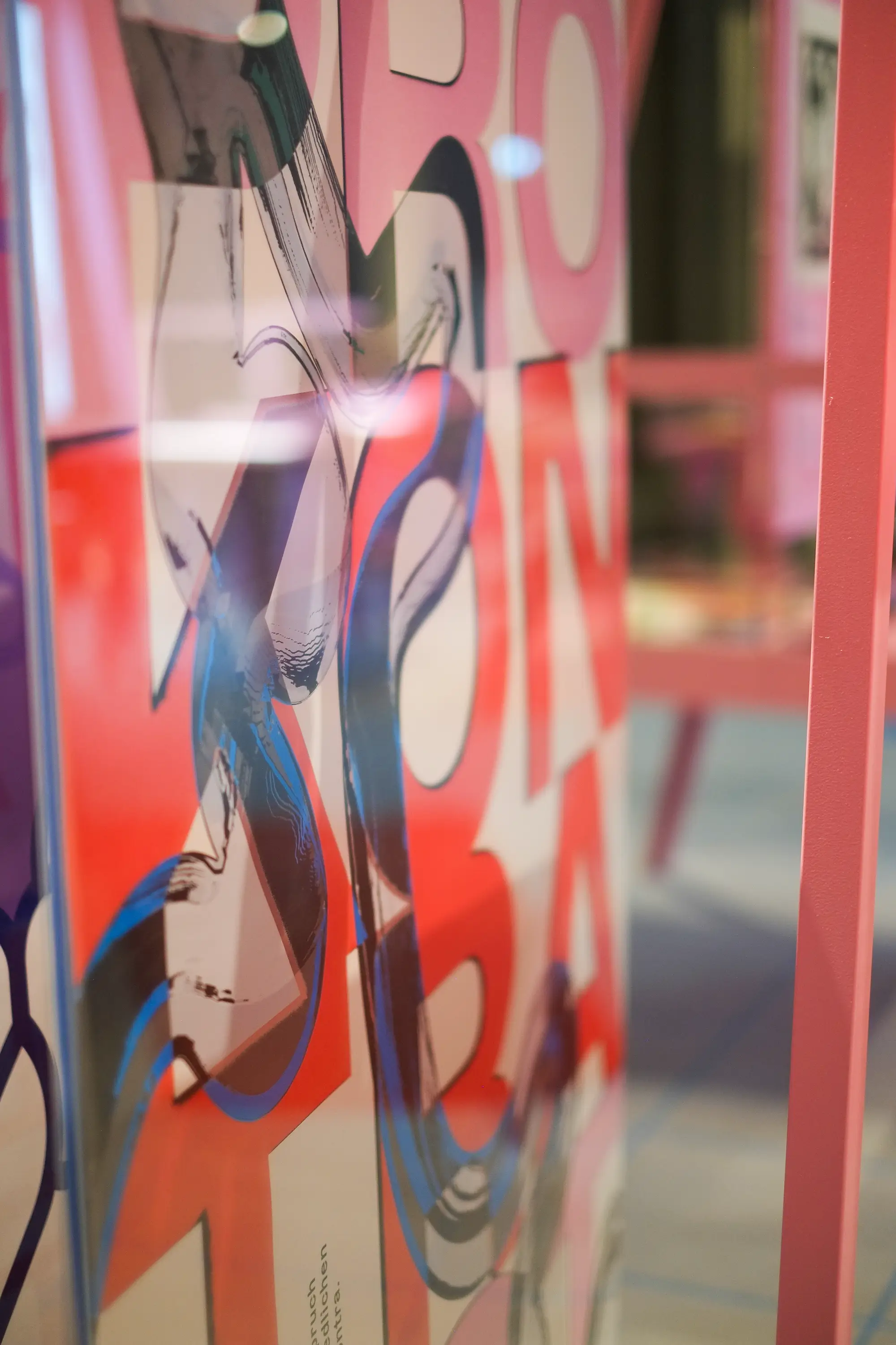
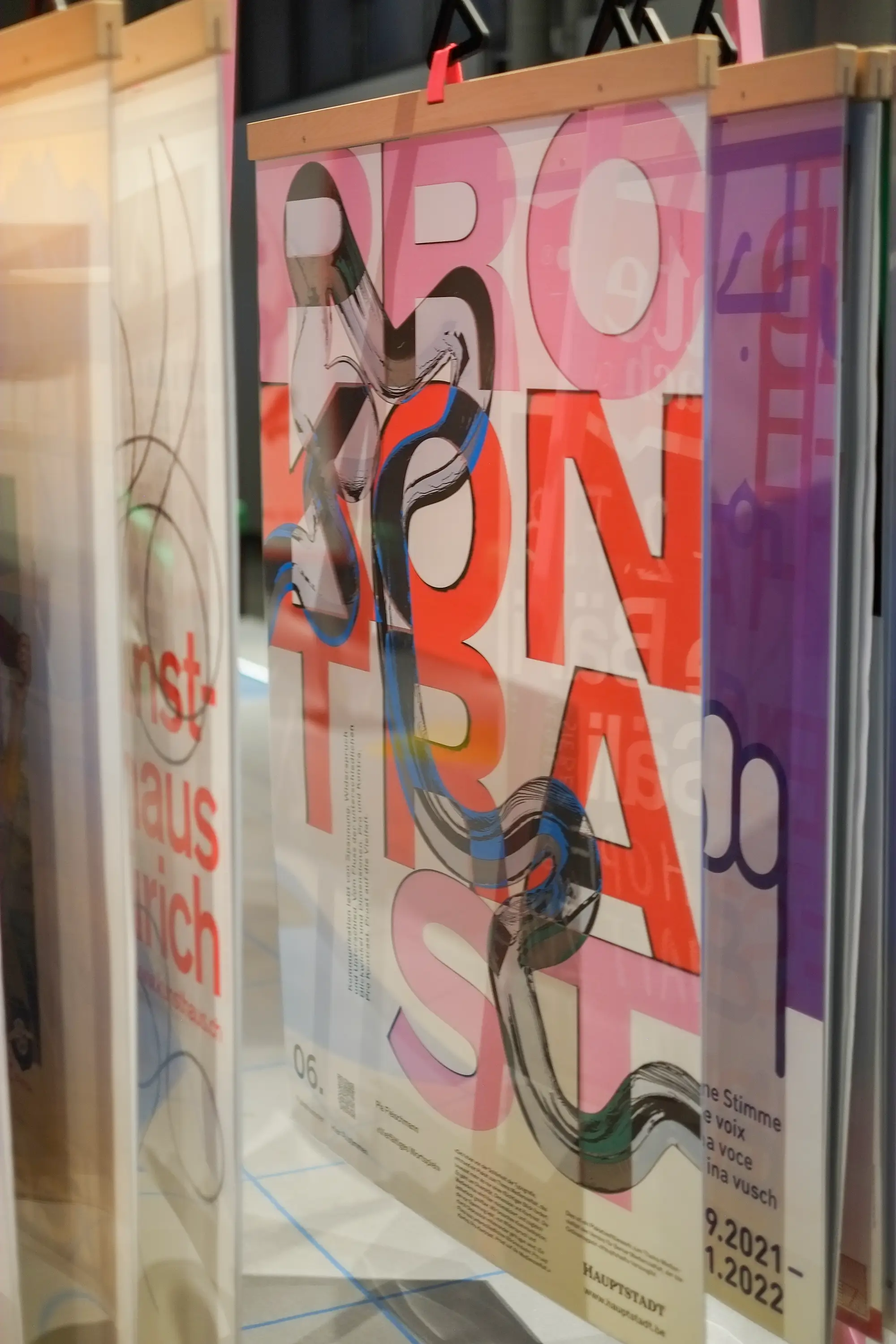
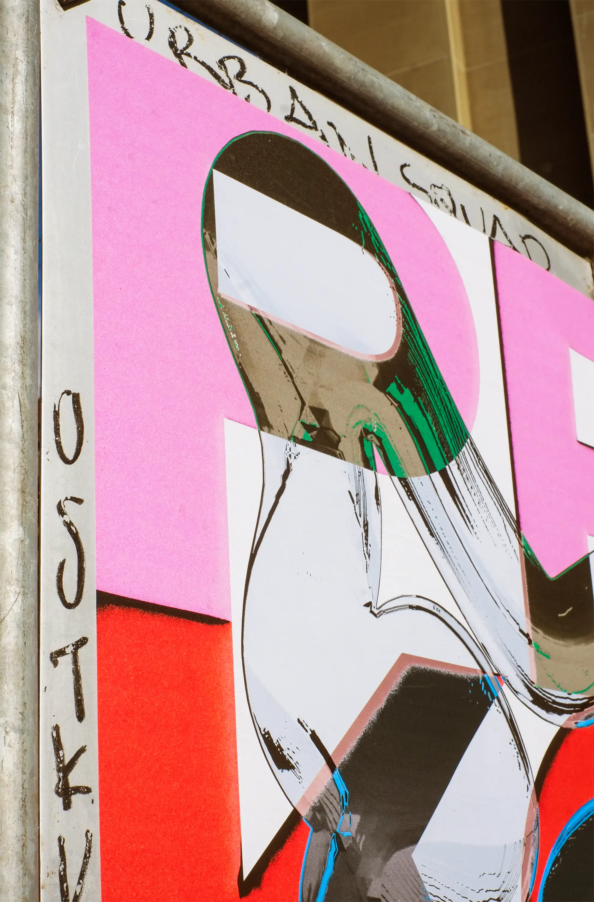
Driven by a fascination with typography, I created a poster on the theme of media diversity that intentionally demands more than just a fleeting glance. It is all about diversity, dimension, and contrast.
The media crisis is minimized yet made aesthetically tangible at the same time. We need communication that thrives on tension, on contradictions, and is sustained through shared discussion. A flow of different perspectives: pro and contra. Pro contrast. A toast (Prost) to media diversity.
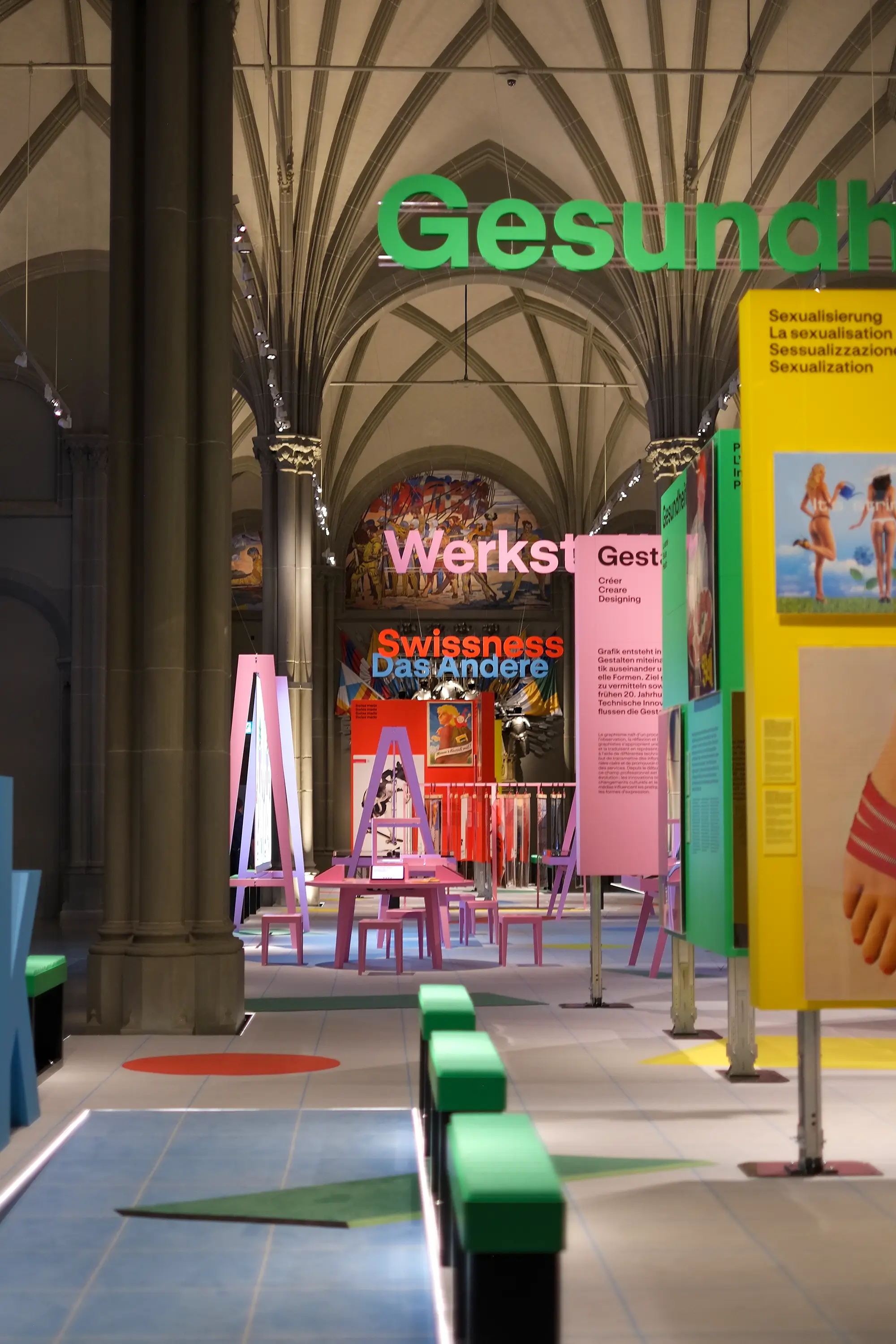
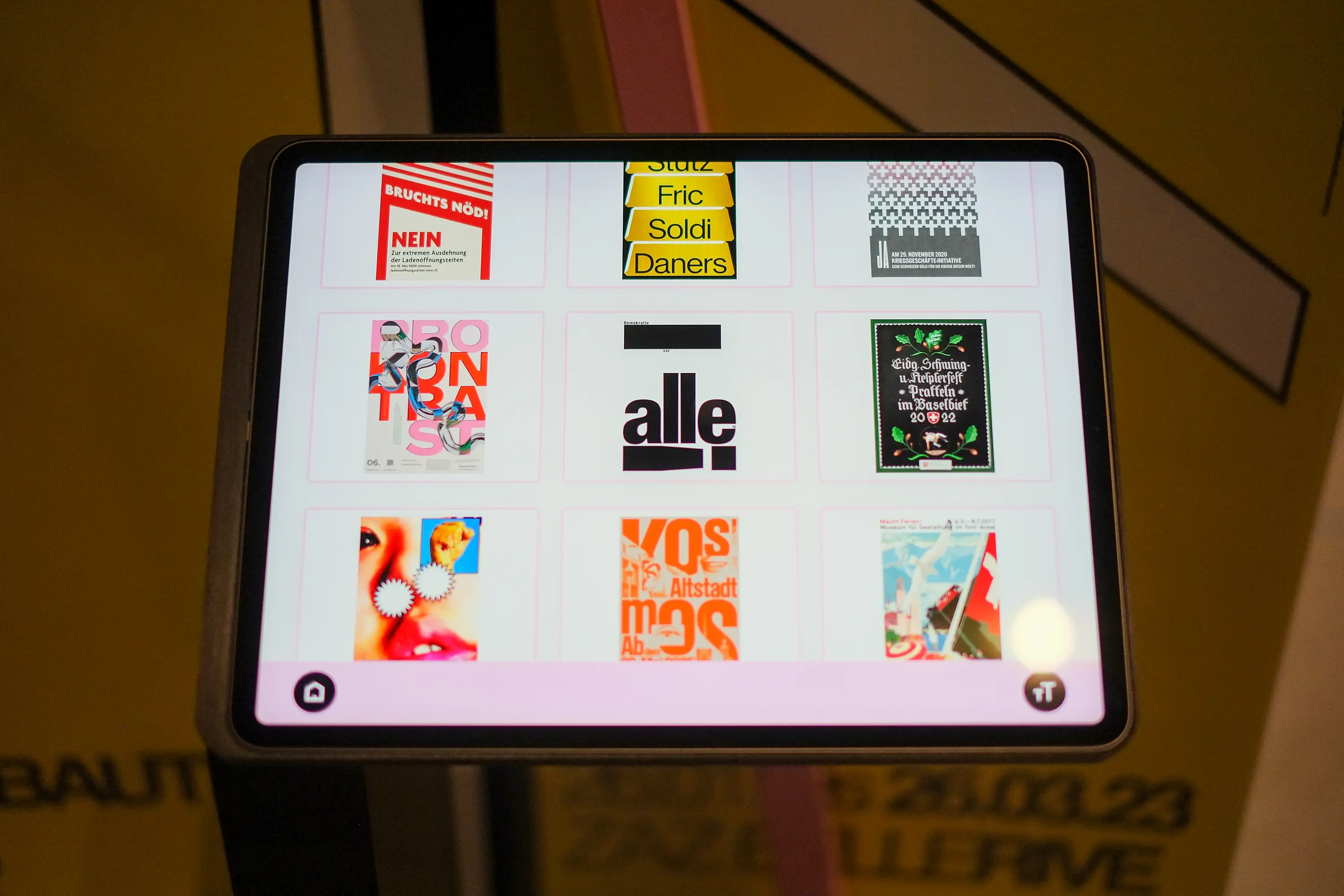
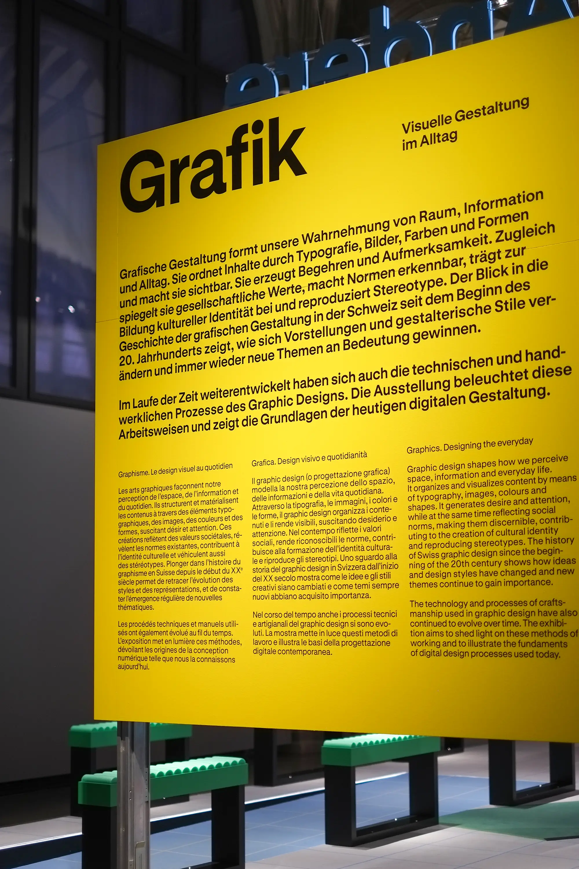
Today, the poster is displayed in the exhibition «Graphic Design – Visual Communication in Everyday Life», which adorns the impressive rooms of the National Museum Zurich (Landesmuseum Zürich) until April 4, 2027.
Having my poster selected during the National Museum’s Open Call to sit alongside the works of so many inspiring graphic designers—and being part of this brilliantly staged exhibition—makes me extraordinarily proud. A huge thank you to the team at the National Museum Zurich for this wonderful opportunity!
Biodiversity Impact Assessment Framework
Promoting biodiversity in decision-making
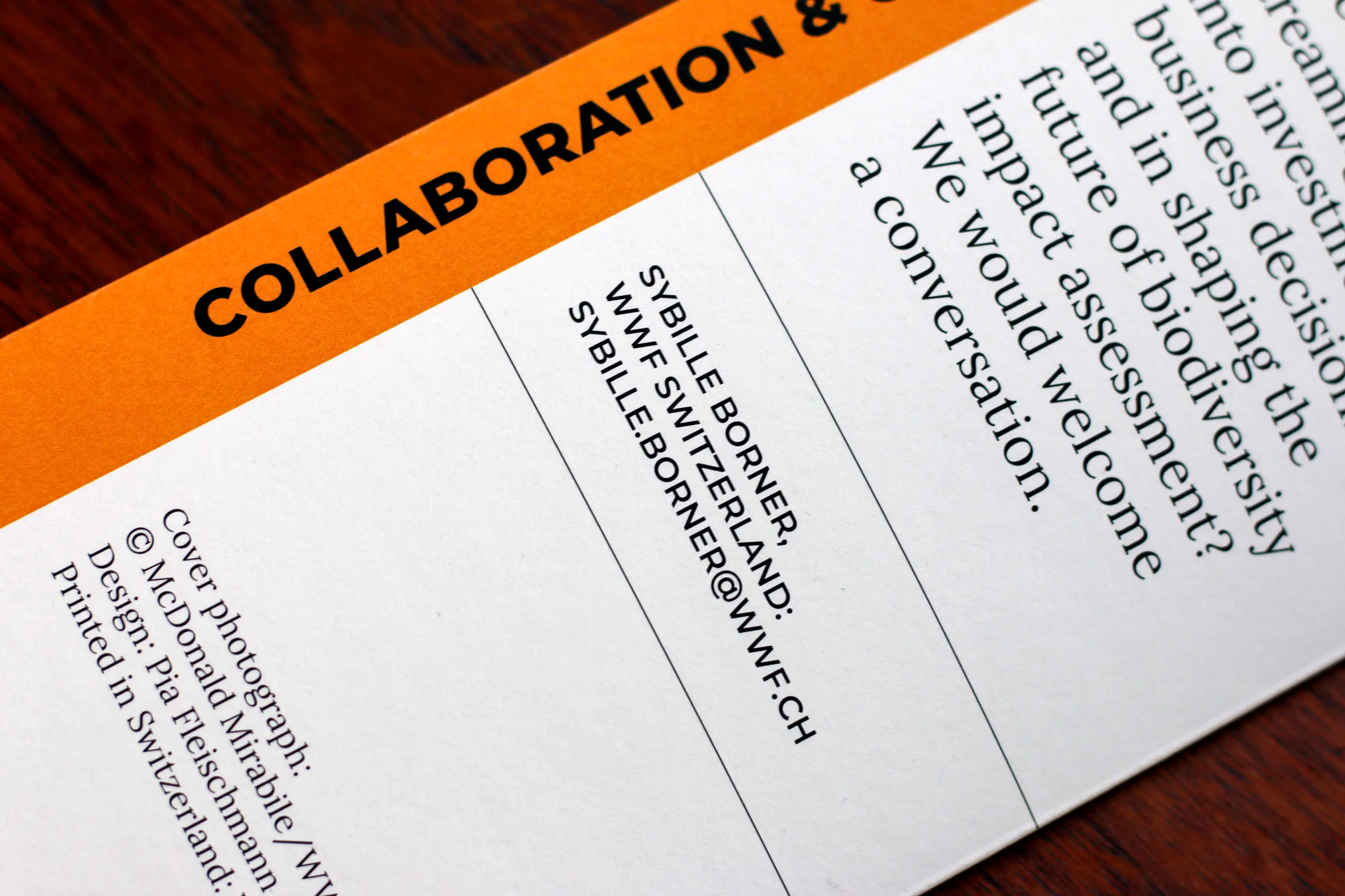
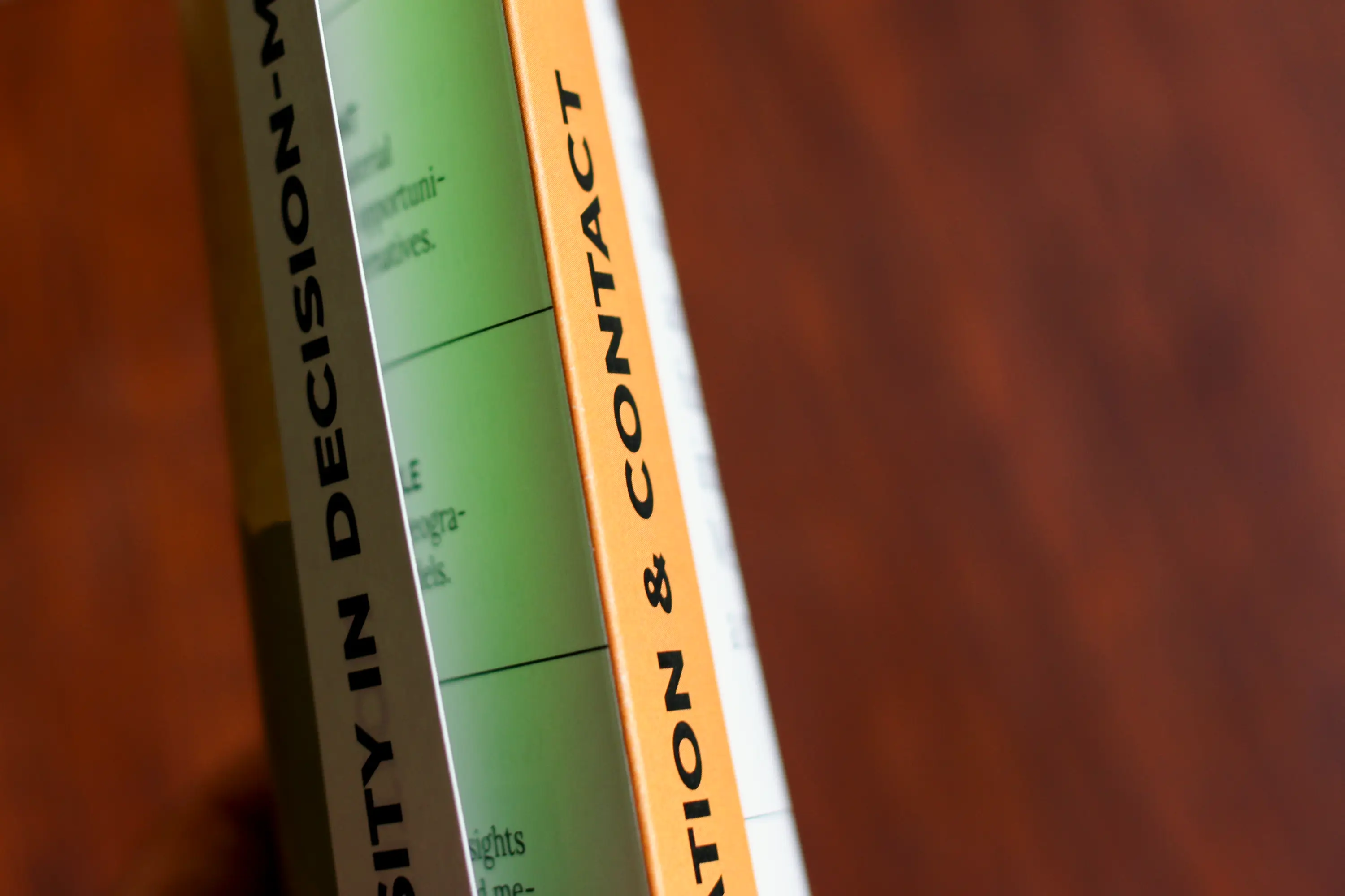
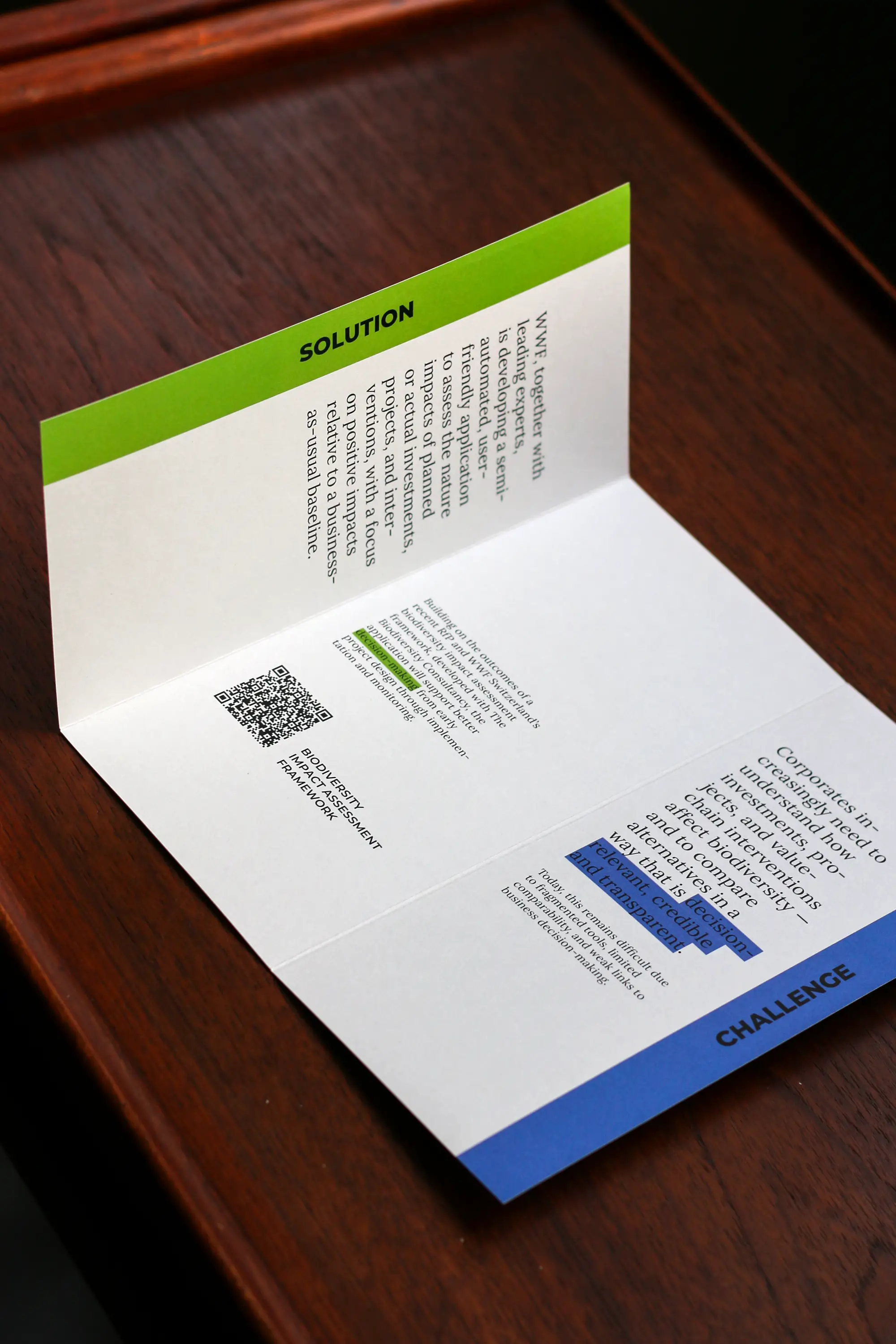
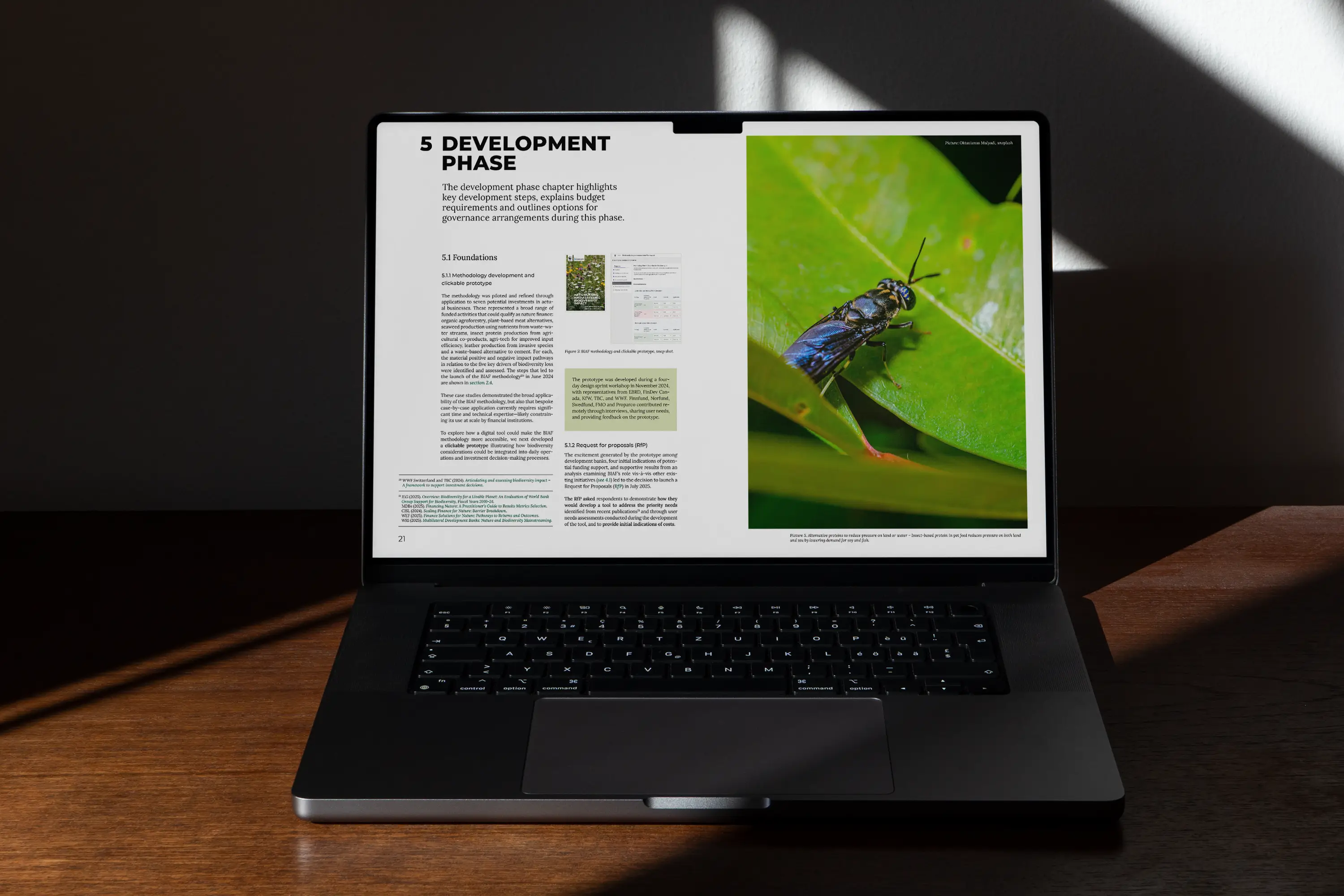
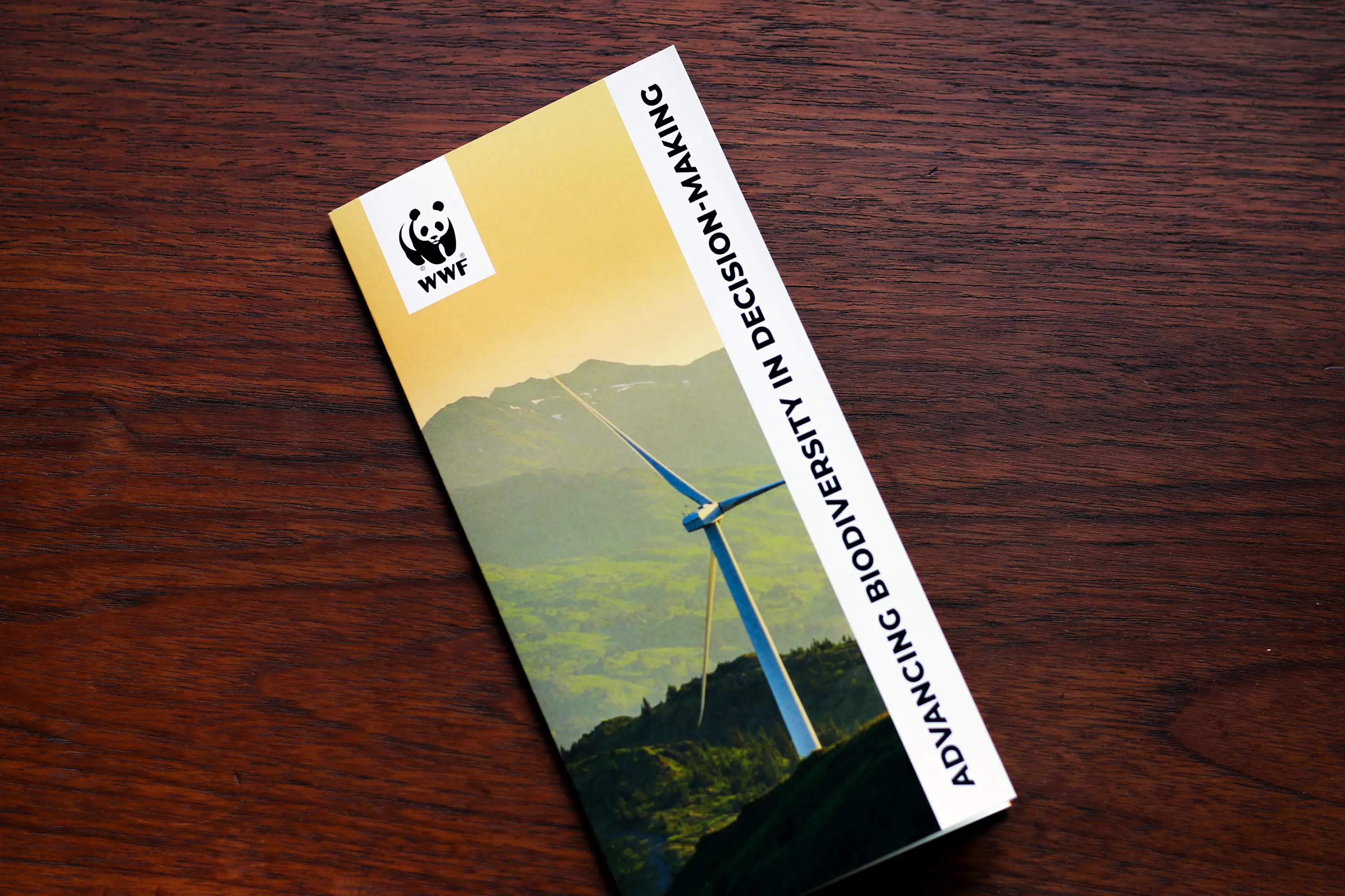
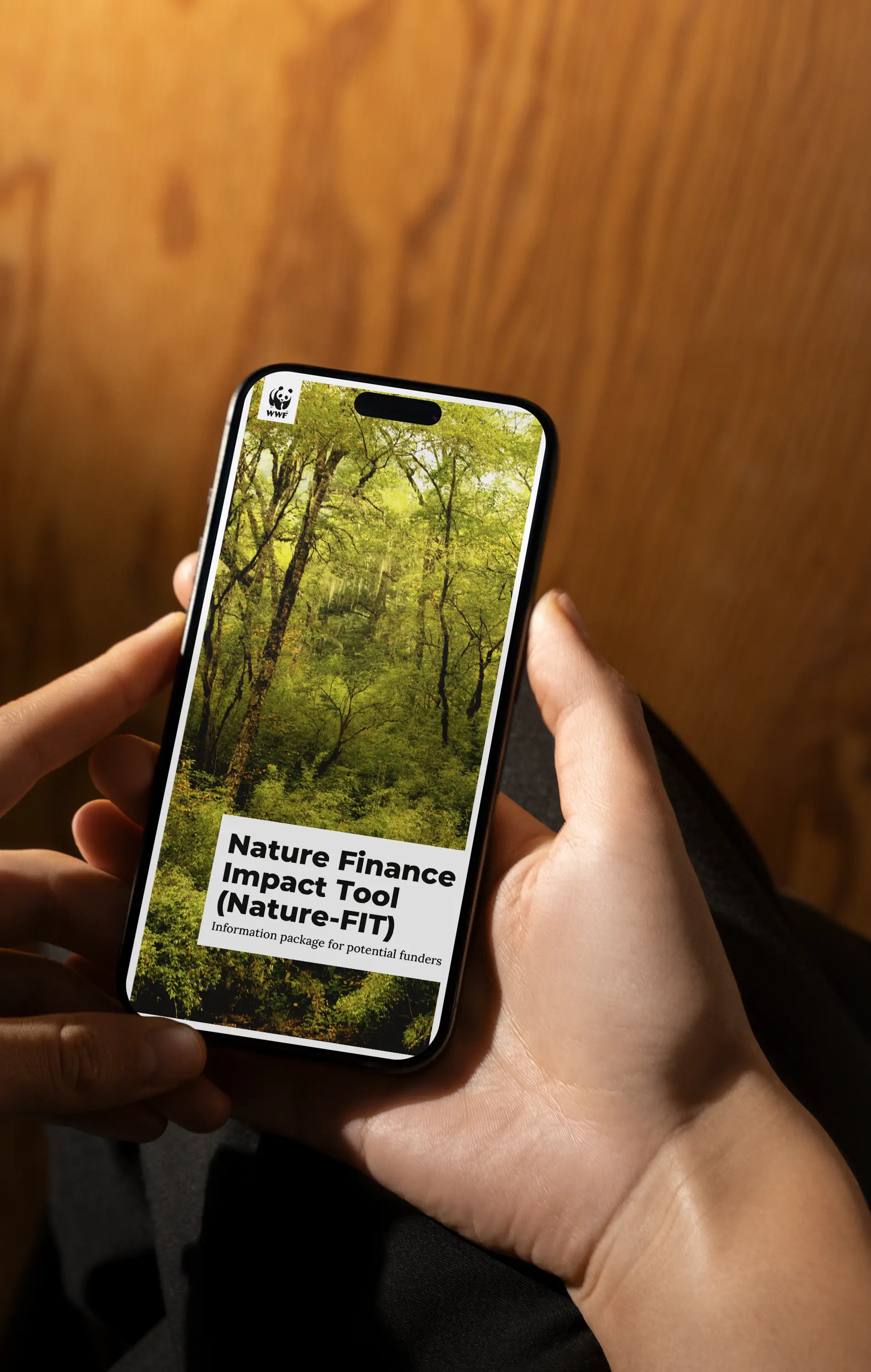
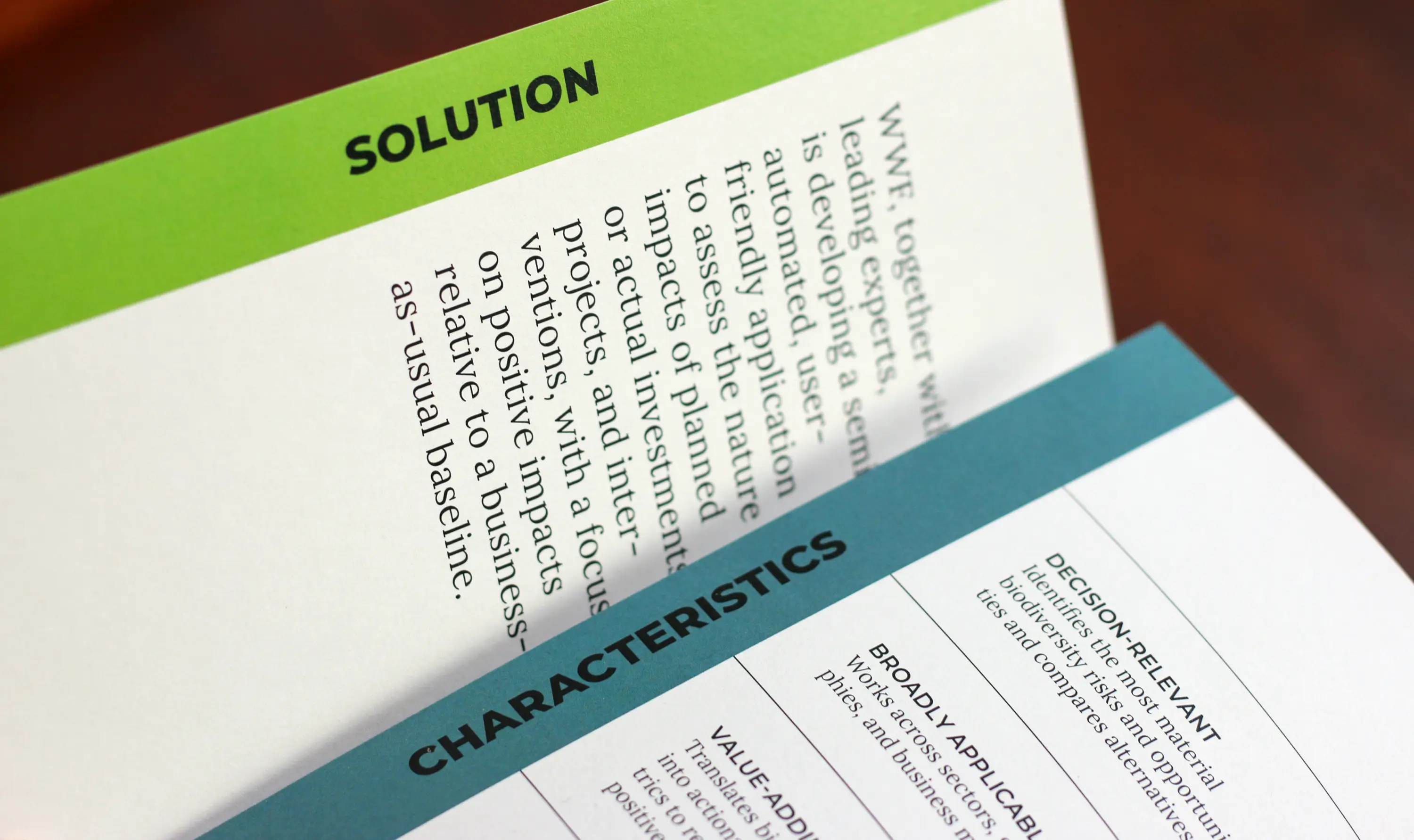
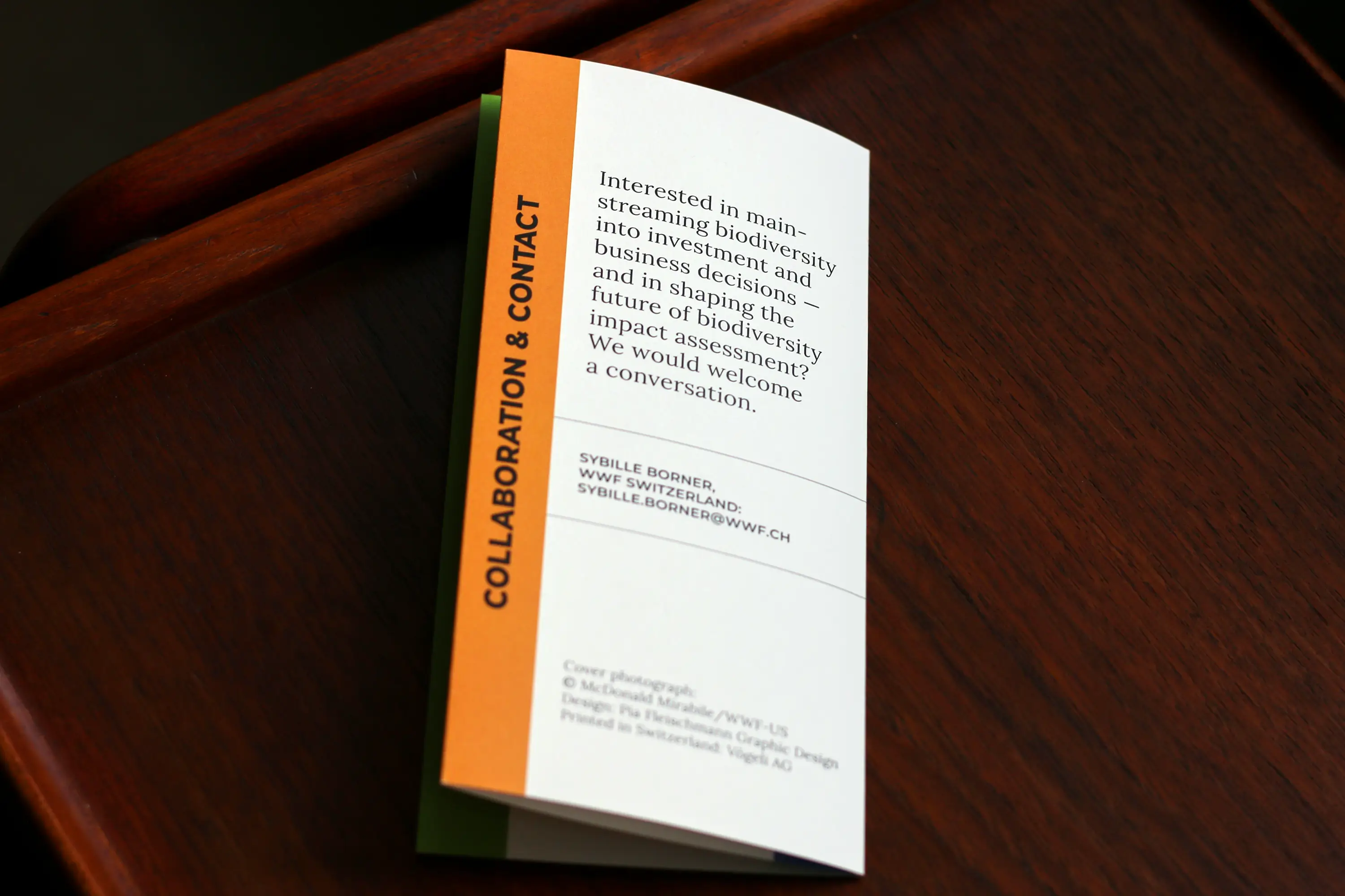
At the beginning of the year, for example, I had the privilege of designing the funding application and flyer for Nature-FIT—an approach developed by WWF Switzerland to help development banks and financial institutions systematically assess and strengthen the «nature-positive» impacts of their investments, actively directing funds into nature conservation.
For me as a graphic designer, this project is a matter close to my heart. It shows that design can reduce complexity without losing its core essence. It also highlights that transparency is the first step toward a shift in mindset, and that science and aesthetics make an unbeatable team.
Even though funding to develop a tool based on this approach hasn’t materialized for implementation for now, the topic remains highly relevant and the groundwork laid is enormously important. It was a true pleasure to visually accompany this forward-looking idea. Many thanks to Sybille Borner from WWF Switzerland and to Vögeli Printing for the sustainable print production!
A Bold Statement in Fashion Design
Sustainable & Thoughtfully Crafted: PFEFFER / VERBEEK
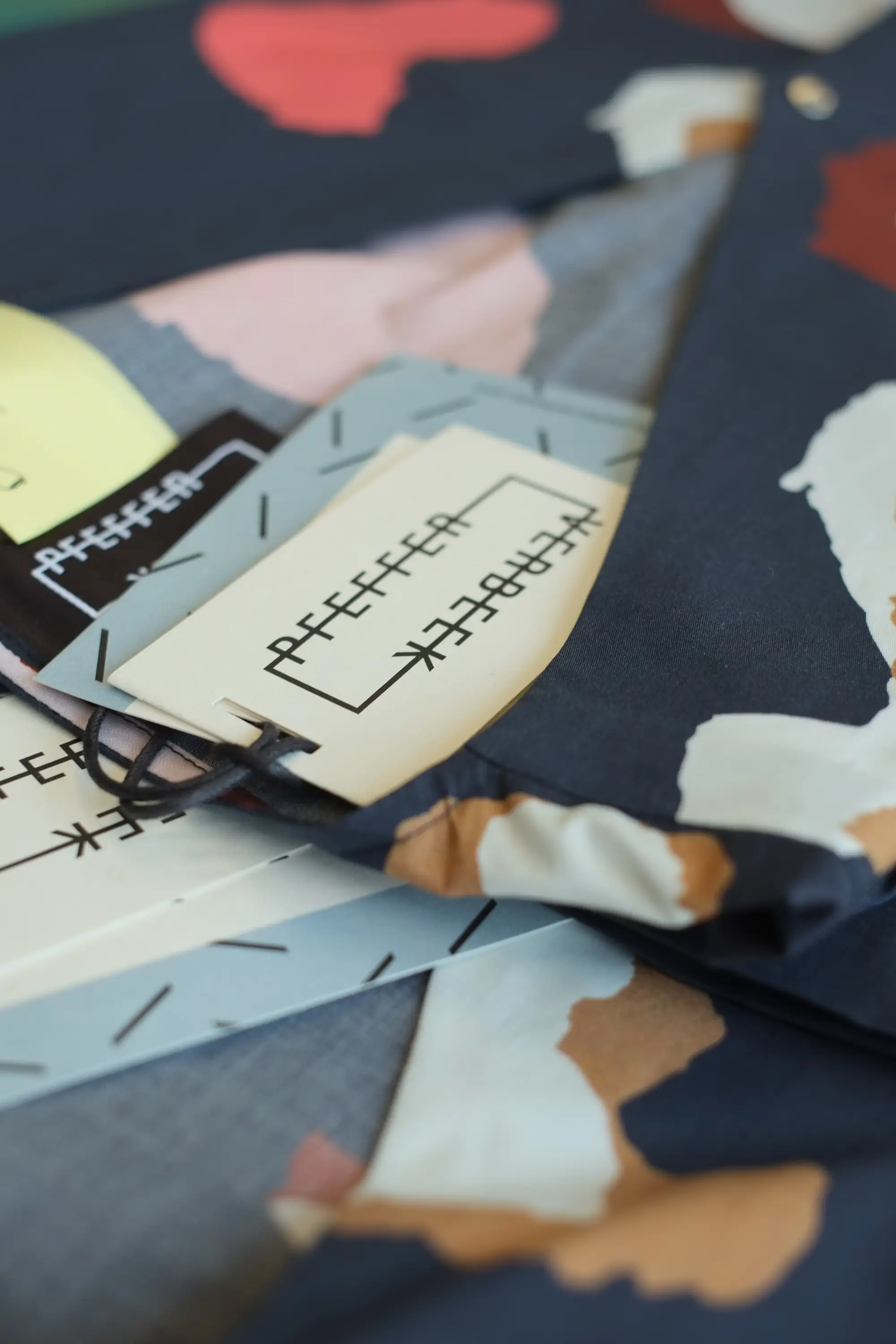
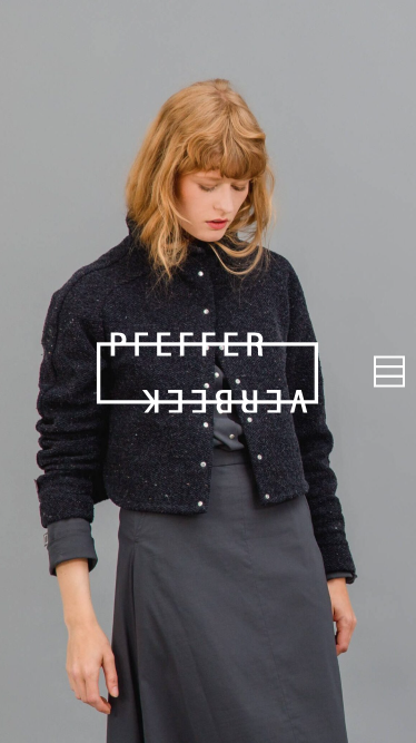
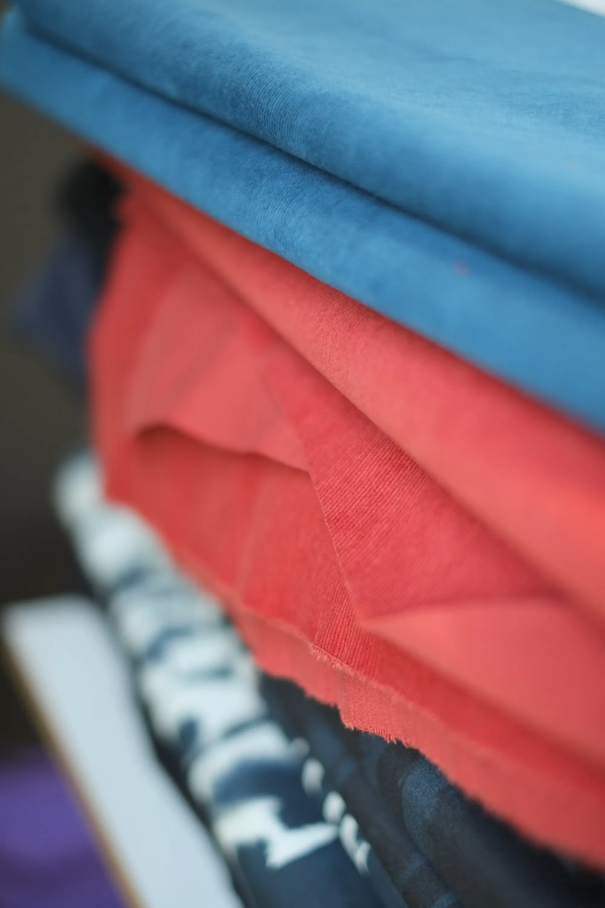
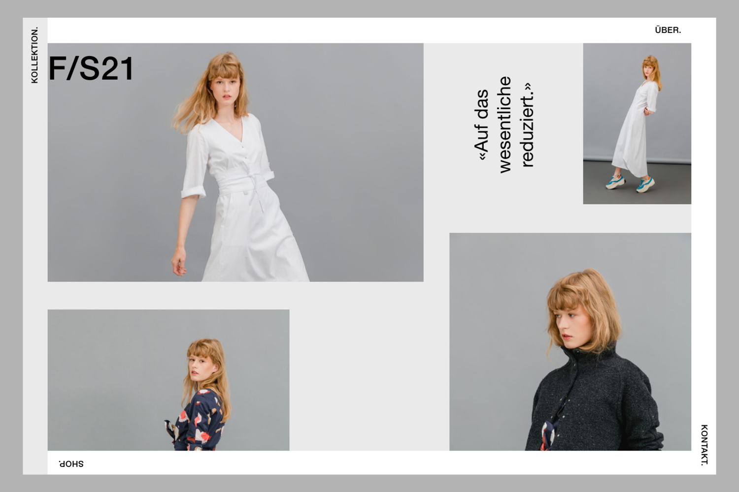
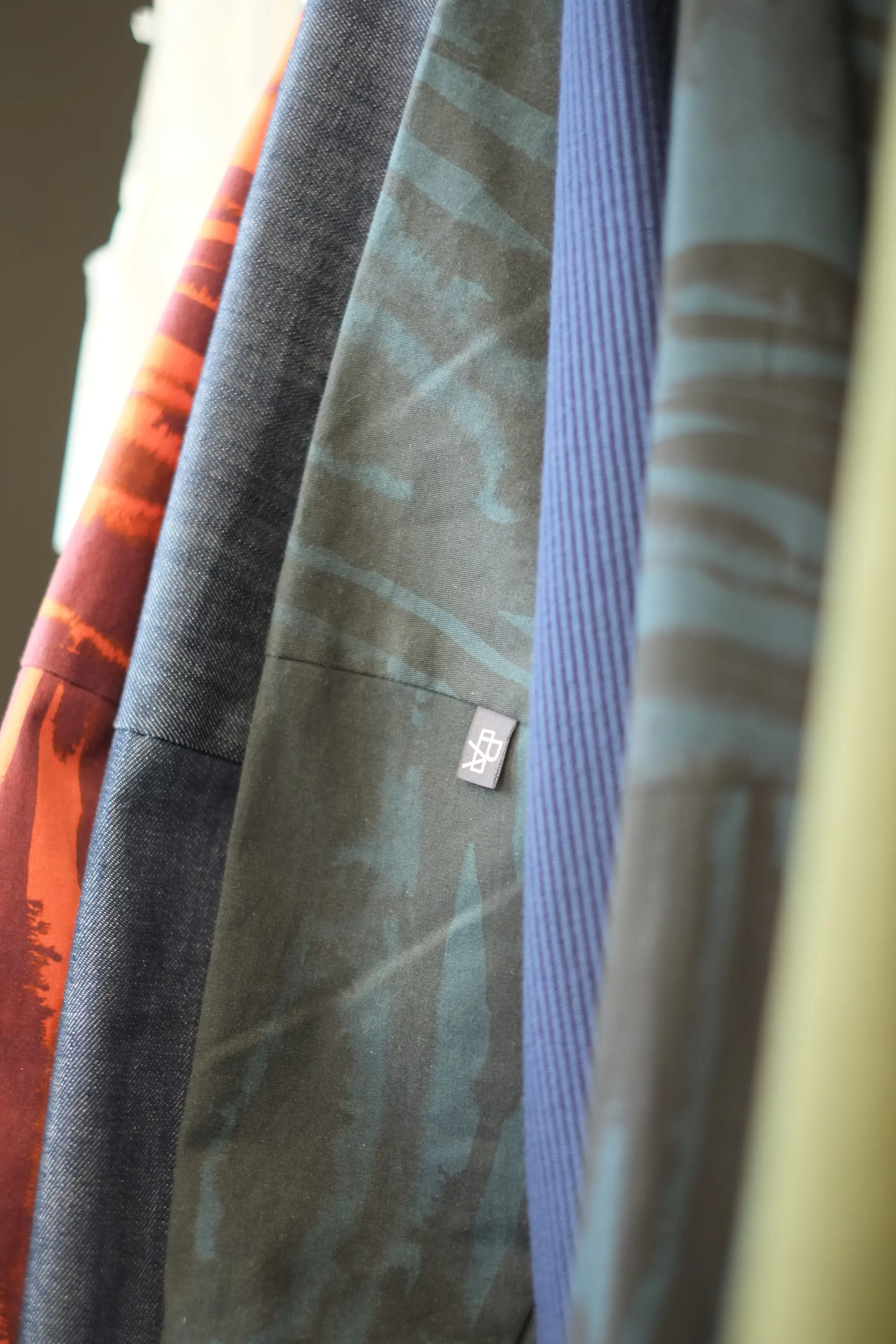
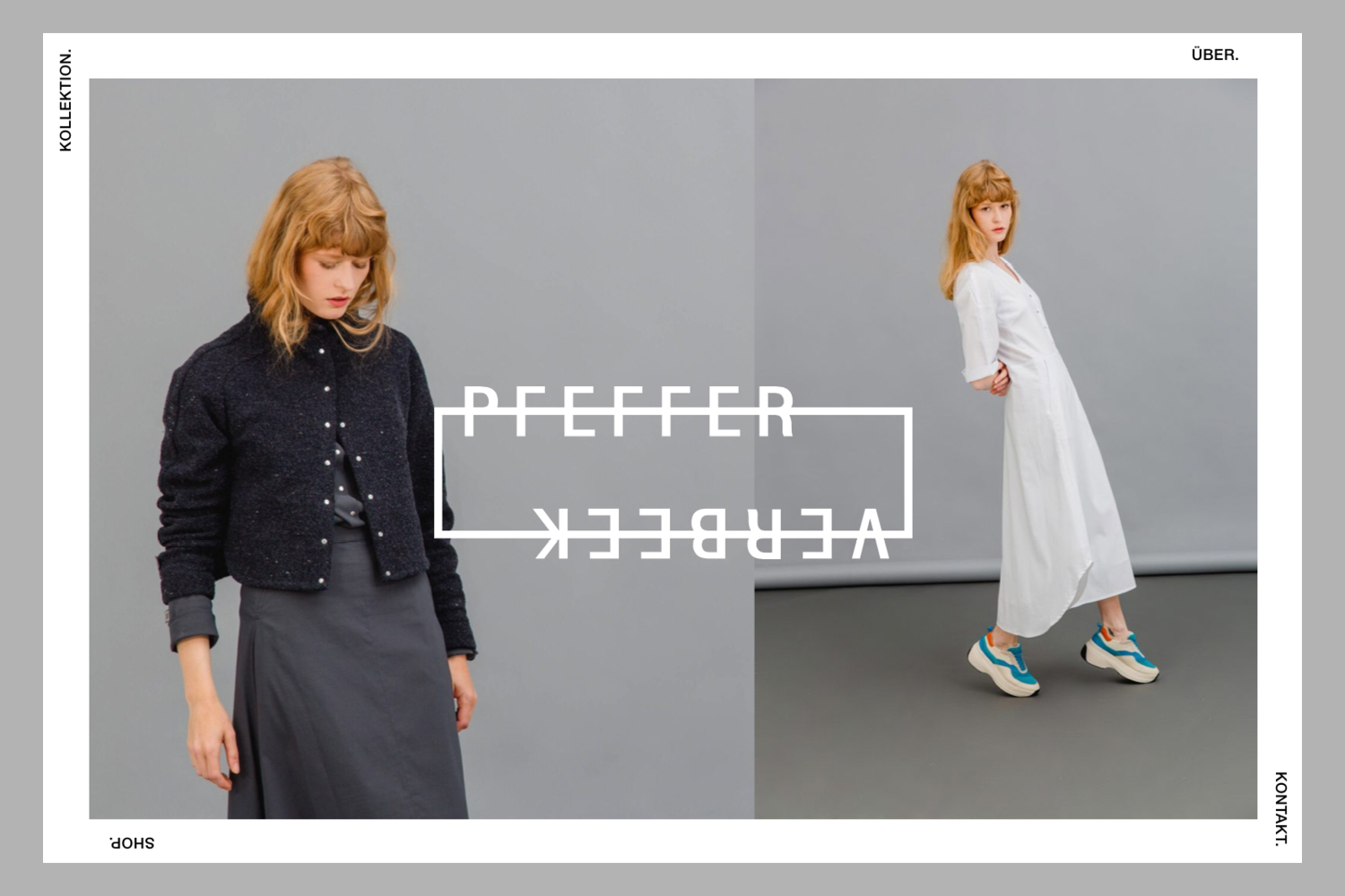
What happens when two fashion designers join forces to make a powerful statement? You get a sustainable, thoughtfully crafted fashion label. Susanne Pfeffer and Nicole Verbeek truly impress with PFEFFER / VERBEEK—a timeless brand that stands for clean, sophisticated looks made from handpicked European materials.
With transparent communication, made-to-measure customization options, and a modular collection concept, Susanne and Nicole are proving that they are just getting started. To put their beautiful philosophy and conscious fashion center stage, the web design was created to be minimalist yet highly adaptable. For instance, the website’s background colors can be seamlessly adjusted to match the aesthetic of each new collection. The homepage warmly invites visitors to explore the brand and sparks curiosity for more. Within just a few clicks, users can dive into the thoughts and concepts behind PFEFFER / VERBEEK and browse a stunning overview of their collections. Fittingly, this digital presence itself becomes an eco-friendly communication tool that saves resources.
In close collaboration with Roger Burkhard, we developed a unique and pure brand identity that brings the vision and passion of PFEFFER / VERBEEK to life.



Swiss Post
Upcycling – from Postal Uniform to Postage Stamp
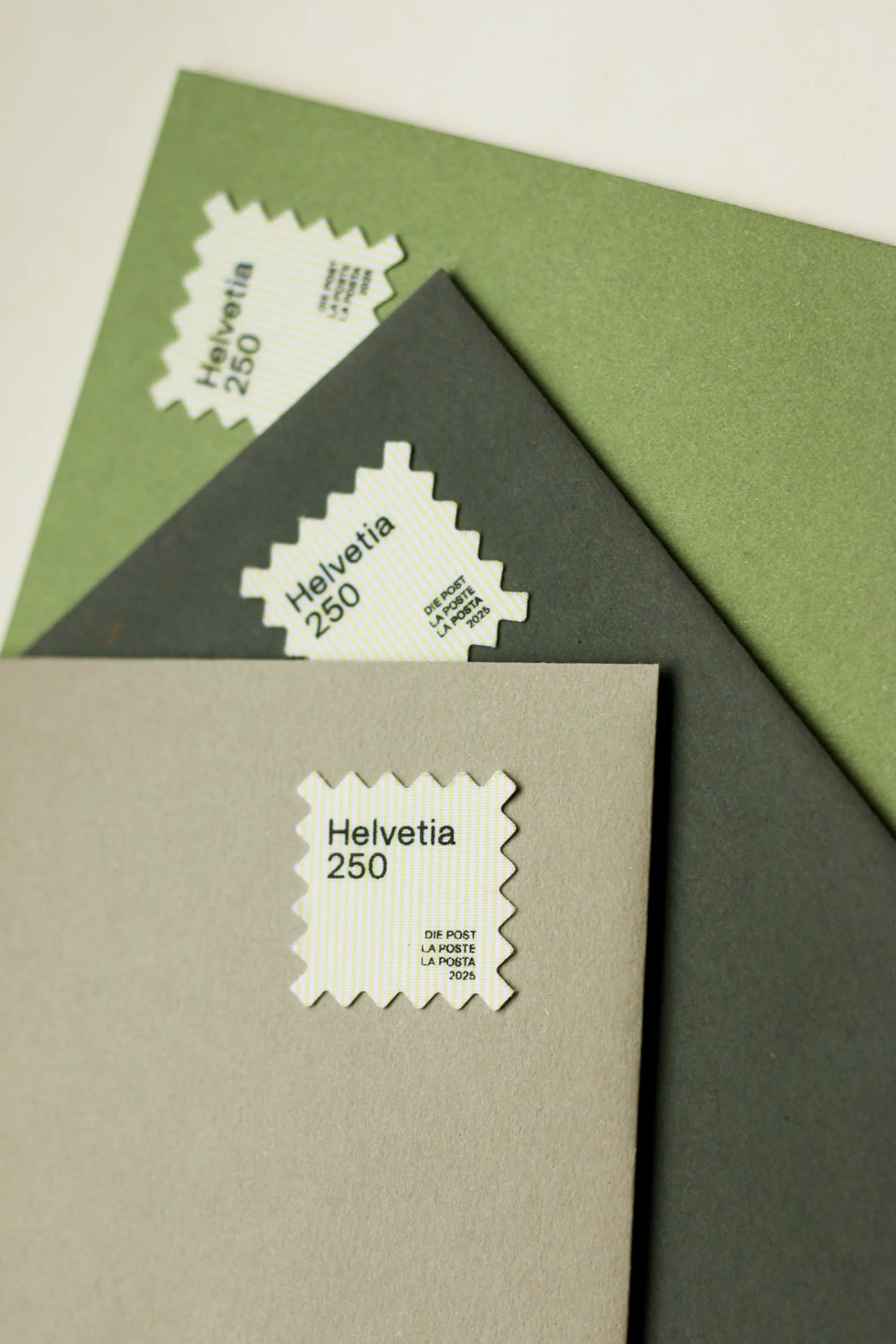
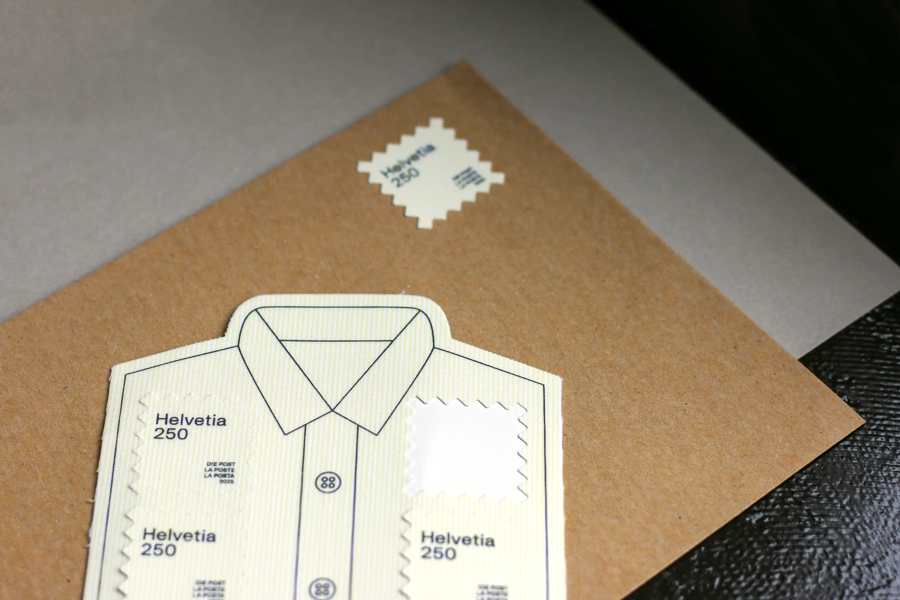
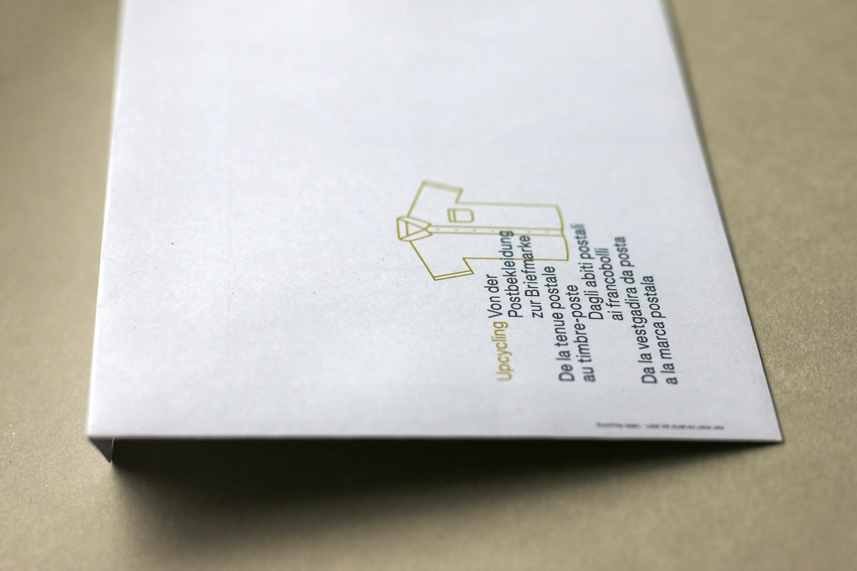
Experience Swiss Post up close: What served as workwear for postal employees for over 20 years is now getting a new life. Together with the committed and open-minded team at Swiss Post, I had the pleasure of designing the special stamp “Upcycling – from Postal Uniform to Postage Stamp.”
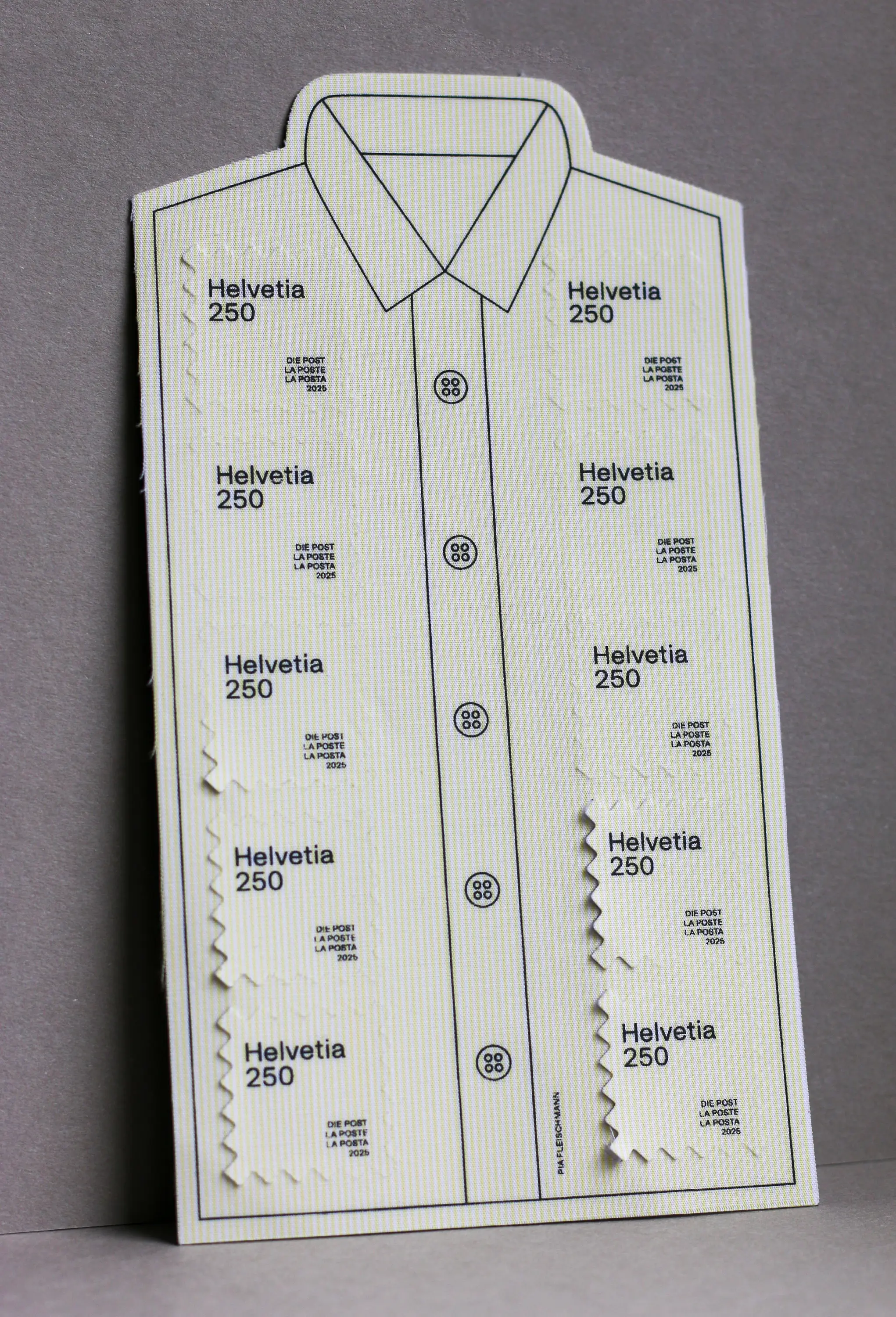
At the heart of the project was the idea of creating a tribute to the recognizable look and strong sense of belonging among employees. The fabric of the familiar light-yellow shirt is now setting off on another journey – this time as a postage stamp.
The design incorporates characteristic elements of the postal uniform: the print recalls the anthracite-colored blazers that were once part of the outfit and celebrates the diversity of the people who wore them with pride every day.
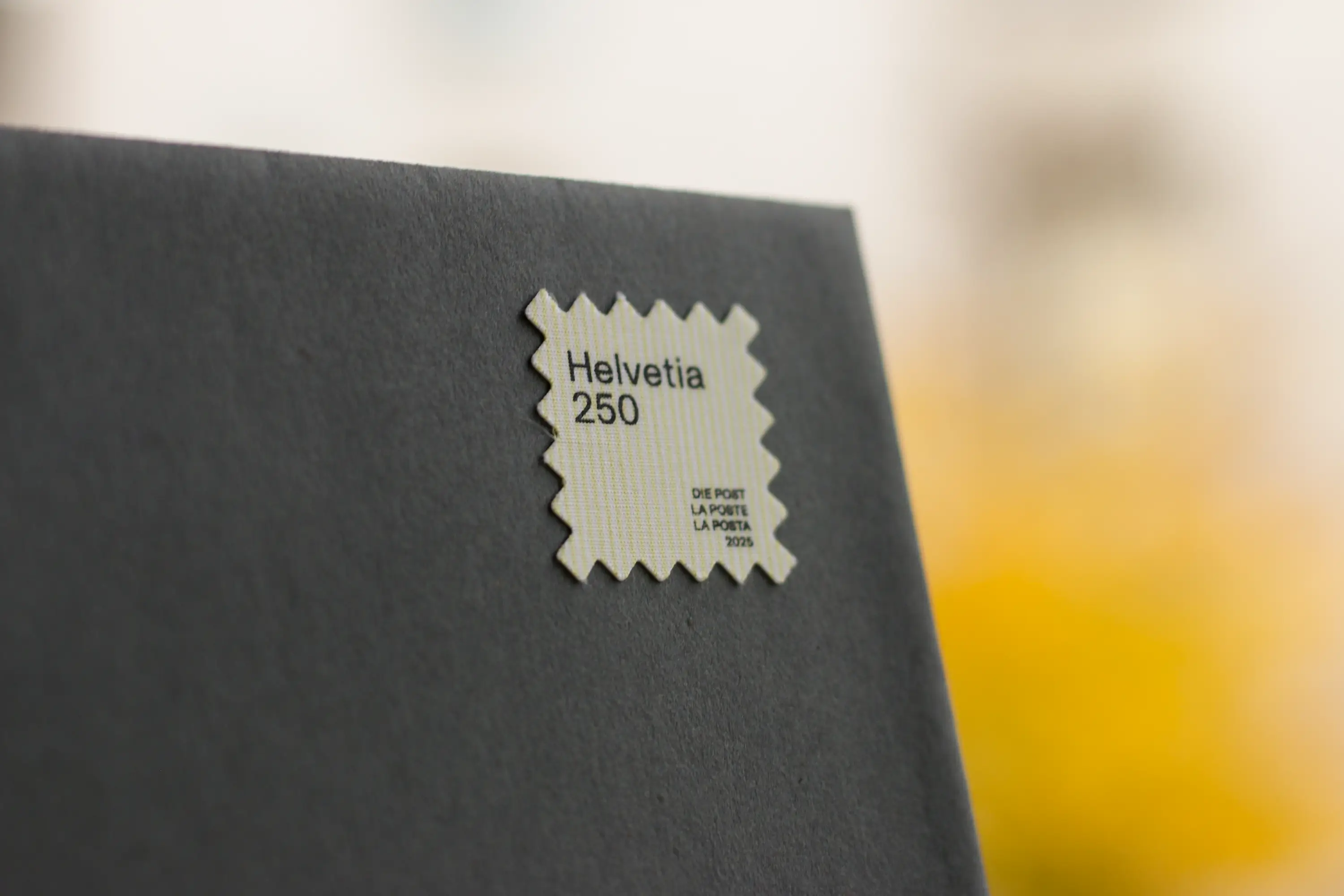
Typography plays an essential role as well. The stamp features OTR Grotesk by Marc Zennhäusern – a contemporary workhorse typeface rooted in Swiss design, combining legibility, precision, and character. A perfect complement to the theme.
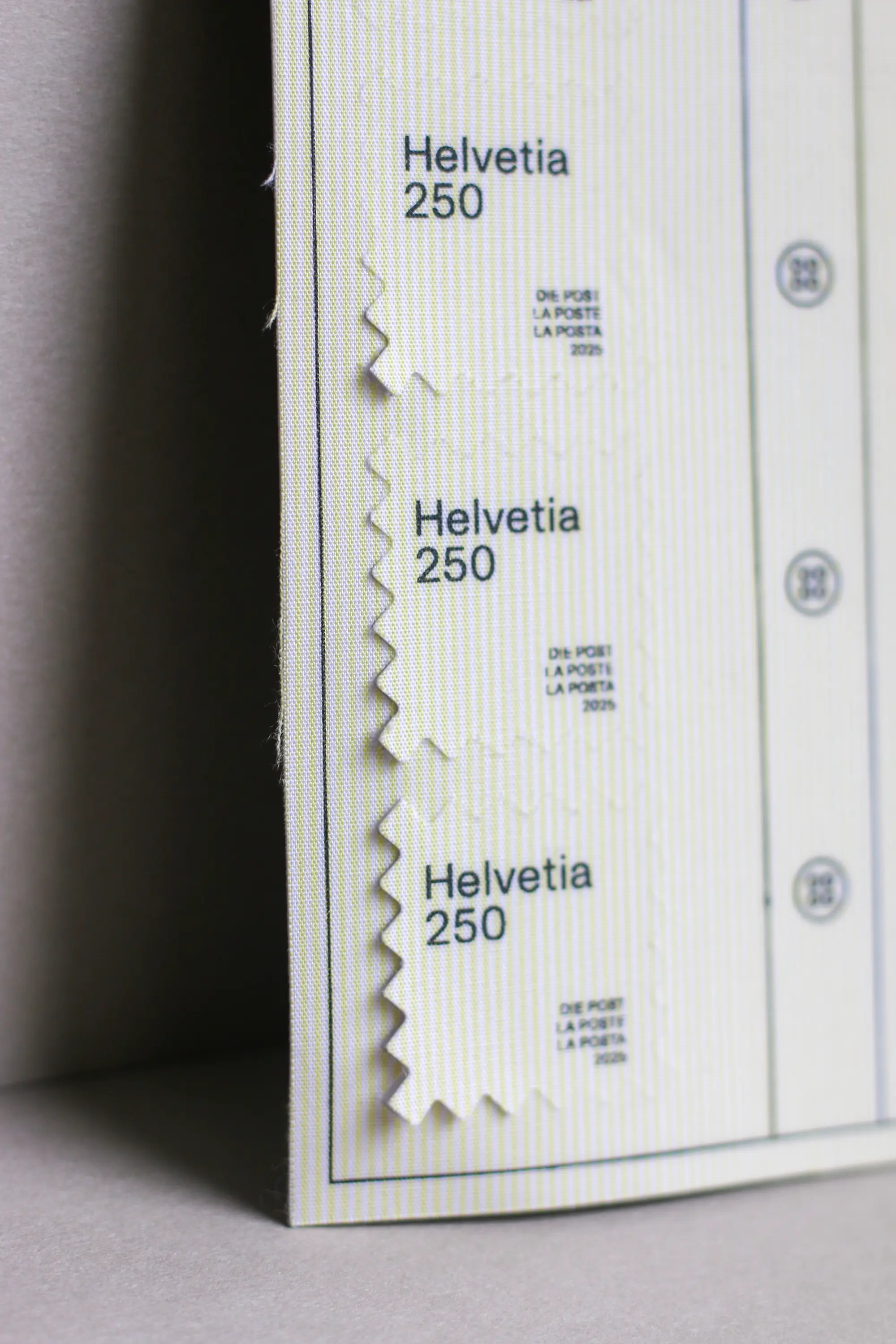
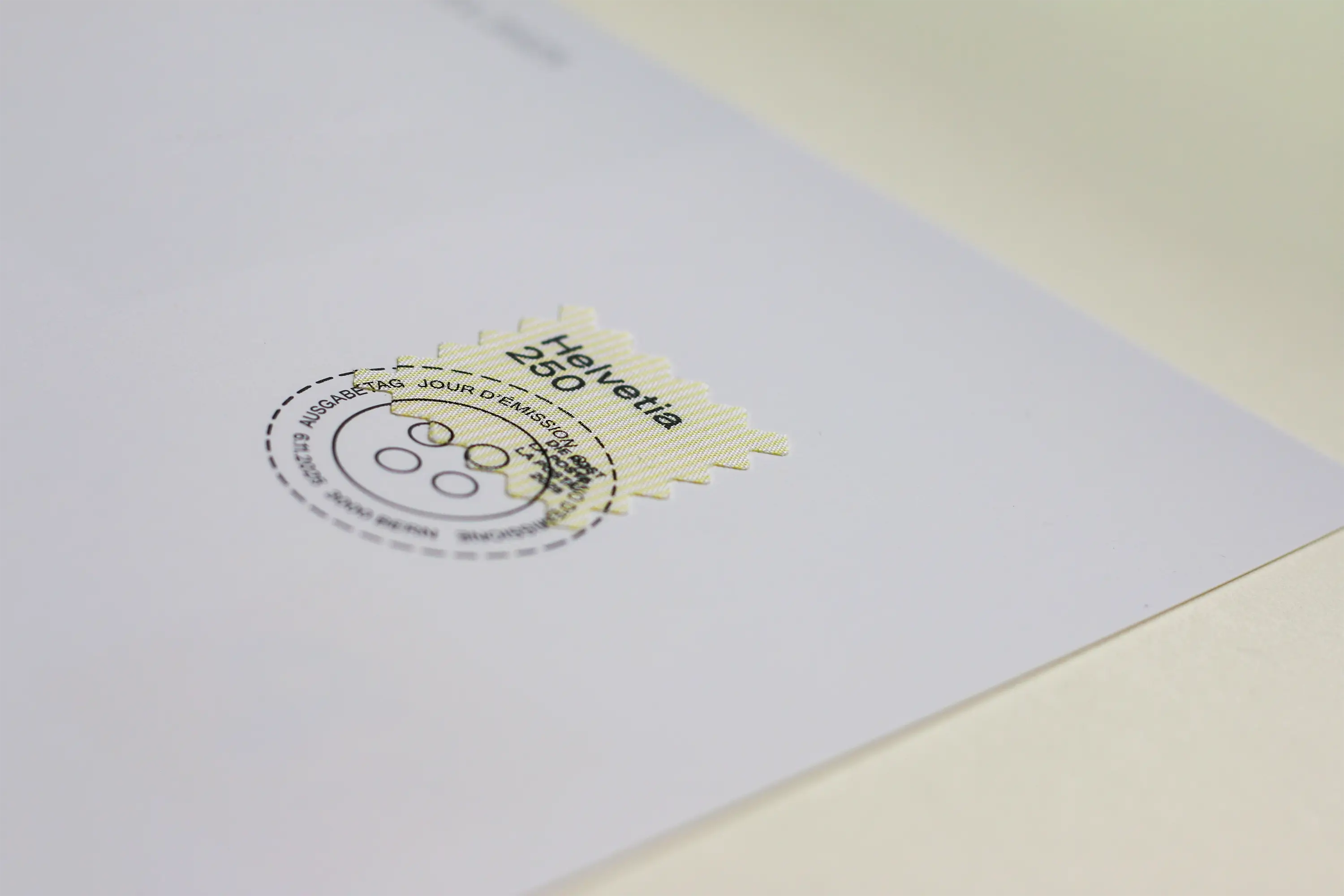
In close cooperation with the postal service team, I was given the opportunity to design the sheet layout, including the stamps, the first day postmark and the motif for the first day cover.
The shape of the stamp is also distinctive. As if cut out with fabric scissors, it visually extends the idea of upcycling. Sales start on November 6th. For anyone who’d like to secure a small piece of fabric and memory: available at Swiss Post.
Used Font: OTR Grotesk from MZ Type by Marc Zennhäusern

Taste meets craftsmanship
Pure unfolding
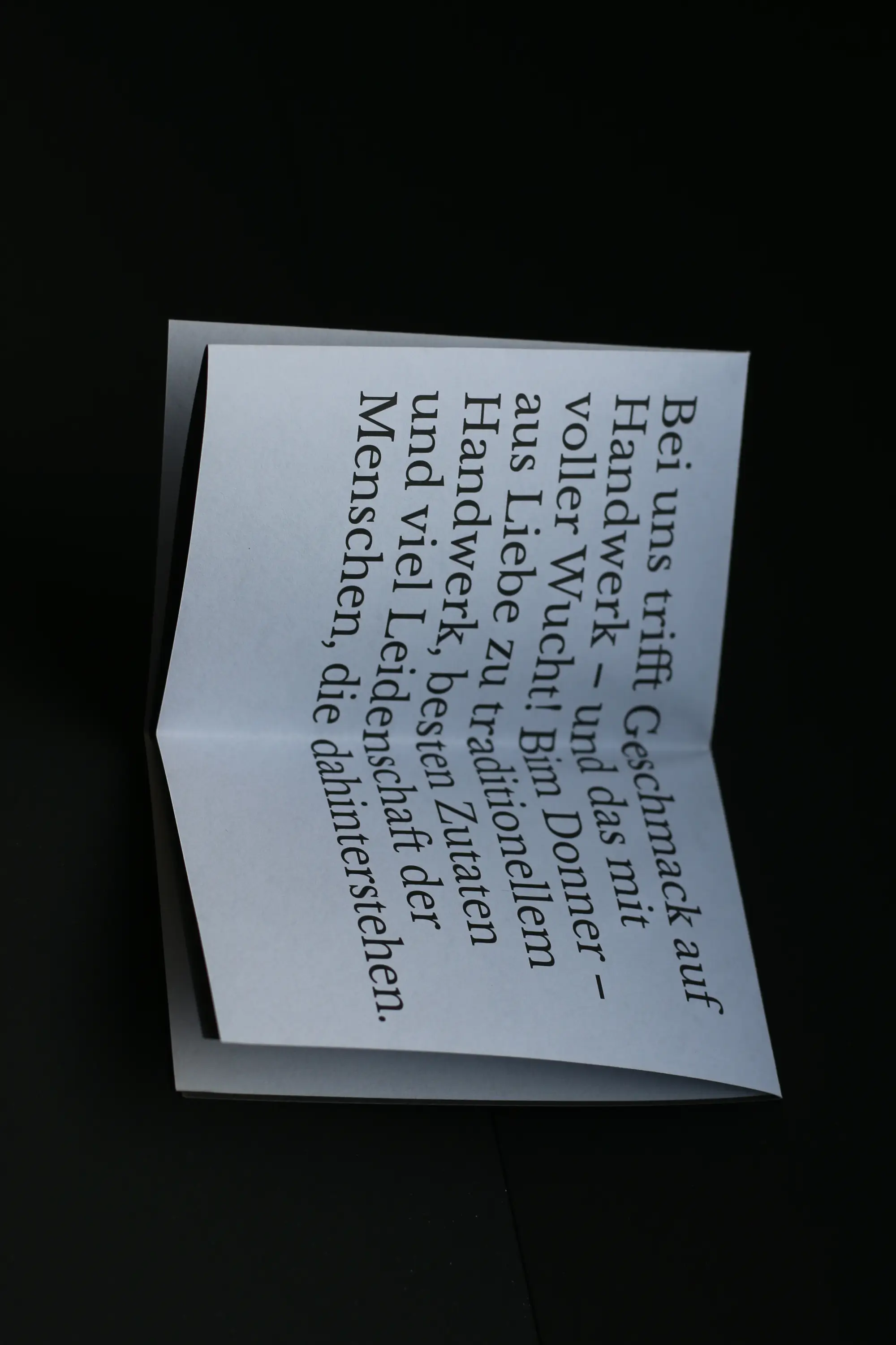
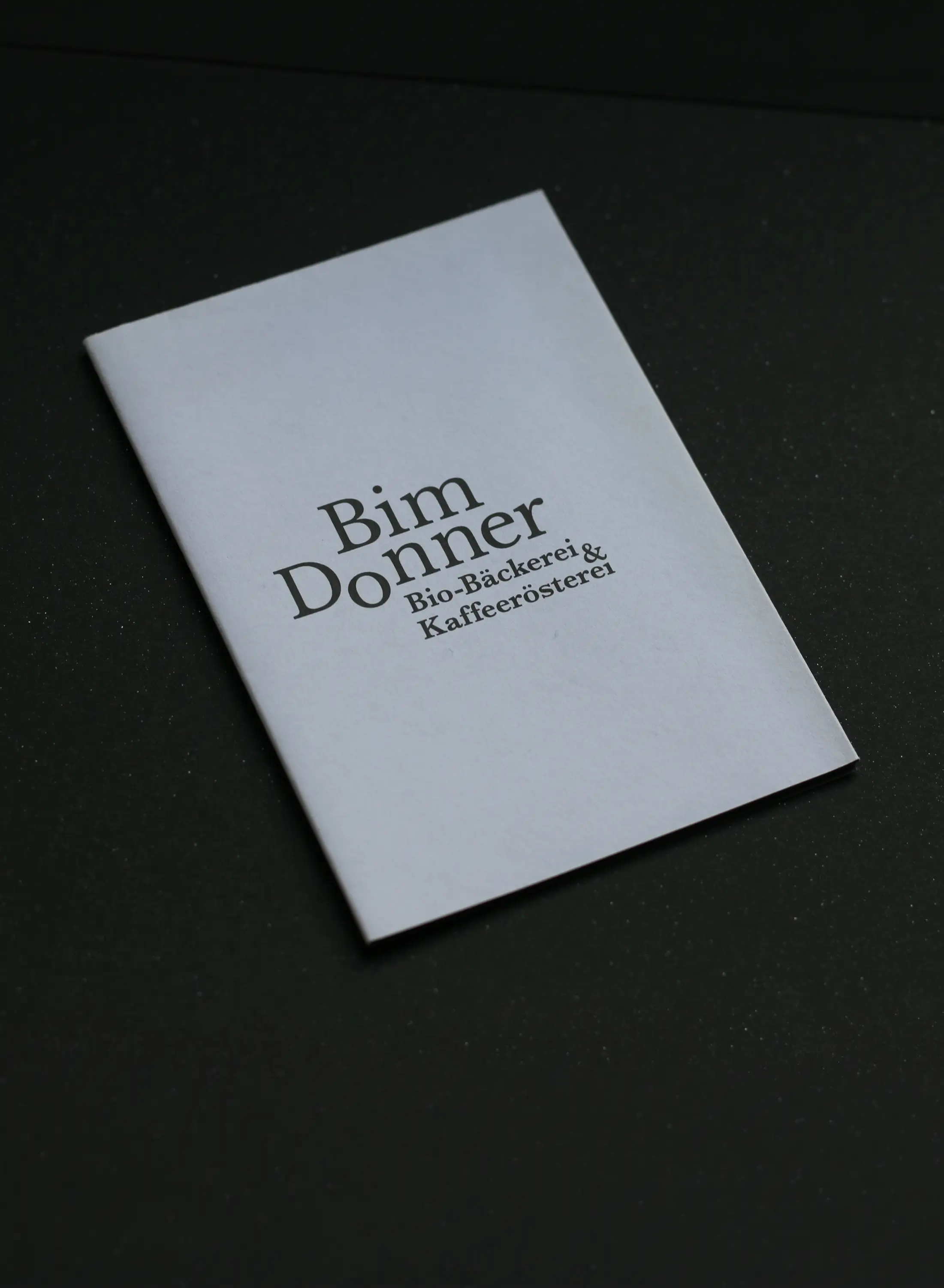
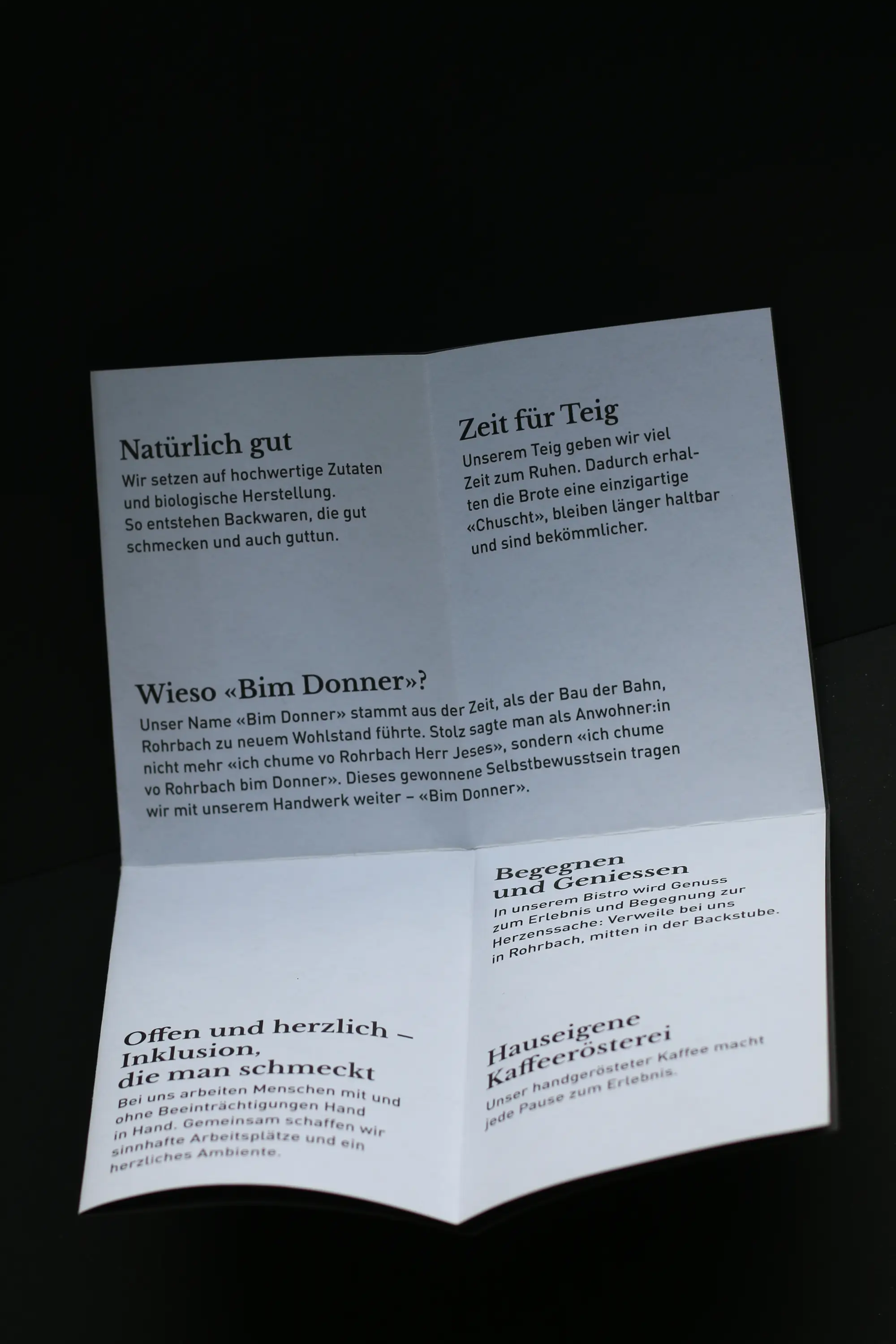
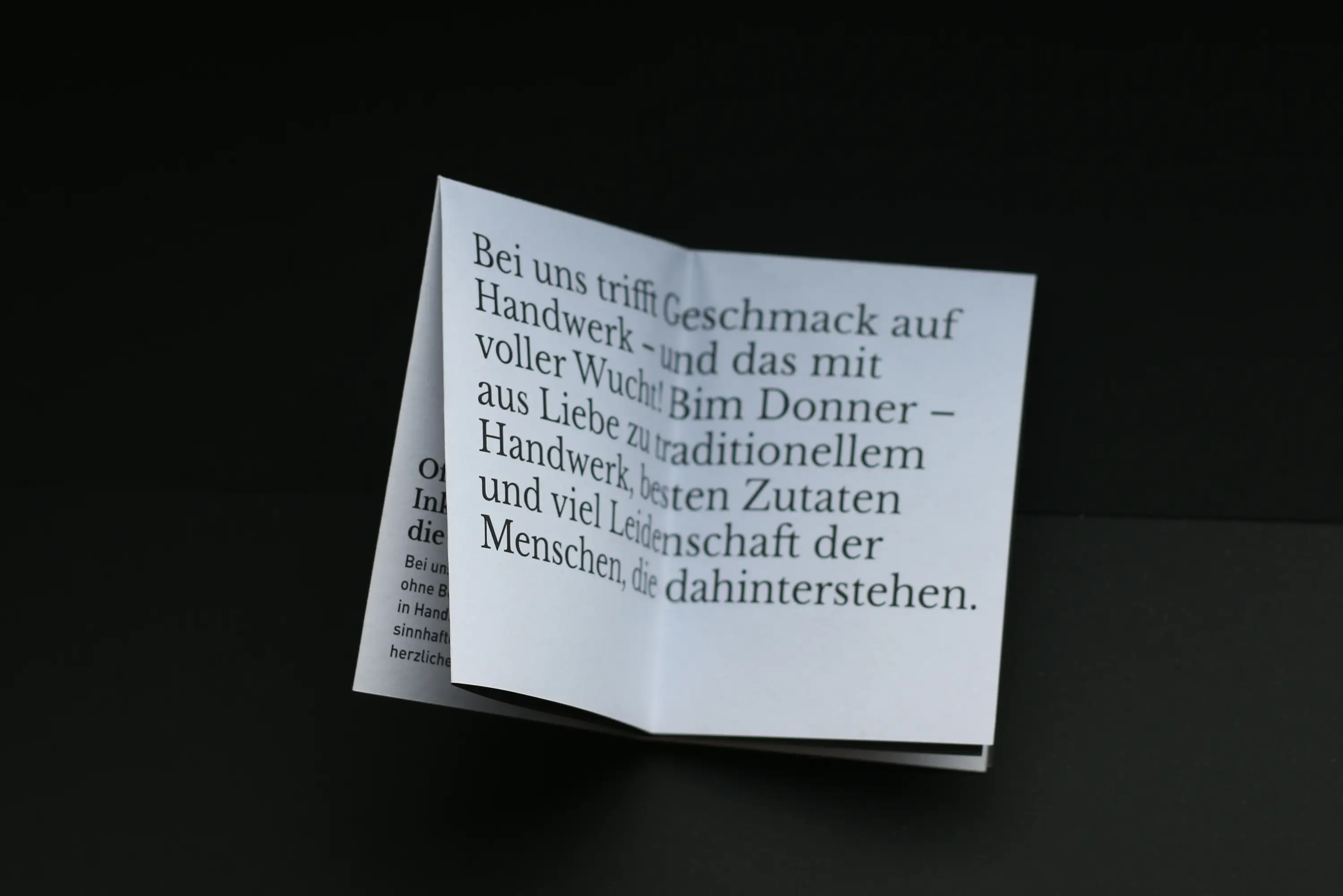
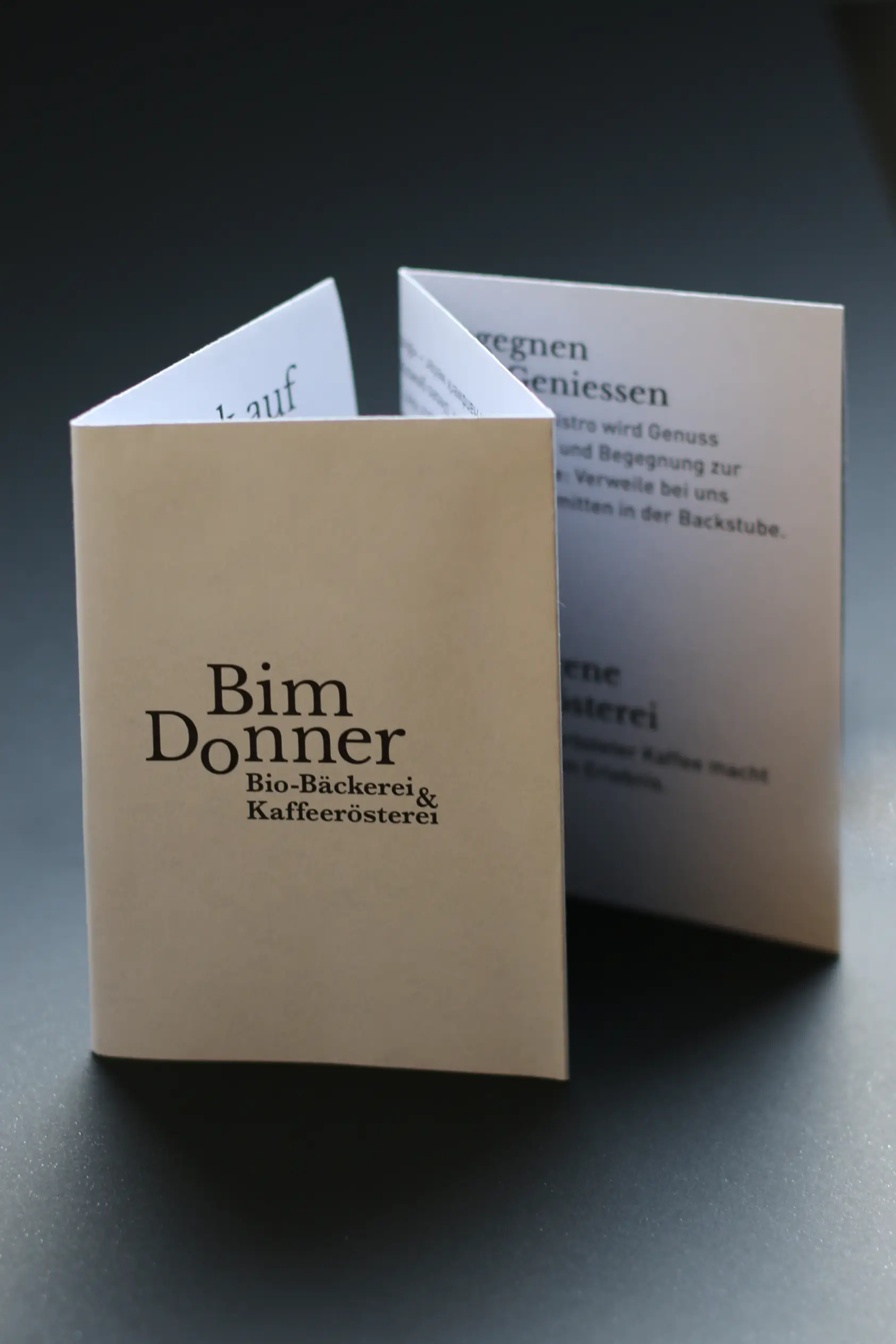
The organic bakery and coffee roastery Bim Donner impresses with fresh, crispy treats, aromatic coffee and a lot of passion. To give the charismatic bakery a tool that tells its story and values, I created a flyer together with the team at the WBM Foundation.
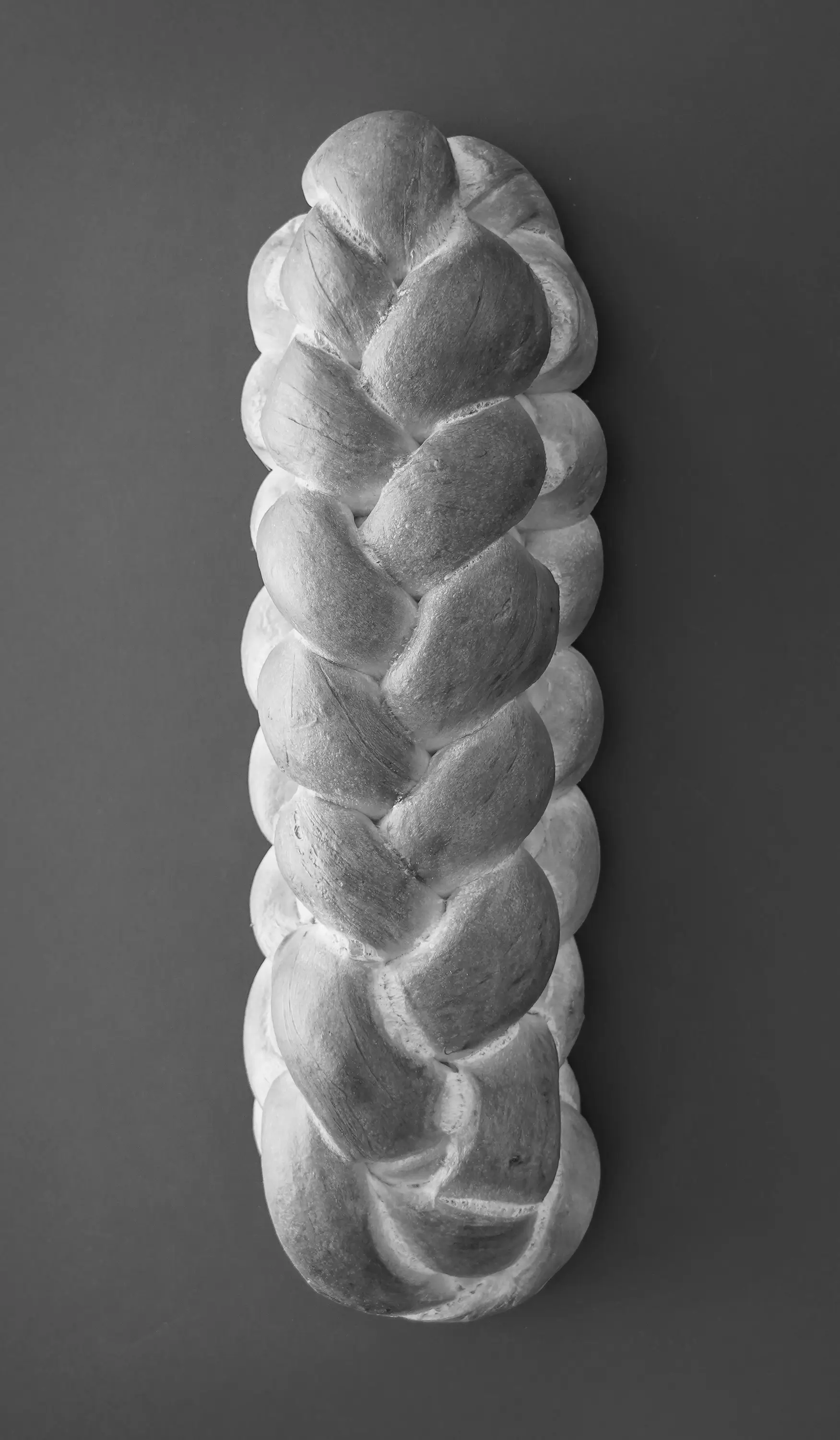
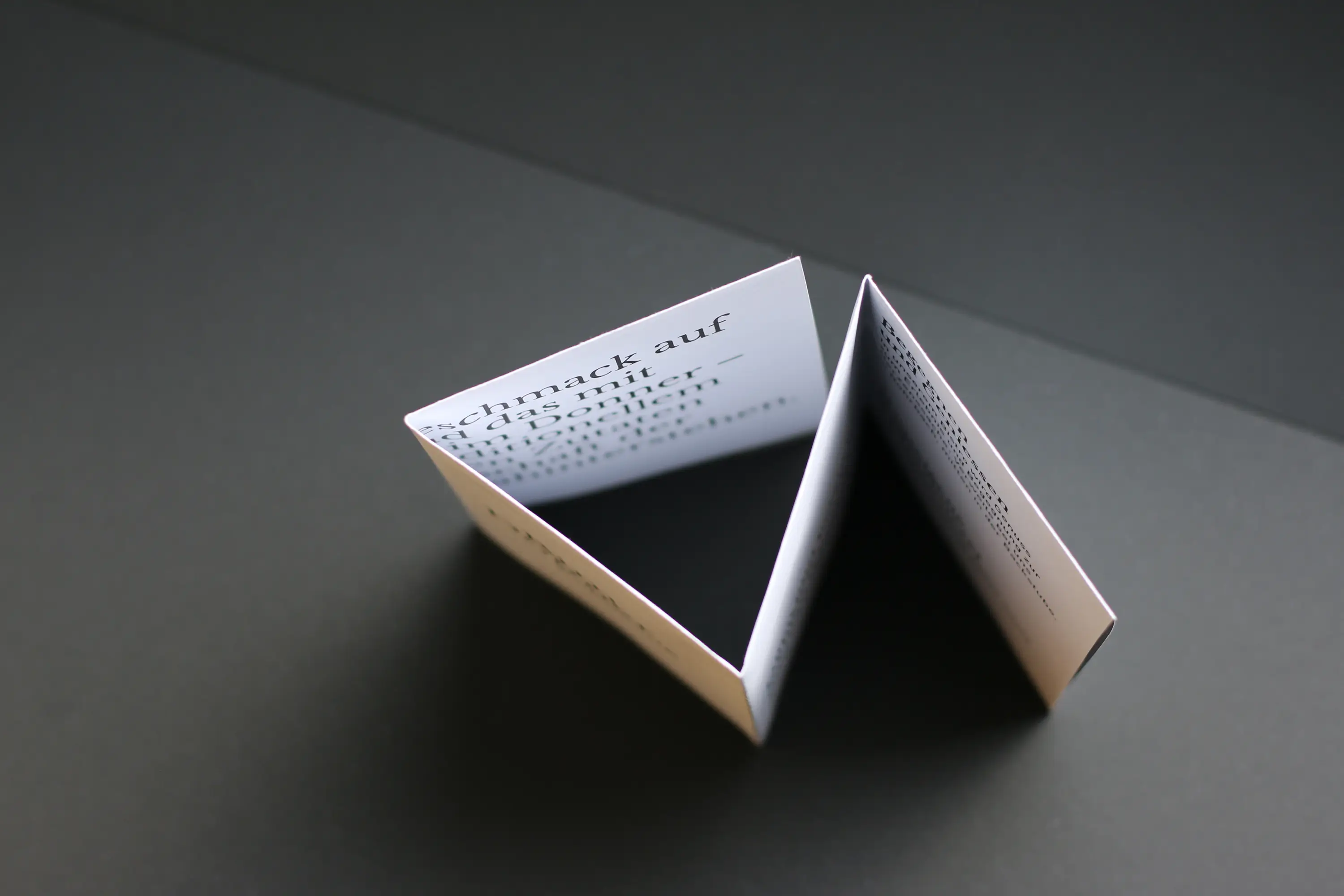
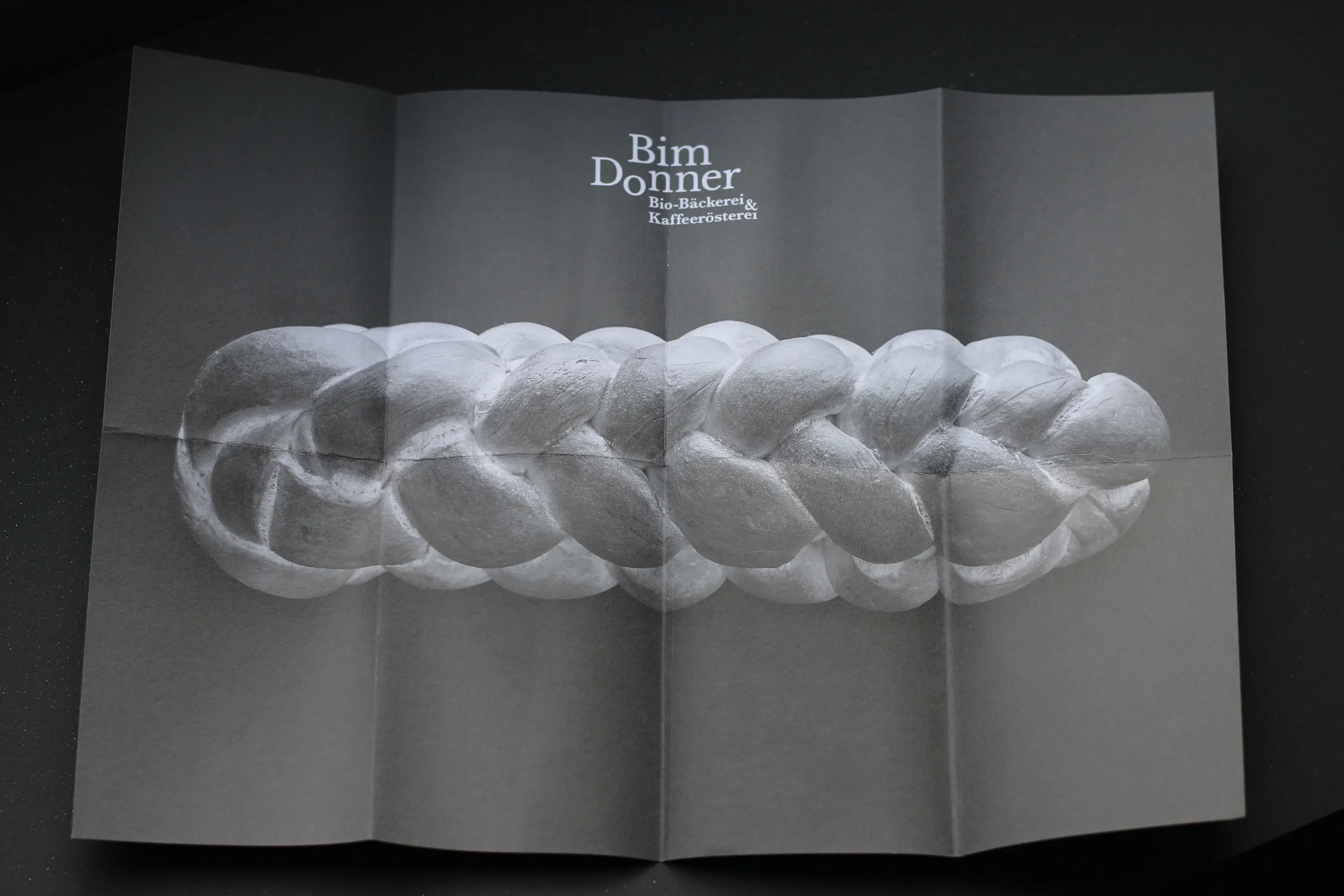
From small to large with a tactile touch. Just like good dough, the flyer unfolds and, page by page, provides new insights into the work and convictions of Bim Donner. When fully opened, one of the beautiful braided creations adorns the sheet in such a way that it can also serve as an inviting little poster. The unfolding also plays on the exciting concept behind Bim Donner: as a project of the WBM Foundation in Madiswil, the Rohrbach facility not only provides a tempting aroma, but also promotes the integration of people with and without disabilities into the workforce.
Print: Merkur Druck, Langenthal
100% wastepaper: Genesis from Fischer Papier

Typographic Refinement
Nikkol Rot’s Dynamic Visual Stories
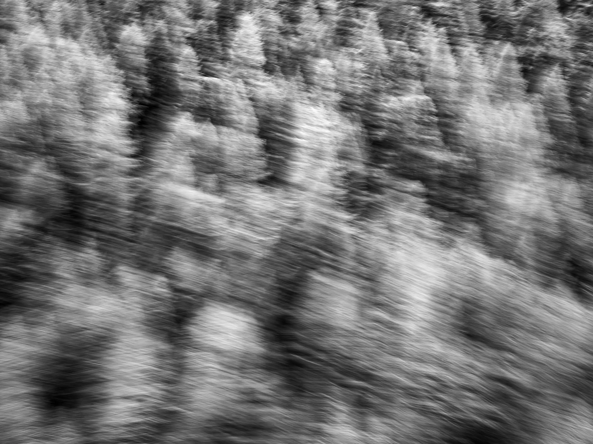
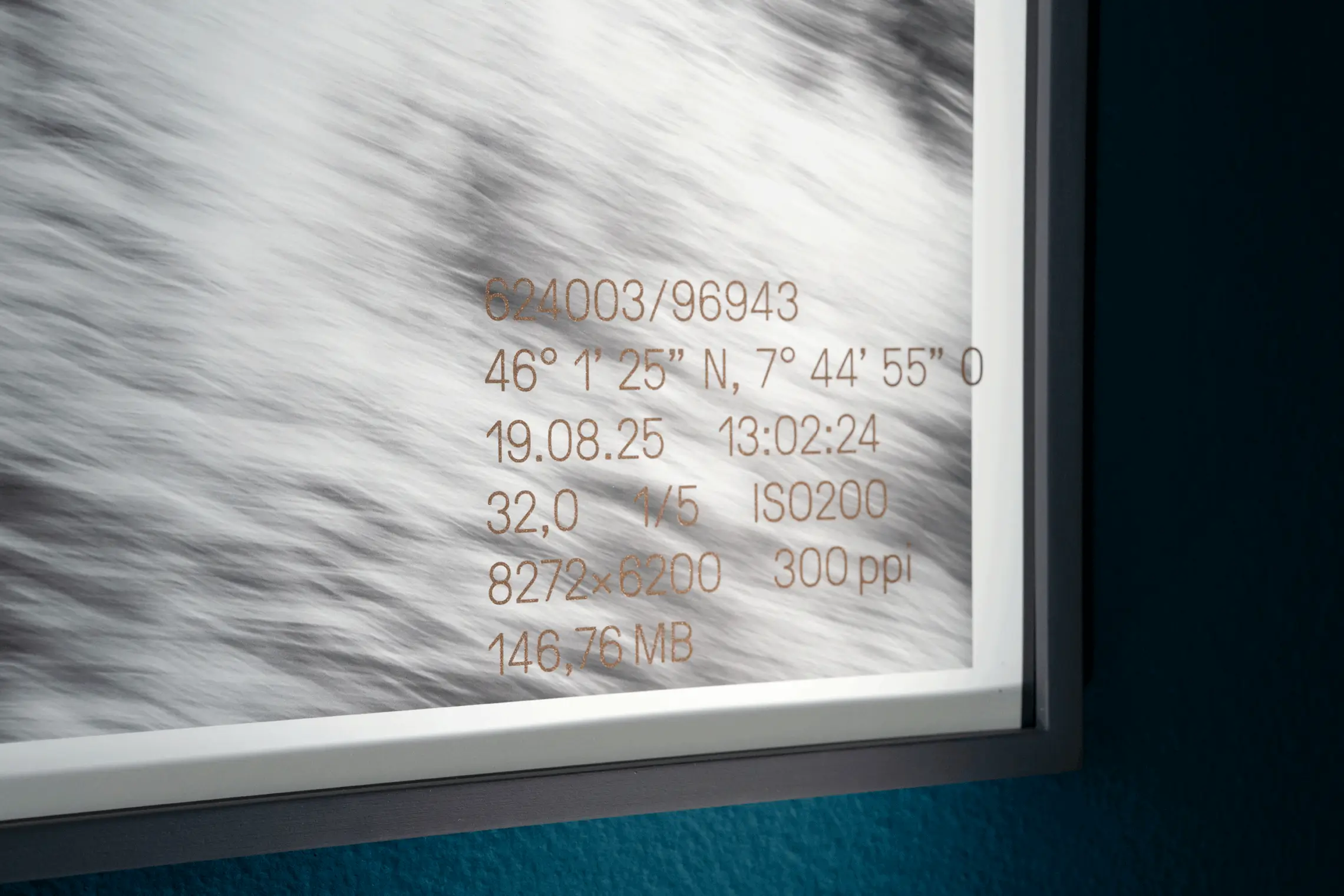
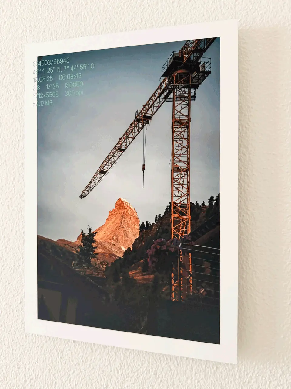
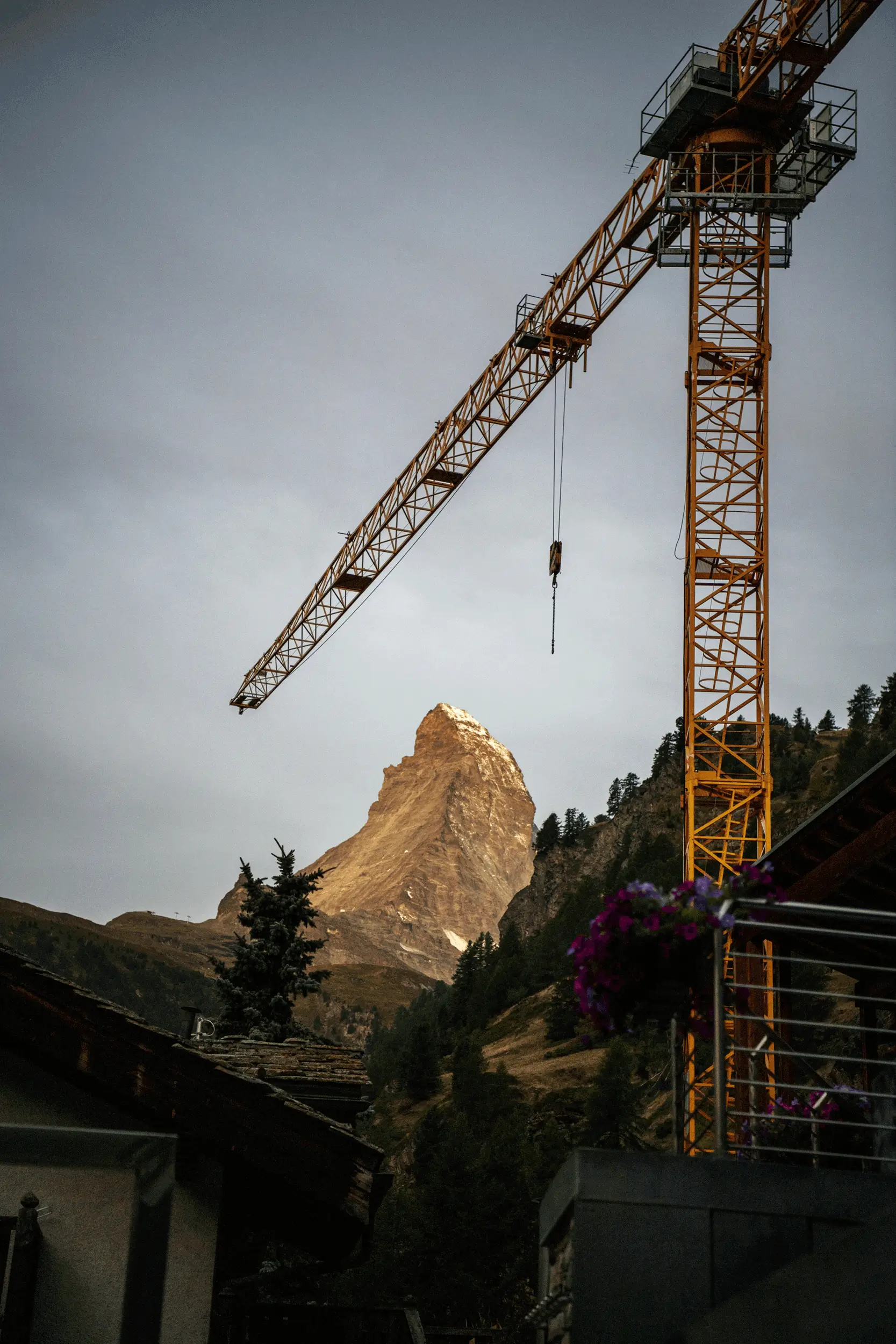
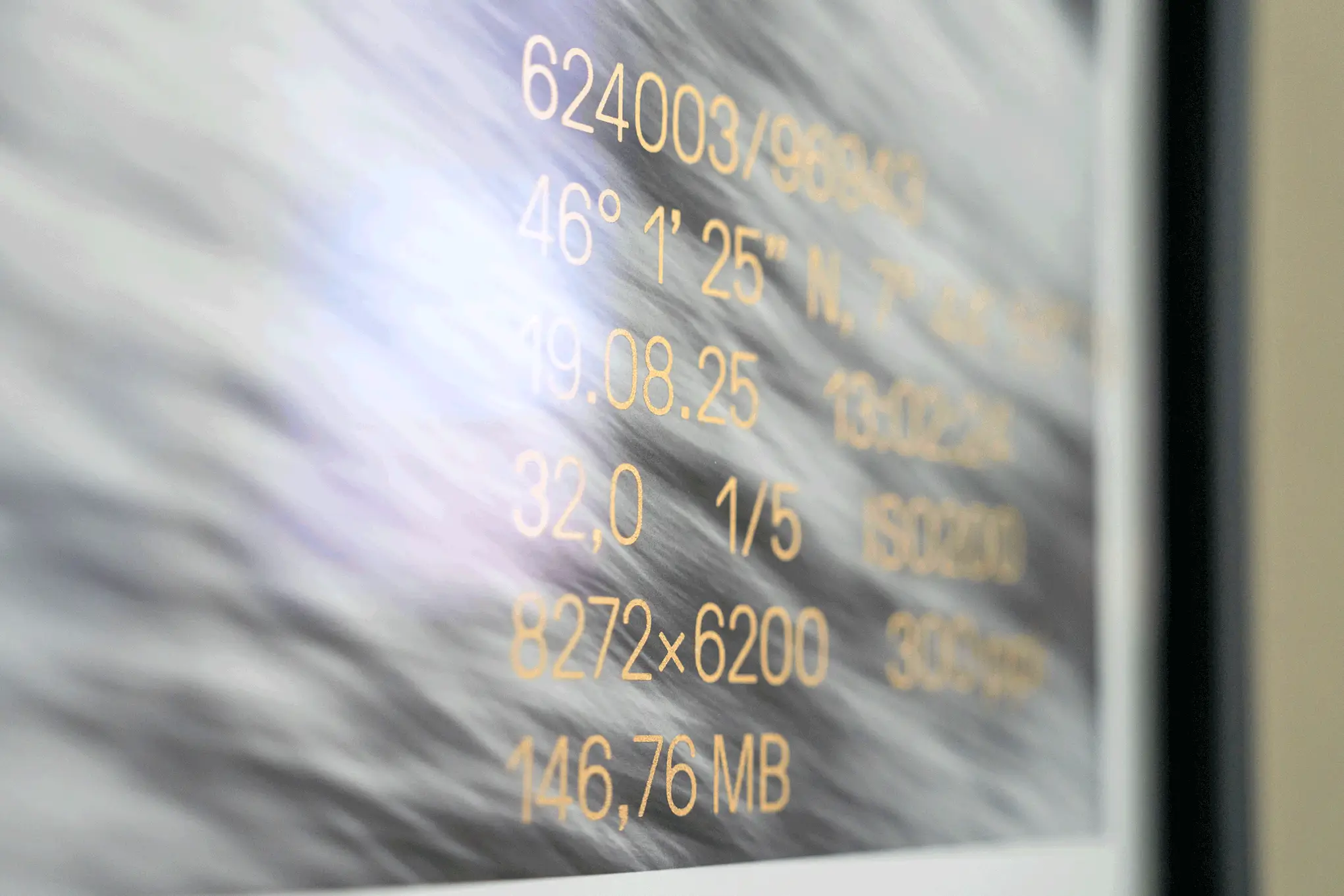
What began as a commissioned project by Nikkol for the eti Treuhand agency soon unfolded on entirely new creative levels. Capturing magnificent moments transformed into an imprint of time, which has now also been made visible through custom typography. My goal was to reveal the world of numbers hidden behind the photography for the trust agency.
To achieve this, the primary digital coordinates were extracted from the imaging software and now subtly adorn the vivid visual language of Nikkol’s «Zermatt» series. Thanks to the astonishing screen printing and pigment magic of Lorenz Bögli, these typographic details shimmer, change color depending on the viewing angle, or fade discreetly into the background—ready to surprise the viewer at just the right moment.
This creative collaboration not only enriched our work but also allowed us to build many valuable new connections. It is a graphic design project where, step by step, the data behind the image unfolded. It continues to bring joy every day; in fact, the stunning forest photograph now beautifully graces the wall of my own living room.
A heartfelt thank you to Nikkol for your trust and for growing, testing, and experimenting together.
Photography: Nikkol Rot, Zürich/Bern
Fine Art Printing: tricolor Bild Produktion, Adliswil
Screen Printing & Silk Screen: Lorenz Bögli, Müntschemier
Framing: Kunstreich, Bern
Webdesign
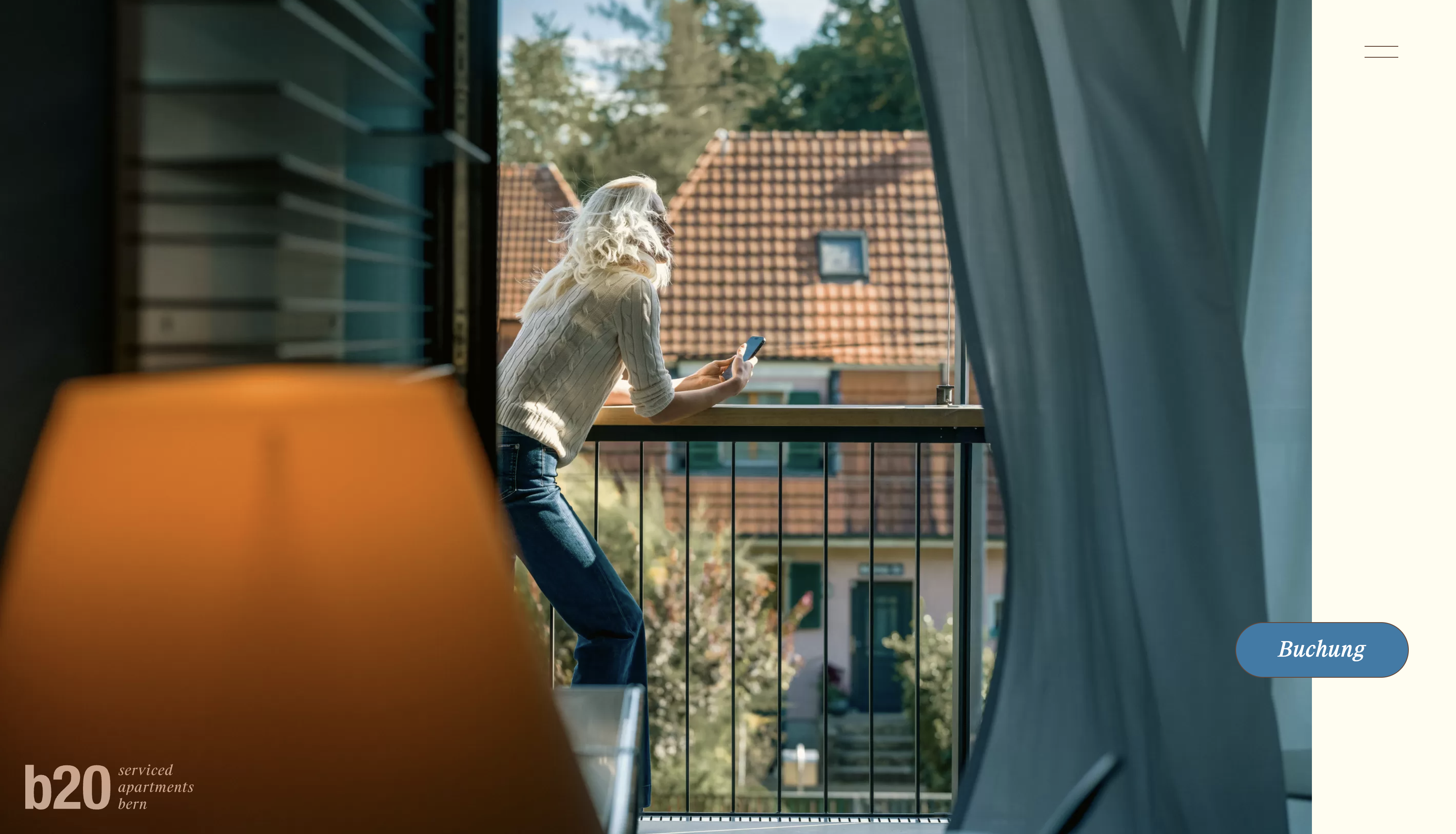
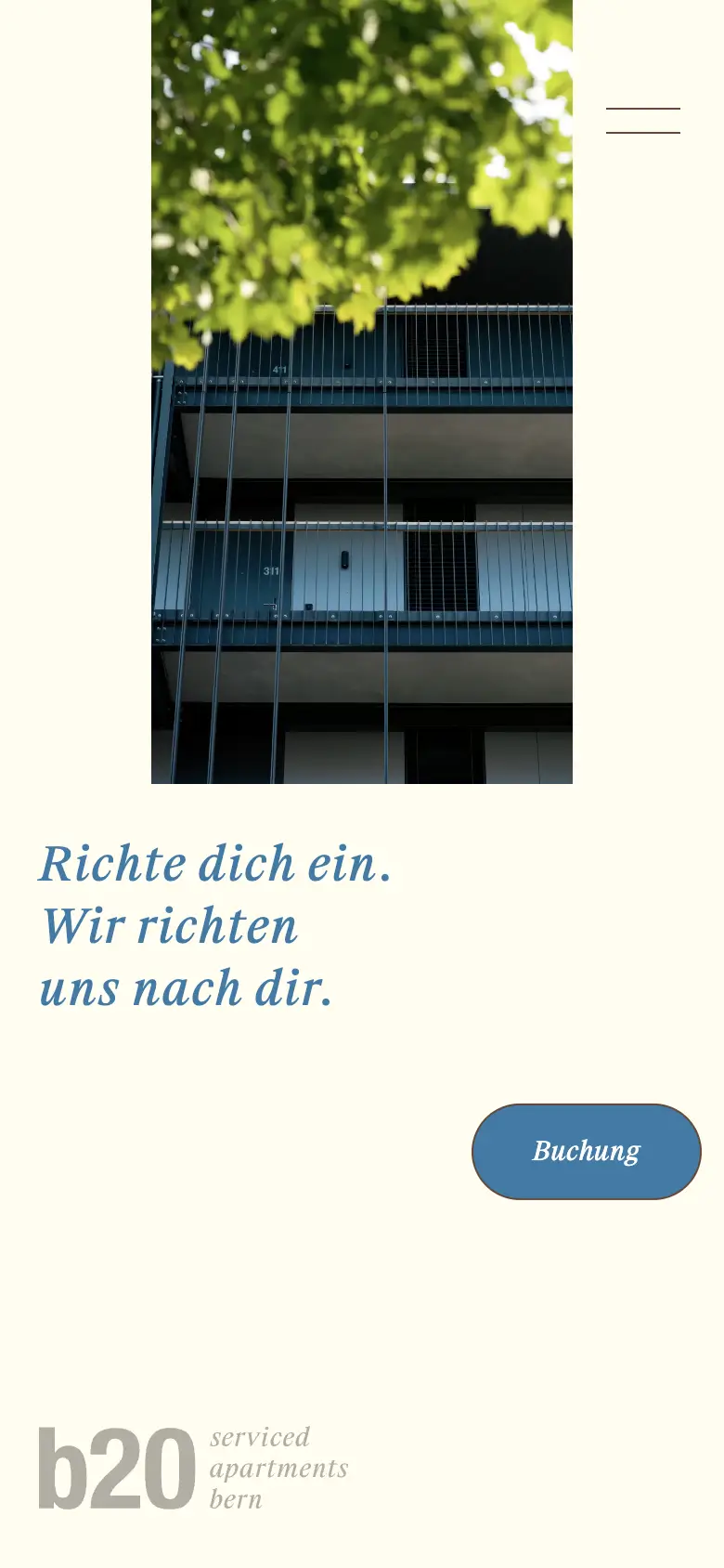
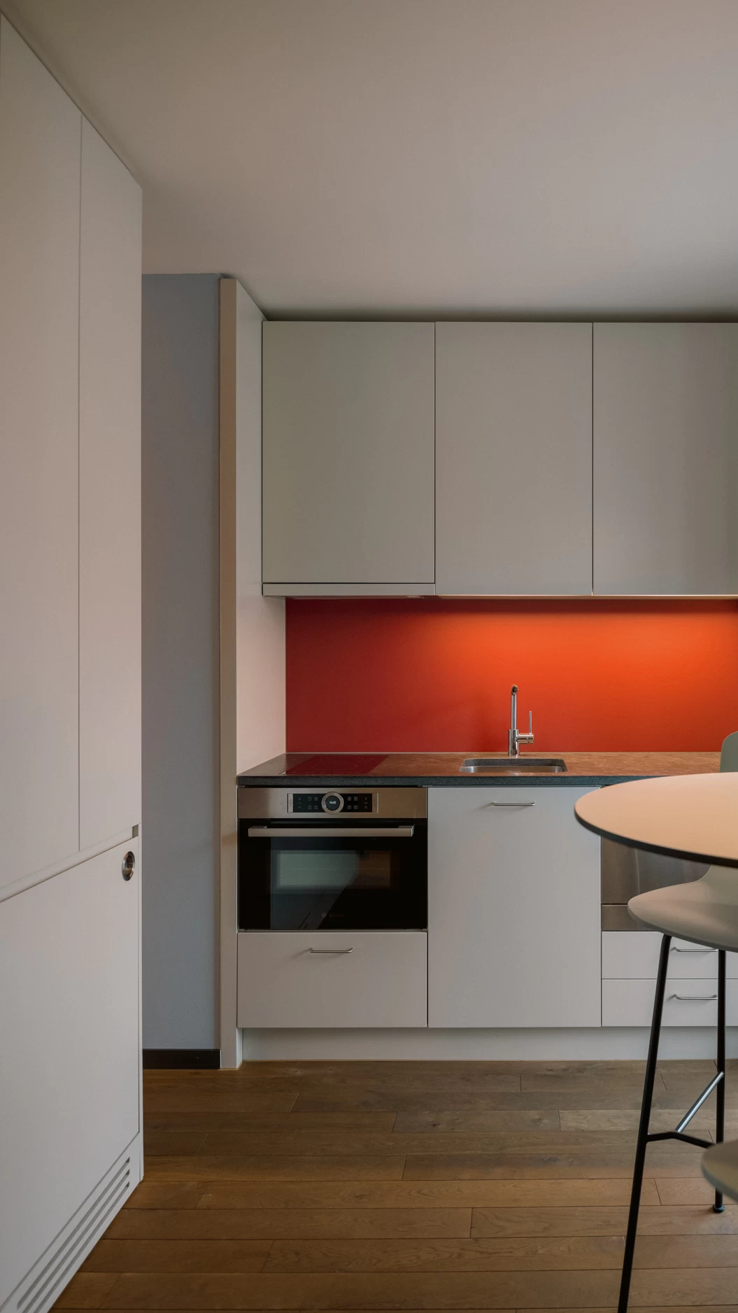
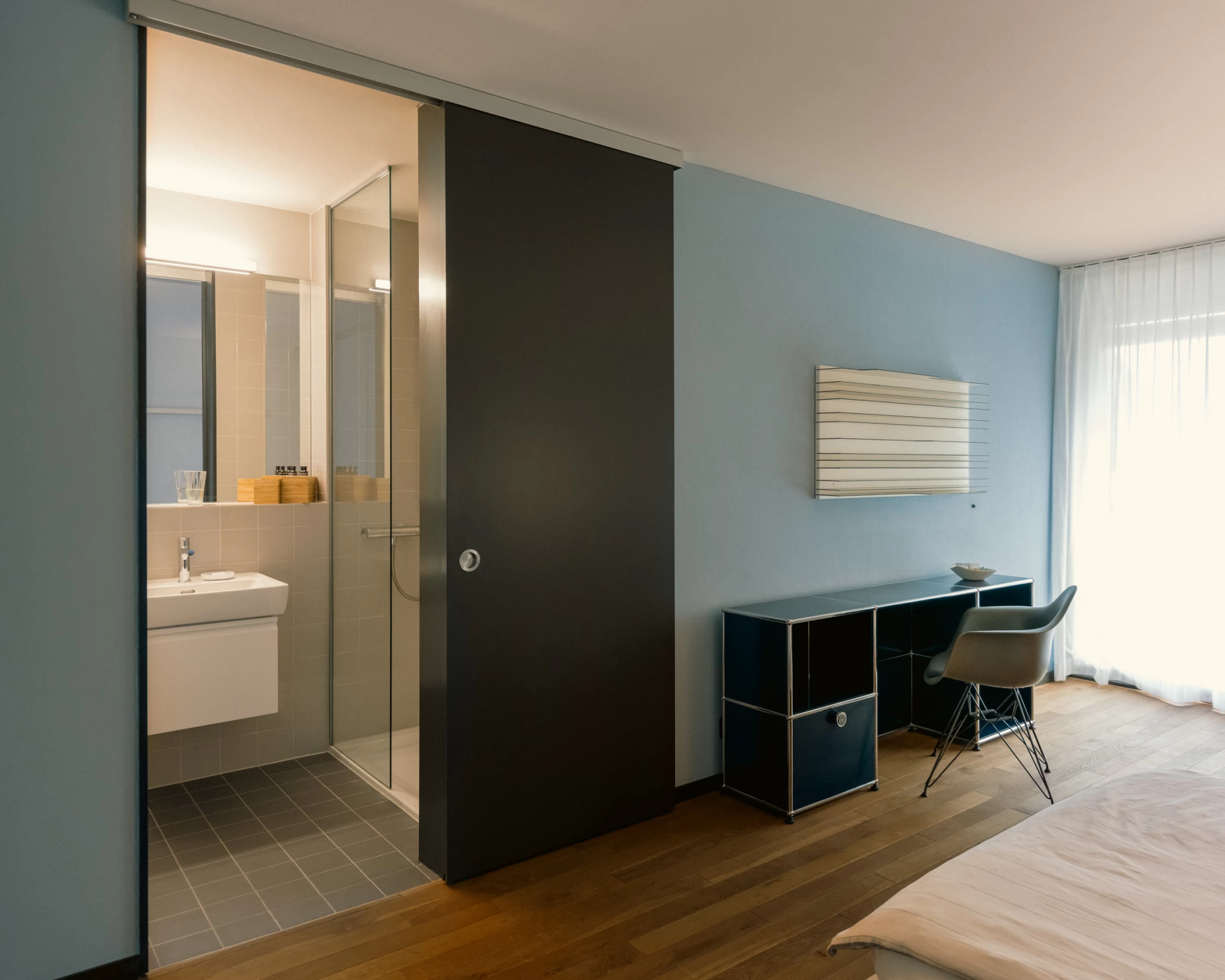
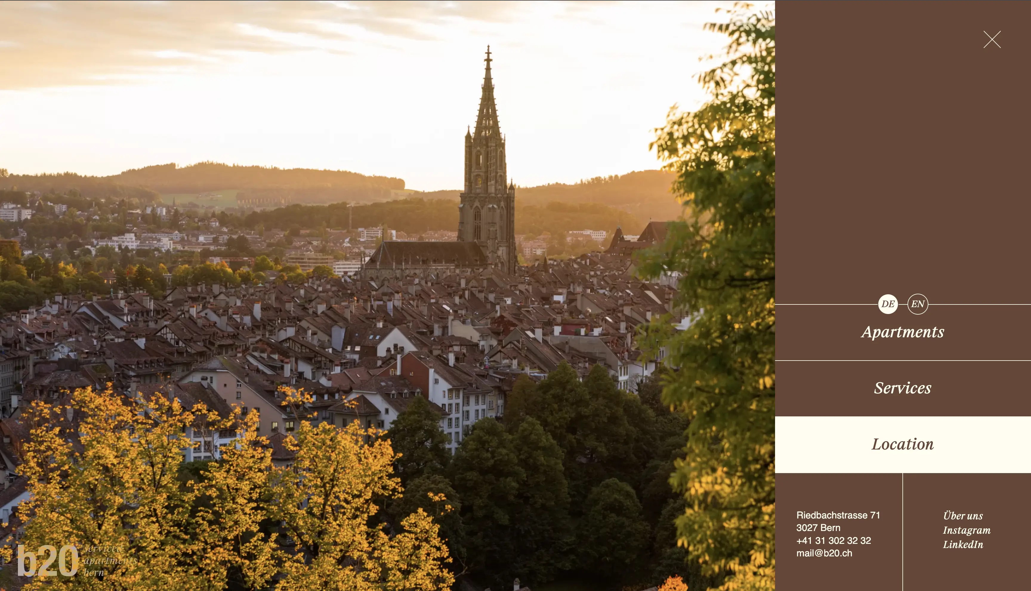
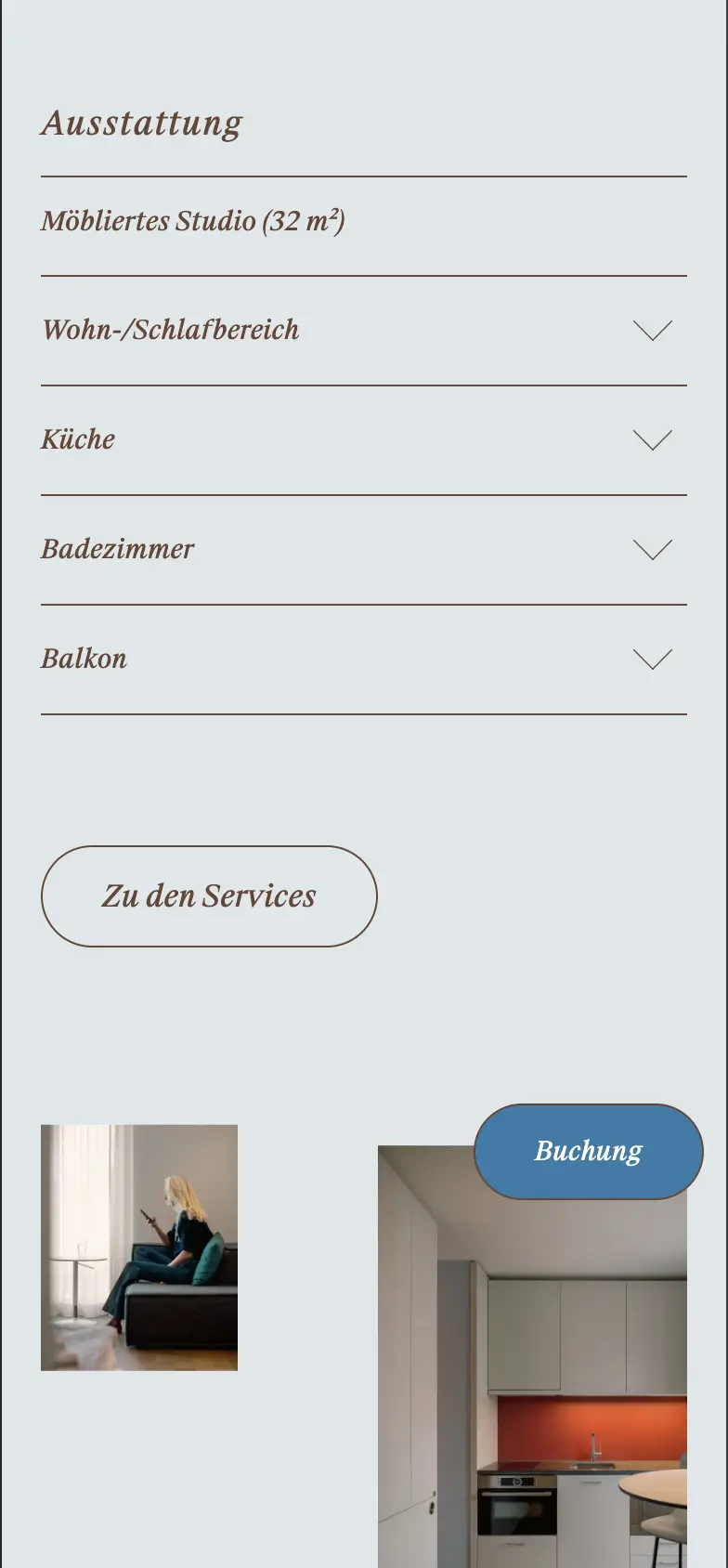
b20: A place of warmth in your home away from home.
These serviced apartments near Westside Bern invite you to feel good, linger, and explore. Their new claim fits like a glove: feel at home.
As part of the carpet collaboration team, specifically assembled for this project, I had the pleasure of creating the web design for these sleek designer apartments.
Rob Lewis captured the wonderfully atmospheric imagery, in your face crafted the individual and personable copy, and unlocked brought the smooth design to life through programming across all formats.
A heartfelt thank you to the charming b20 team for their trust, and to everyone at carpet for the smooth collaboration.
More about: carpet.works
Concept & Photography: Rob Lewis
Text: inyourface
Development: unlocked
Project support: Iris Flückiger
Fonts in use:
Suisse Works from Swiss Typefaces
Helvetica Neue
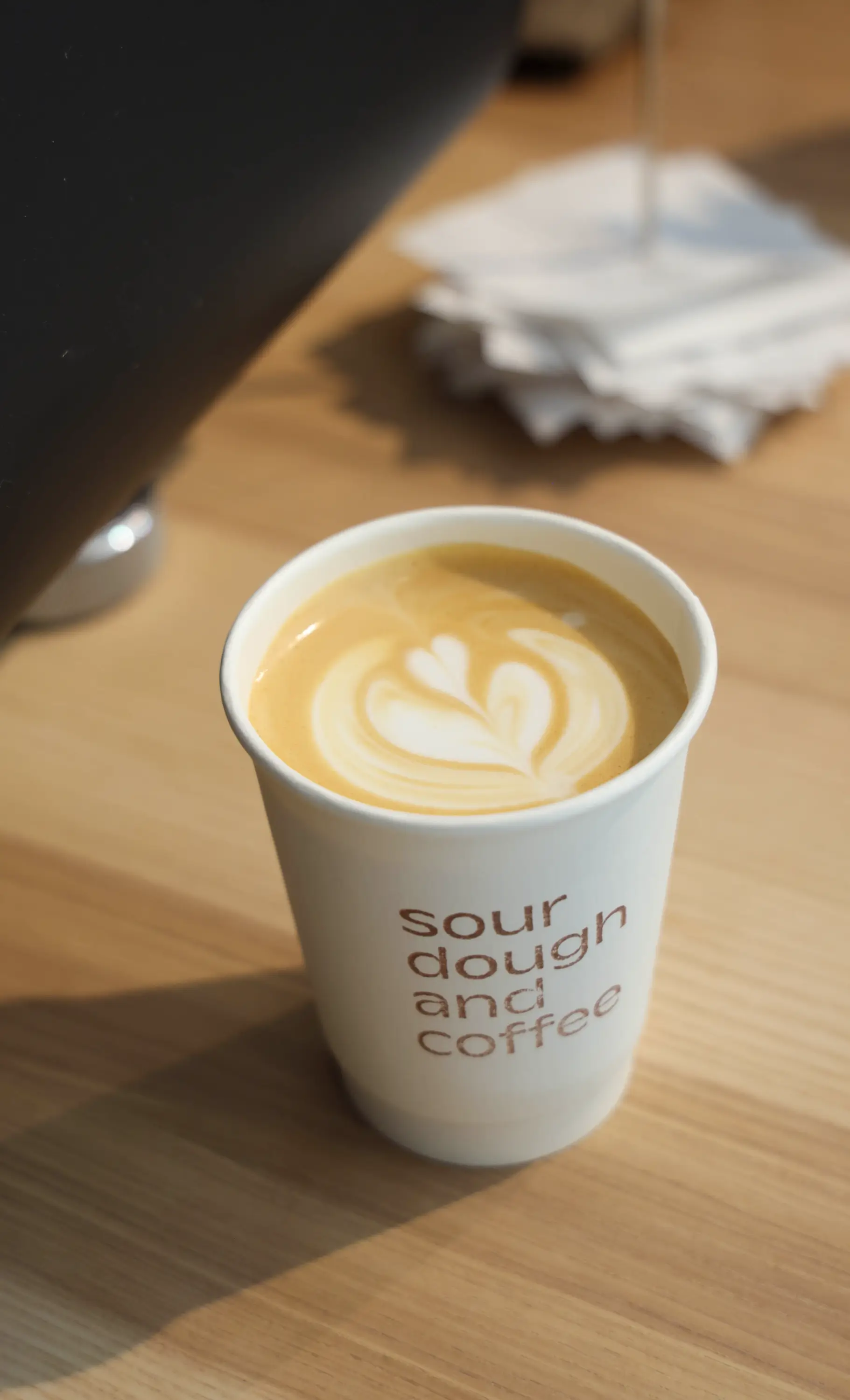
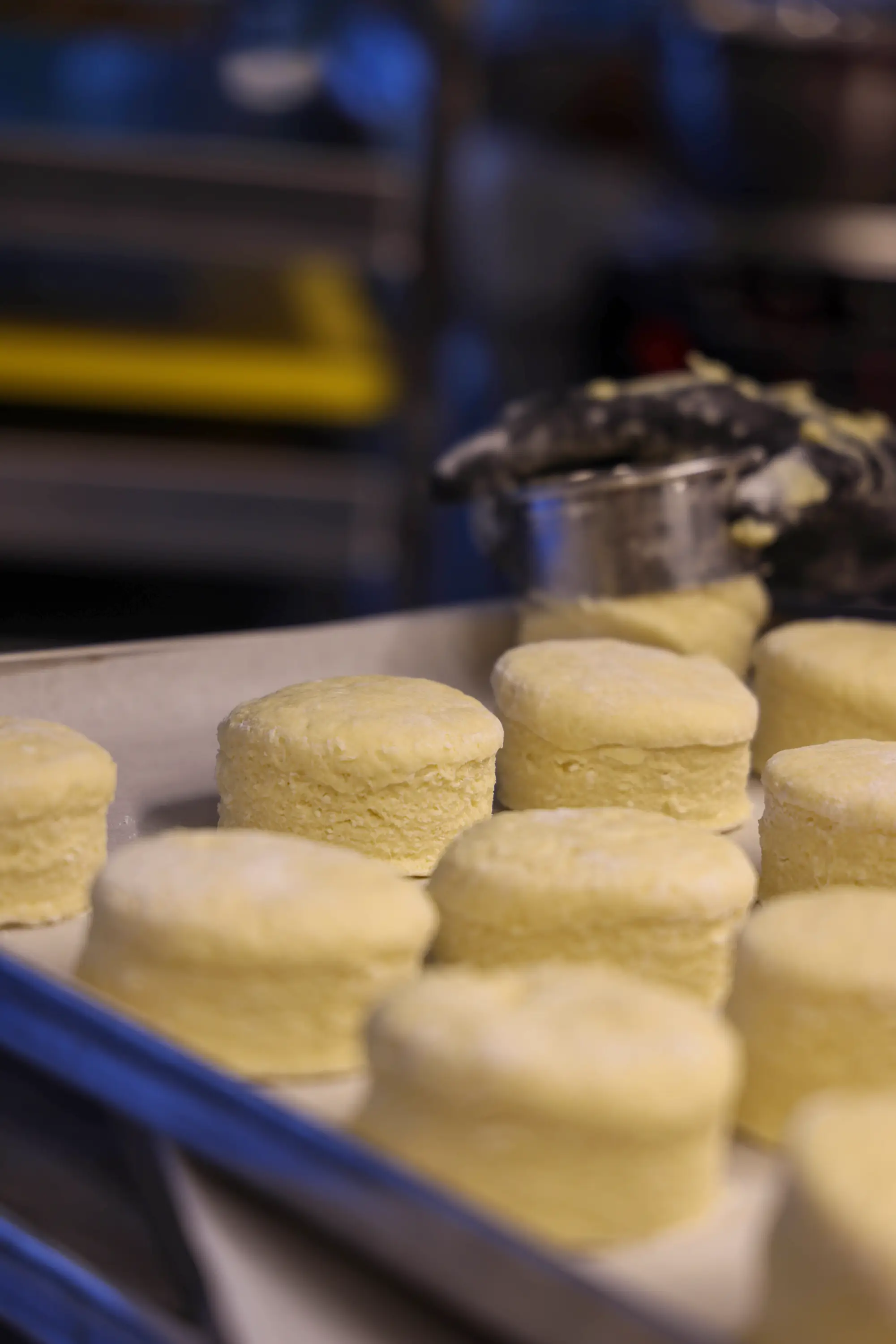
Sourdough and coffee enjoyment
le bread: creativity and dedication
When you get to be part of an inspiring transformation – and experience so much fun, passion and trust in the process – then tackling new projects, recreating, collaborating and decorating windows is twice as much fun!
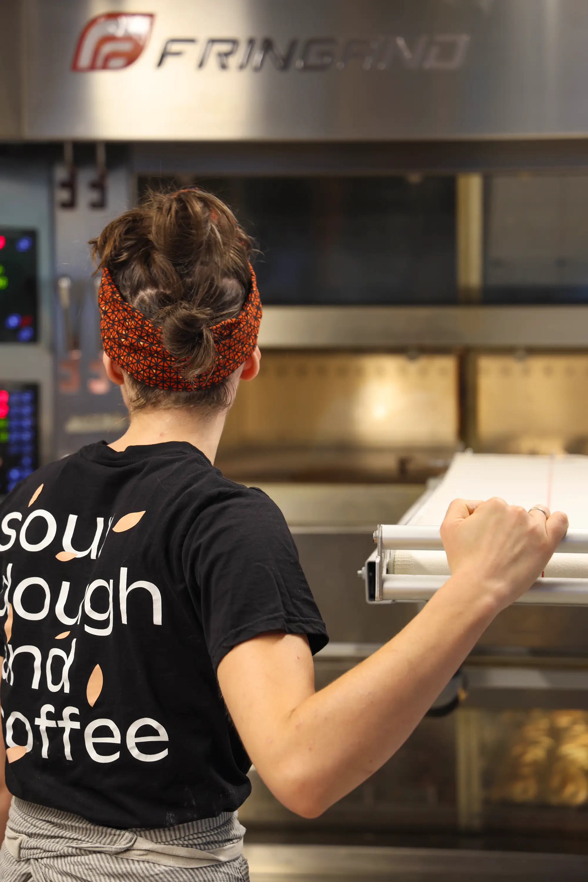
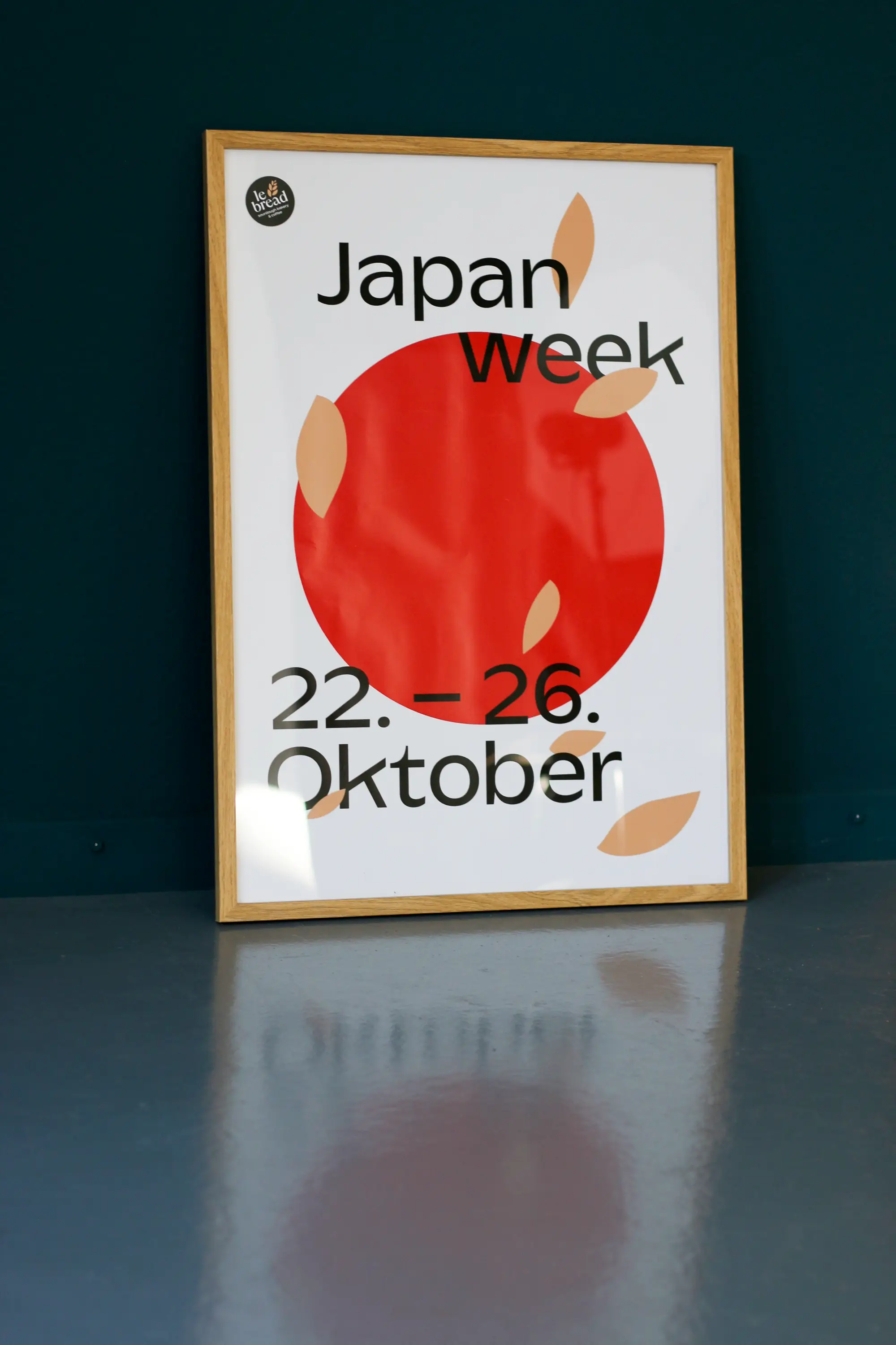
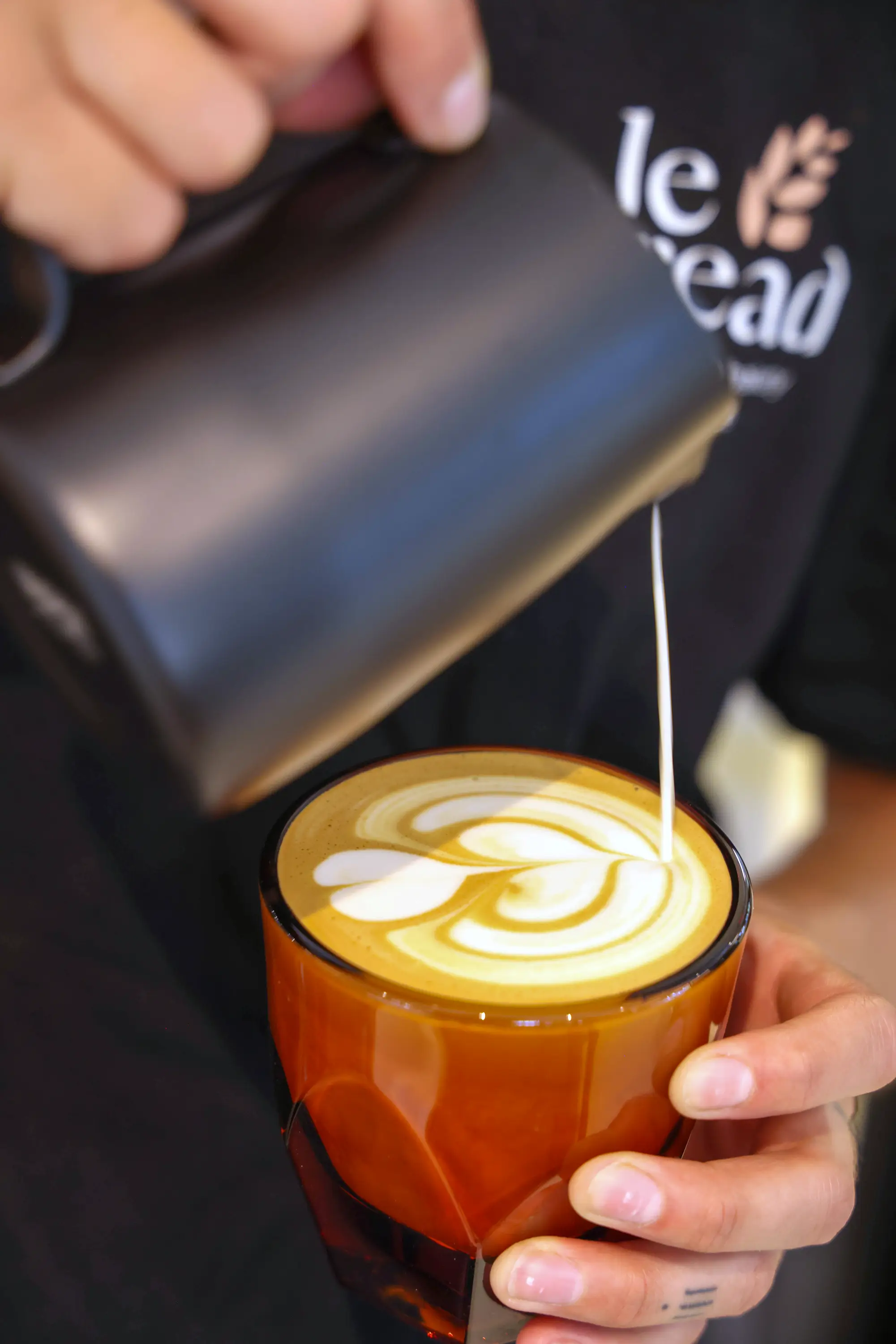
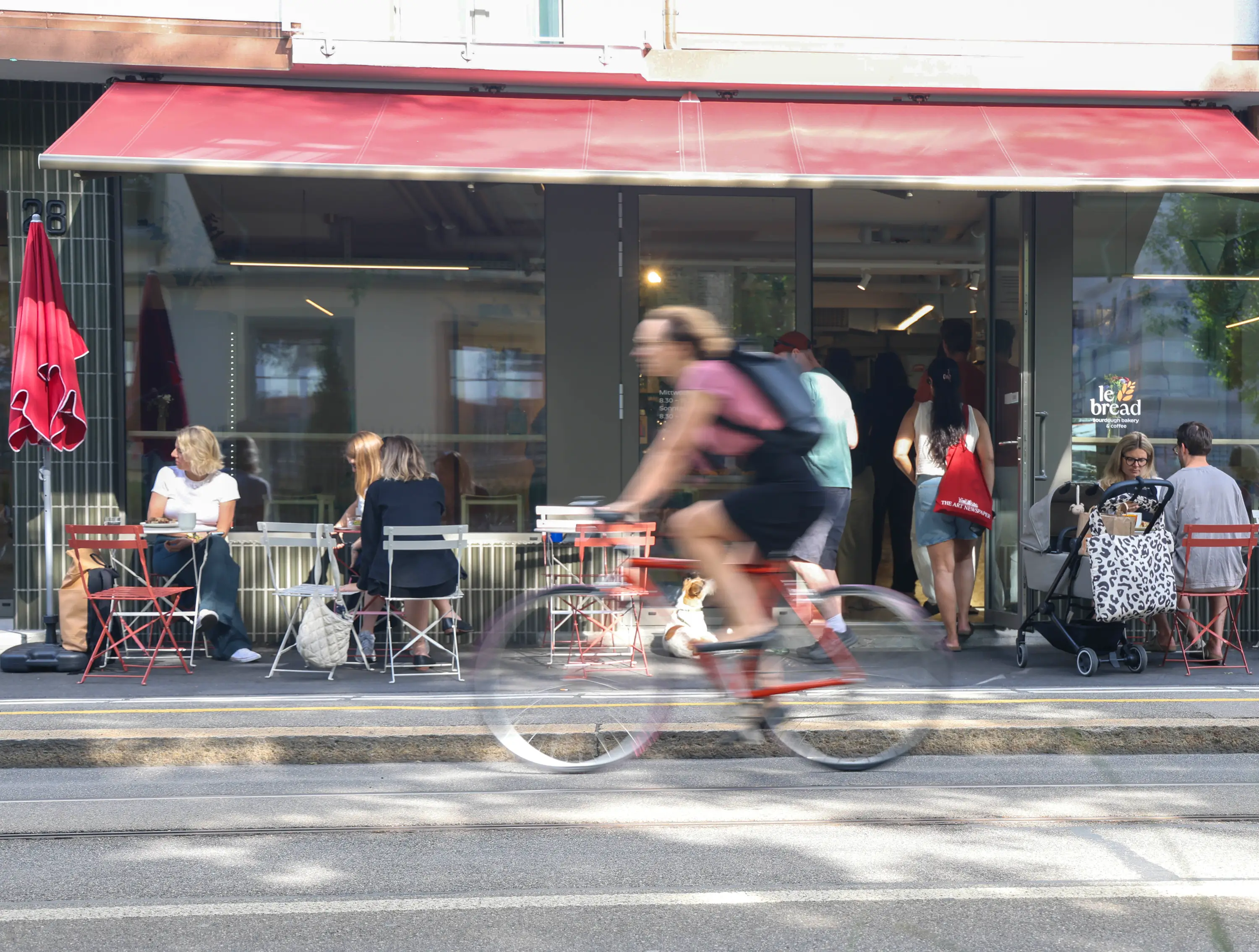
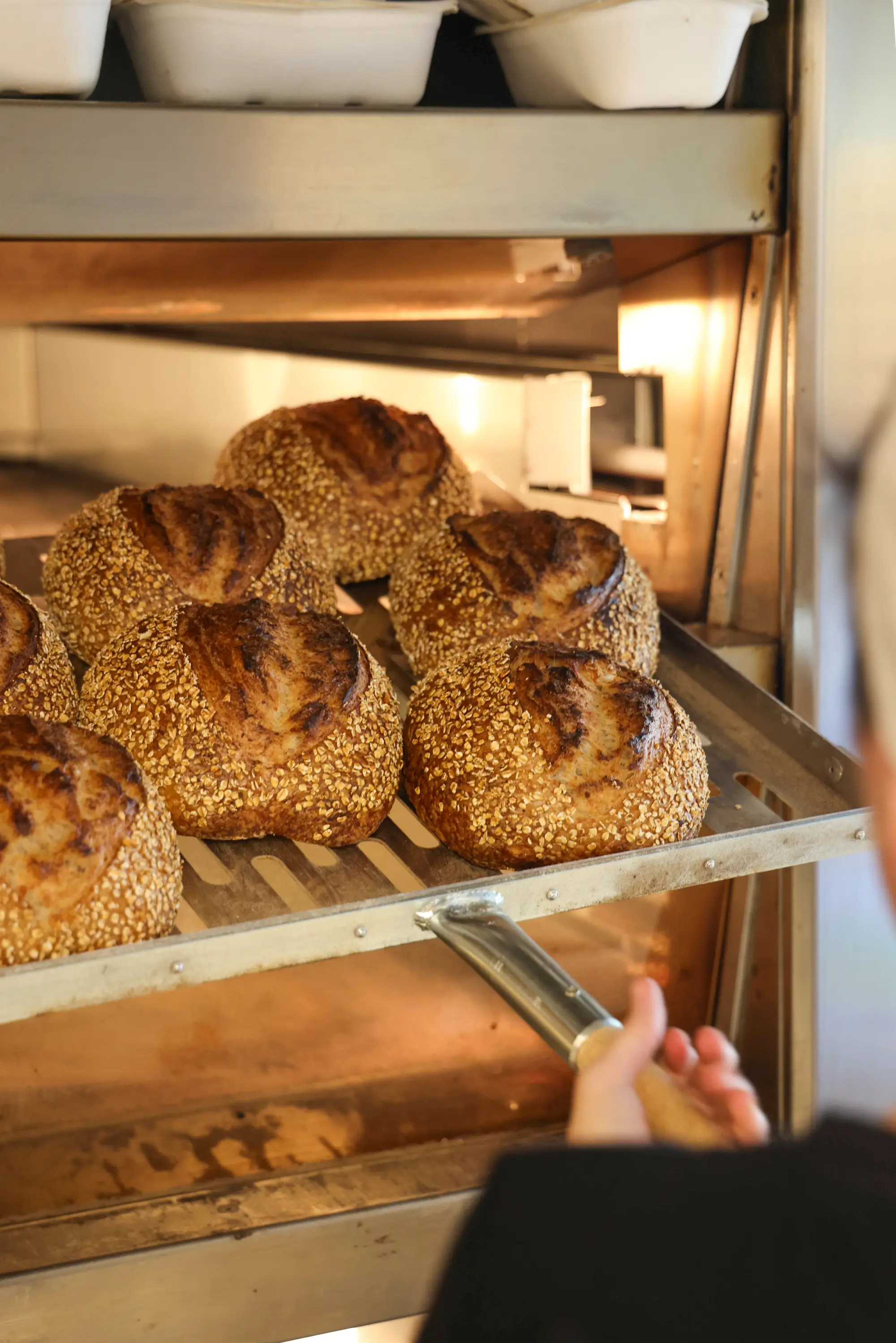
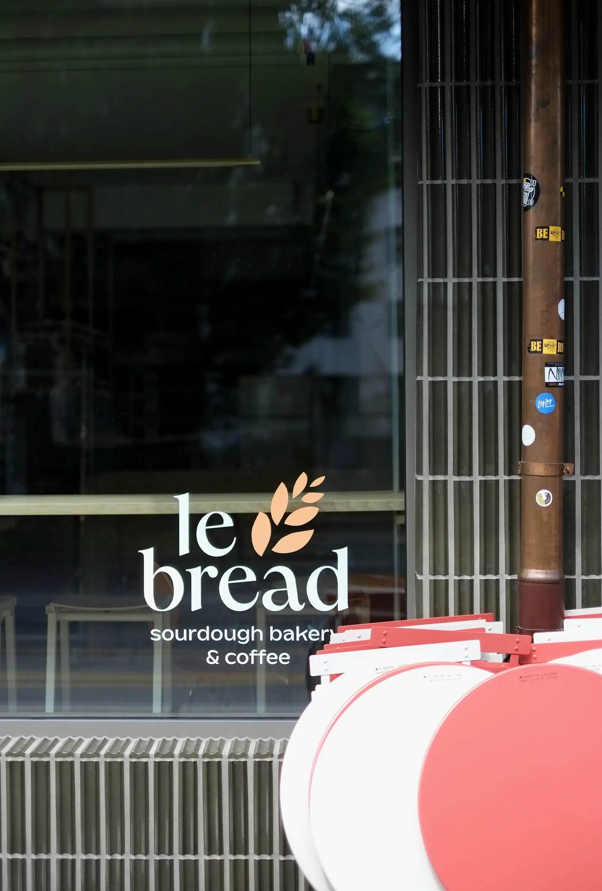
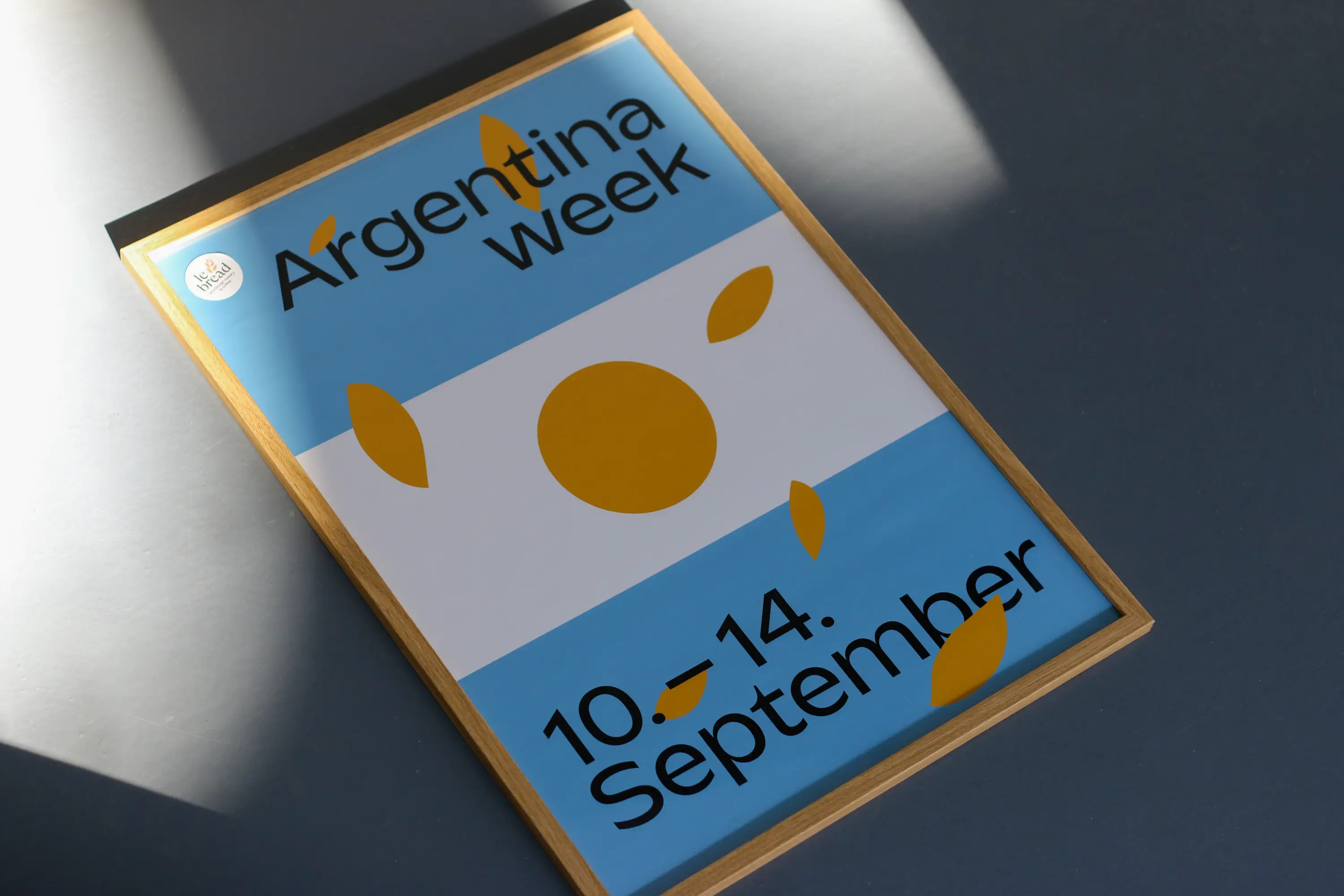
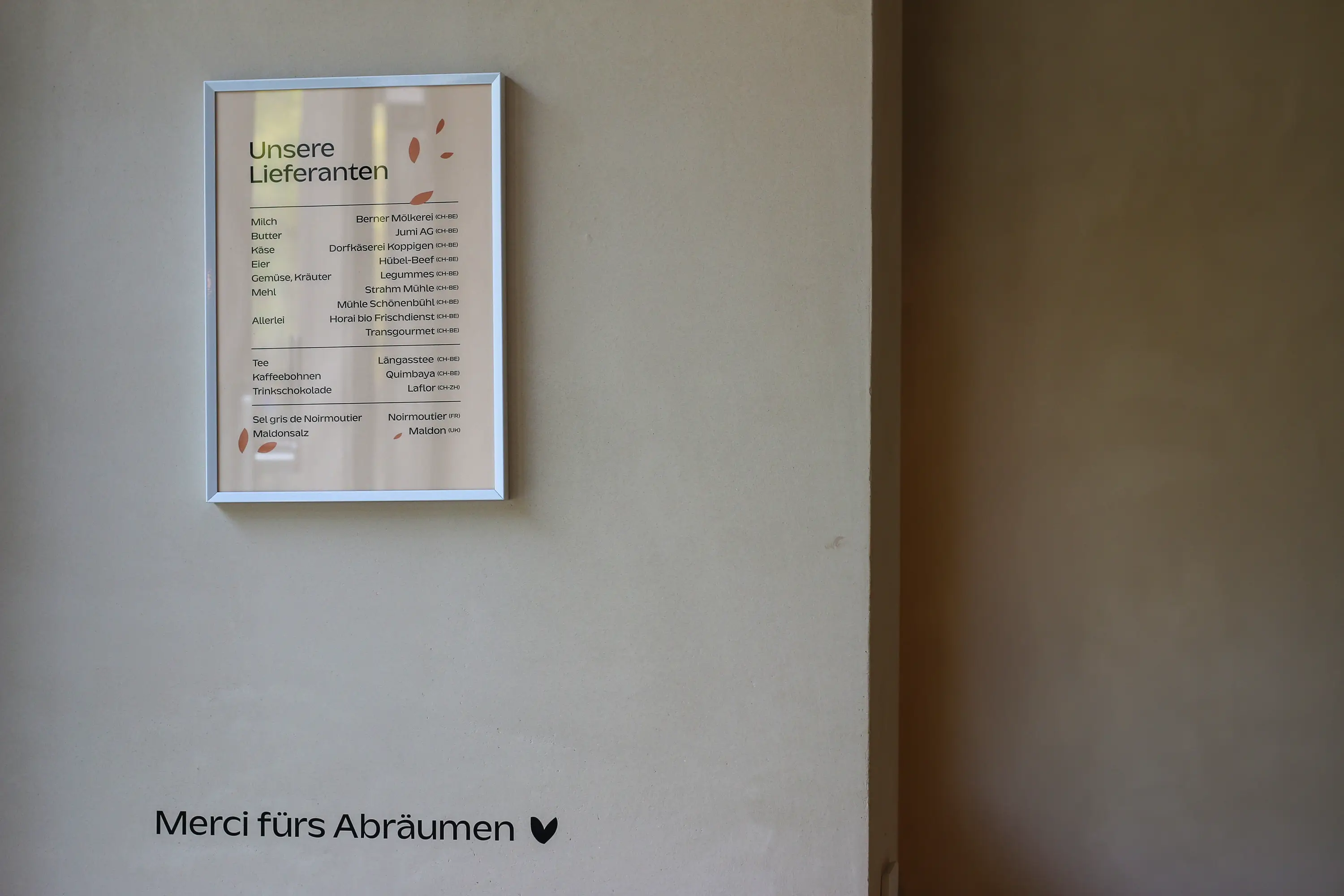
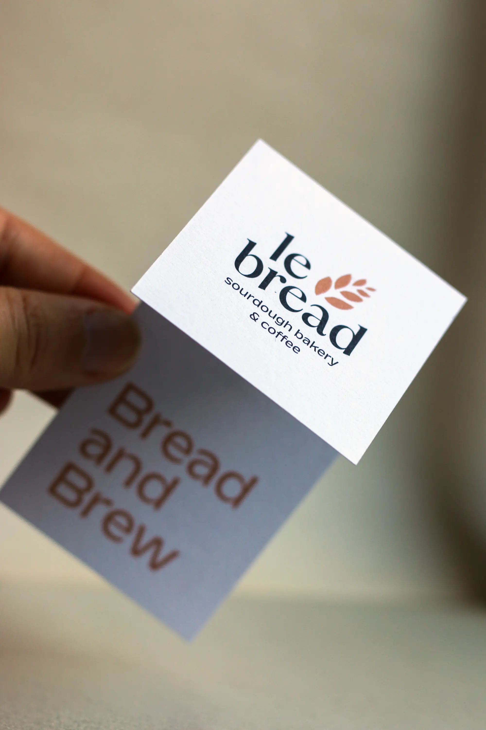
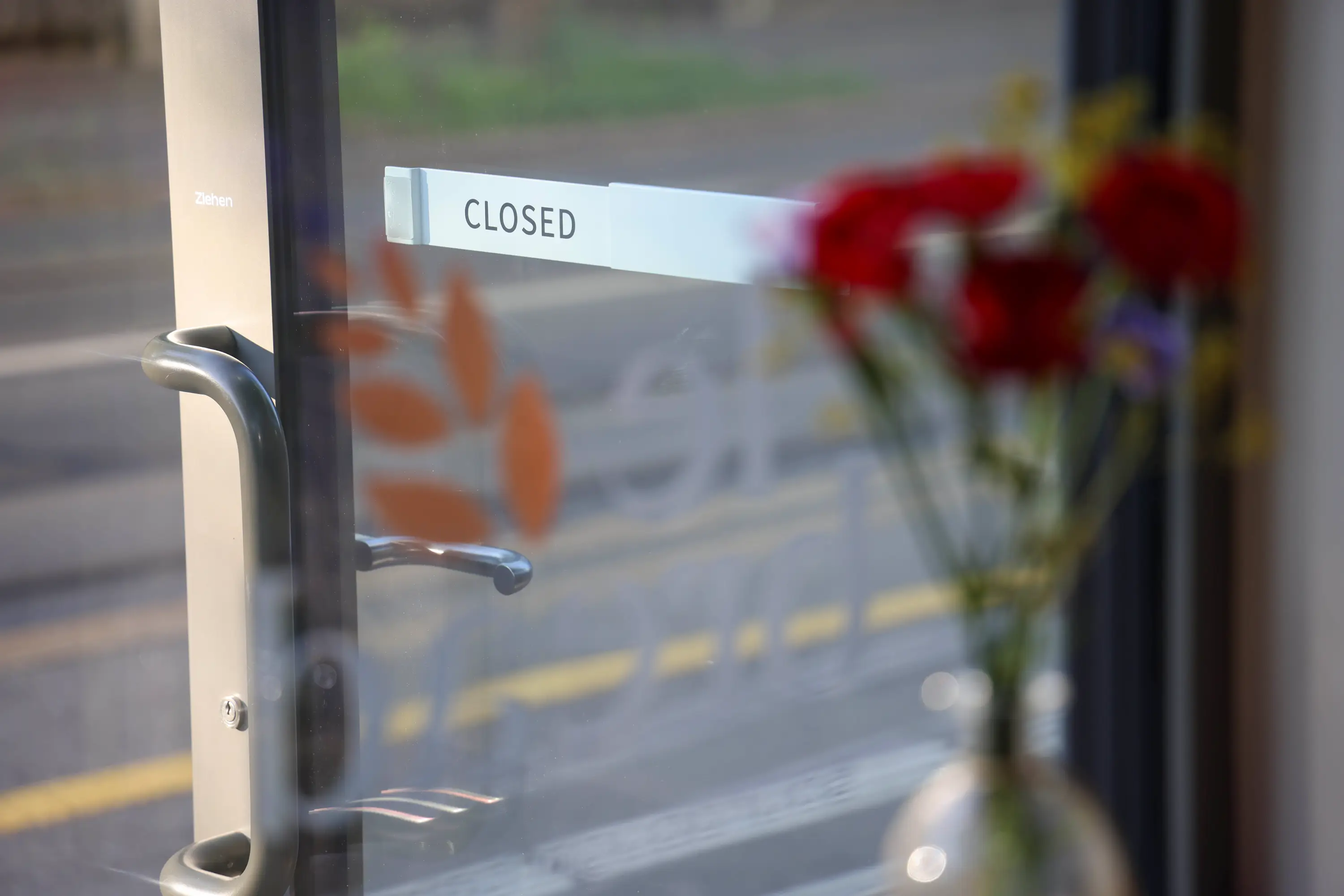
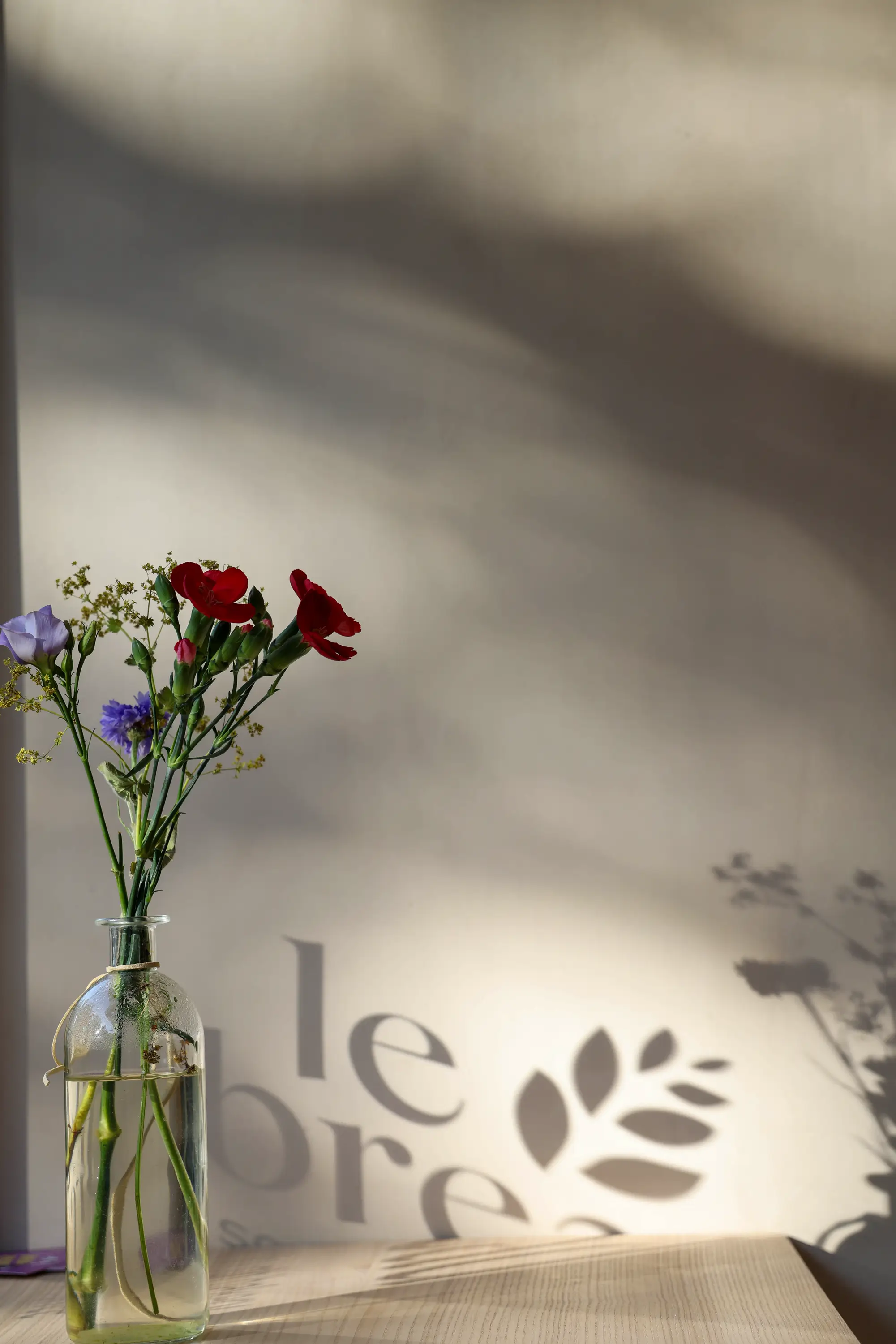
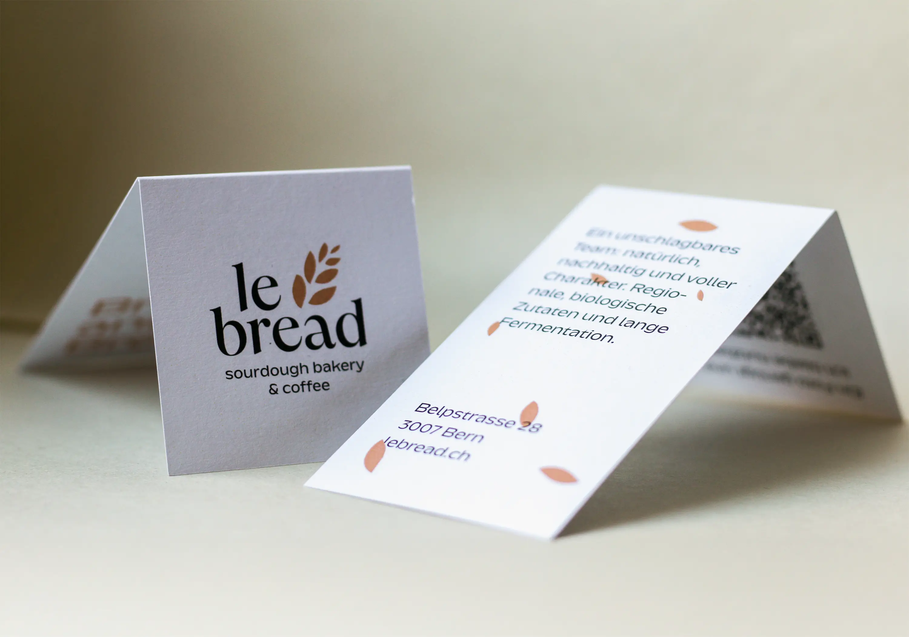
Le bread has evolved from a microbakery into a comprehensive and diverse sourdough paradise in Bern. With the move to Belpstrasse 28 in Bern came the desire for a new, adapted yet recognisable brand identity. Step by step, the logo, the lettering on the windows, the bread rack, the walls, the packaging, the team’s T-shirts and rechargeable vouchers were redesigned. And each implementation underlines the love of regionality, of lived team spirit and of discovery and creation.
This exciting collaboration has already produced some great results and continues to bubble and grow. Just like the many doughs that Bojana and her team nurture and process with love and passion. Thank you, Bojana, for your wonderful sourdough bakery and your tireless enthusiasm.
Rechargeable vouchers: Vögeli Druck, Langnau
Poster printing Special Weeks: Jordi, Belp
Font: Kaio from Lift Type
Paper Voucher: Genesis White from Fischer Papier
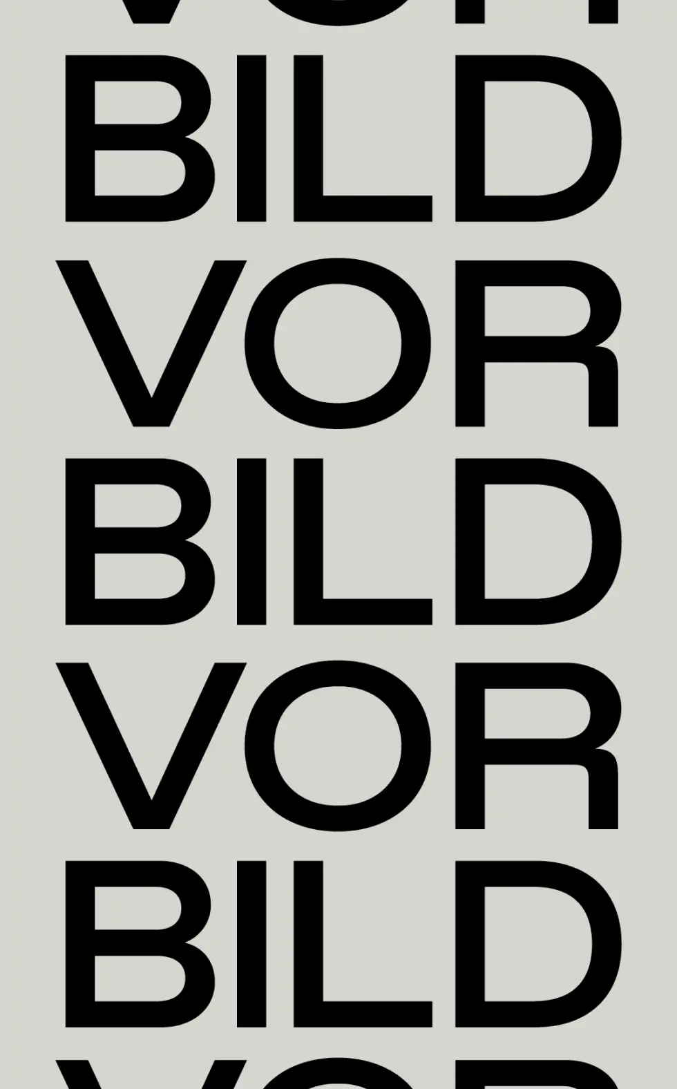
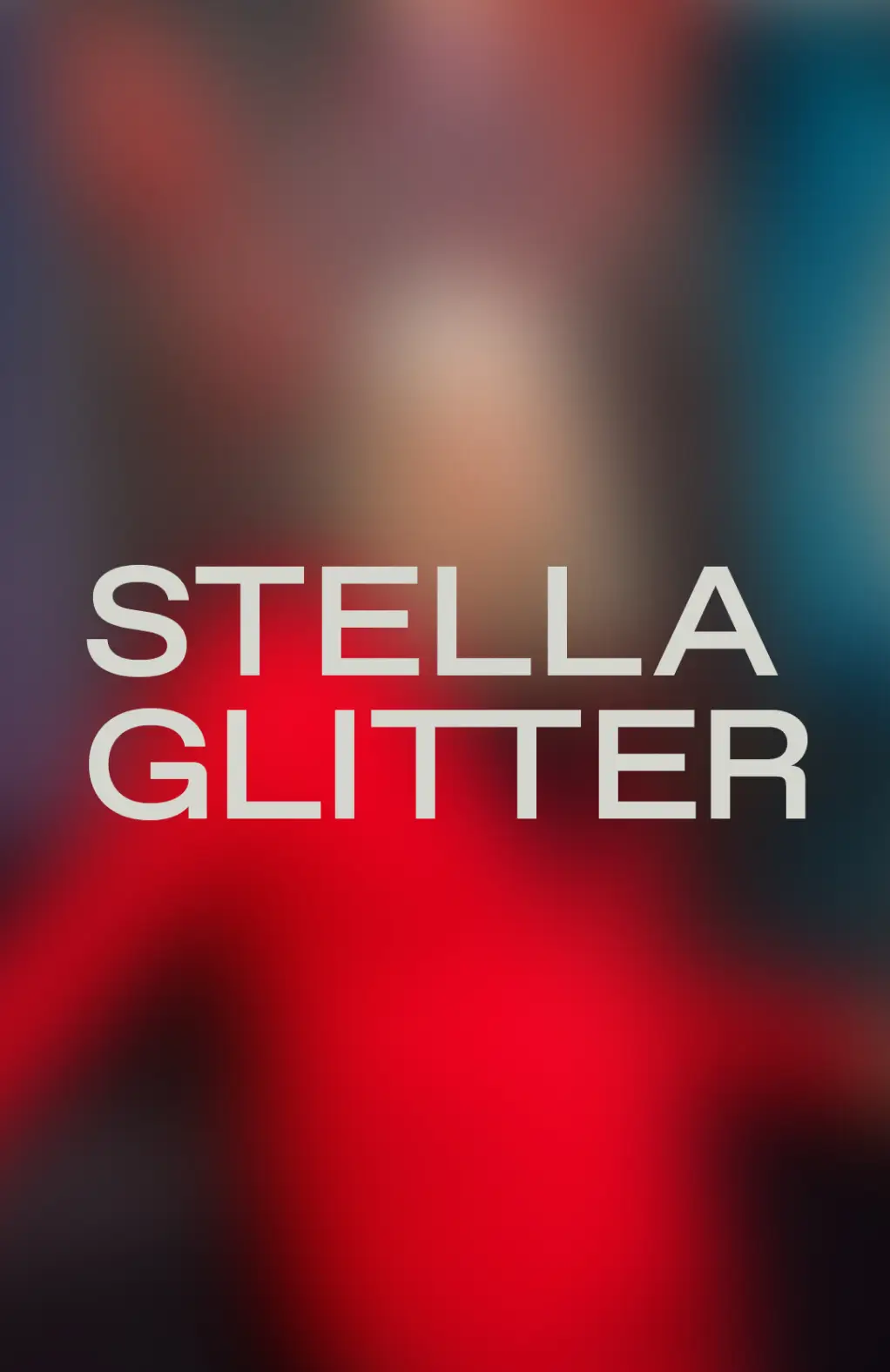
Nikkol Rot – Corporate & Book Design
Clarity, Heart, and Aesthetics in a Square: This is Nikkol Rot
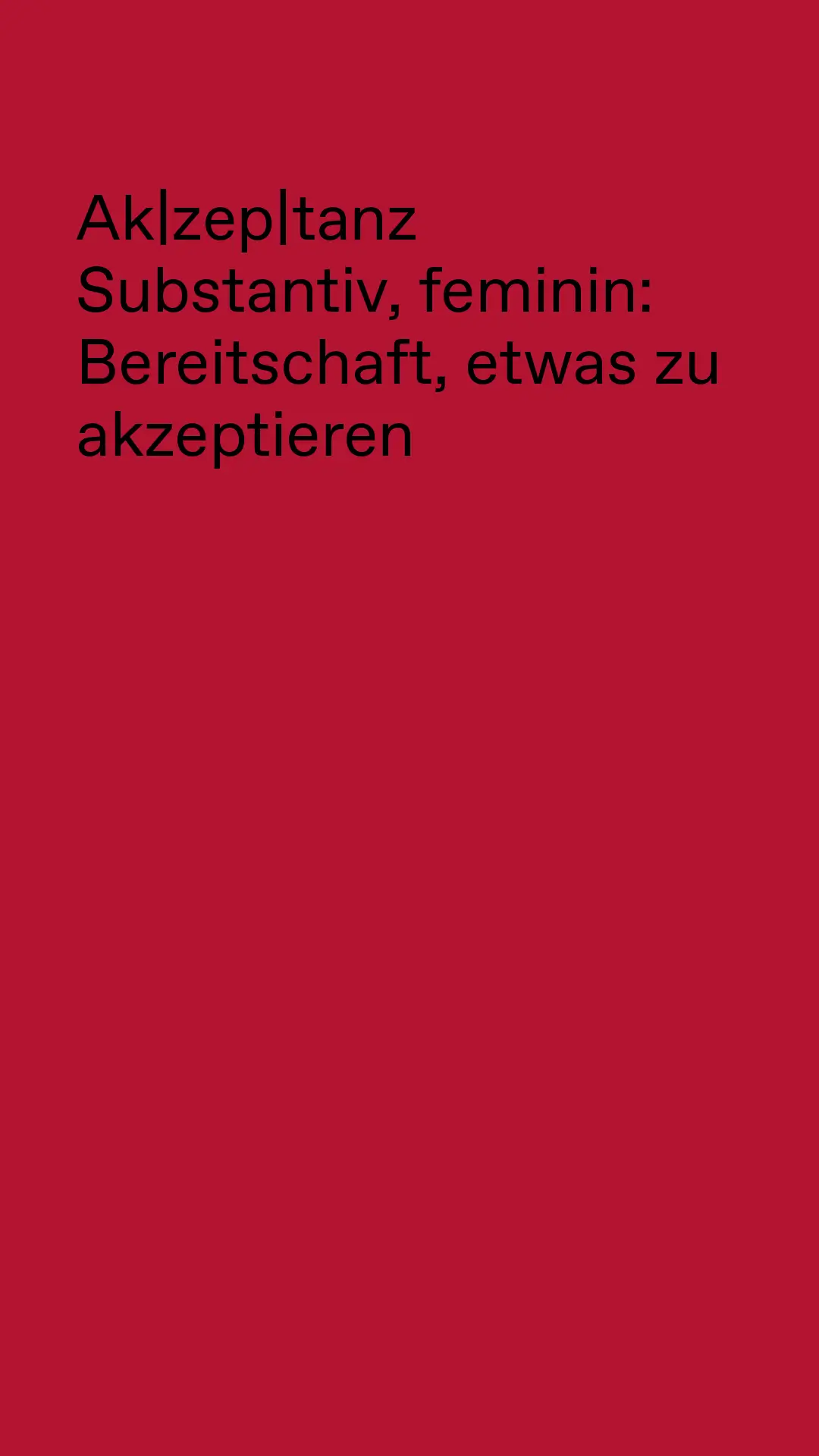
With these ingredients, Nikkol Rot creates a distinctive visual language. With these ingredients, her new visual identity was born. In her work, Nikkol celebrates diversity and makes acceptance visible. The result is always unique—constantly simmering, transforming, and evolving with new ideas.
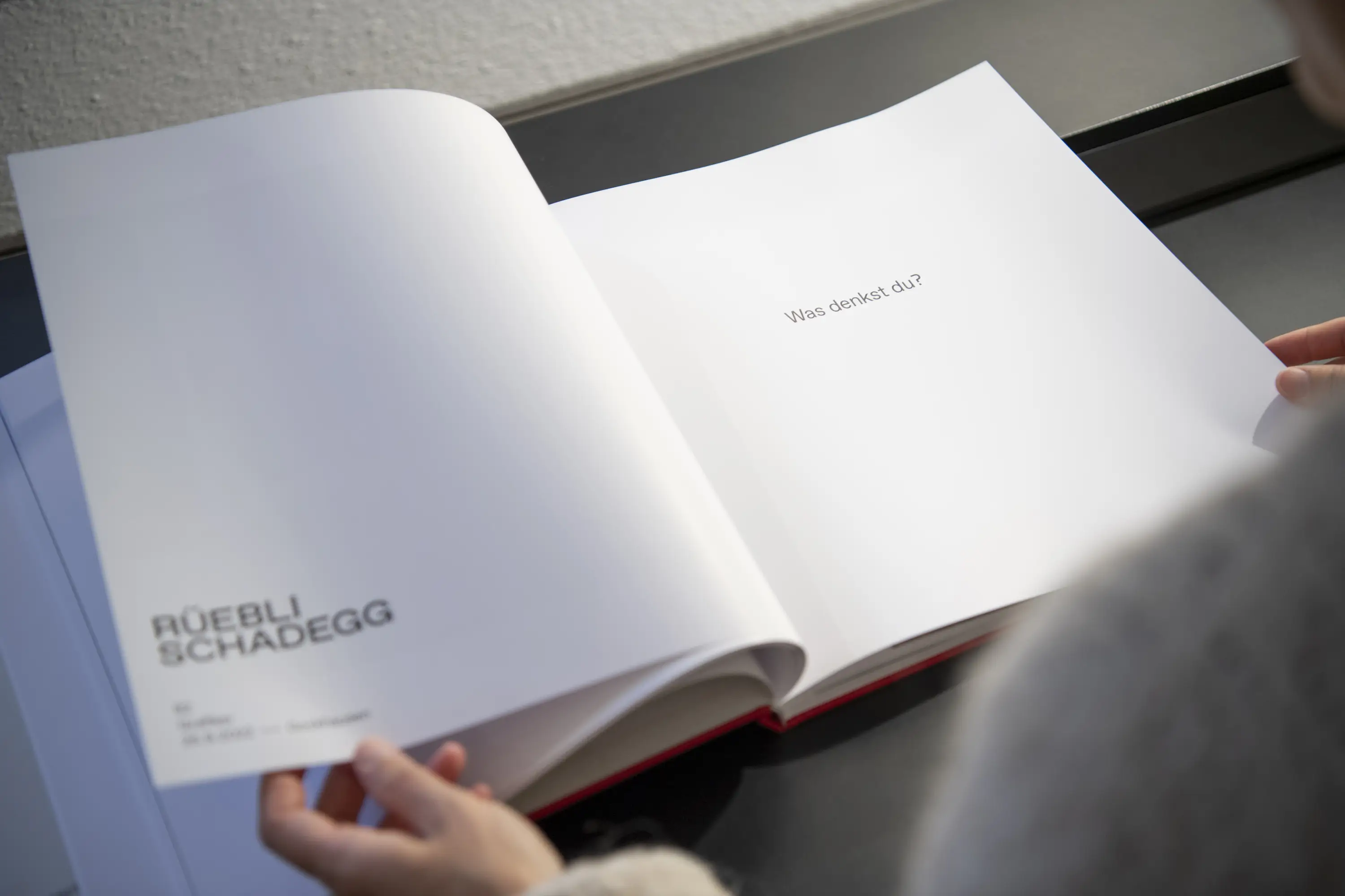
Together, Nikkol and I developed her individual, powerful, and confident presence: a business card with texture and aesthetics, printed by Jürg Brunner on his letterpress machine—minimalist yet with a striking fiery touch. A glimpse into her heartfelt and authentic book project—available on her website or Instagram profile. Or printed invitations for the two exhibition openings in Bern and Zurich.
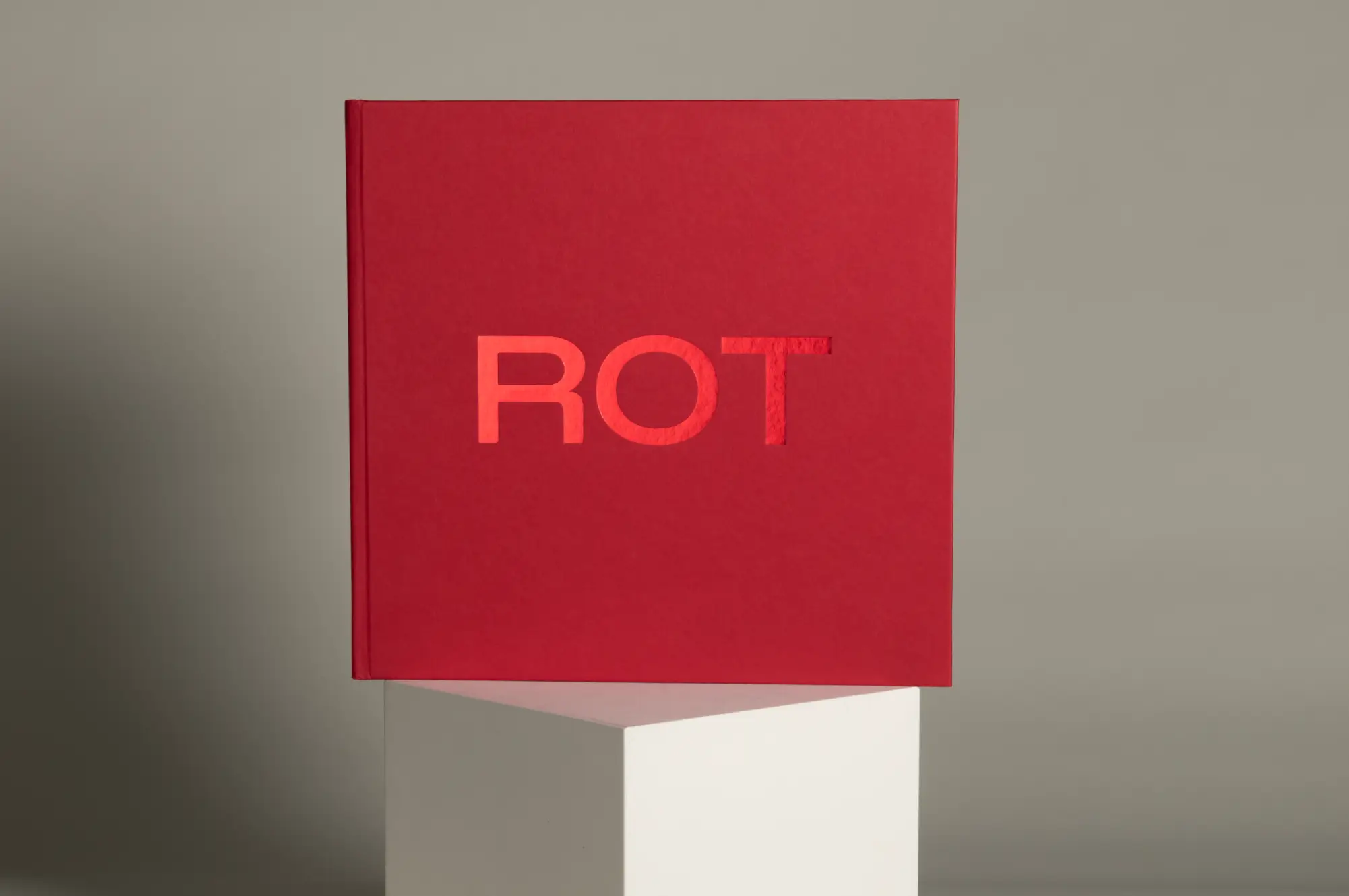
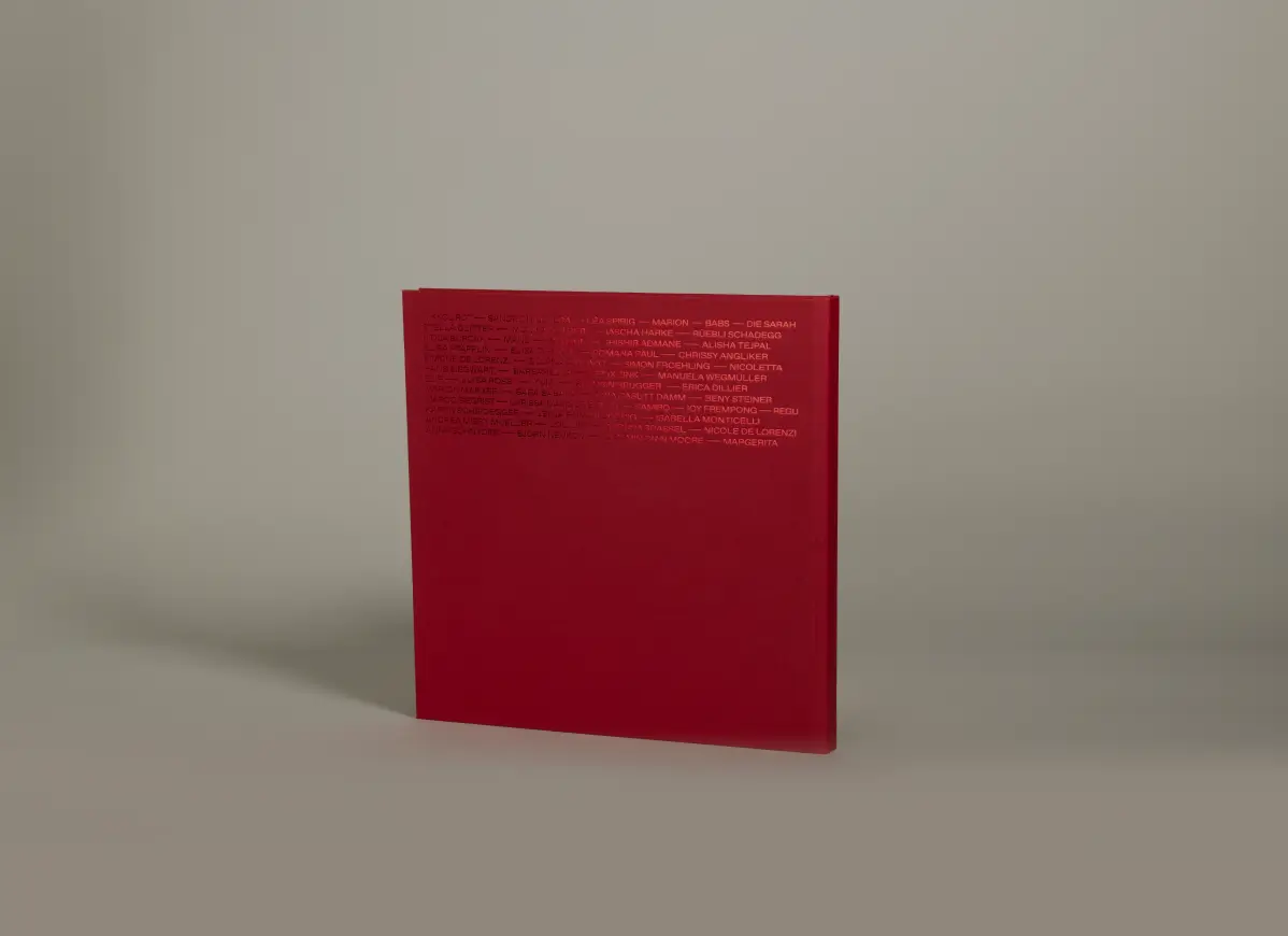
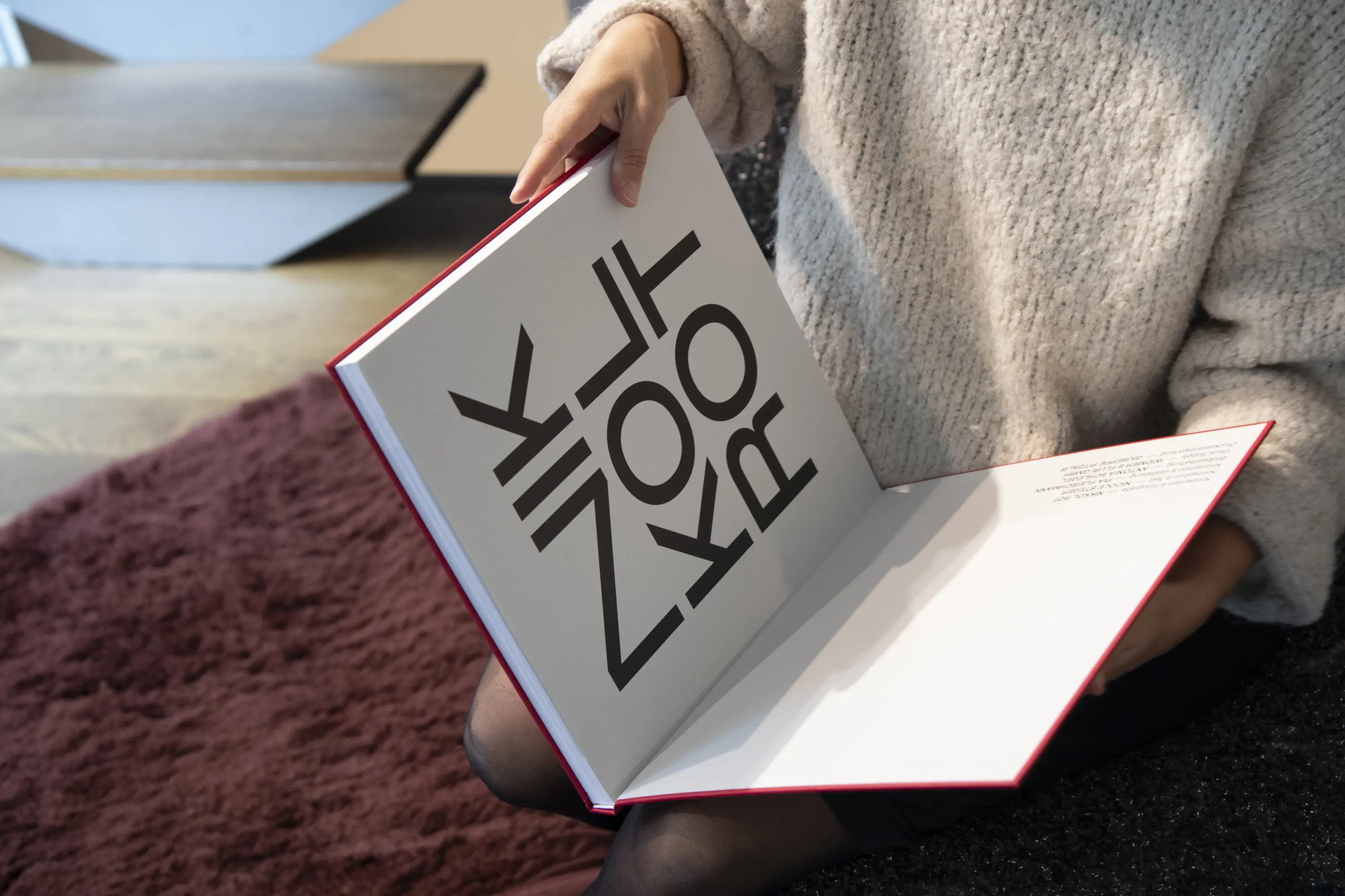
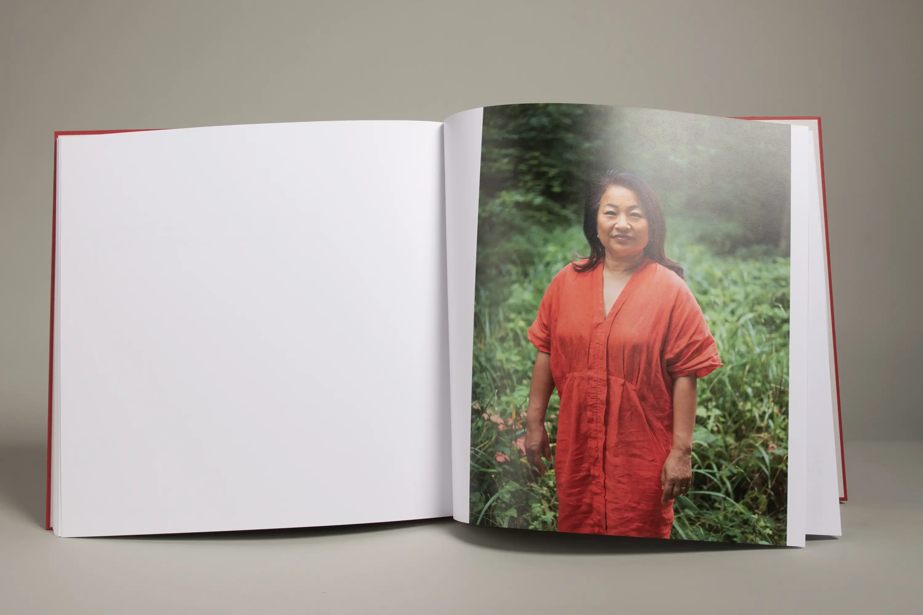
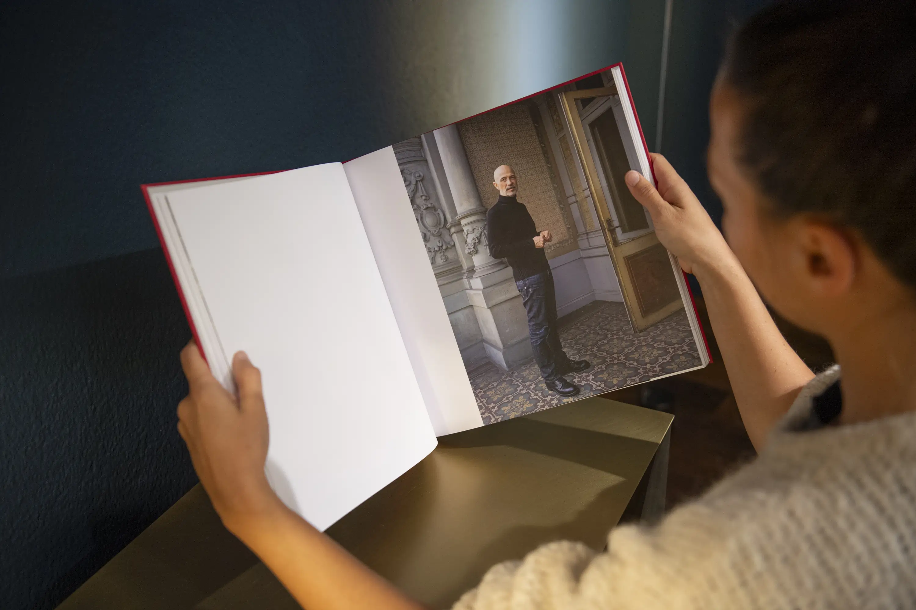
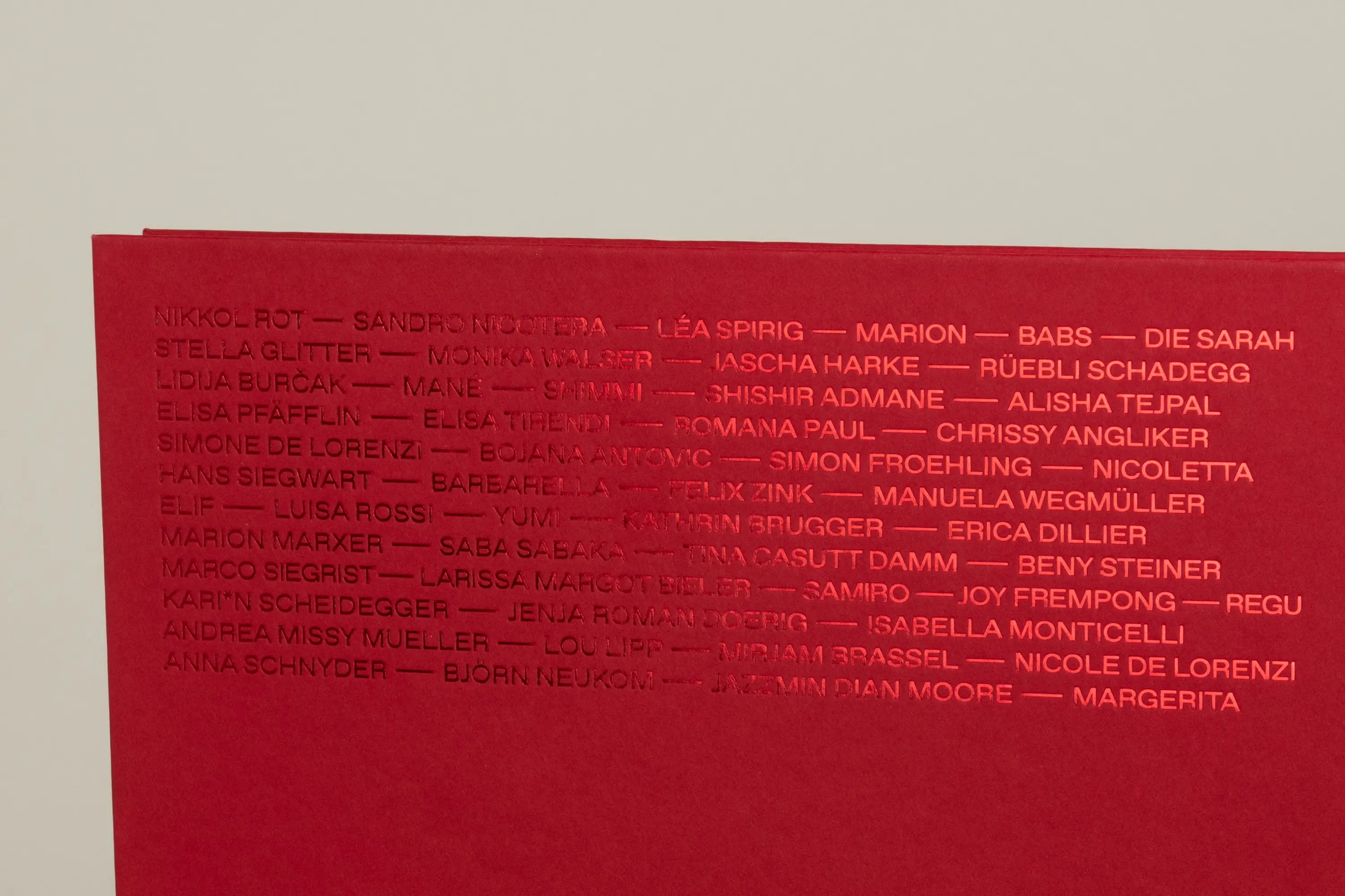
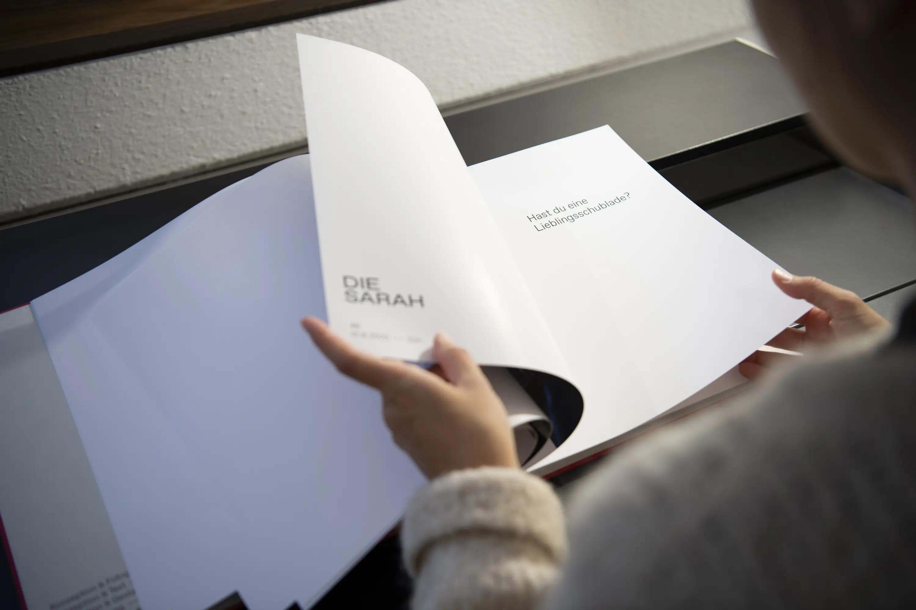
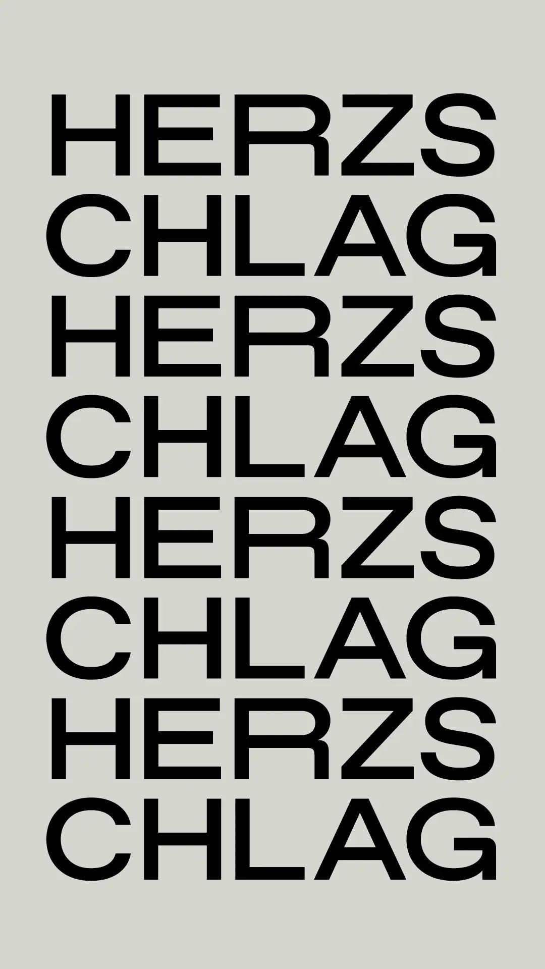
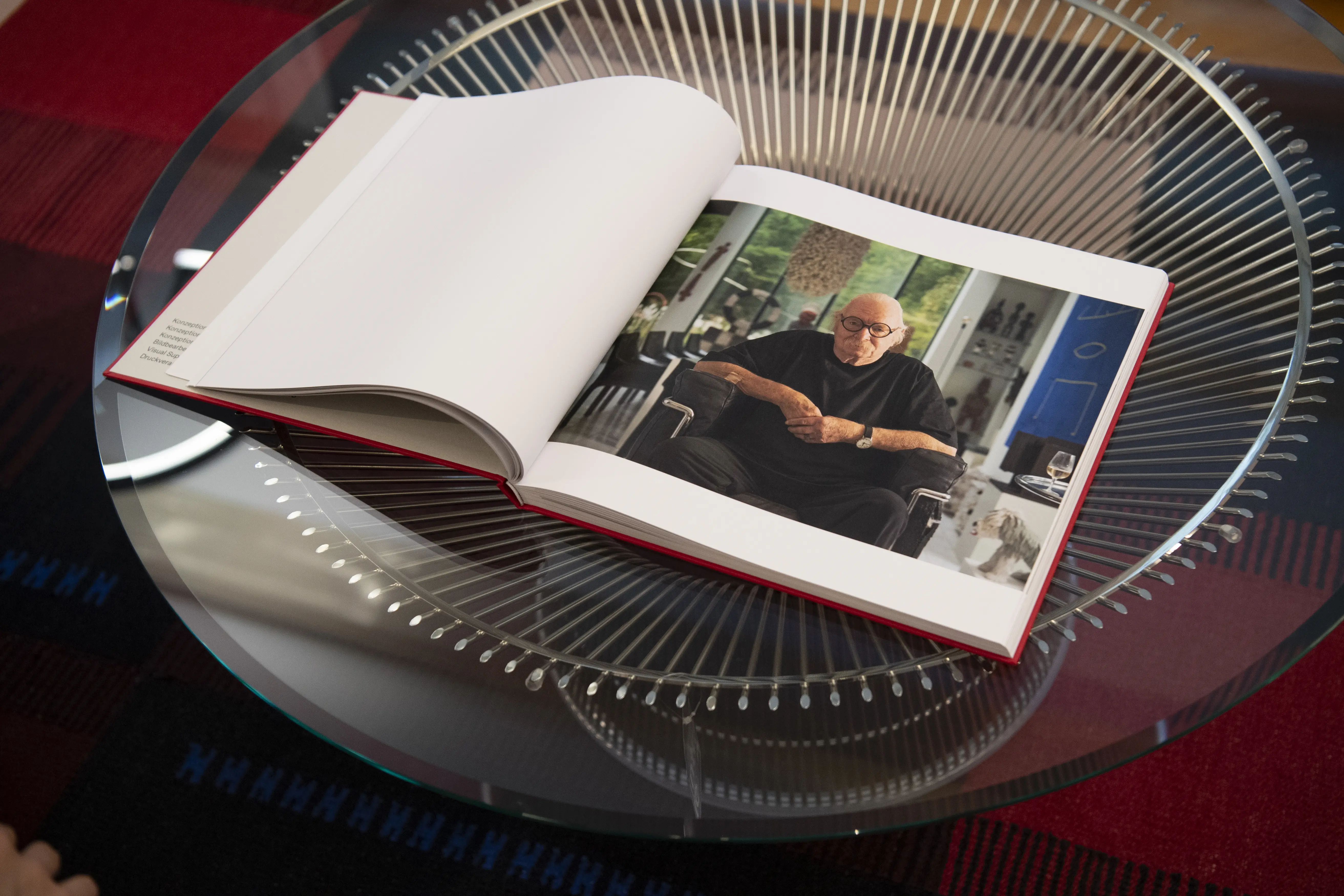
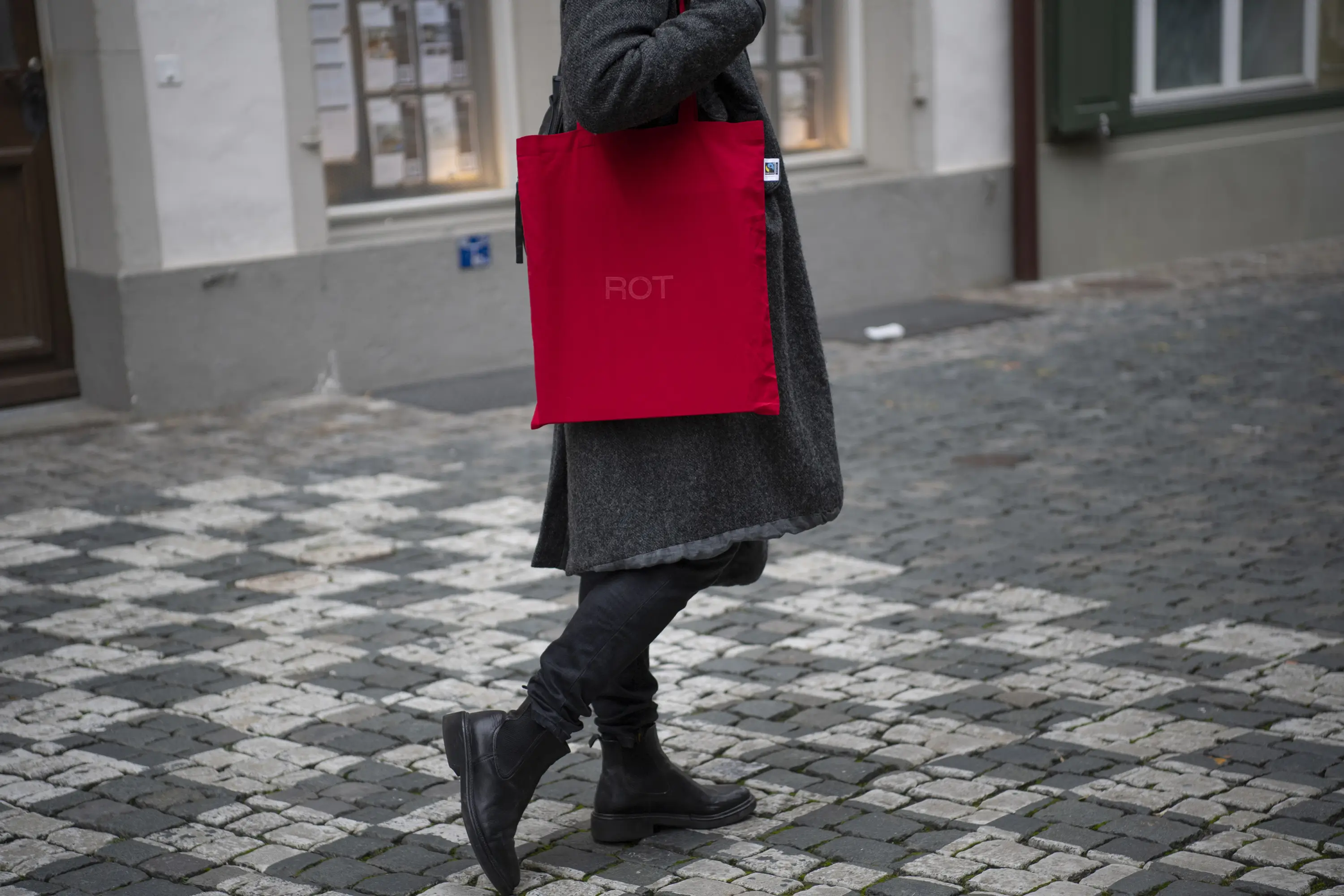
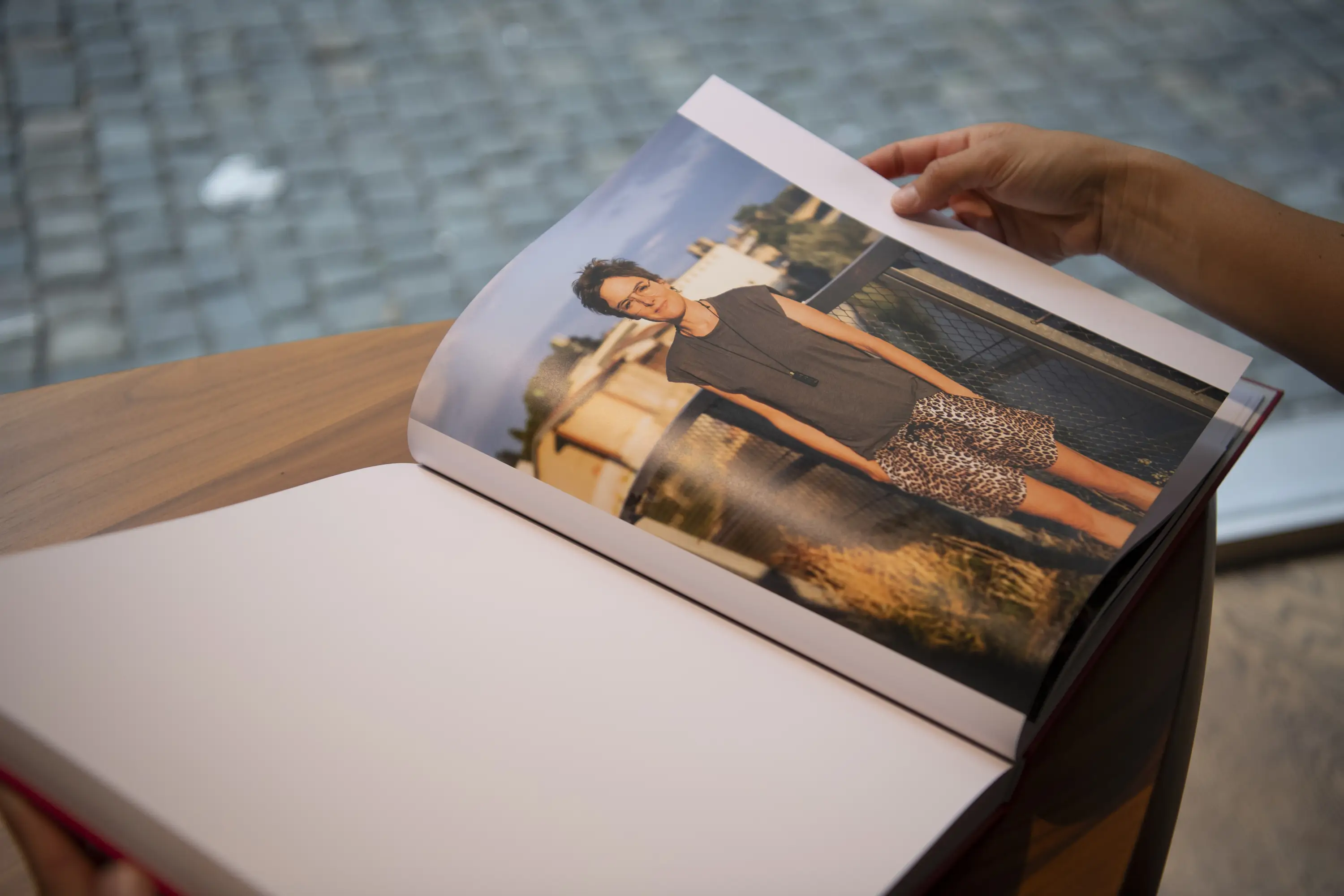
Our creative kitchen continues to simmer. But Nikkol has already served up something remarkable, proving that not everything has to be round—sometimes, it’s meant to be square. Her book ROT comes in the original format of her beloved Hasselblad X1DII camera. Nothing and no one is hidden in this wonderful work, thanks to the conceptual ideas brought to life by Nicole Steger, Nikkol Rot, and me. It was—and still is—an immense honor to have been part of this favorite project.
Printer Businesscards: Druckerei Brunner, Wohlen Bern
Printer Book: Kasimir Meyer, Wohlen Aargau
Bookbinding: Pagina, Hittnau
Image processing: Antonia Schlegel
Visual Supply: Widmer & Fluri
Printing responsibility Book: Giuseppe Pitzalis
Used fonts in the book: ABC Favorit von ABC Dynamo
Book Wrappaper: Wibalin Natural Cherry
Book Endpaper: Colorplan Pale Grey
Content Paper: Profi Extra
Concept & Photography: Nikkol Rot
Concept & Text: Nicole Steger


Sustainable service
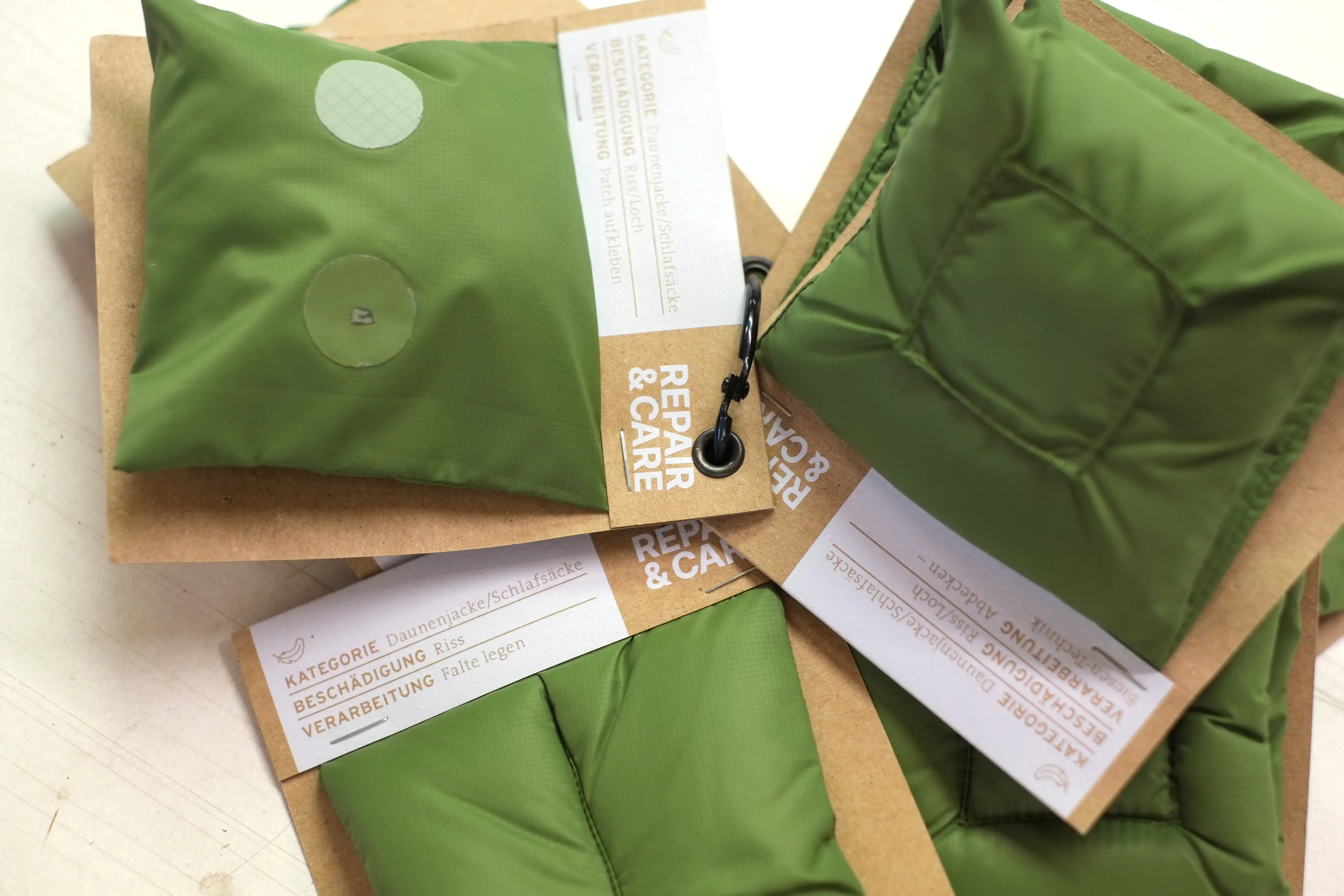
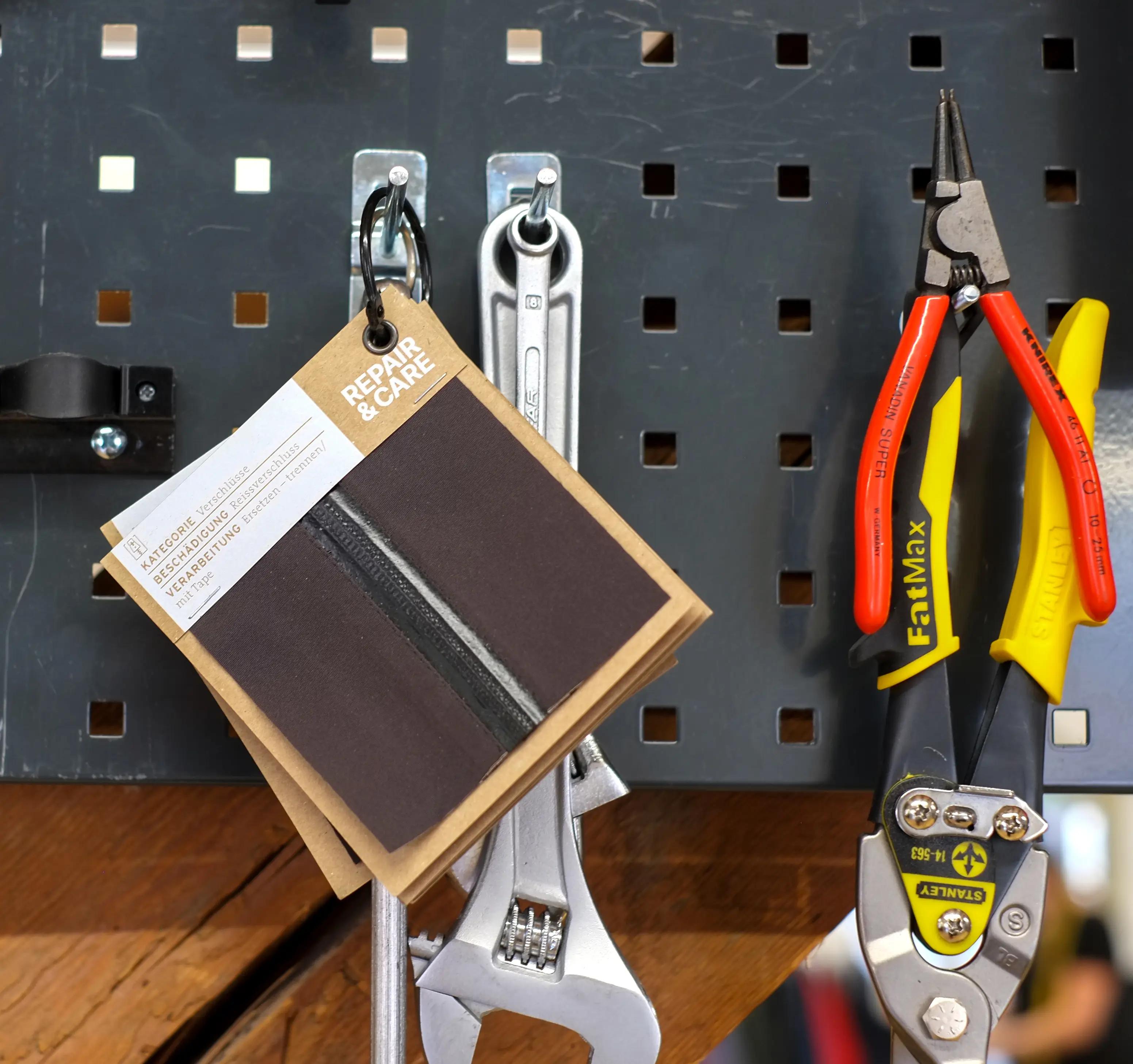
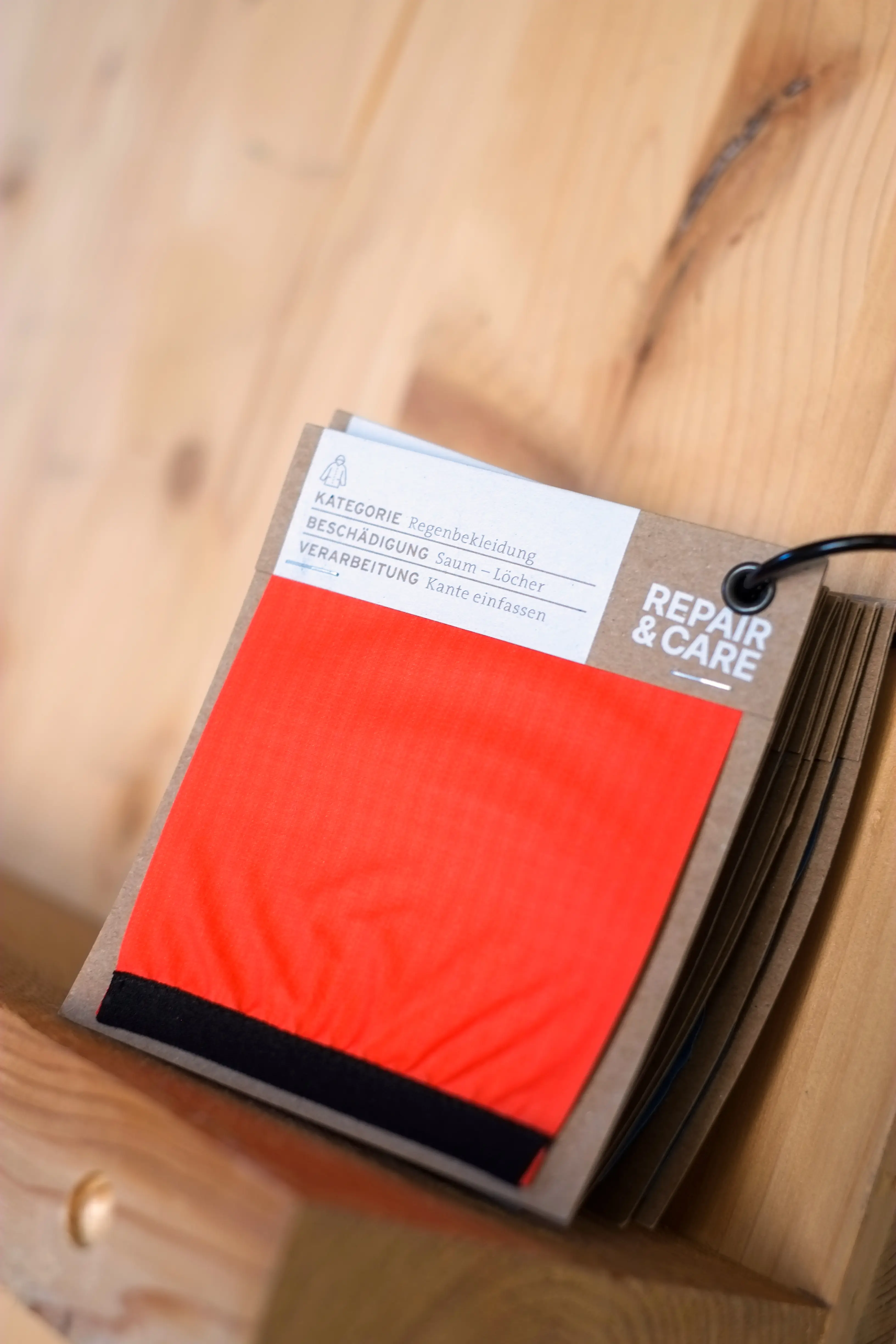
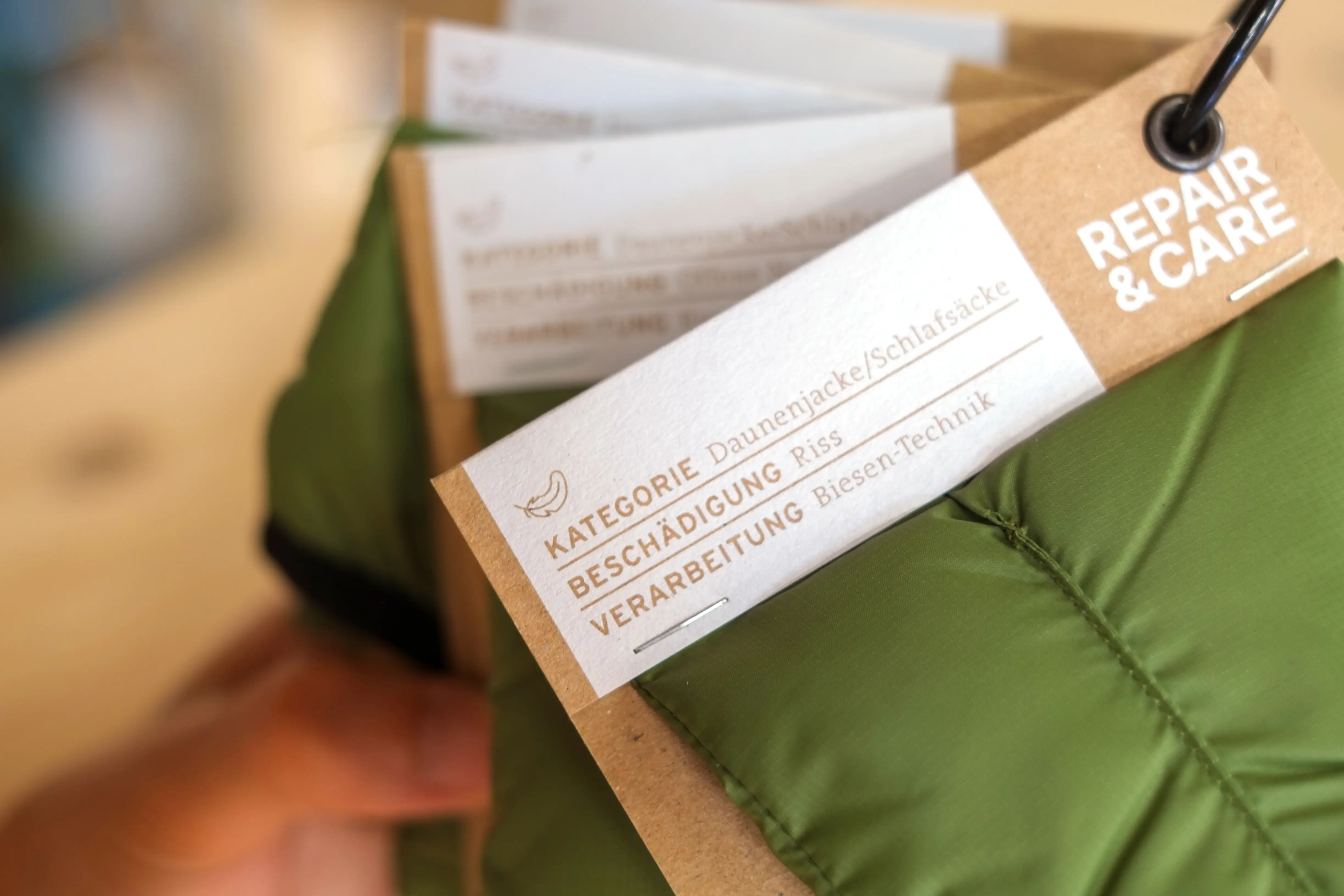
Repair sample cards for Transa
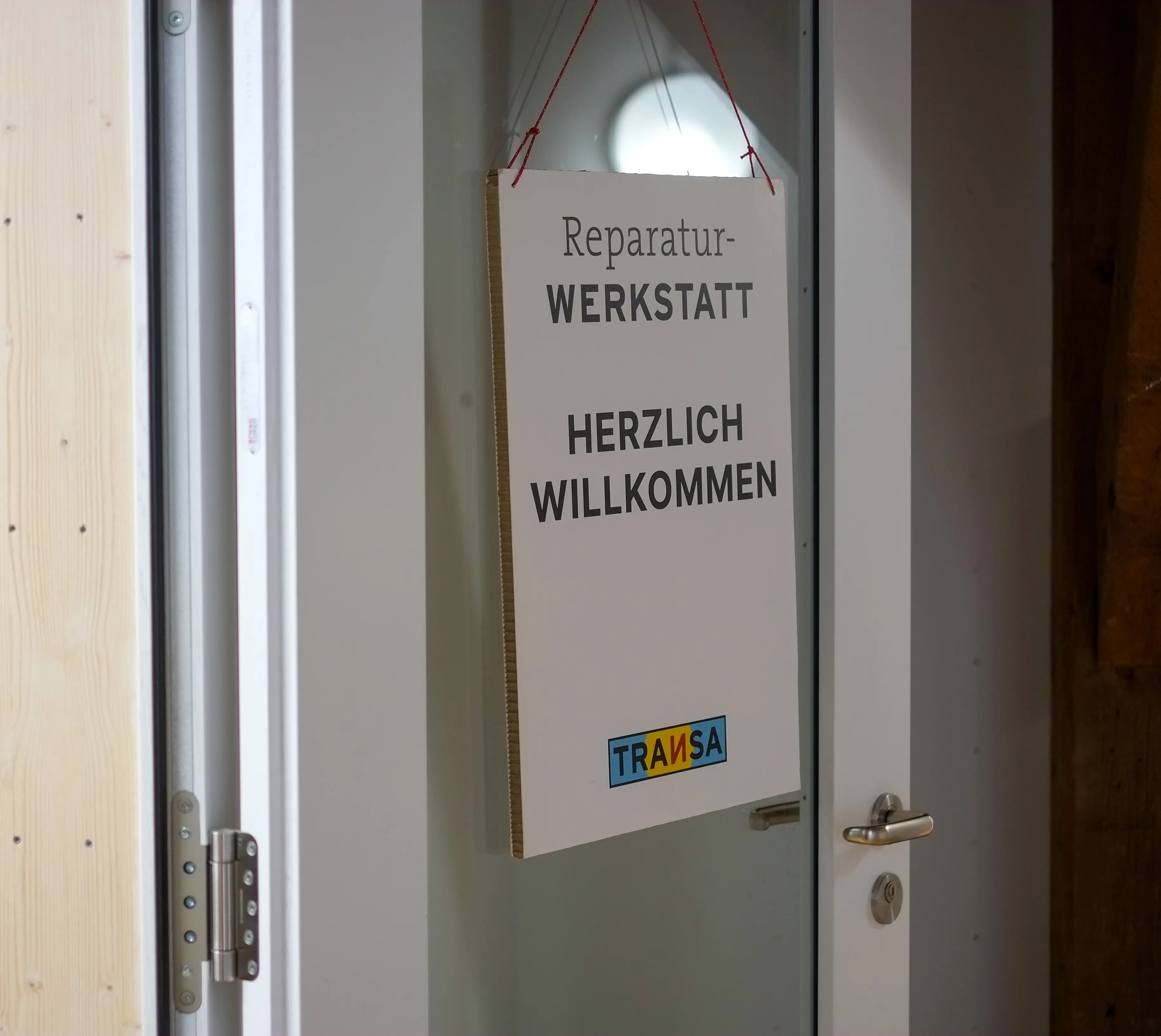
Transa Repair Workshop ensures that favourite outdoor items can be worn and cared for longer, putting sustainability into practice.
For a few years now, I’ve had the pleasure of supporting transa in shaping their visual identity – across a wide range of exciting areas. And every time, I’m amazed by the drive of this vibrant team, their ideas, and the values they bring to life.
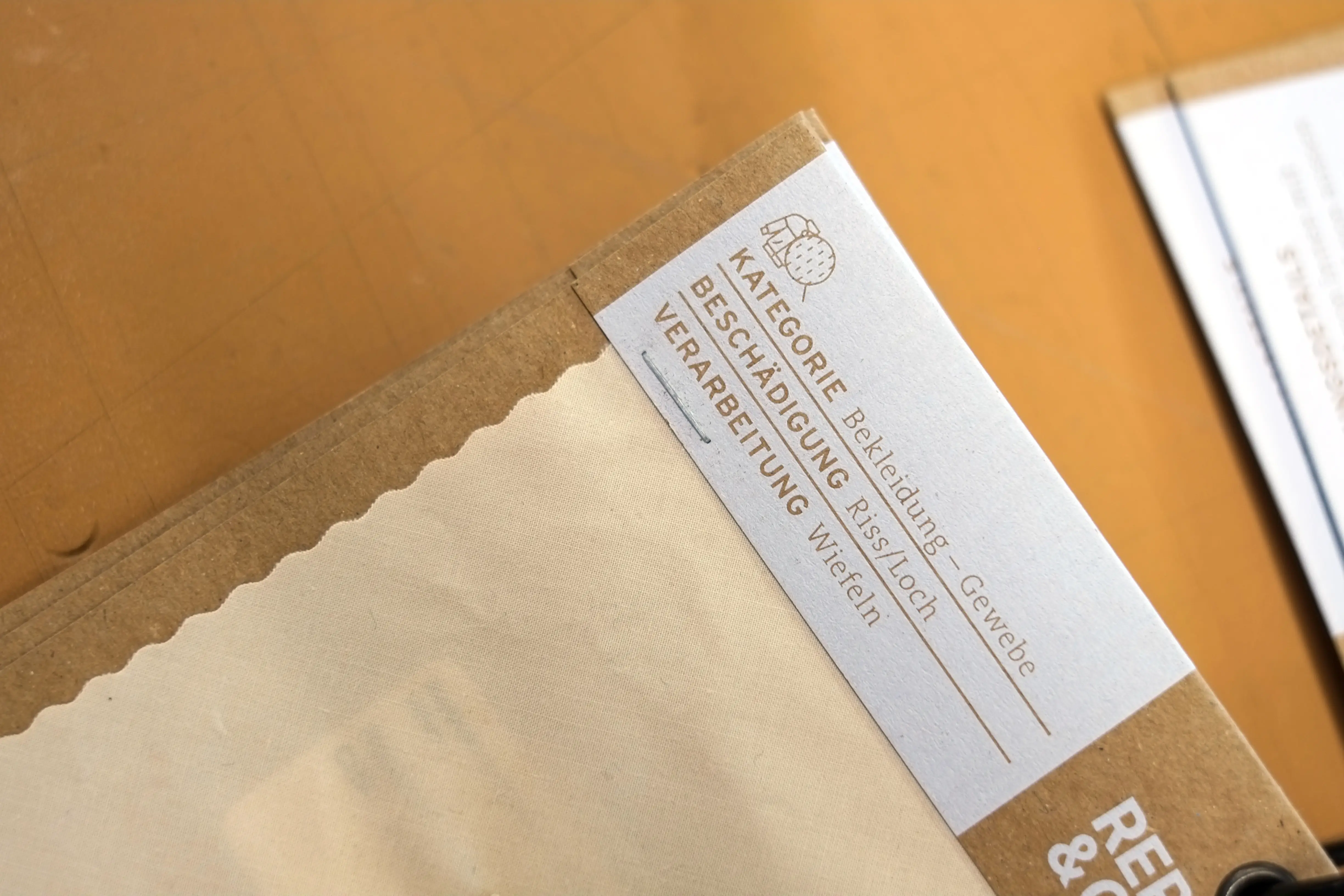
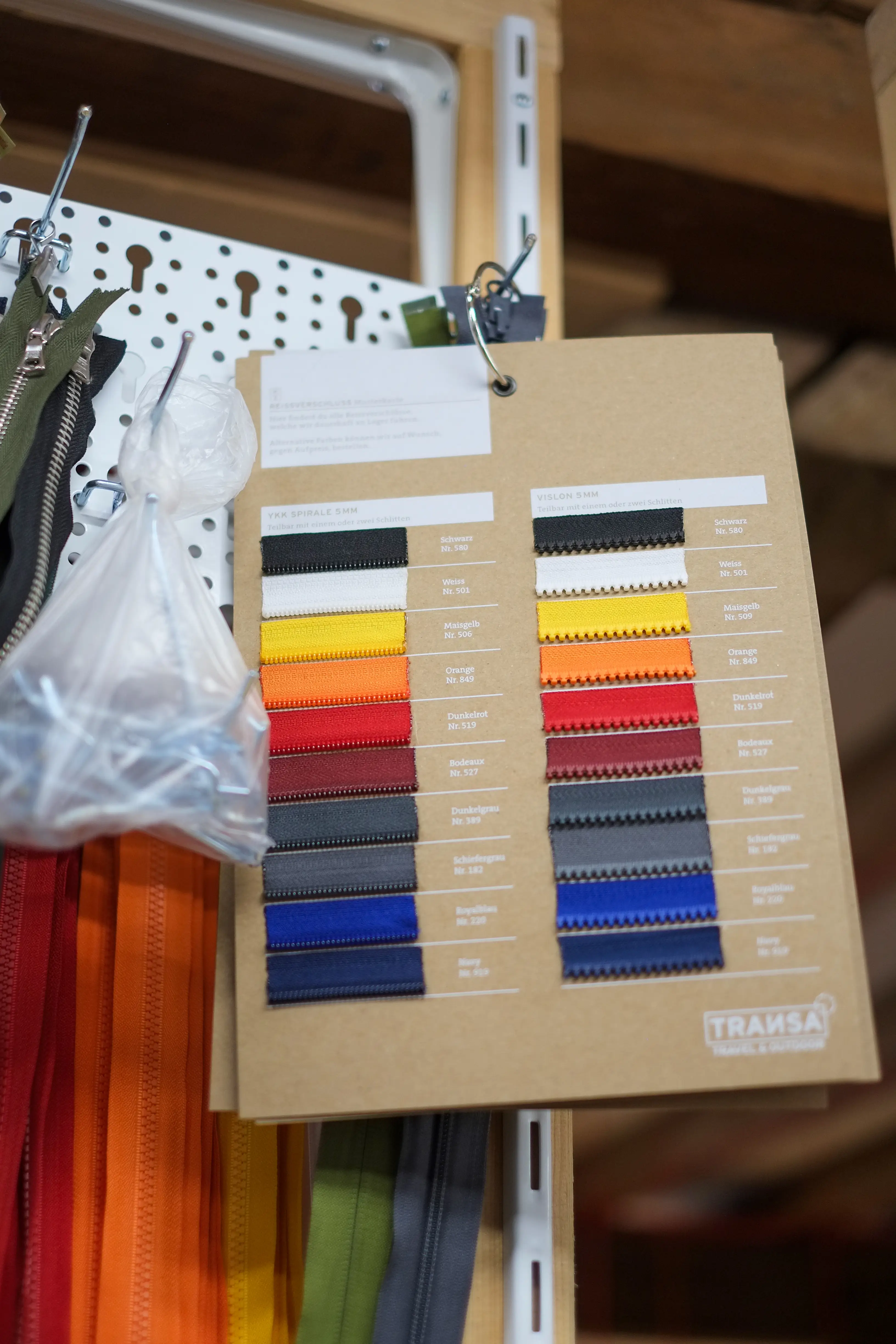
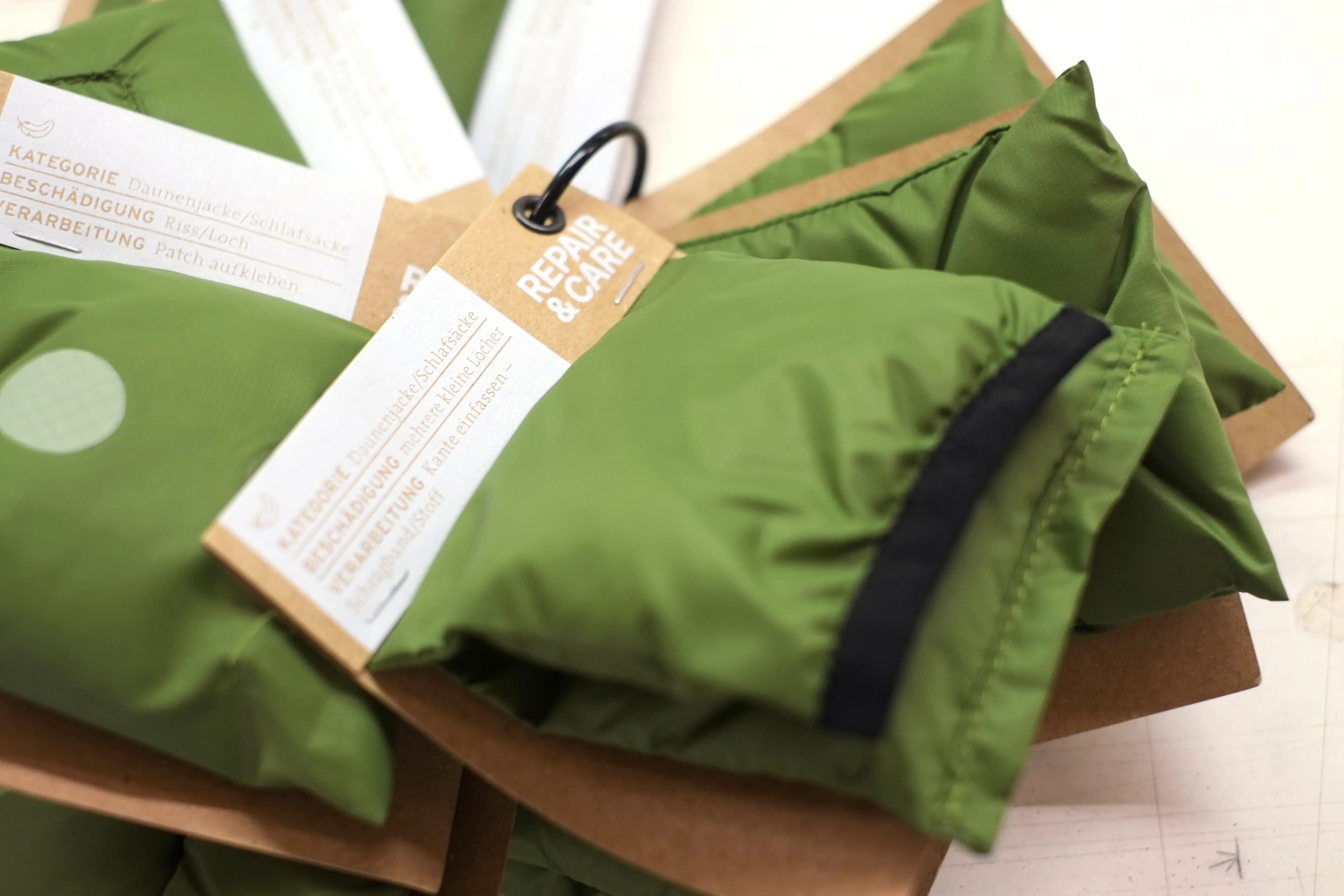
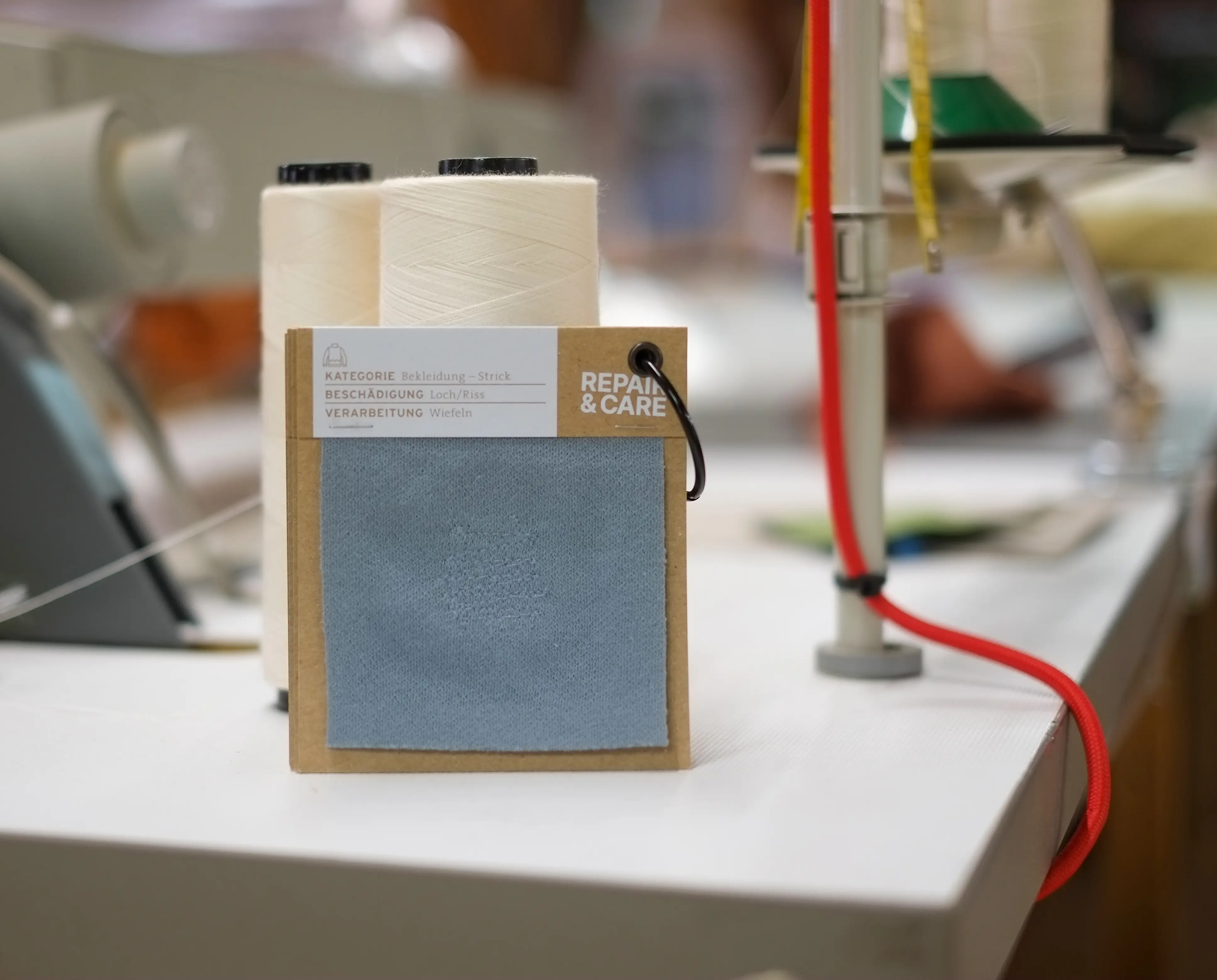
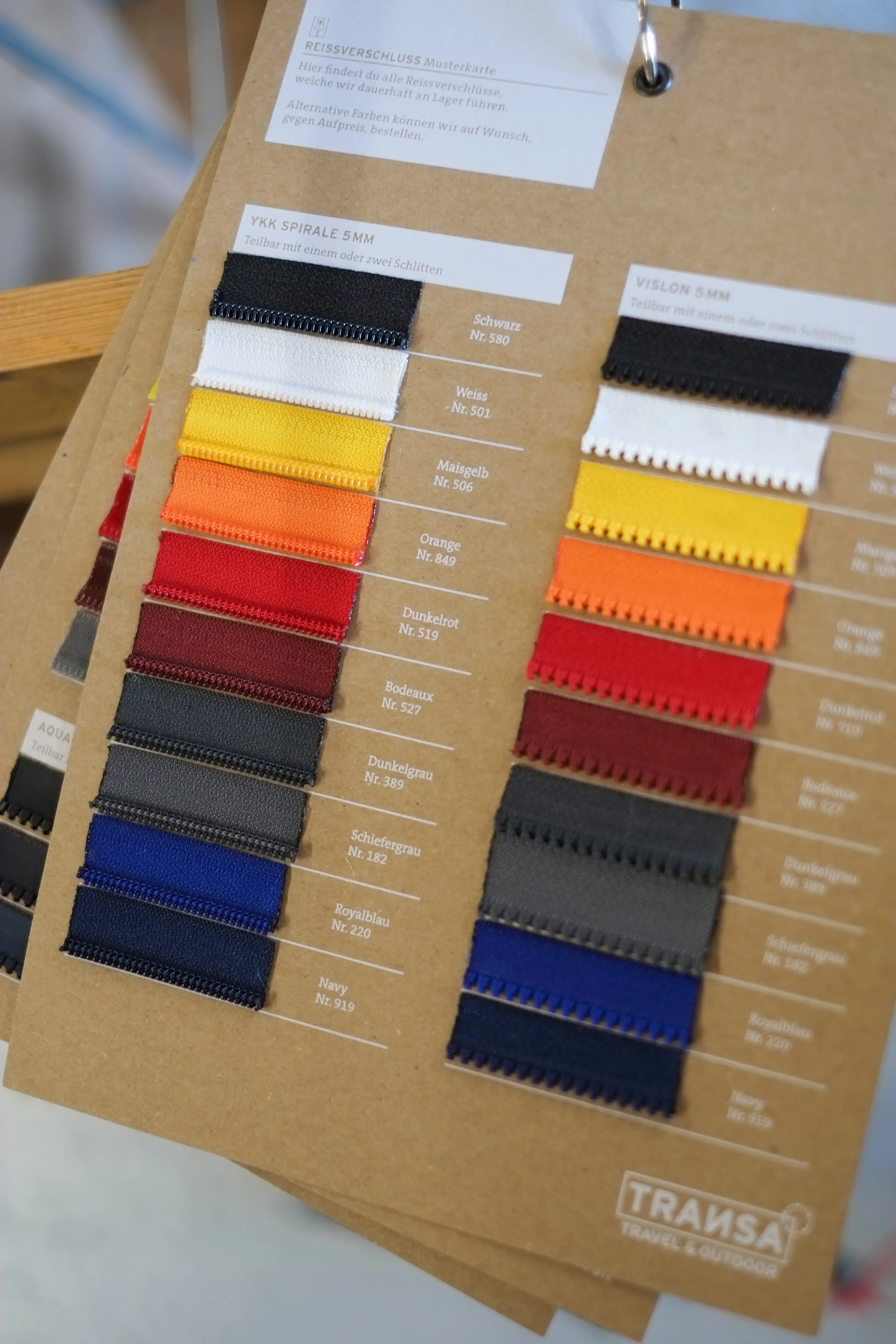
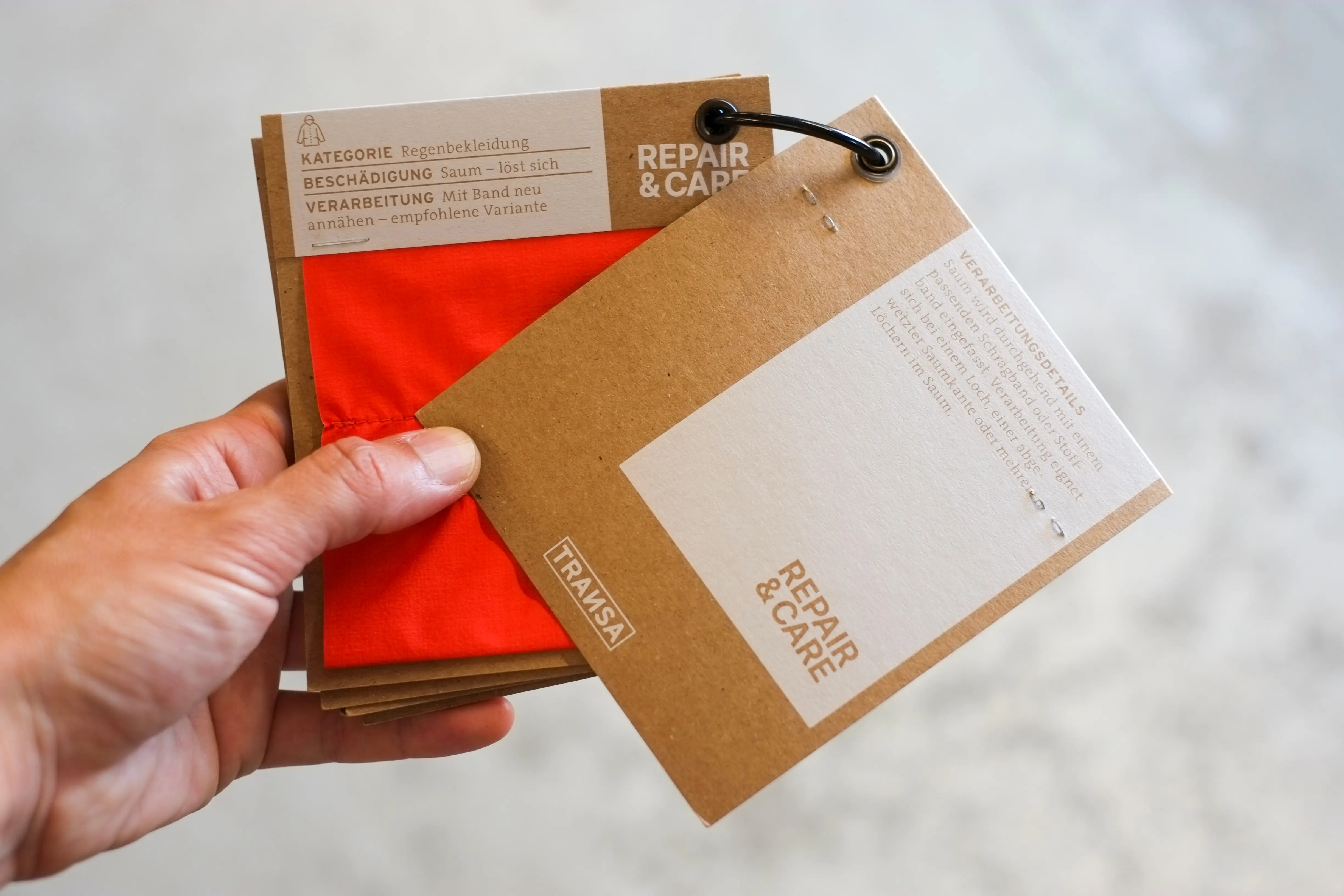
So I was all the more delighted to create sample cards showing the various repair options and zip colours for their repair workshop. The cards serve as a visual aid for the repair team and customers and as a basis for straightforward communication.
Printer: Kasimir Meyer, Wohlen Aargau
100% recycled paper Muskat from Fischer Papier
Coffee Fair in Zurich
Swiss Coffee Festival
A meeting point for coffee lovers, producers, roasters, equipment manufacturers, and more.
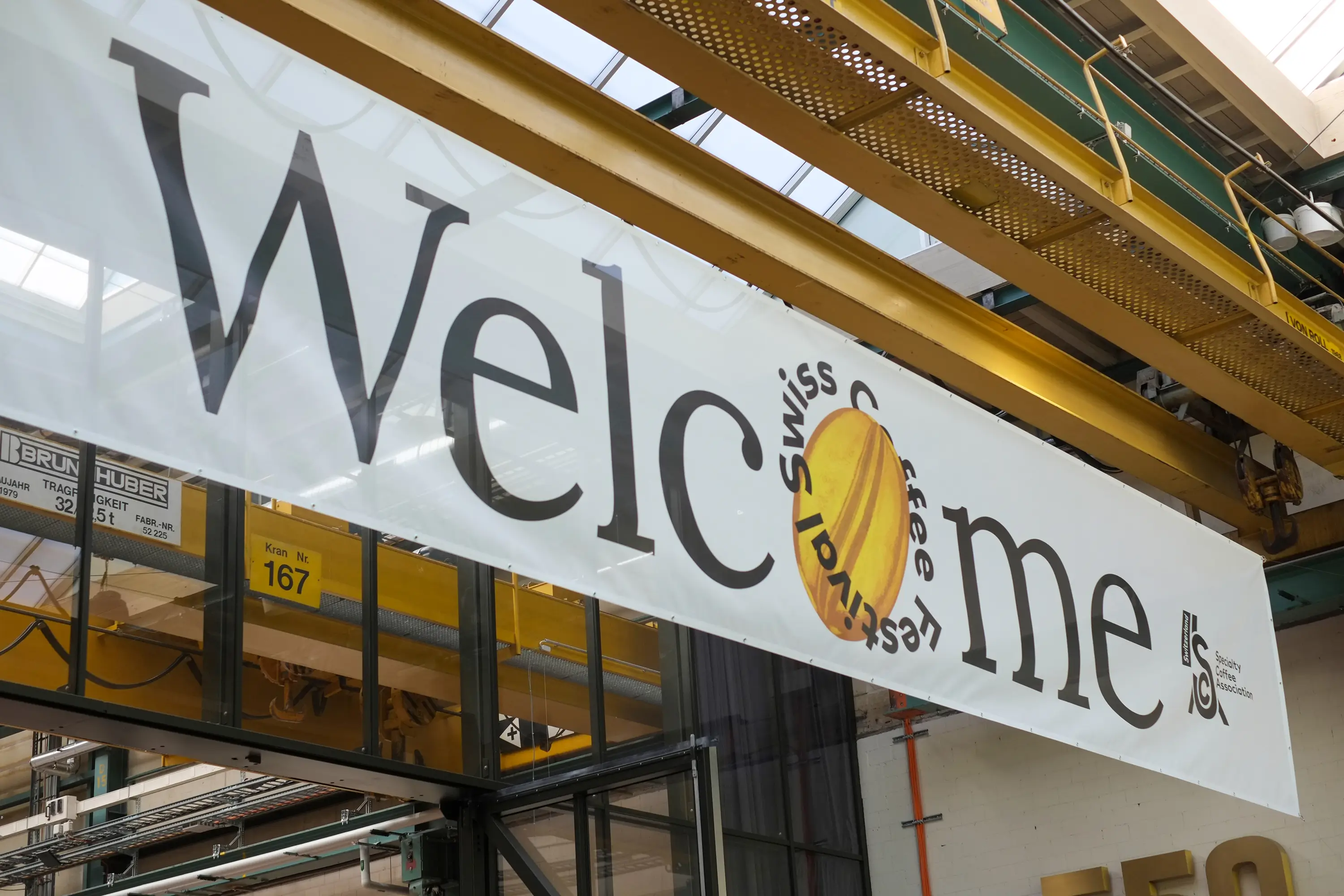
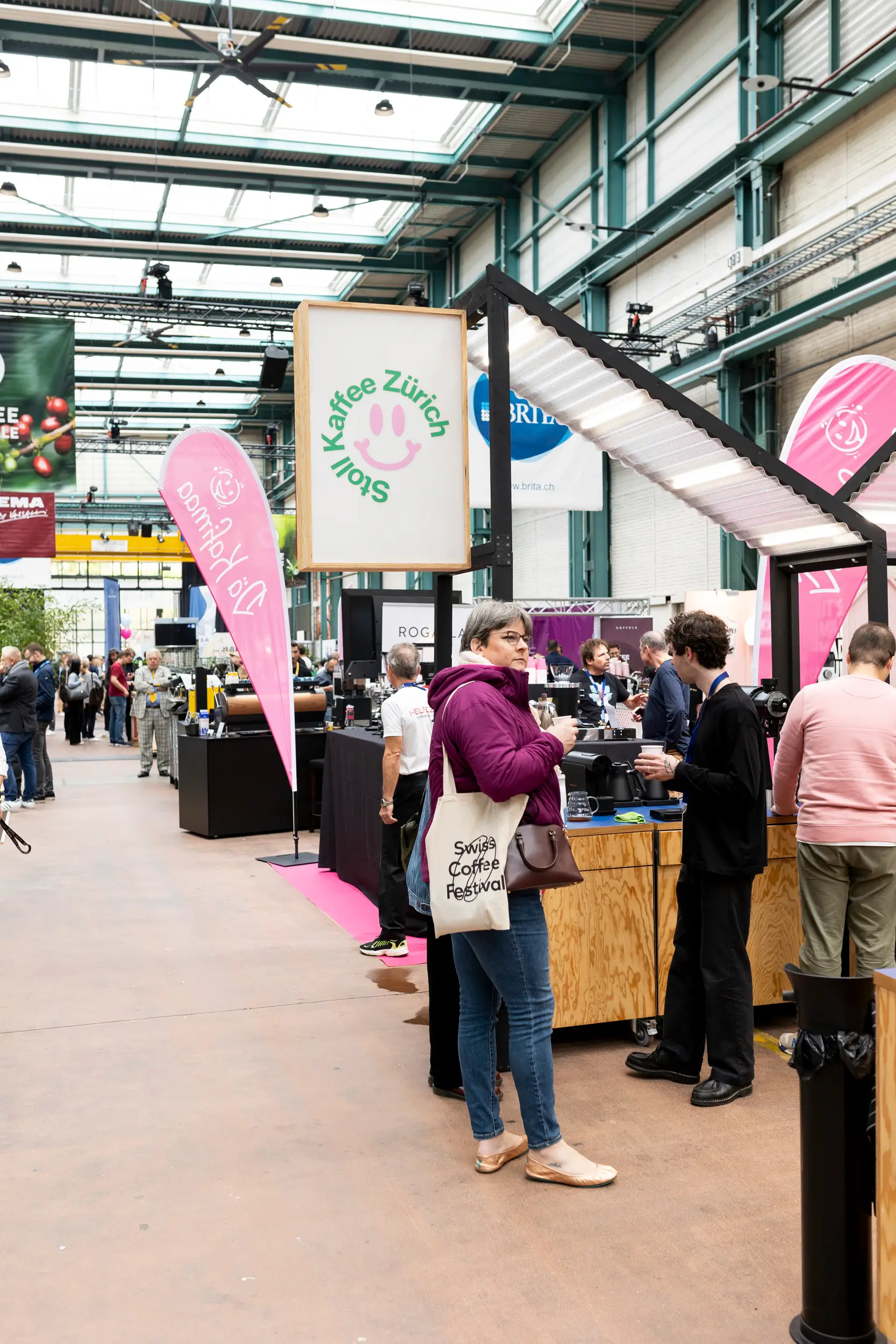
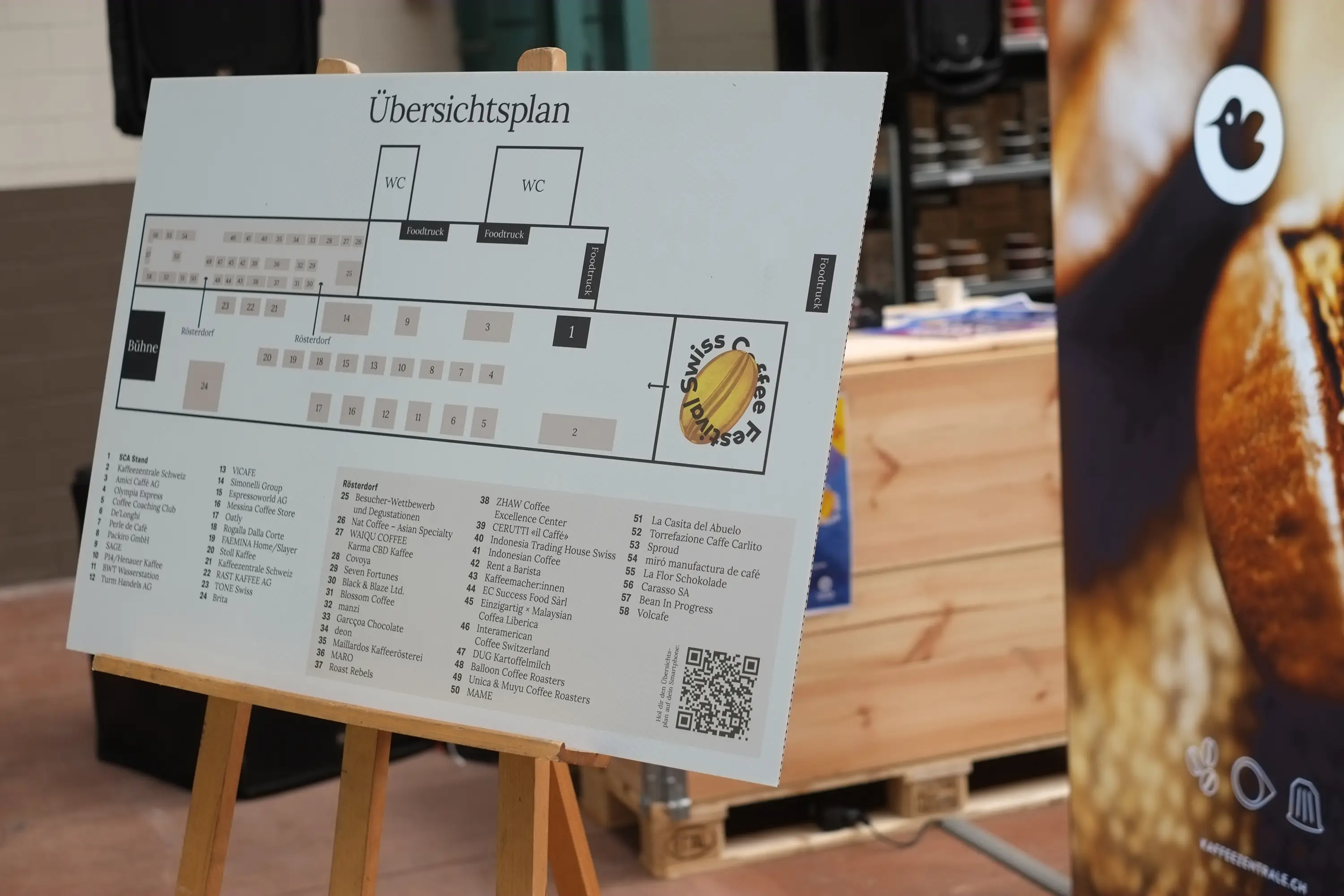
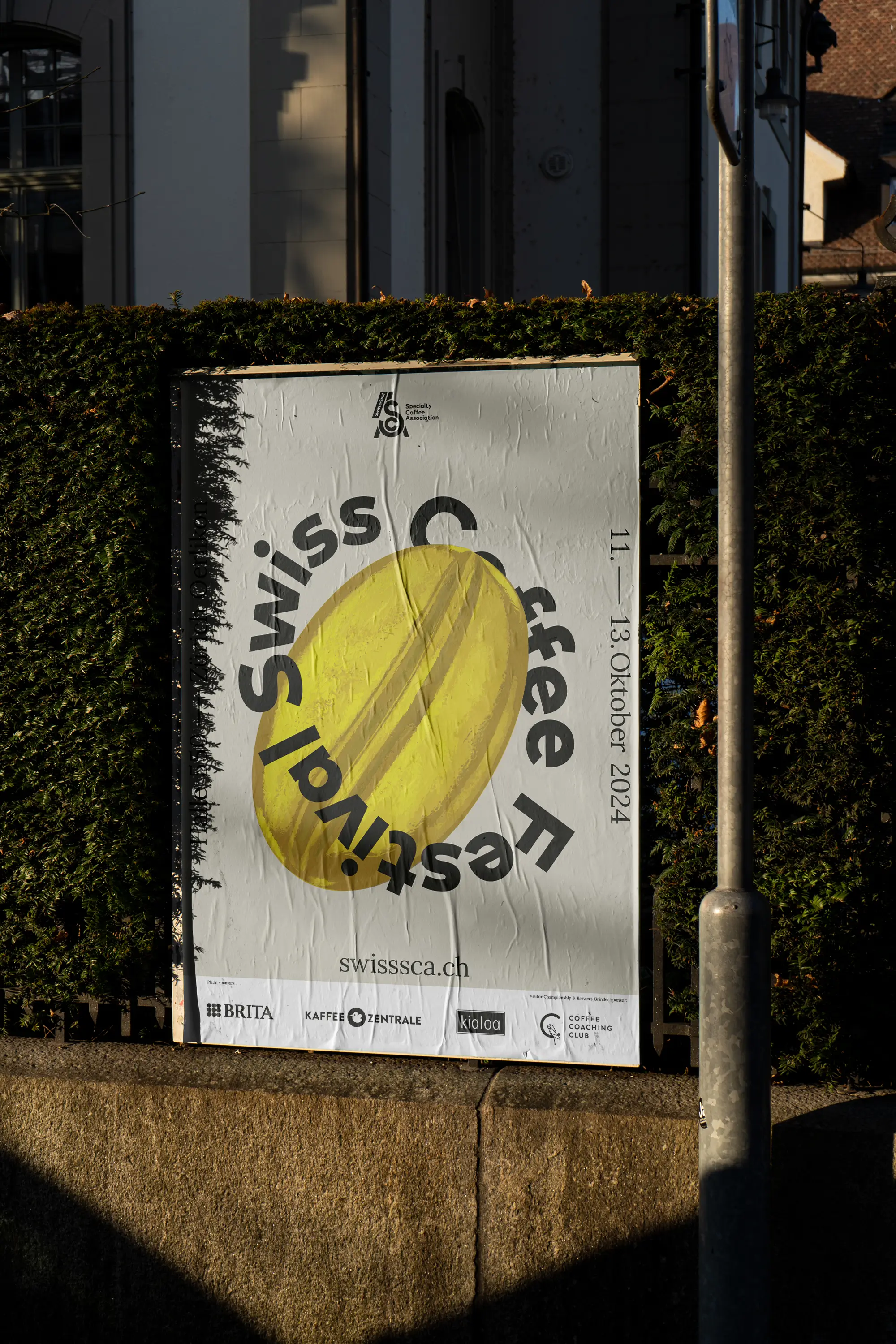
When an impressive hall in Zurich fills with coffee lovers and the air is filled with delightful aromas at every corner, you know it’s that time again: The Swiss Coffee Festival is captivating its visitors! The Swiss Coffee Festival is a three-day coffee fair organized by the Specialty Coffee Association in Zurich. It transforms Hall 550 in Oerlikon into a lively meeting point for coffee enthusiasts, producers, roasters, equipment manufacturers, and more. The vibrant exchange within the coffee community also invites attendees to follow the exciting Swiss Coffee Championships.
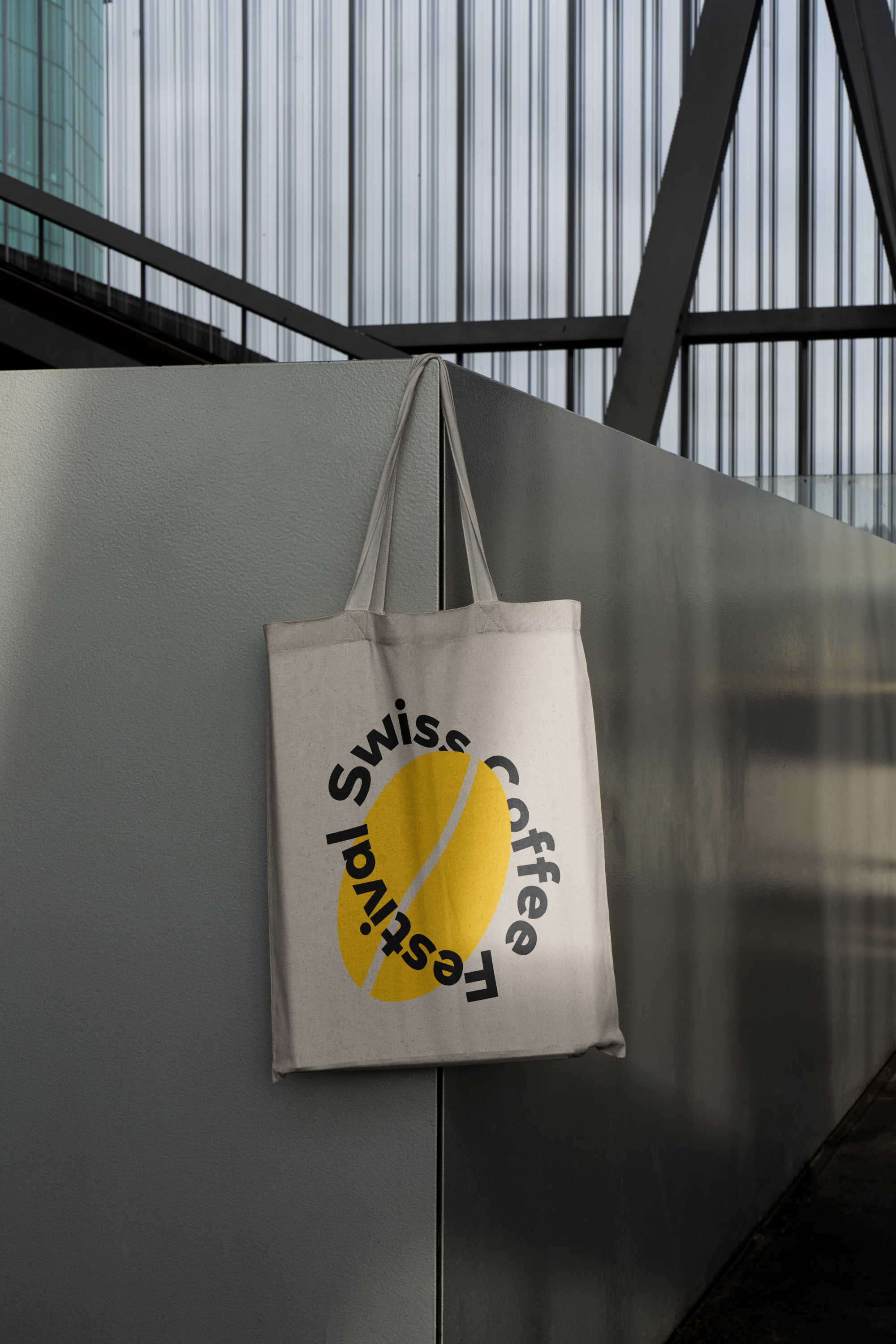
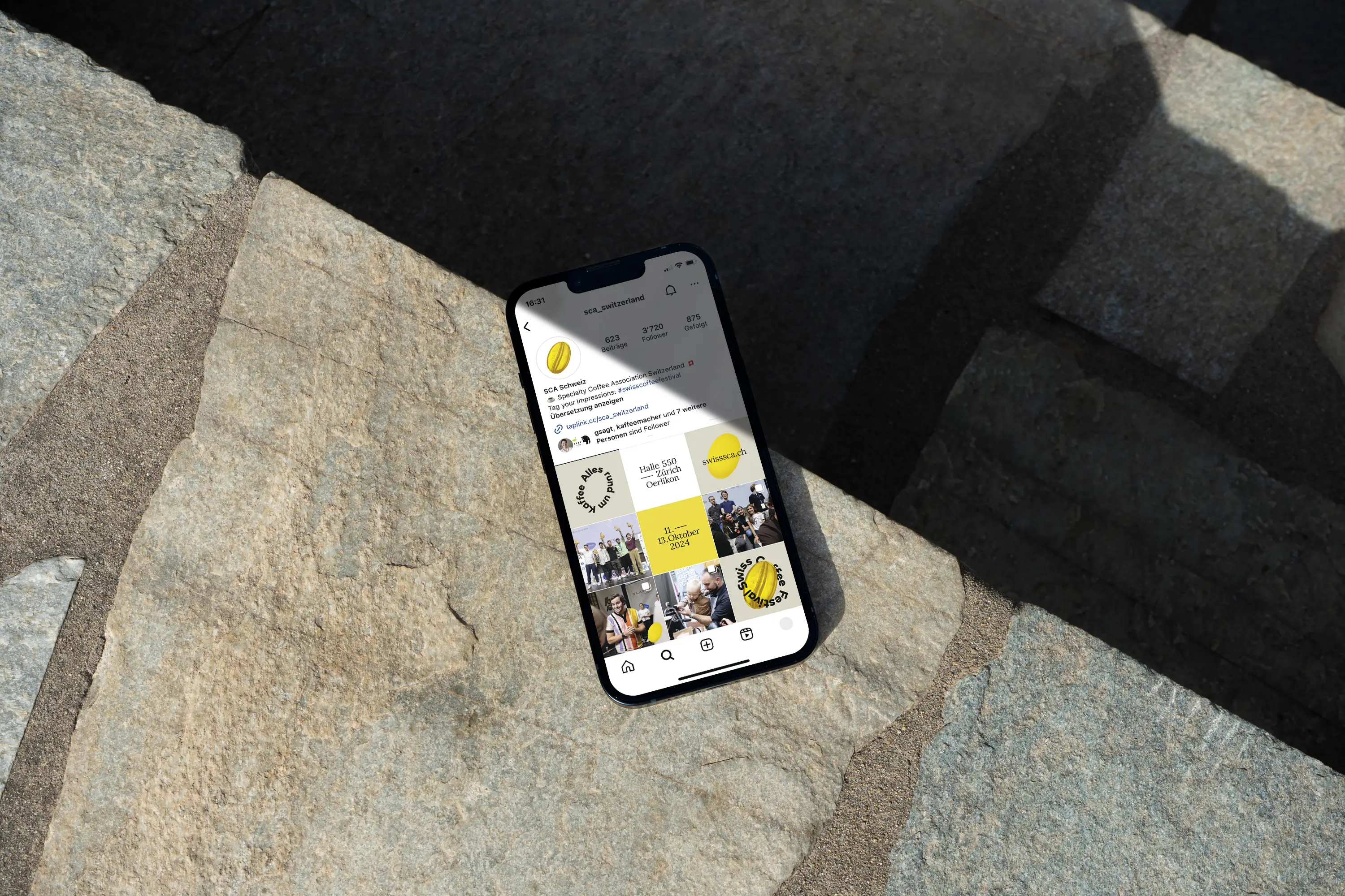
For the third time, I had the pleasure of supporting the festival team at sca switzerland with various visual measures for the festival. At the heart of the design is the essence of every great coffee: the bean. Year after year, the team and I have worked to make the festival’s communication more sustainable and reusable. For instance, with the expertise of our partner Aroma Schweiz, we created great alternatives and solutions for banners and roll-ups that can be used in the coming years or recycled.
60 volunteers pour their heart and soul into the event every year, ensuring a smooth and passionate festival experience. Everything about coffee—and so many fascinating people—at the Swiss Coffee Festival!
Exhibition Measures and Trade Fair Planning: Aroma Schweiz
Printed Products: Wir machen Druck





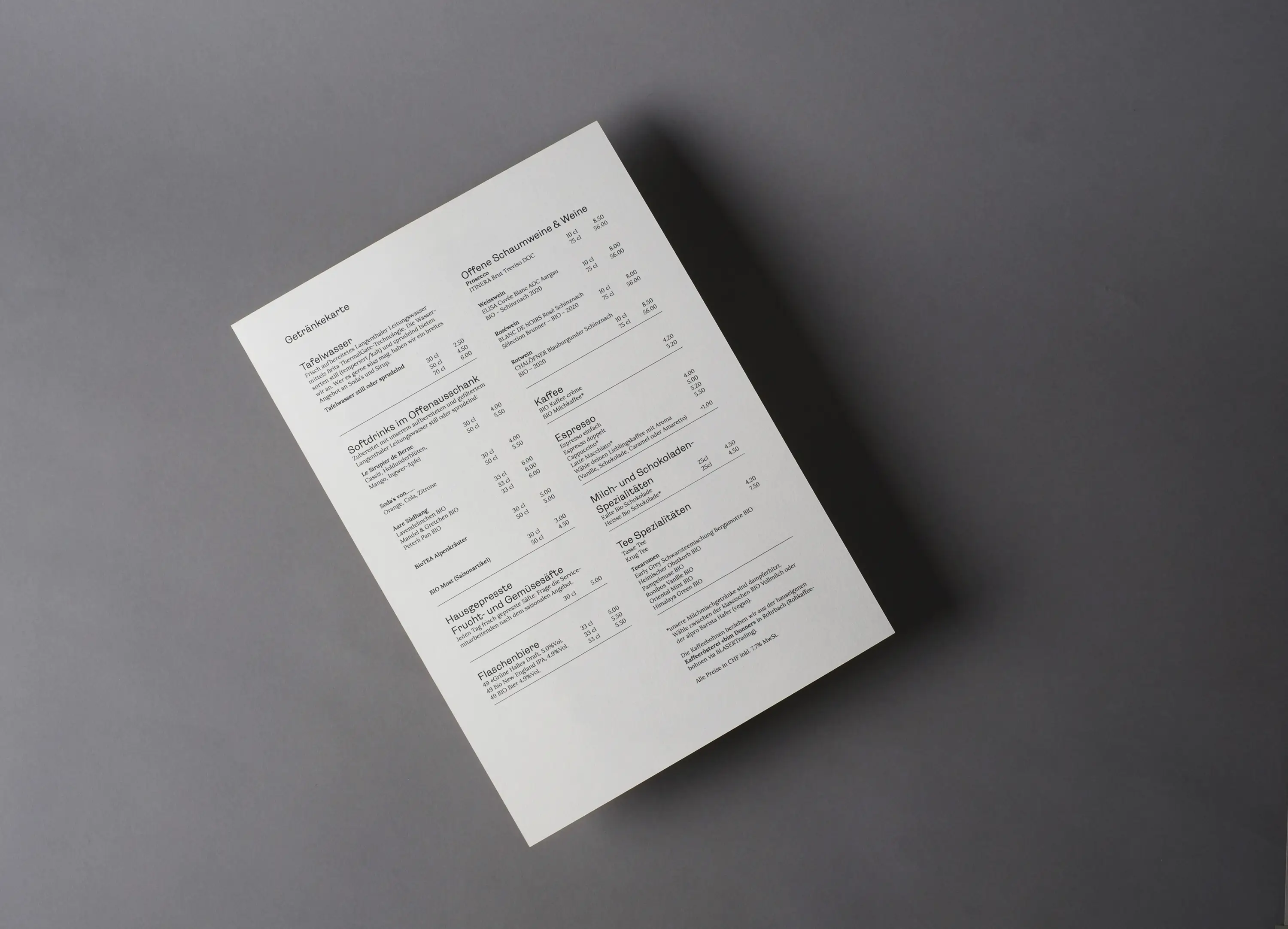
Heart and Passion in Langenthal
Meaningful Culinary Delight
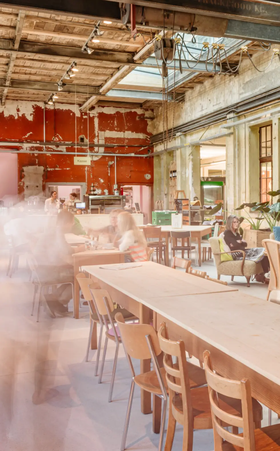
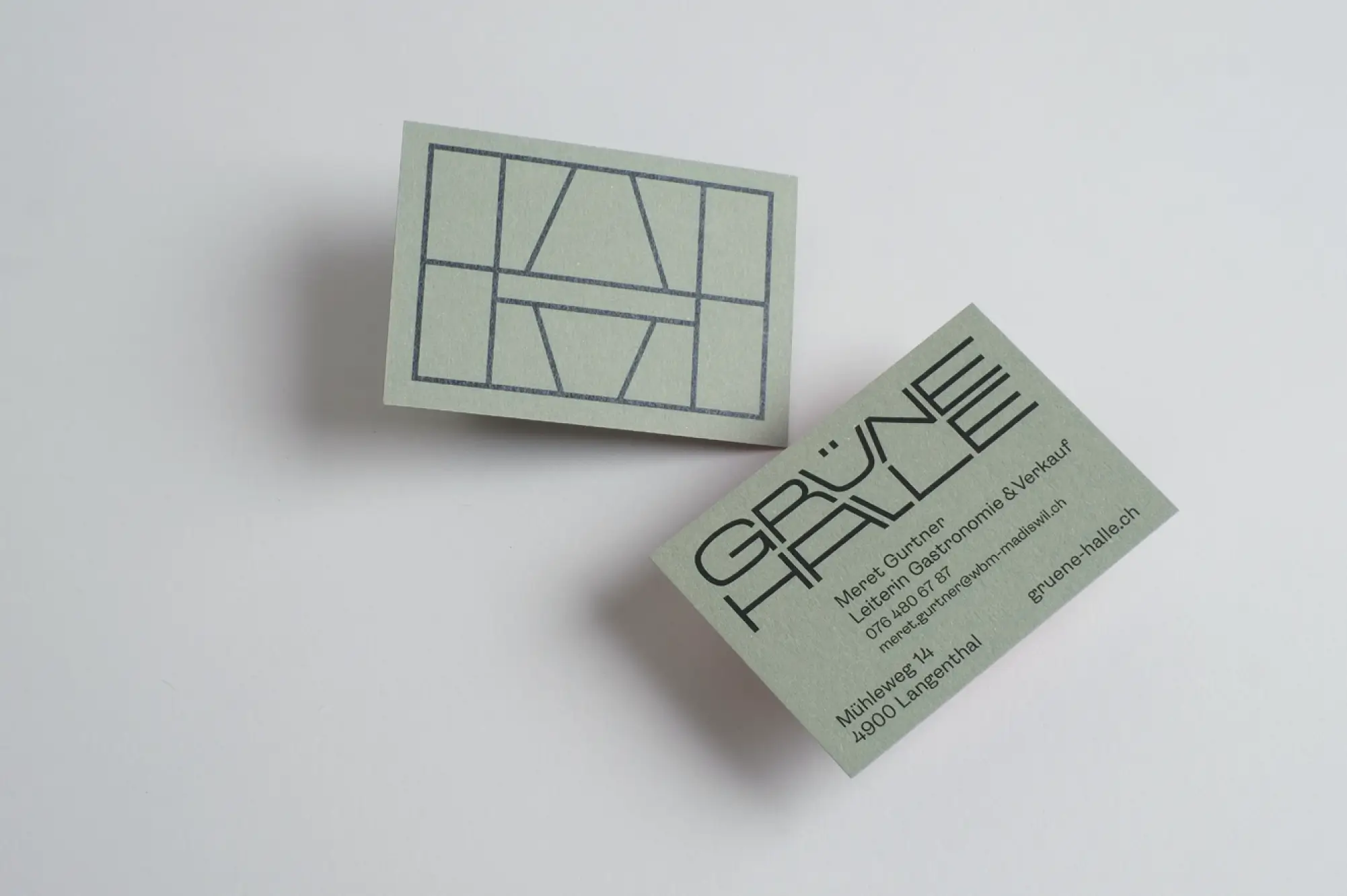
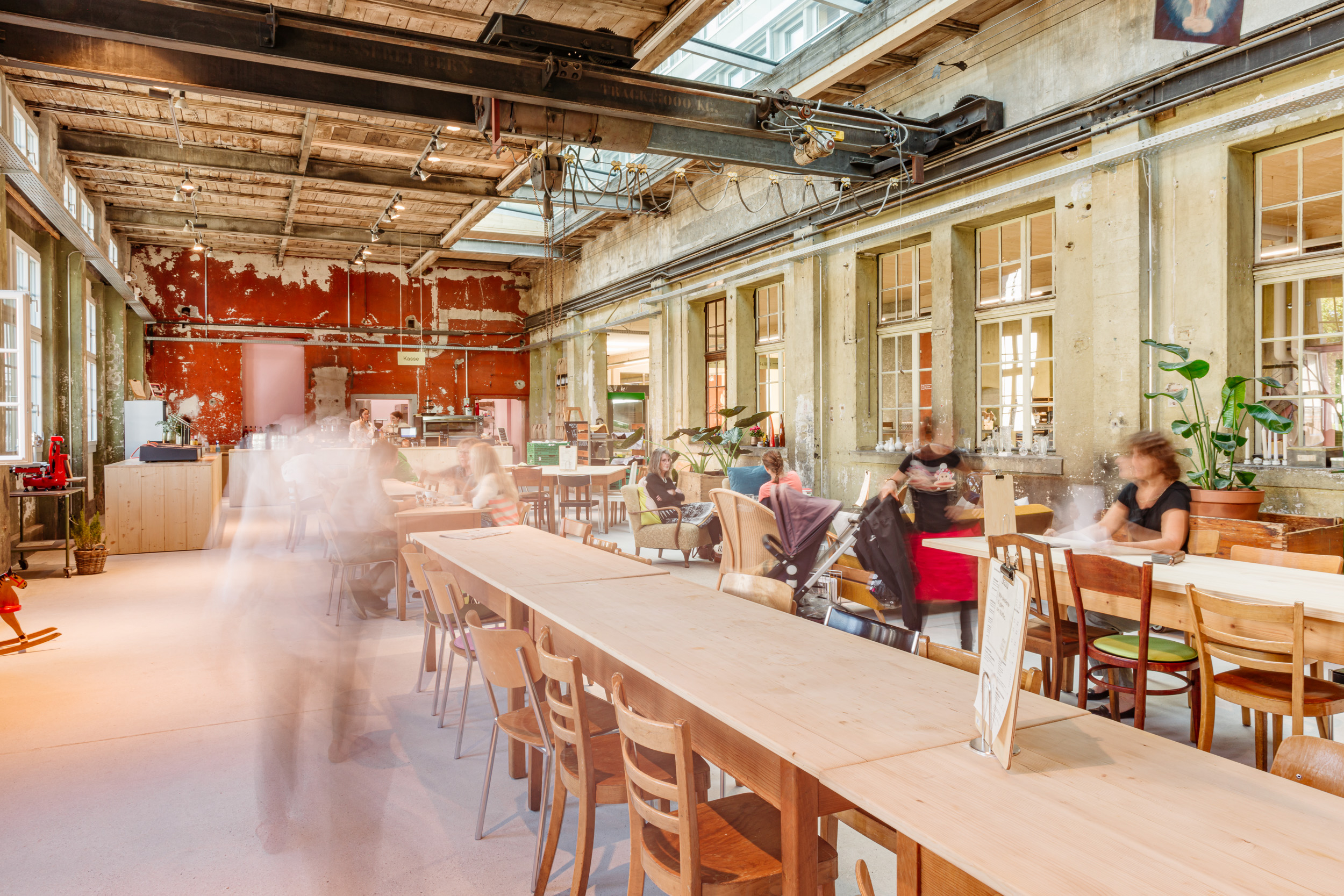
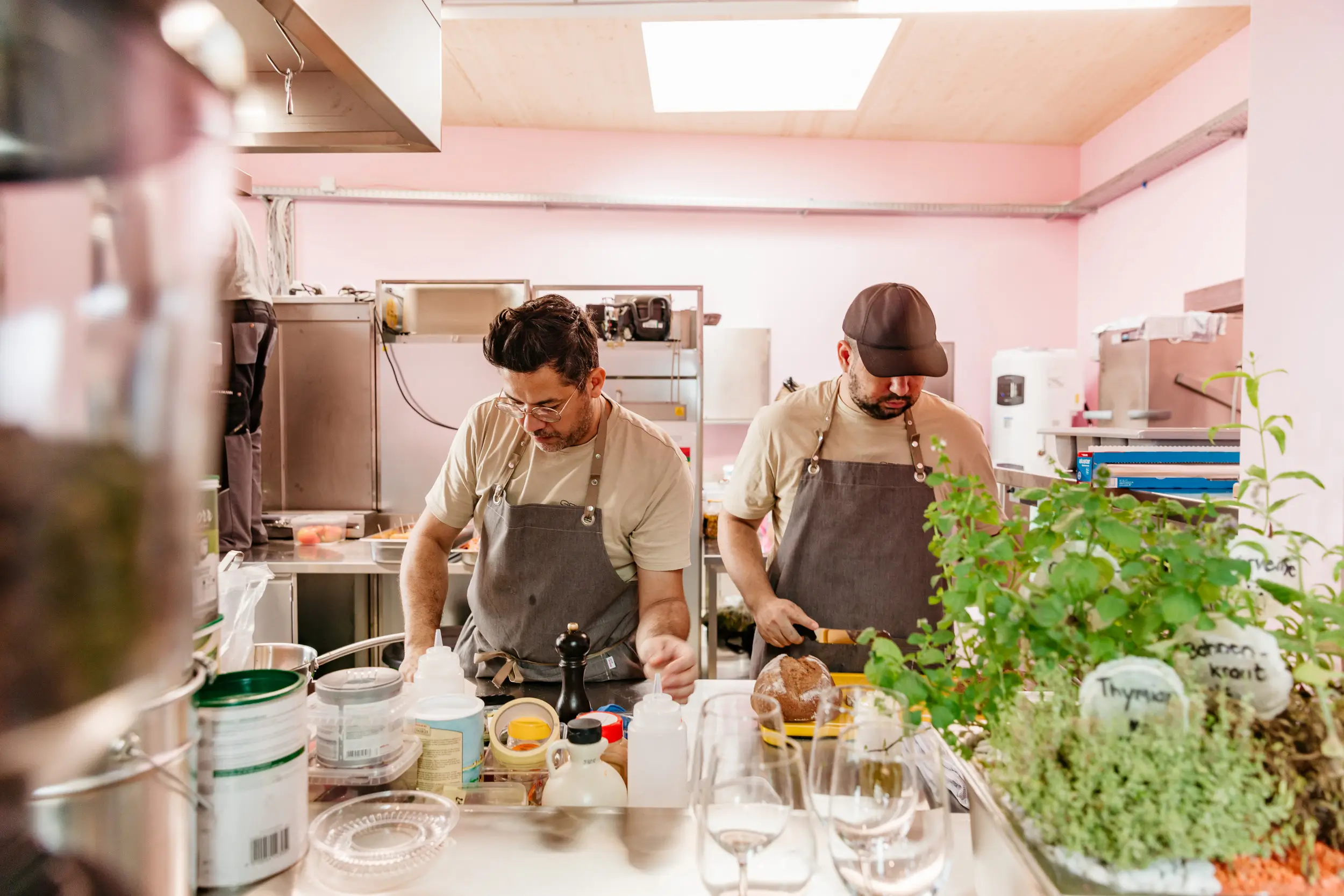
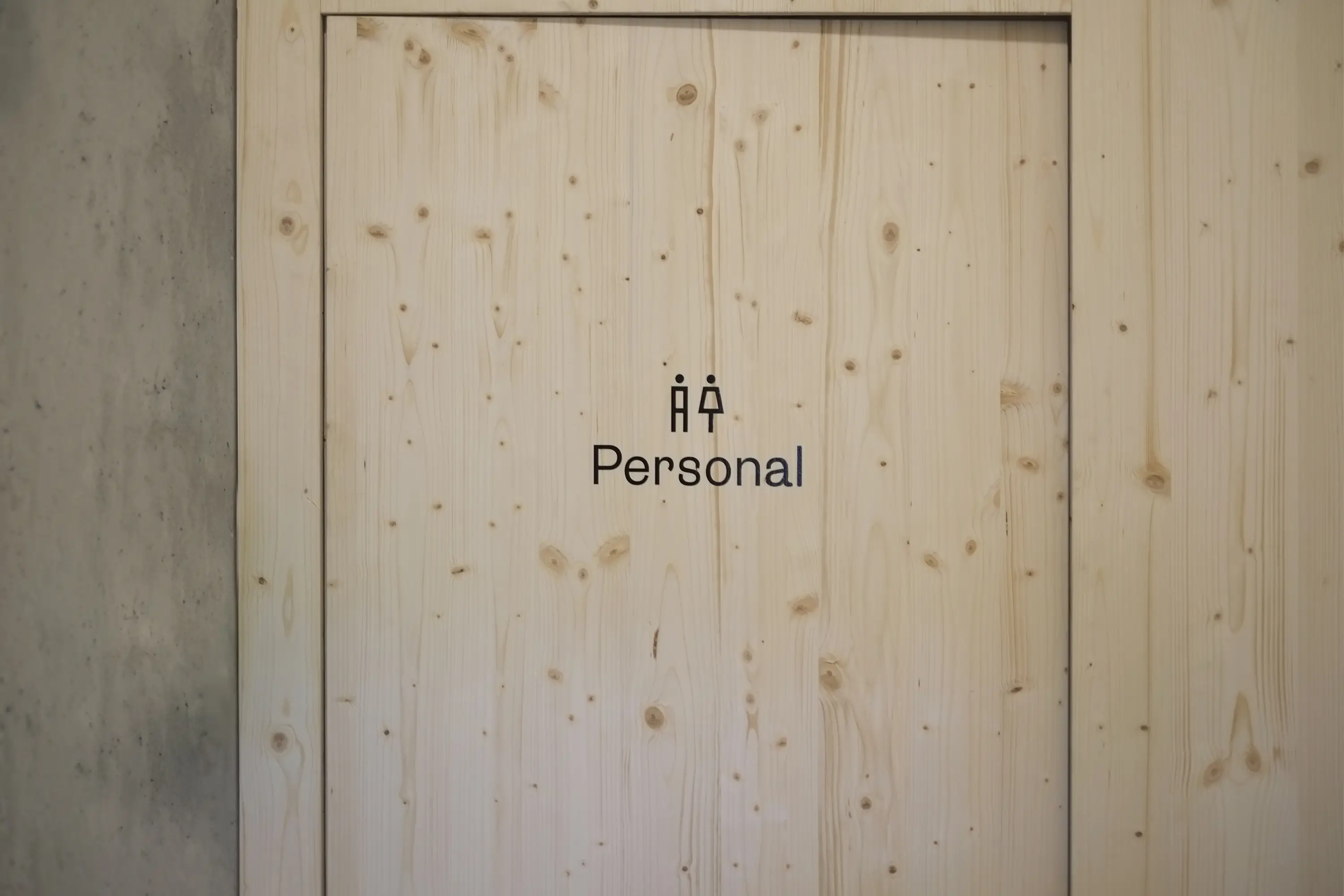
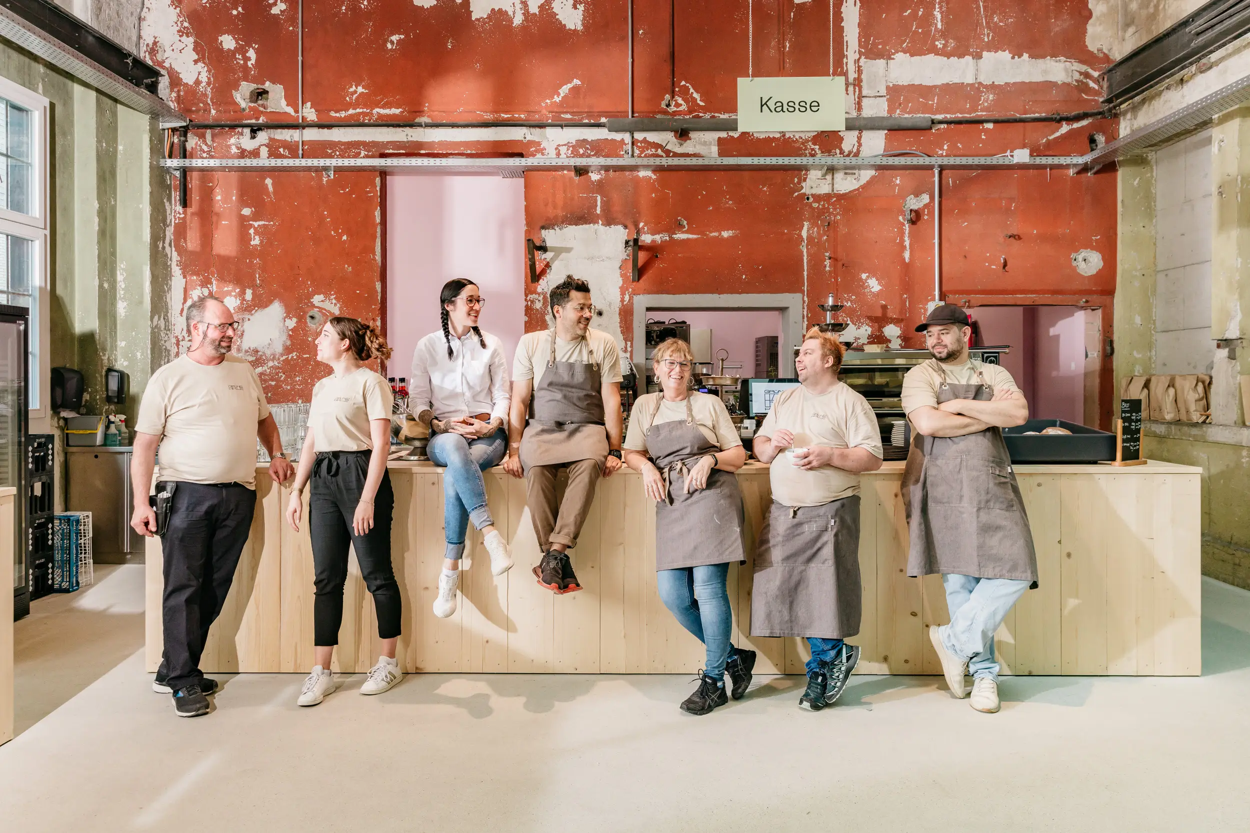
In the old Ruckstuhl Hall in Langenthal, the WBM Madiswil Foundation created an exciting place of well-being with a fantastic restaurant (led by Vagner Aguiar) and handcrafted products made by people with support needs in the foundation’s studio. Meaningful work with visible processes, encounters, and high-quality products—that’s what the Grüne Halle stands for. It’s a natural meeting point for people with and without disabilities, bringing them together effortlessly in society.
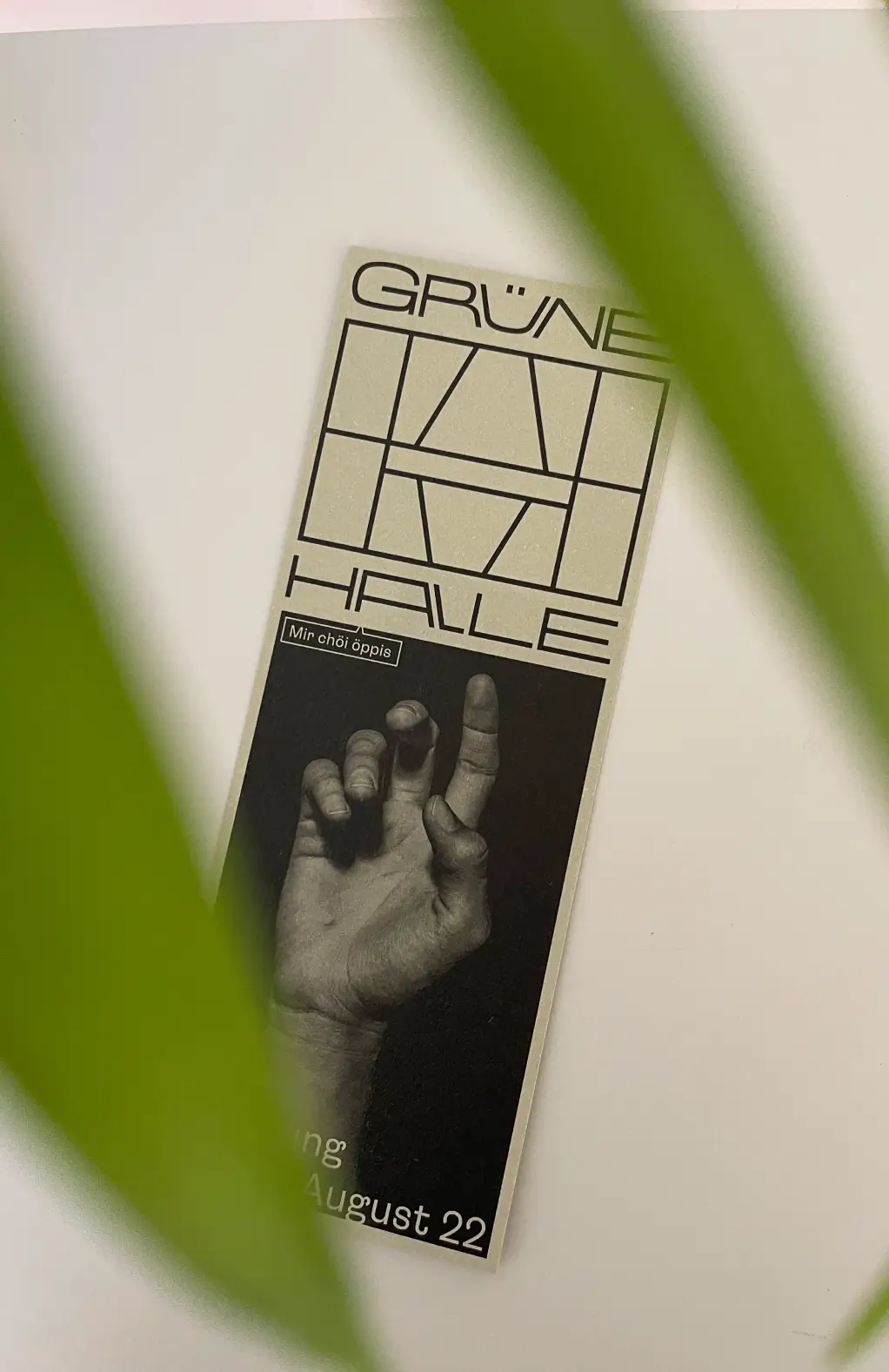
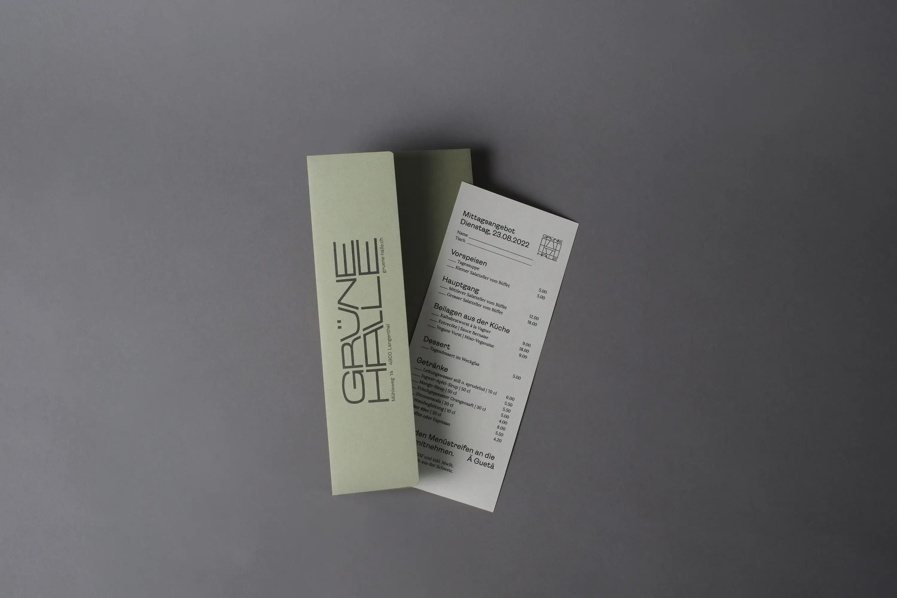
For the visual identity, I had the privilege of developing a distinctive and striking look that carries the charm of the hall and its interior outward, welcoming guests and participants in a tangible, confident, and open way. The typical exposed beams of the outer facade became the hallmark of the Grüne Halle. The beauty of uniqueness is expressed and lived through the flexible and free wordmark. Paired with the peeling colors on the old hall walls, the identity of the Grüne Halle was completed. This constructed visual mark also serves as the foundation for the design grid and ties back to the industrial history of the Grüne Halle.
Since the beginning of 2024, Emmenpark AG has been running the Grüne Halle, but the visual identity continues to thrive under their leadership.
Printed Products: Merkur Druck, Langenthal
Implementation of Signage: Xseh, Langenthal
Font: Lora by Googlefont
Paper: Materica Limestone, Verdigris, Terra Rossa & Clay
Ruben Ung, Bern

Yoga – Ayurveda – Retreats
Flowing with Franziska
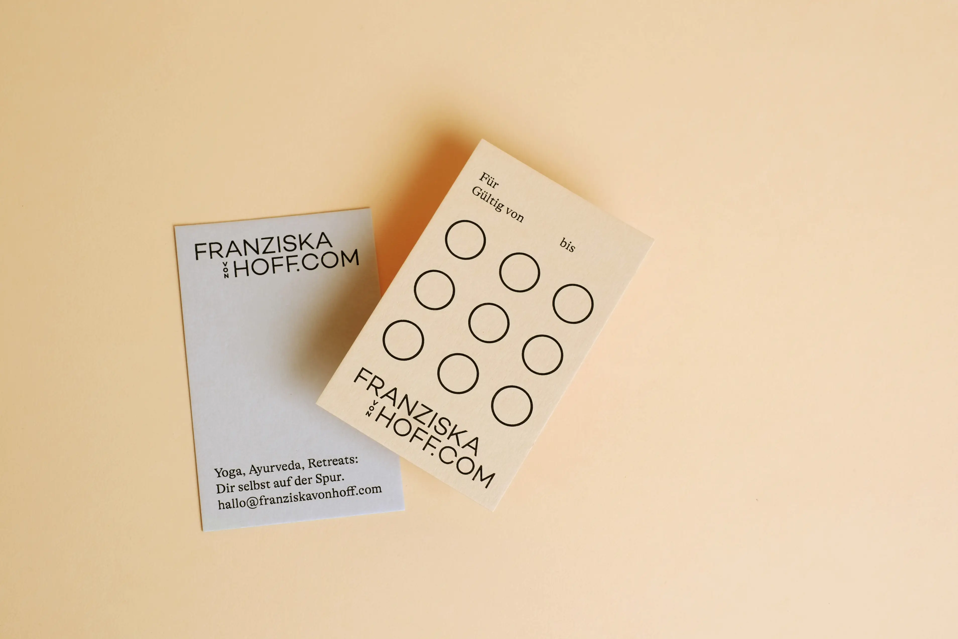
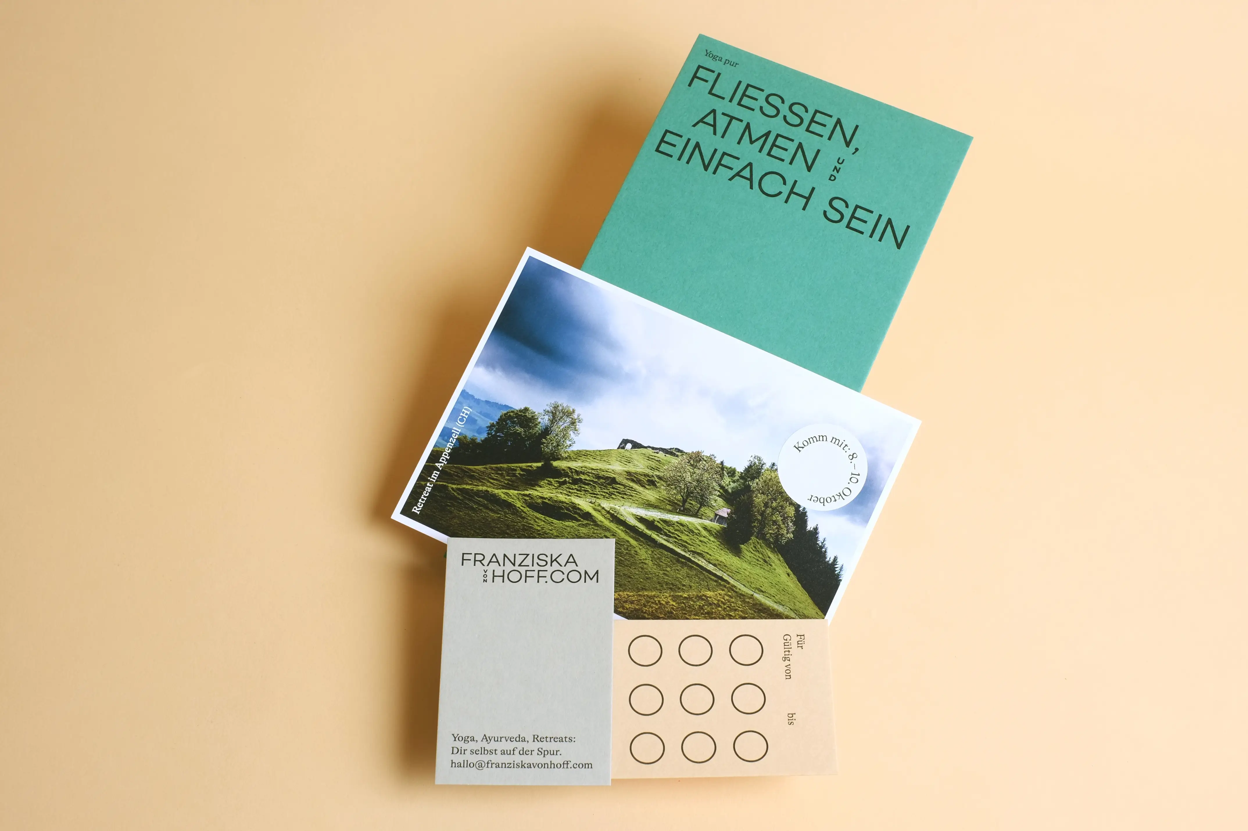
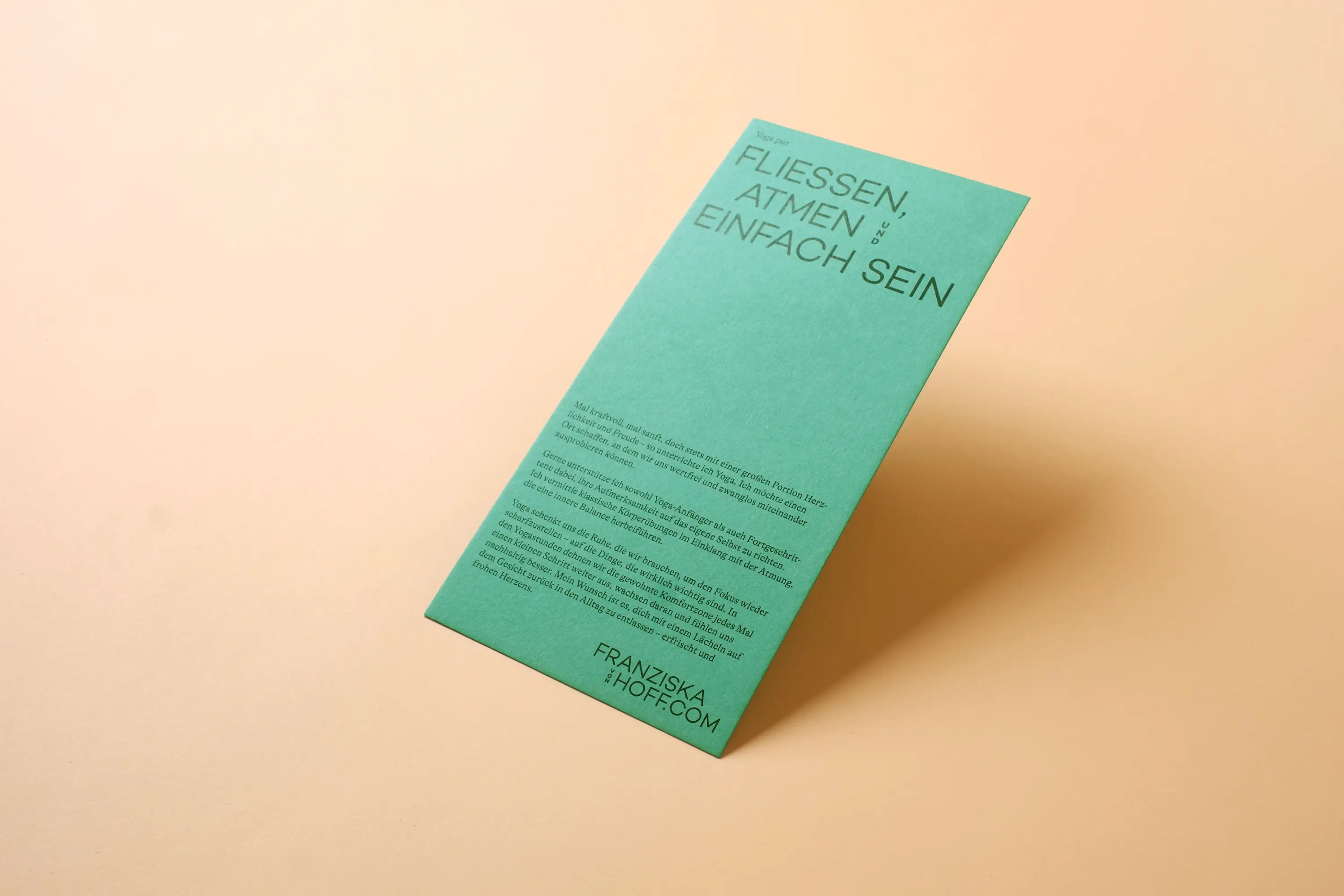
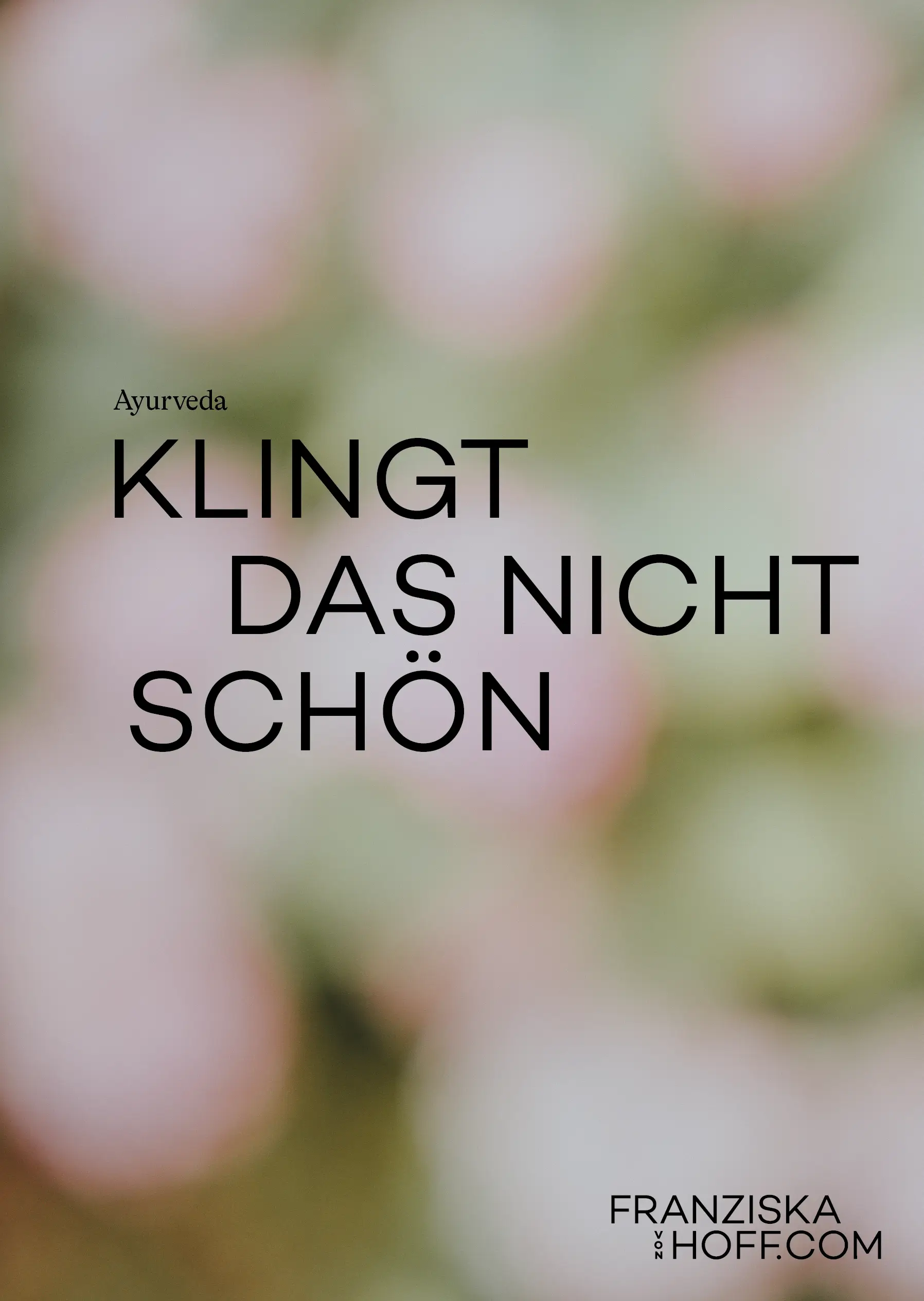
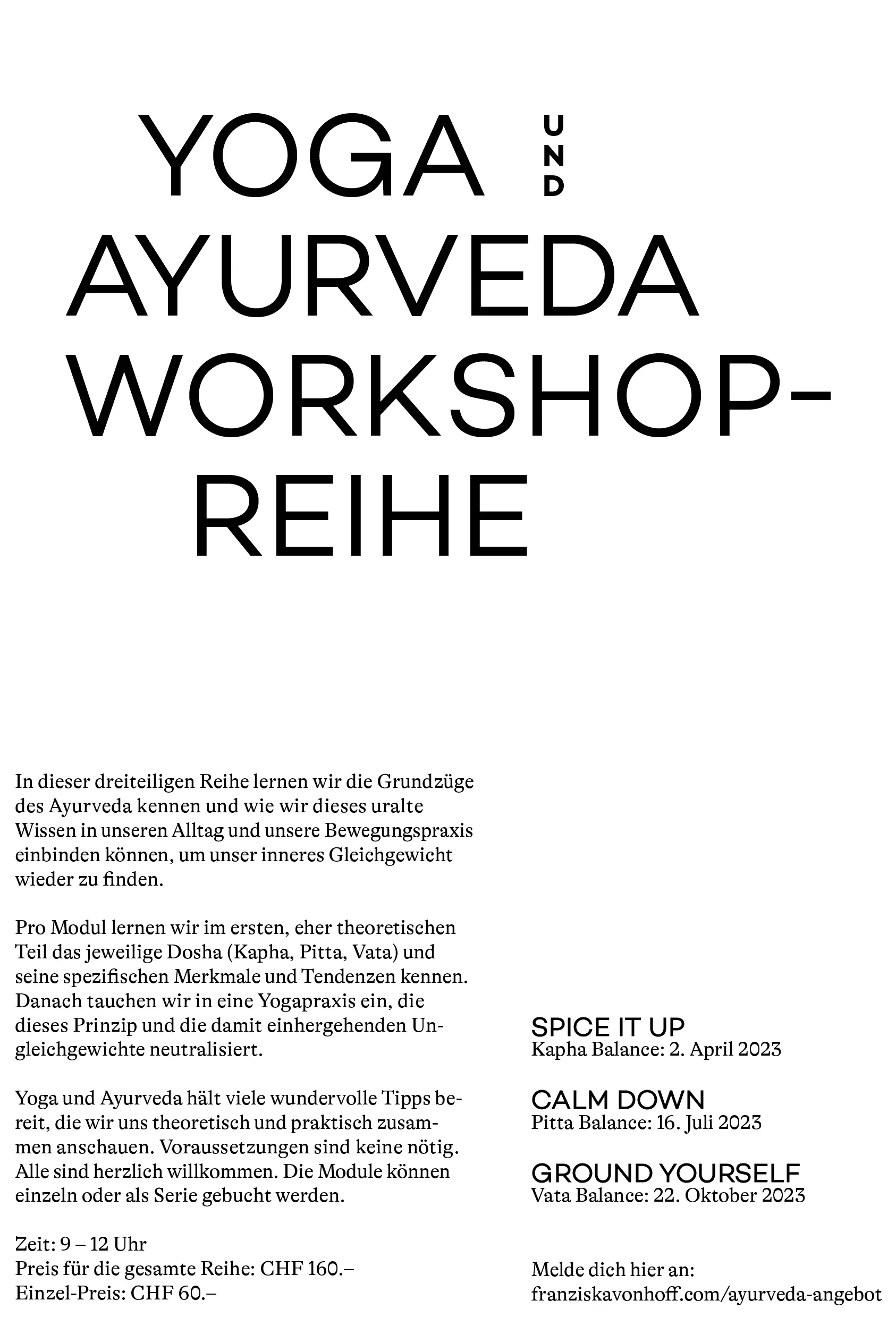
Powerful at times, gentle at others, yet always full of warmth and joy—that’s Franziska von Hoff: When eyes and ideas sparkle, you can be sure that Franziska is at the table. With her aesthetically vibrant energy, the tidy, enduring, and clear identity for her feel-good spaces was created. She offers her expertise and knowledge in the fields of yoga, Ayurveda, health, and well-being.
A unified identity for her diverse offerings was needed. Flexible and adaptable—from the online yoga class to the retreat in Marrakech or the Appenzellerland, to a growing shop in the background. To give each area its own space, we created a set of essential communication materials: an information flyer on yoga, a rotating postcard series for retreat invitations, a yoga stamp card, and the classic business card, putting together a joyful communication package.
The stamp card is filled with motivating phrases for each yoga session:
Supergut, WellDone, WeiterSo…
and many more, sparking curiosity in participants and getting them back on the mat even faster.
Business Stationery: Druckerei Brunner, Wohlen (BE)
Post Cards: Printzessin, Belp
Fonts: Work Sans von Google Fonts und GT Alpina von Grilli Type
Papers: Colorplan von Künzli


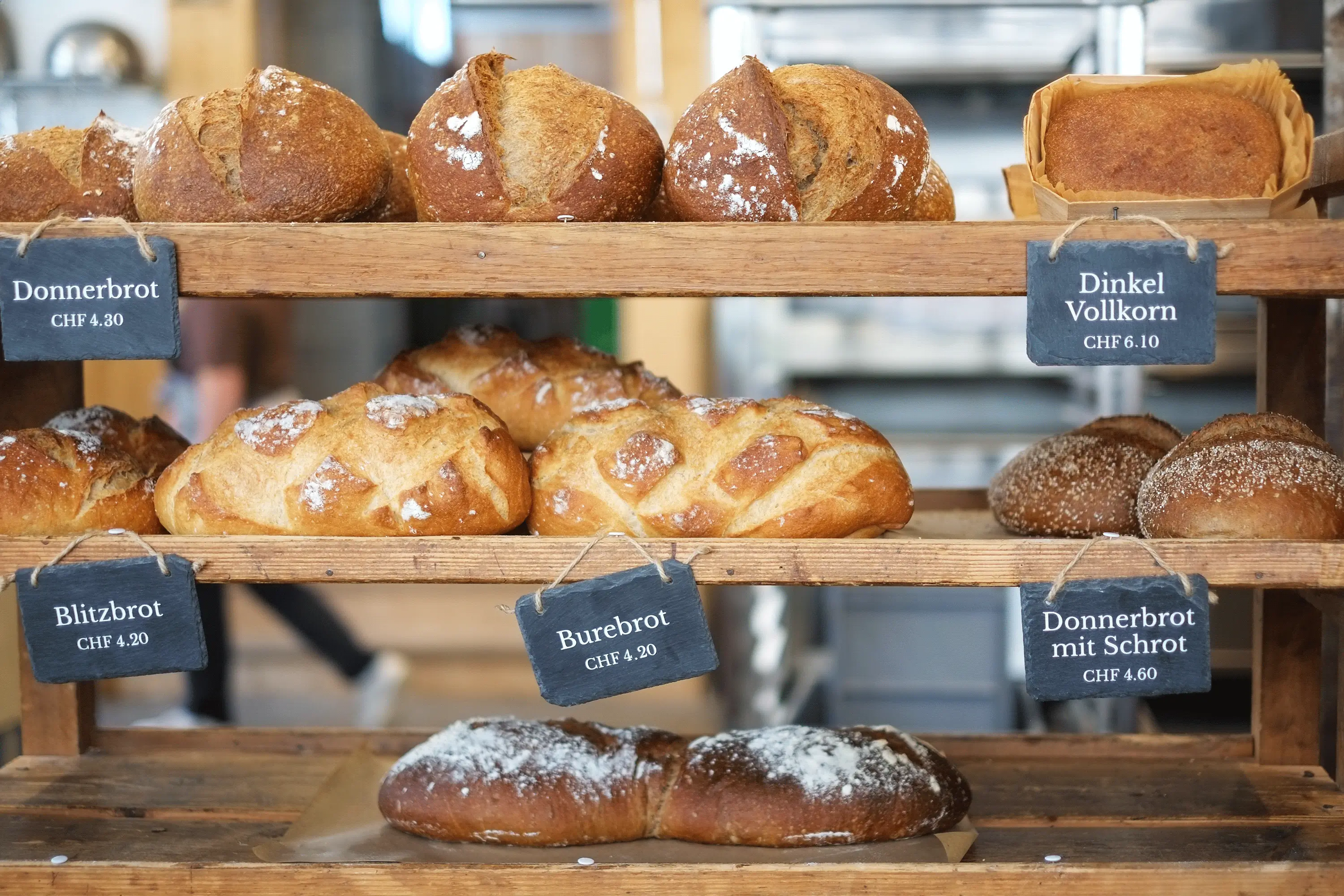
A project of the WBM Foundation
Organic Bakery & Roastery Bim Donner
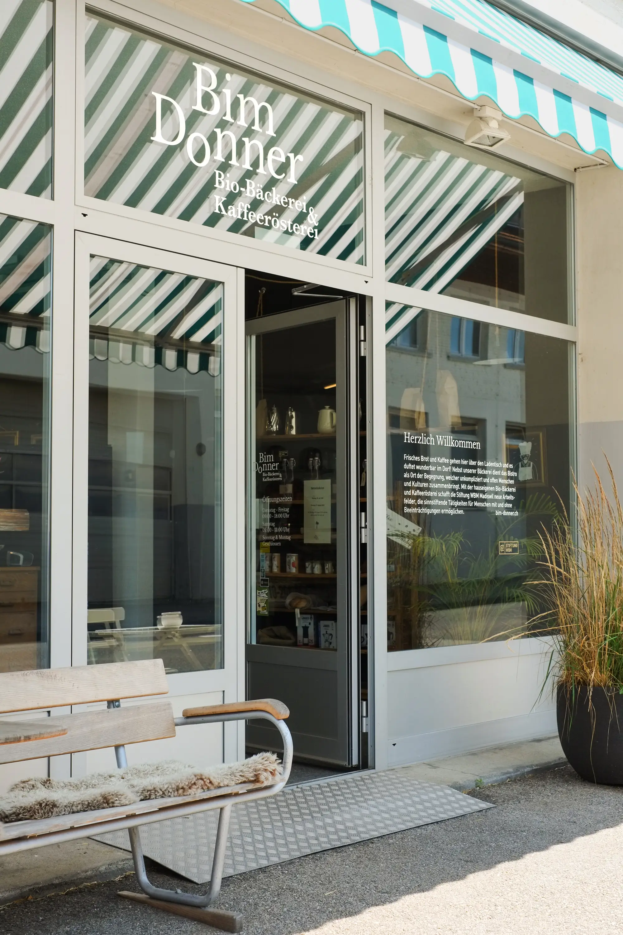
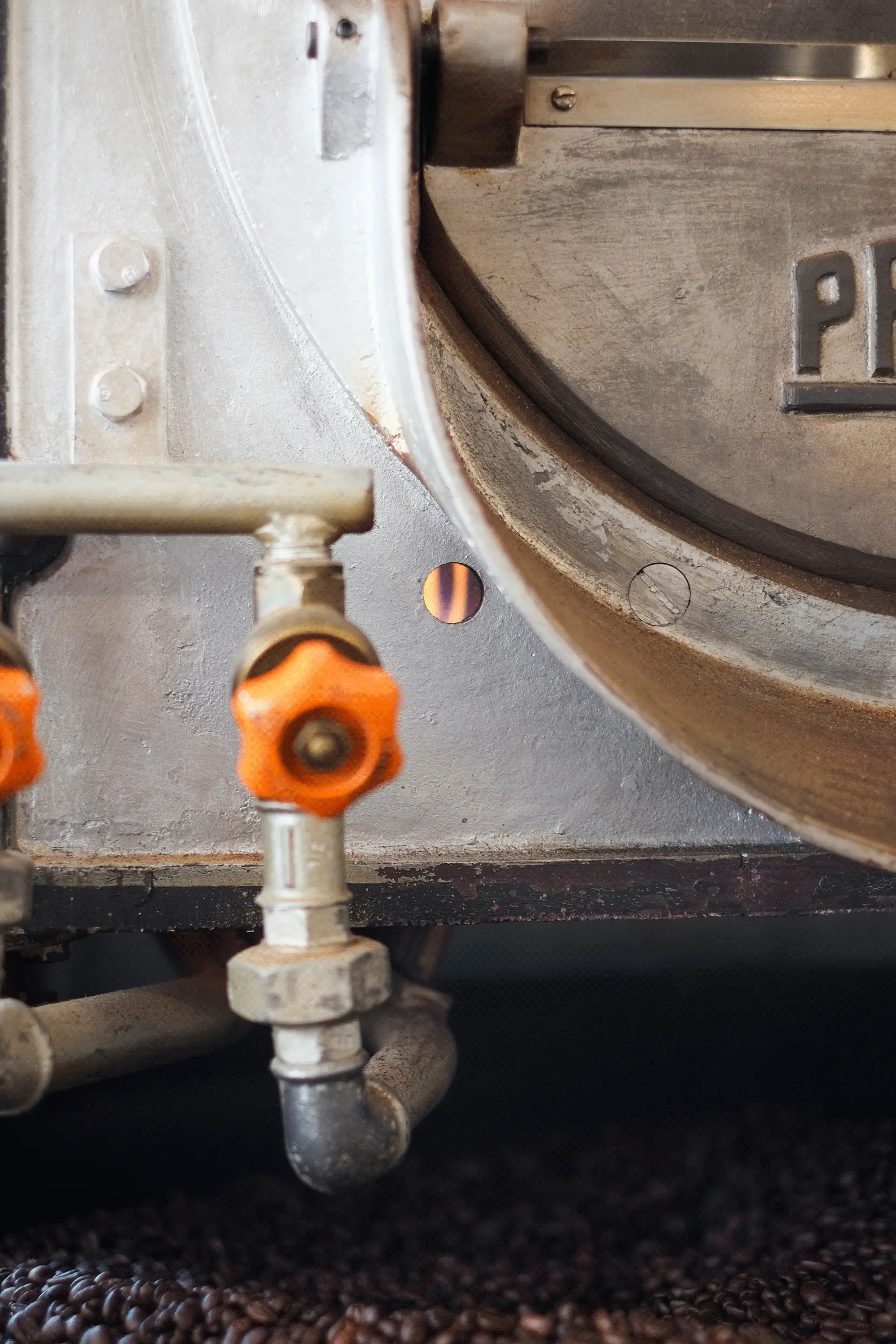
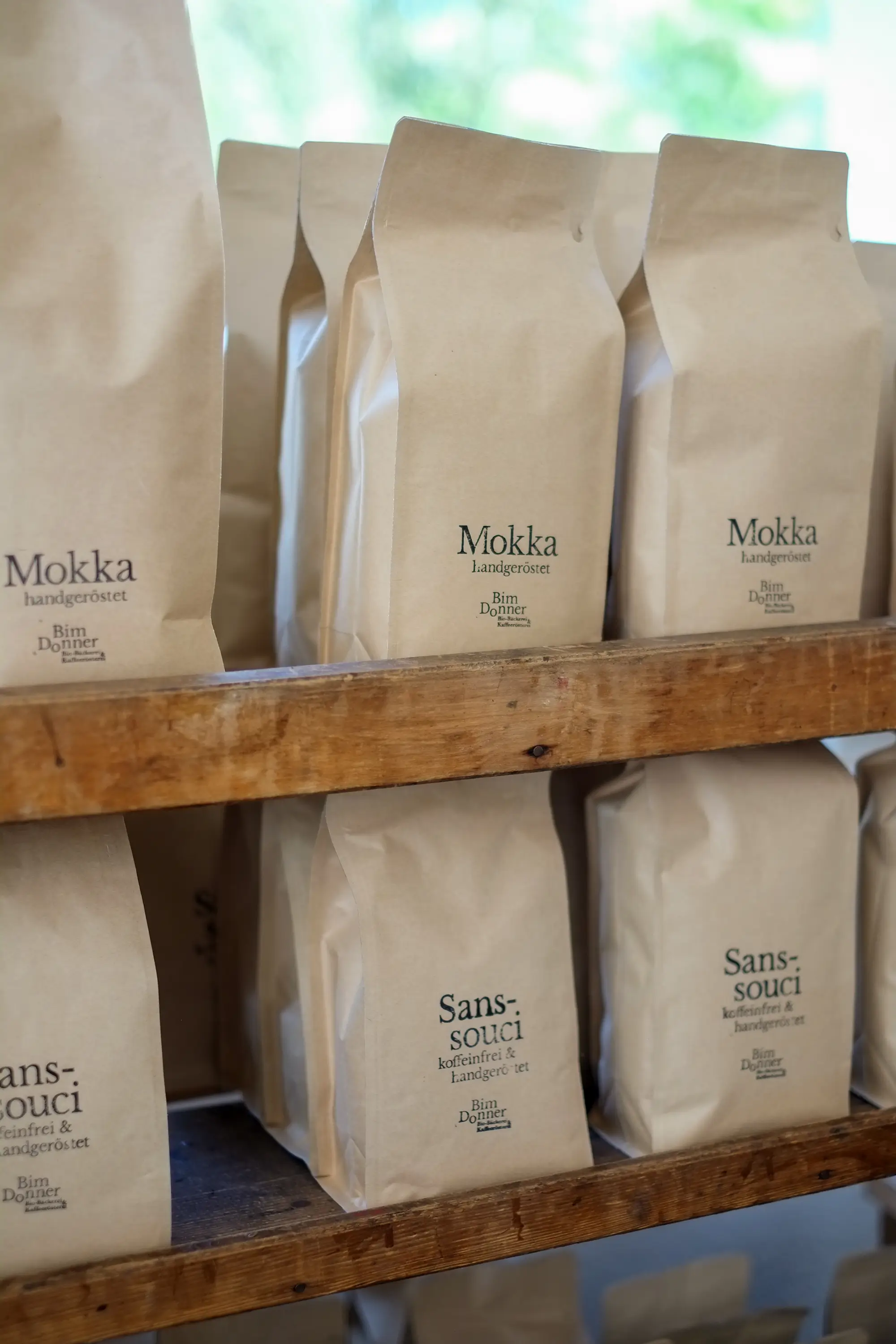
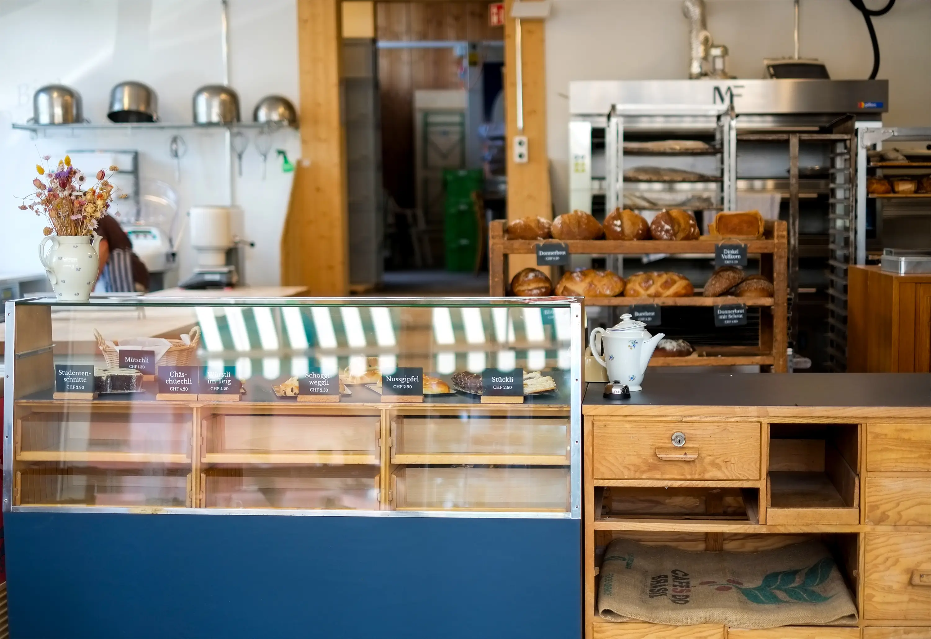
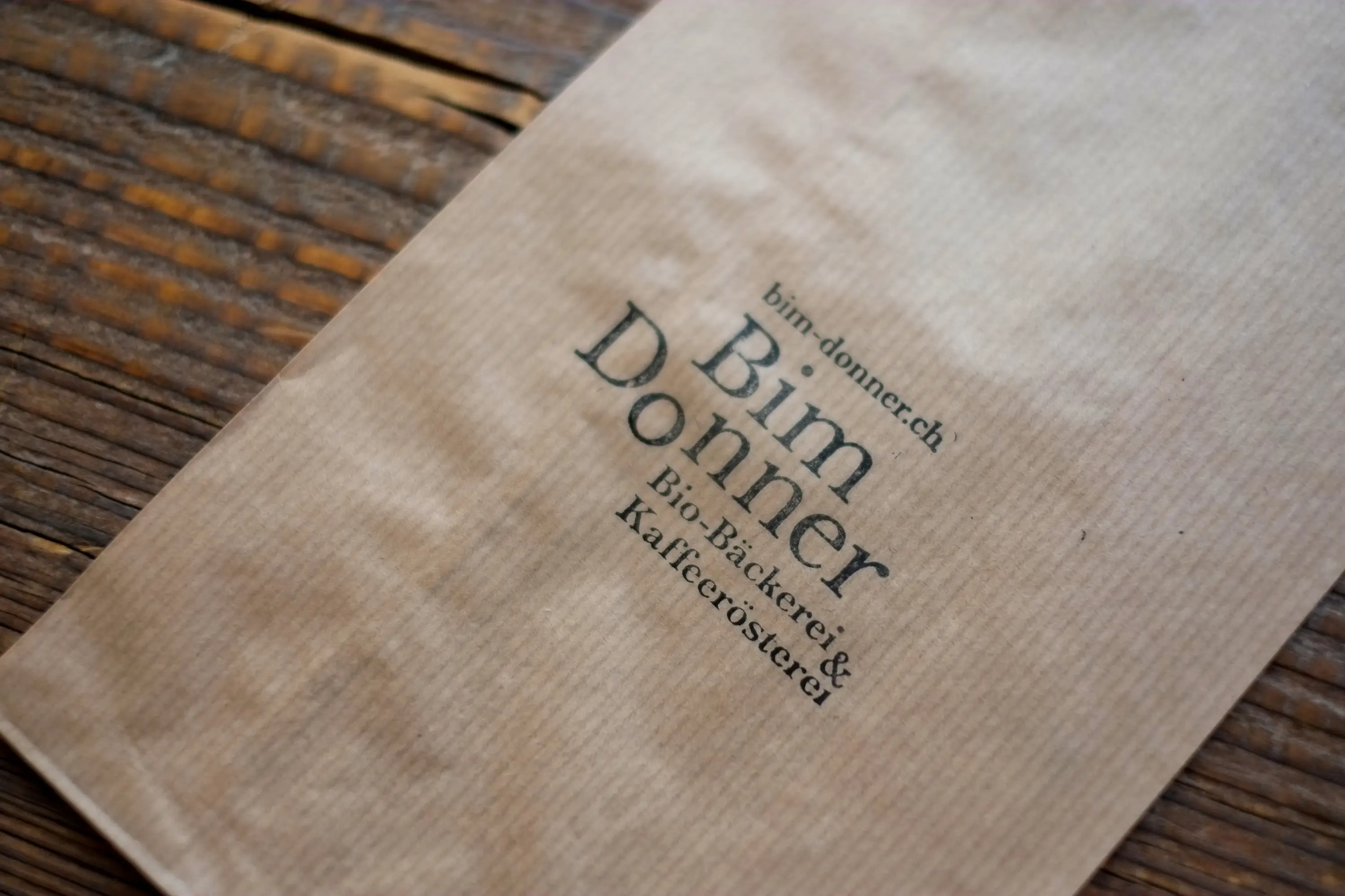
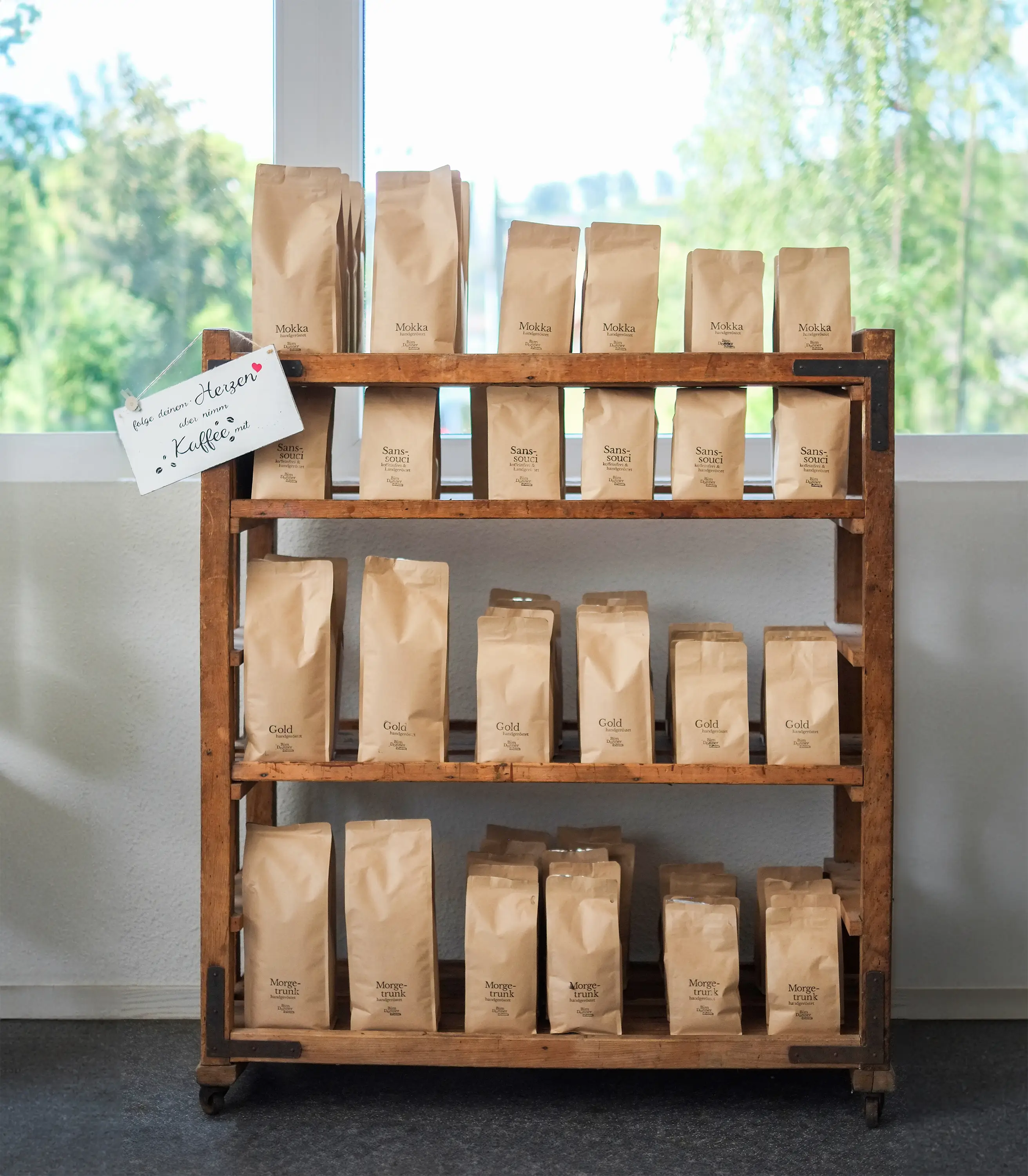
What’s better than the smell of freshly baked bread and roasted coffee? My answer: Being able to implement a complete redesign for a company that dedicates itself to this passion with full heart. From the logo to the signage, coffee packaging, and vehicle lettering.
Bim Donner is a project of the WBM Foundation in Madiswil, not only ensuring a delicious aroma in Rohrbach but also providing work integration for people with and without disabilities.
A professional, warm, and open identity was designed and created together with the team from the WBM Foundation. Many measures were developed so that the staff at Bim Donner could quickly and independently engage with the branding. Organic quality with heart—that’s what you’ll find in Rohrbach with the friendly Bim Donner team.

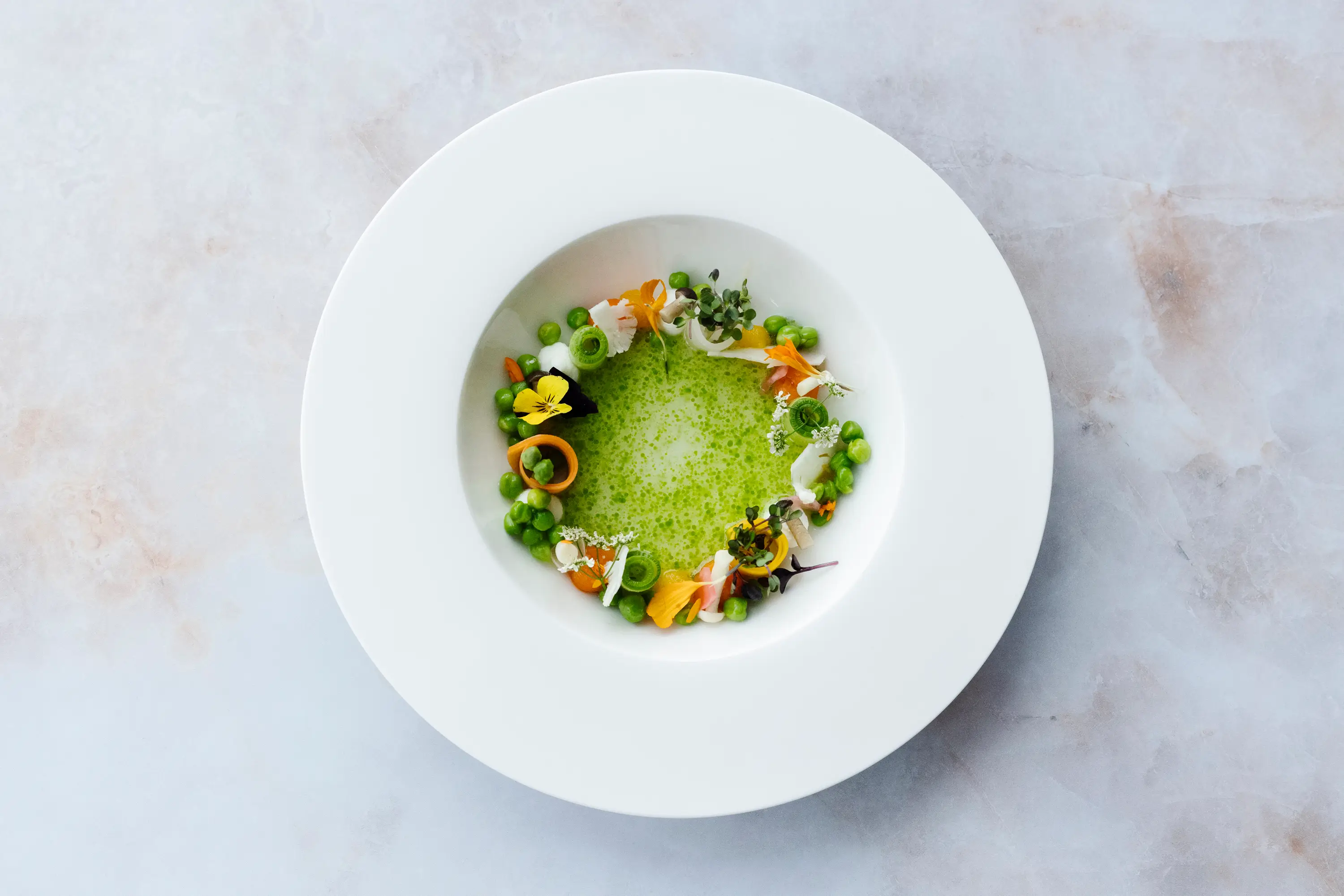
Casual Fine Dining at Lake Zurich
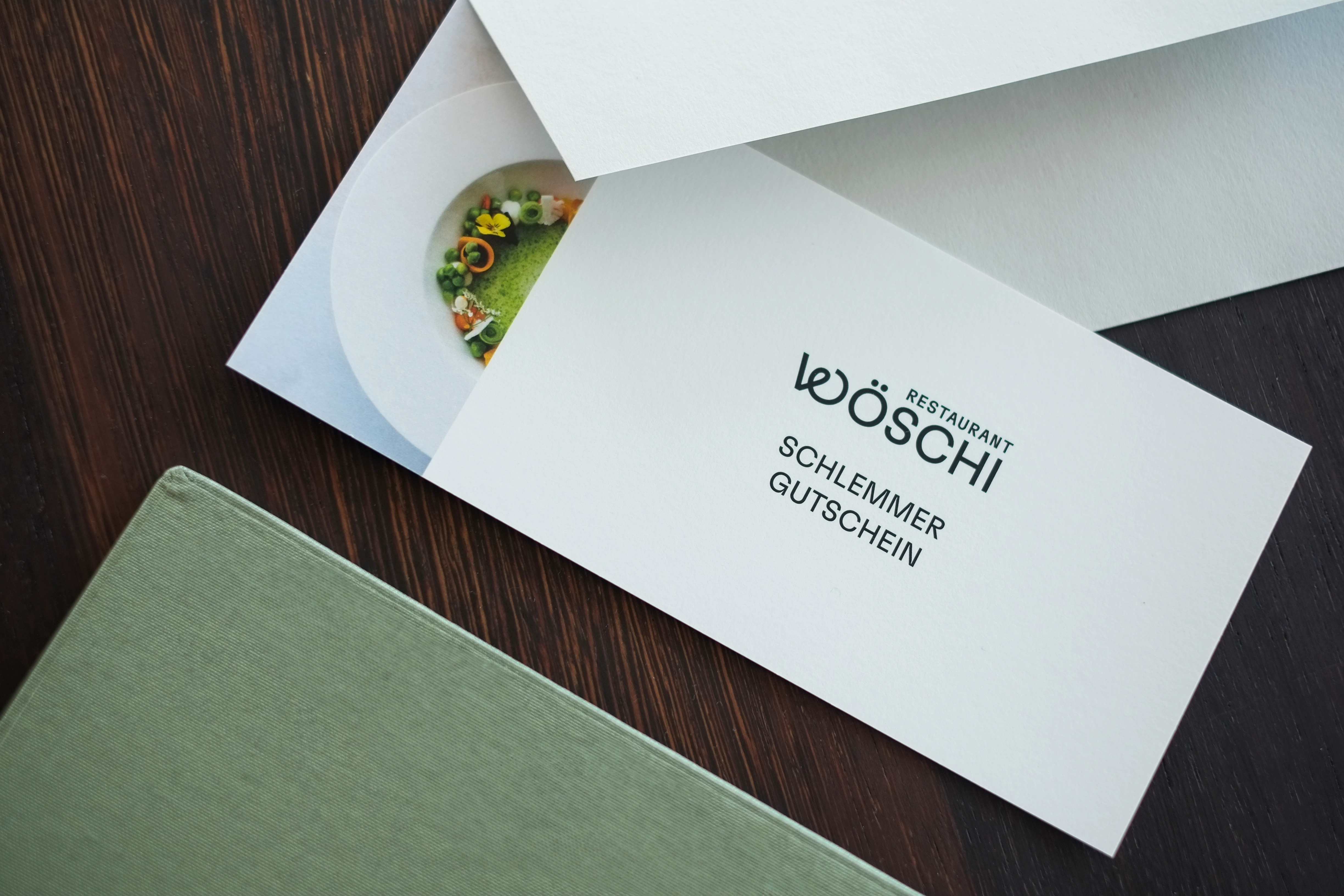
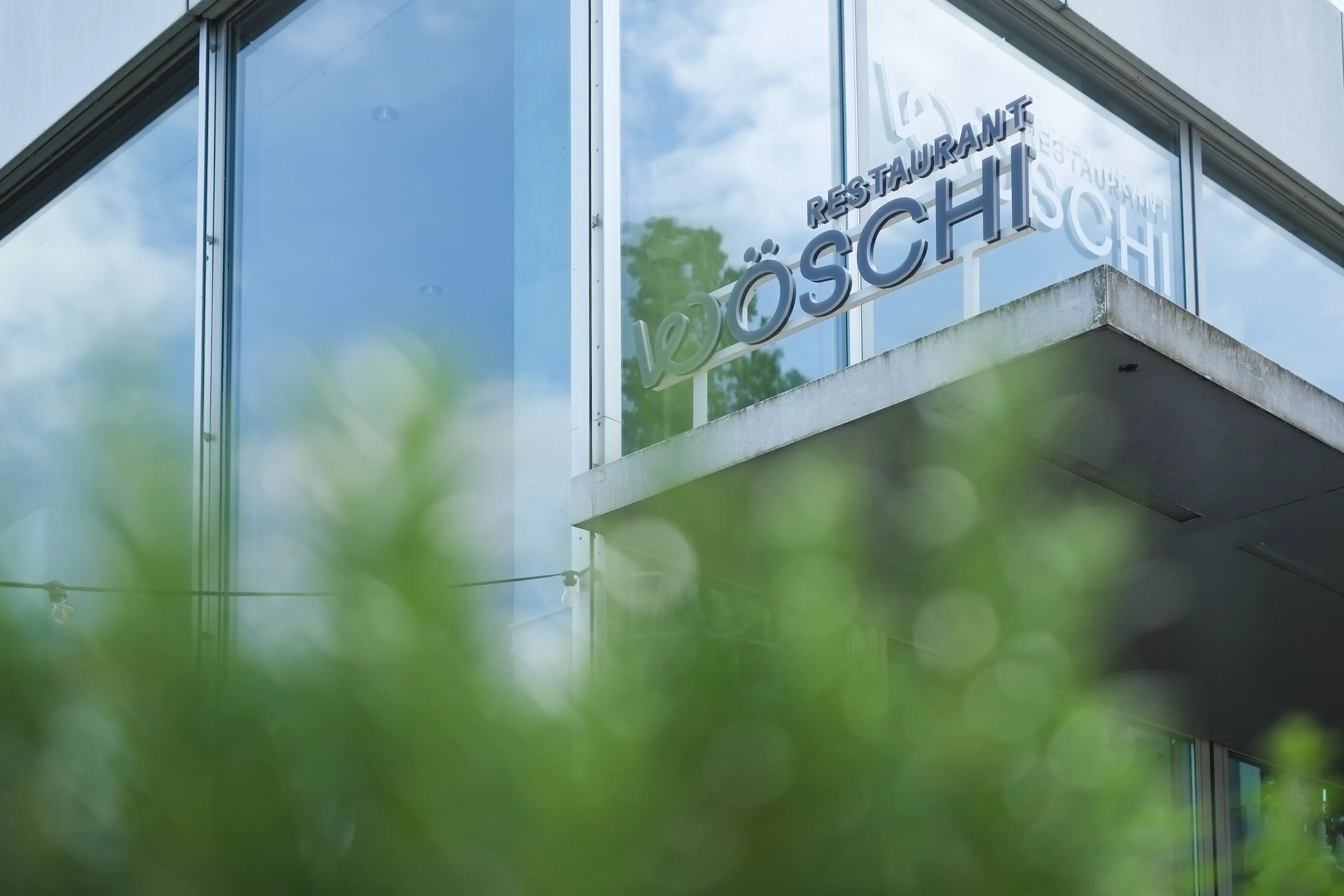
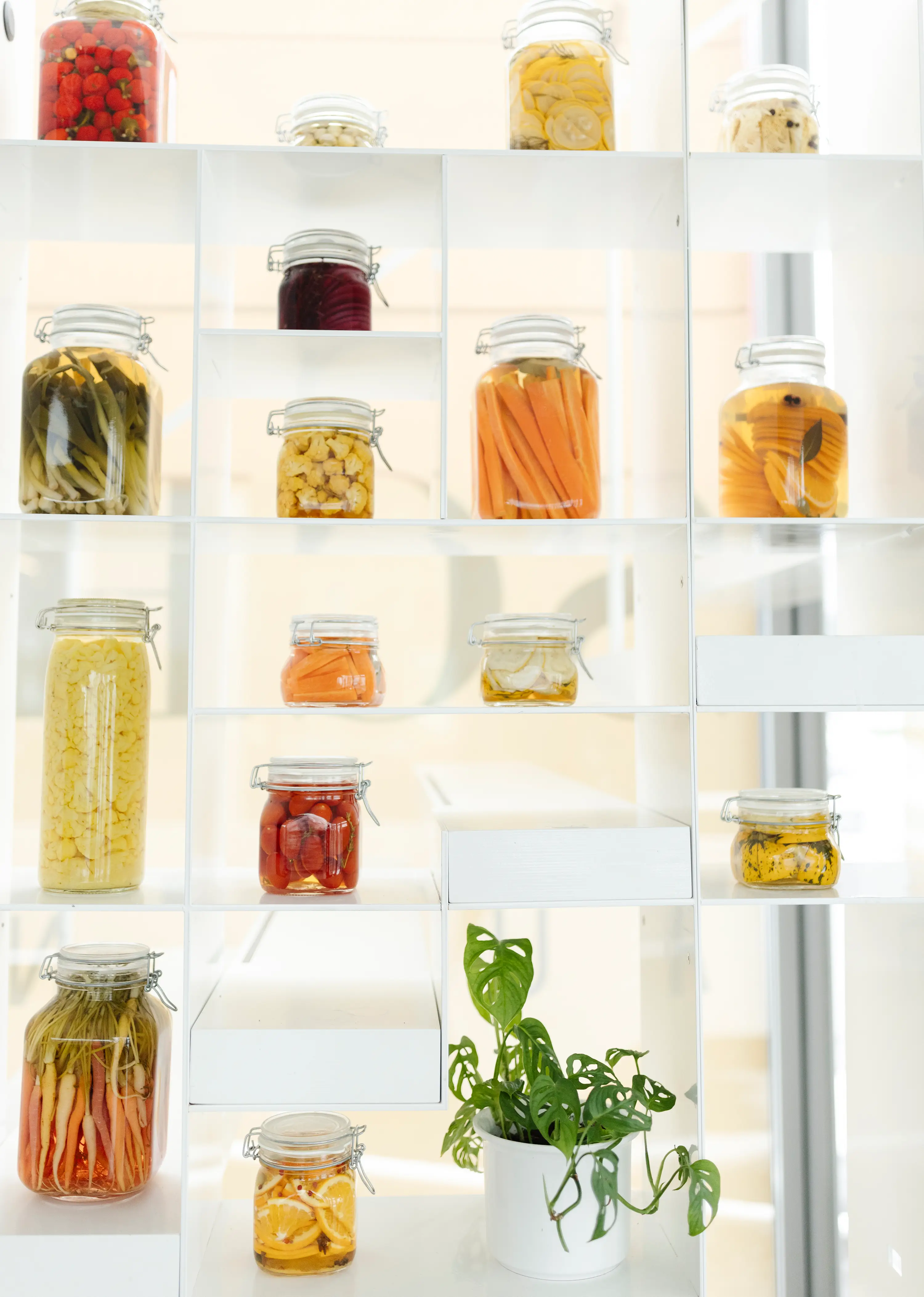
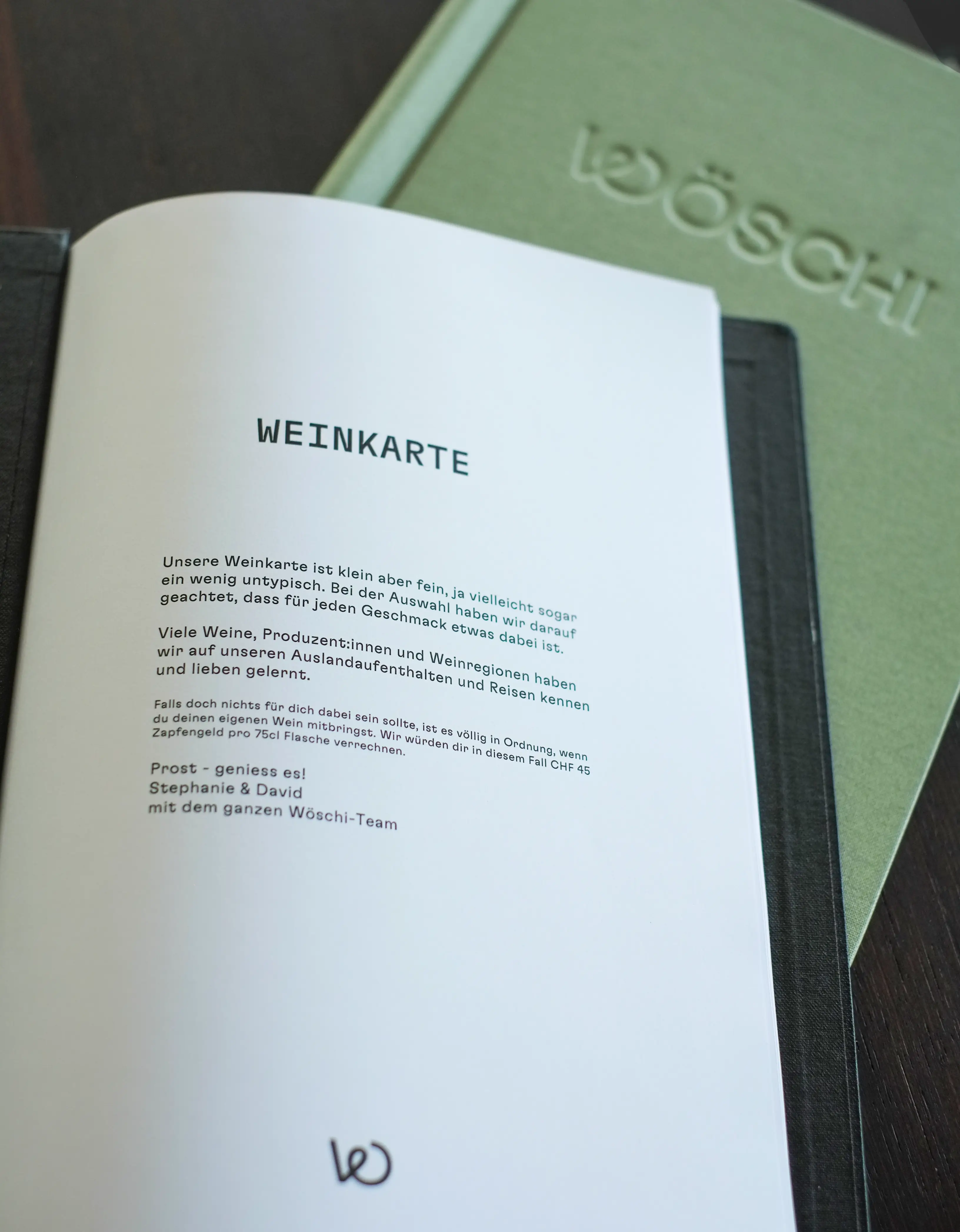
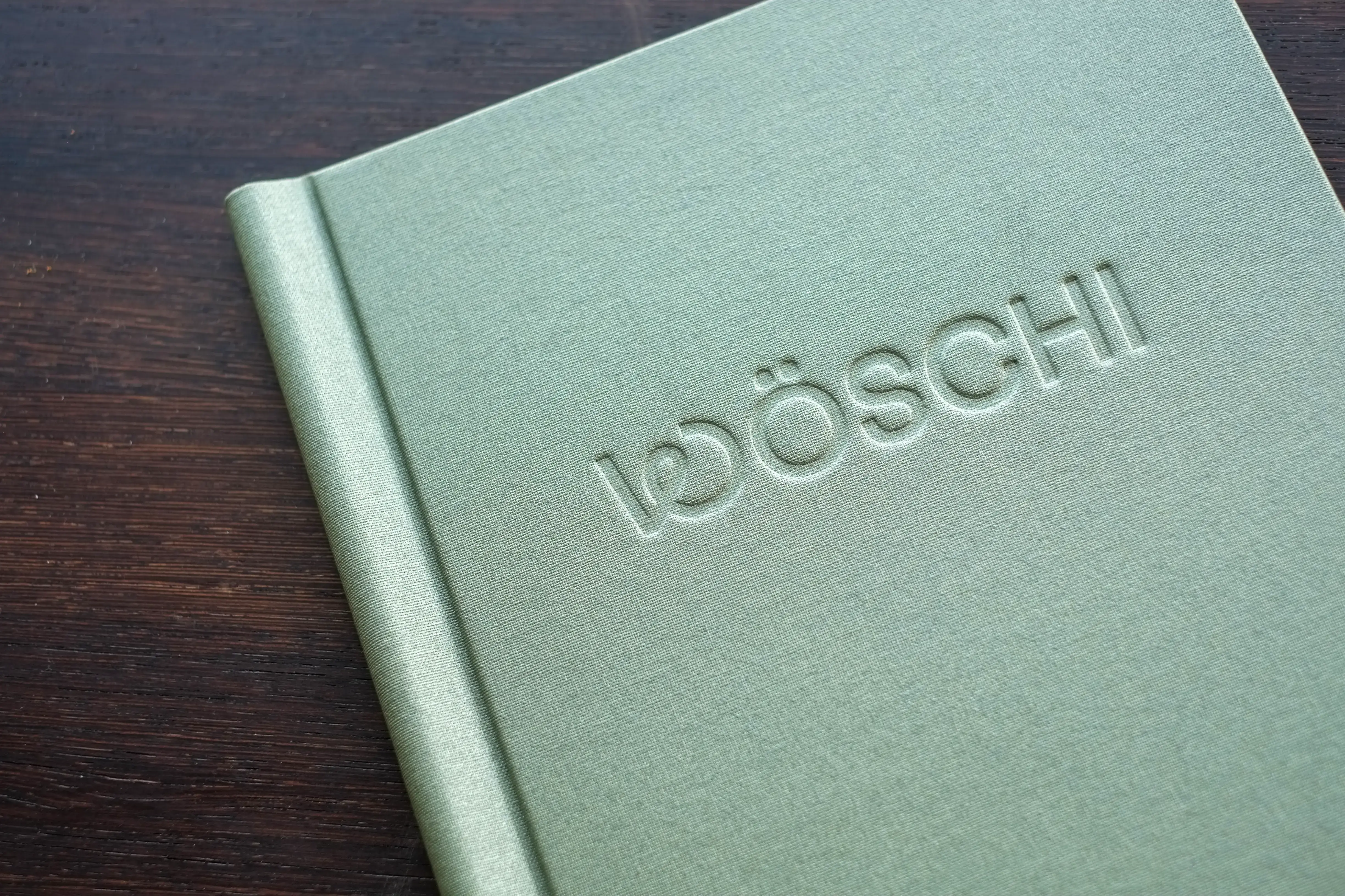
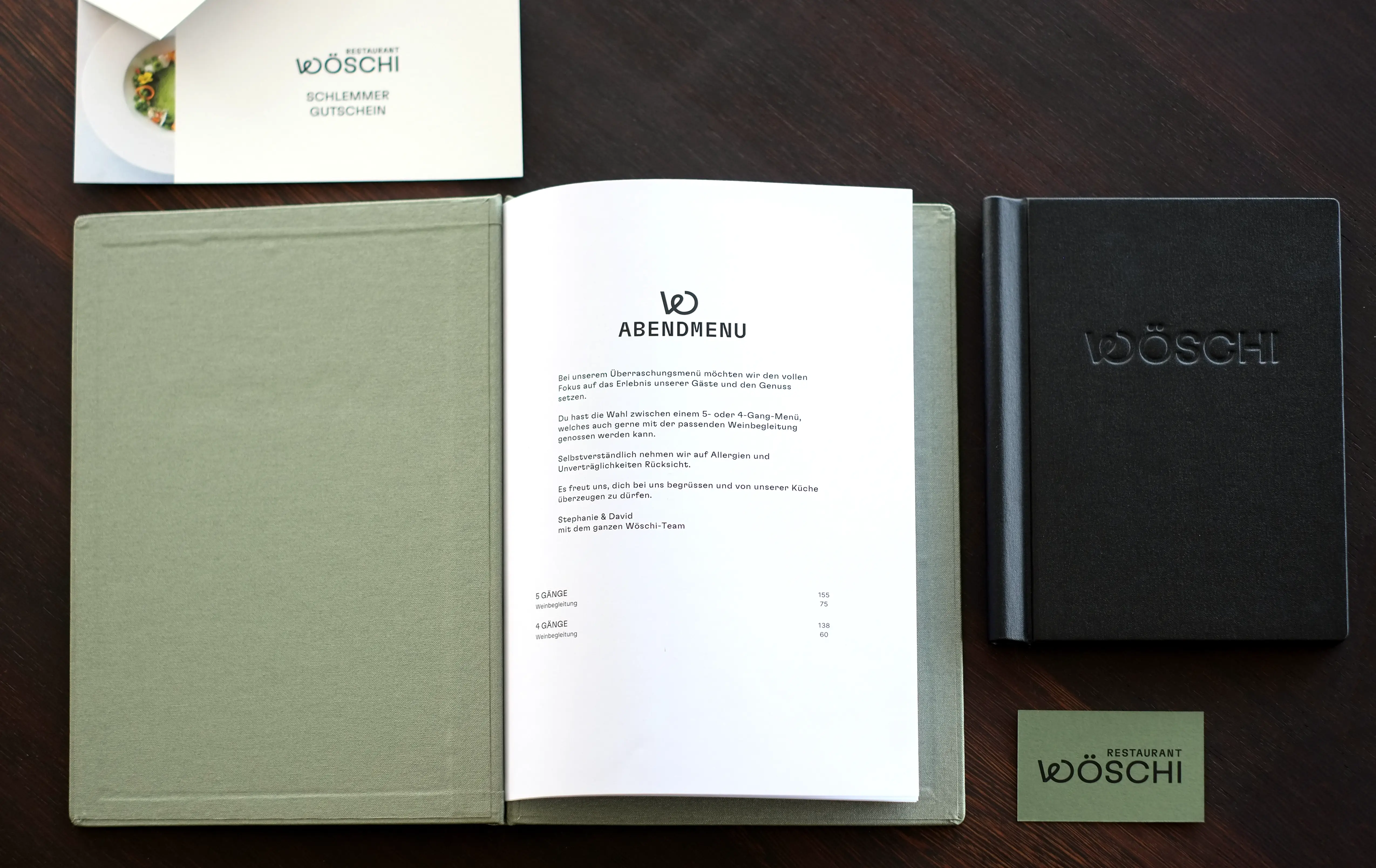
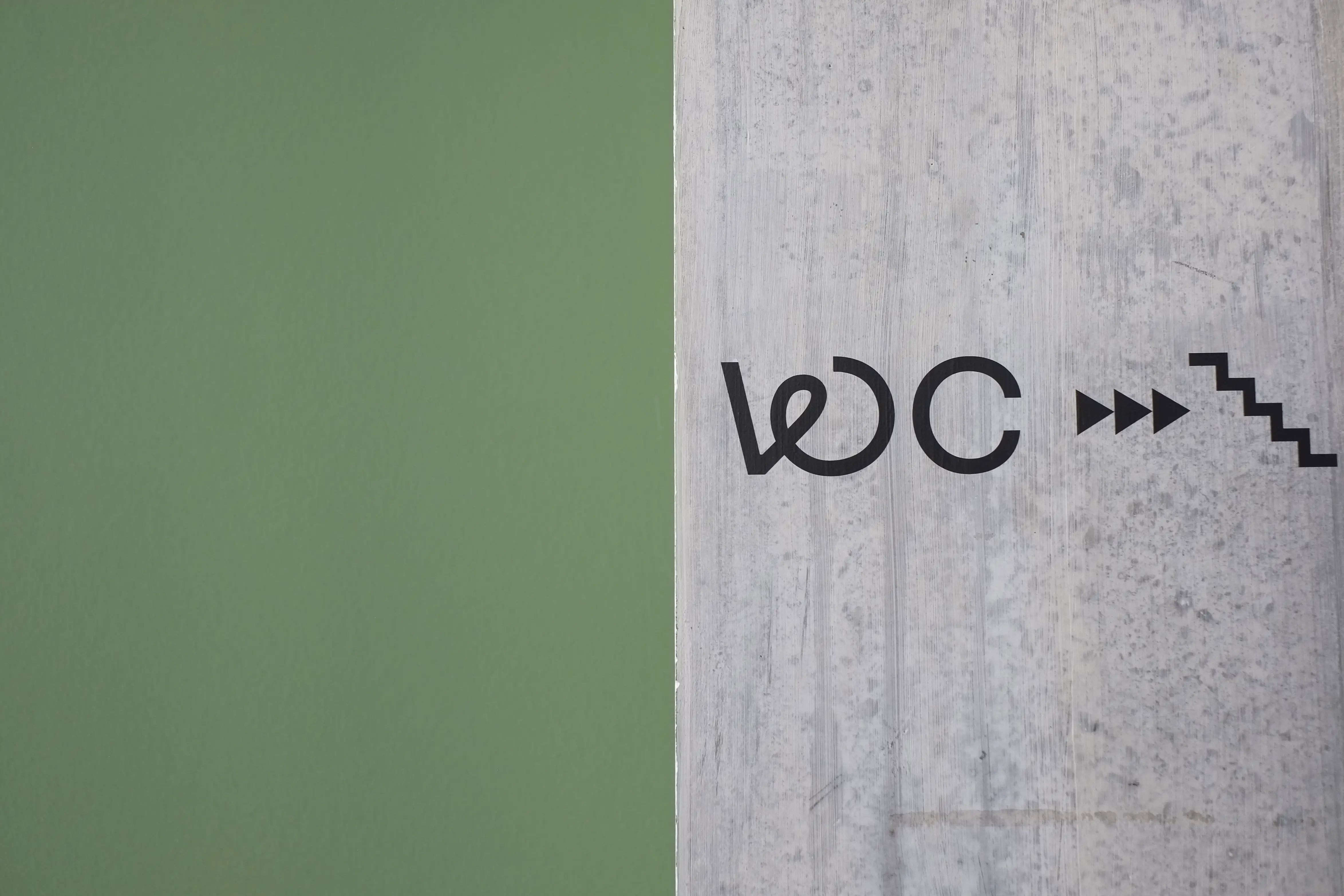
Visual Identity for the Michelin Restaurant Wöschi
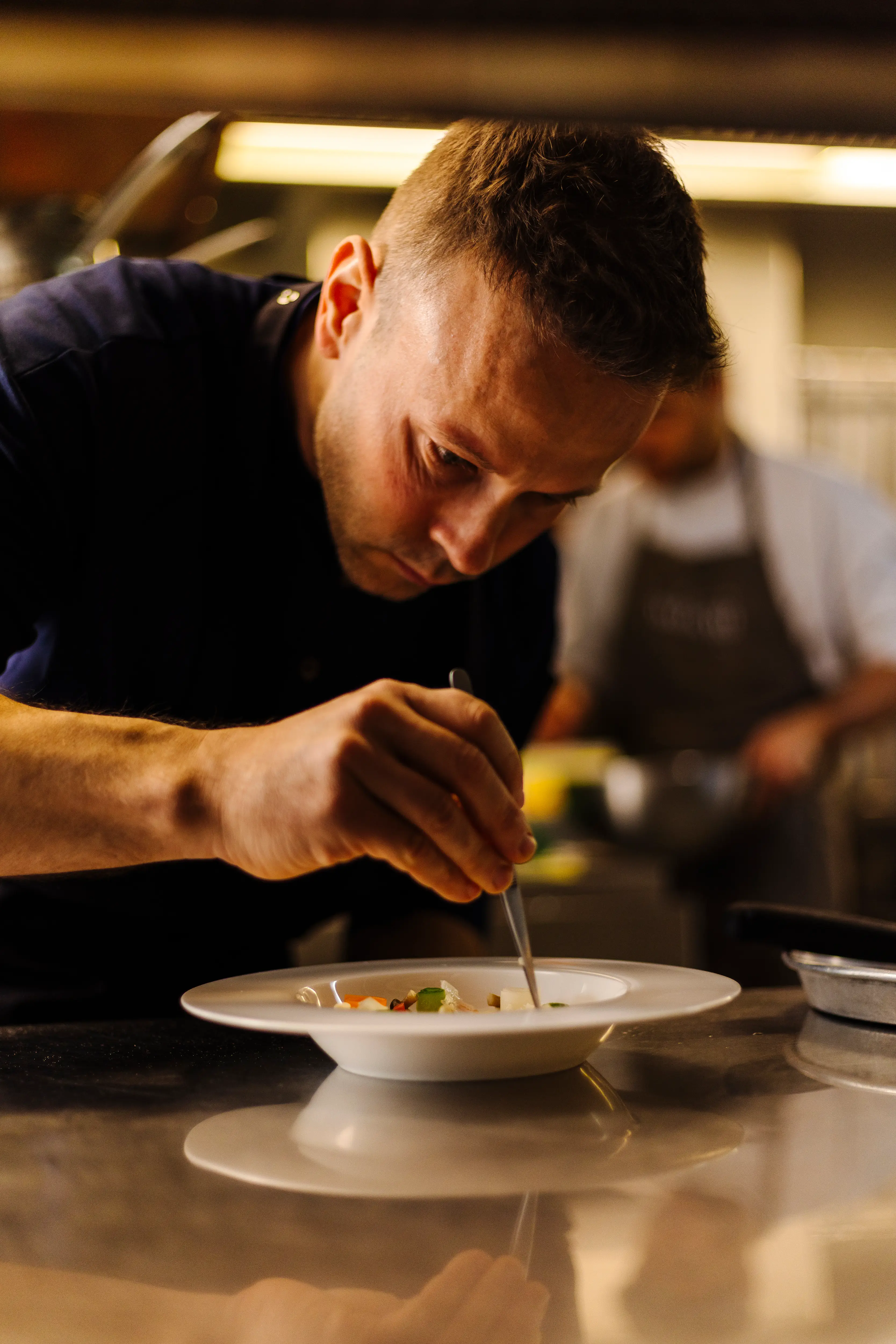
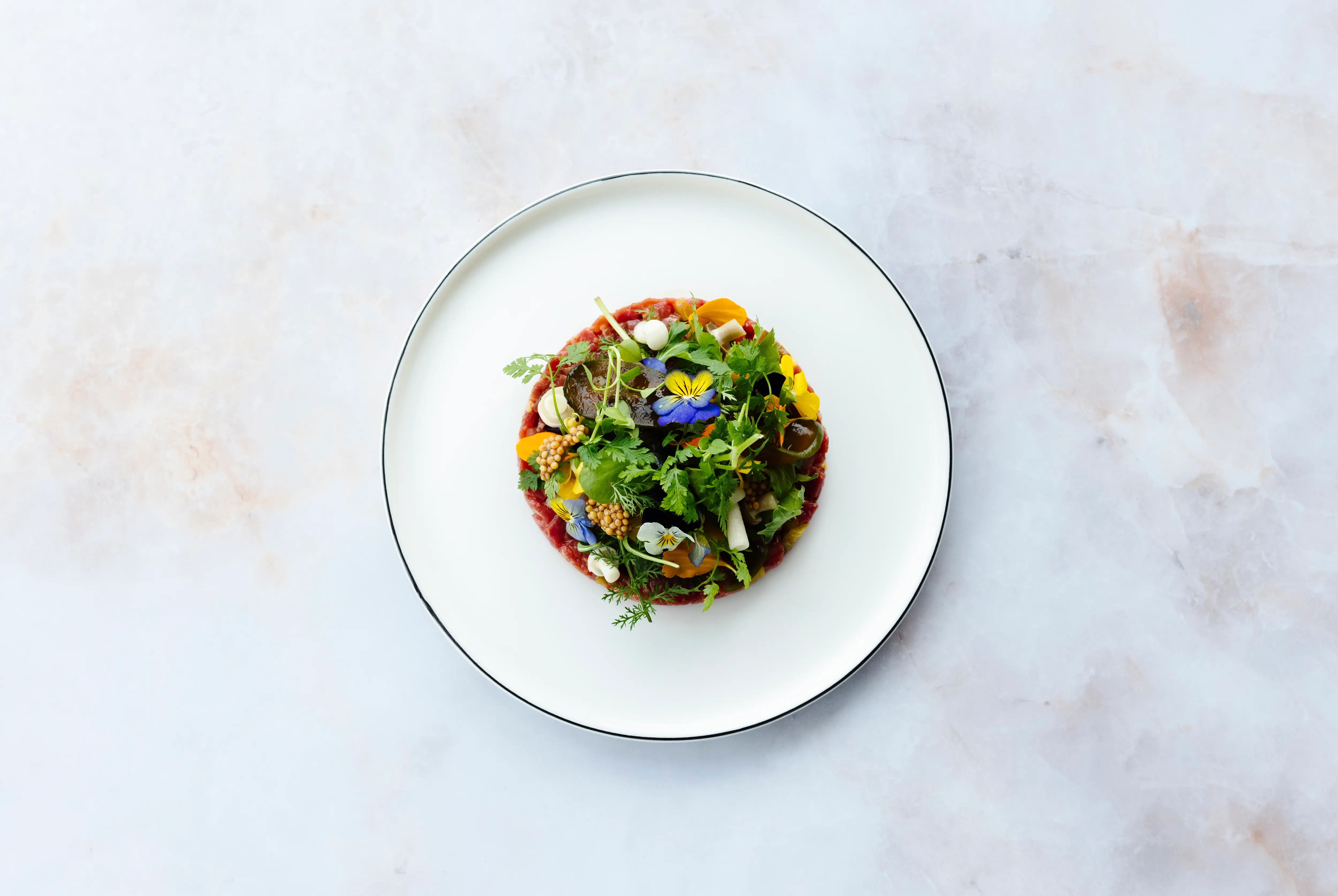
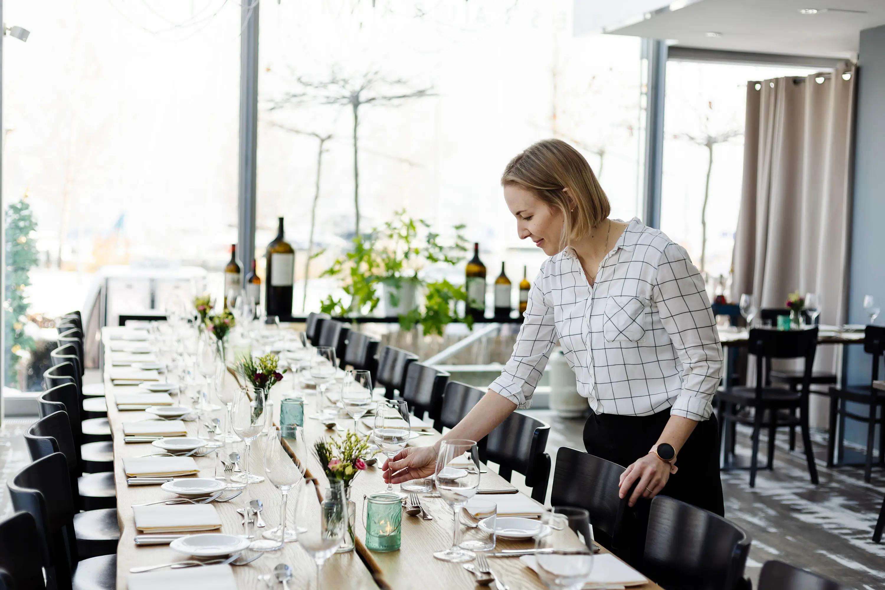
A refined and uncomplicated kitchen. A breathtaking view. A host couple that is fully dedicated to you. Welcome to Restaurant Wöschi!
This is how Wöschi presents itself under the leadership of head chef David Klocksin and hostess Stephanie Ospelt and their team. The power couple not only enchants with the ultimate feel-good place right by Lake Zurich but also delights guests with both visual and culinary treats. This is not just my opinion: in October 2023 and 2024, David was awarded a Michelin star for his creations at Wöschi.
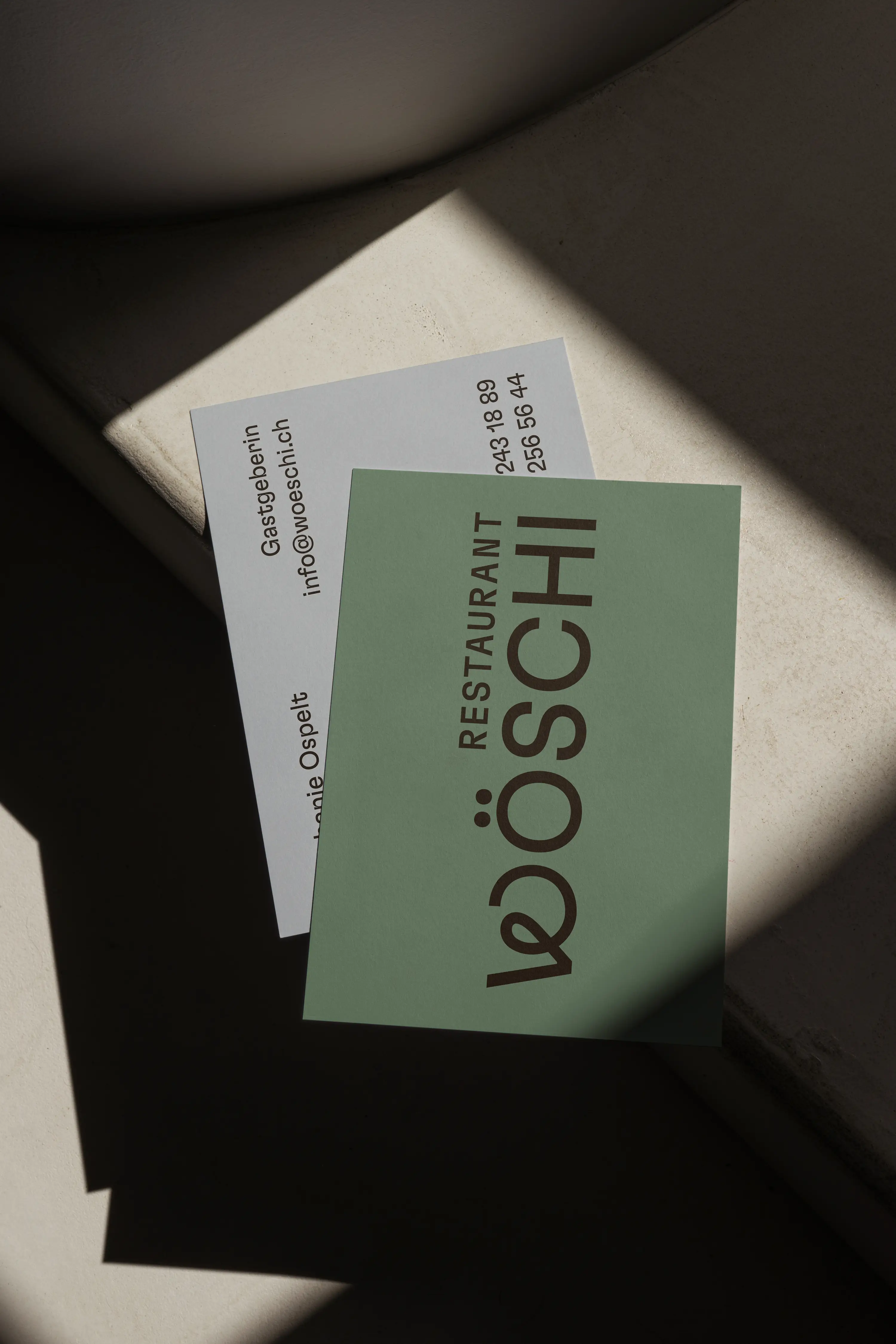
Always in motion, with swirling ideas and bubbling minds, this is how I got to know the dynamic duo. These qualities laid the foundation for Wöschi’s visual identity—fresh, aesthetic, delicious, and unique.
The identity is minimal yet playful, leaving space for the passionate work of the Wöschi team and impressing with its light, playful simplicity.
Business Cards & Voucher Print: Drucksalon Zürich
Food- and Mood-Photography: Aly Aesch
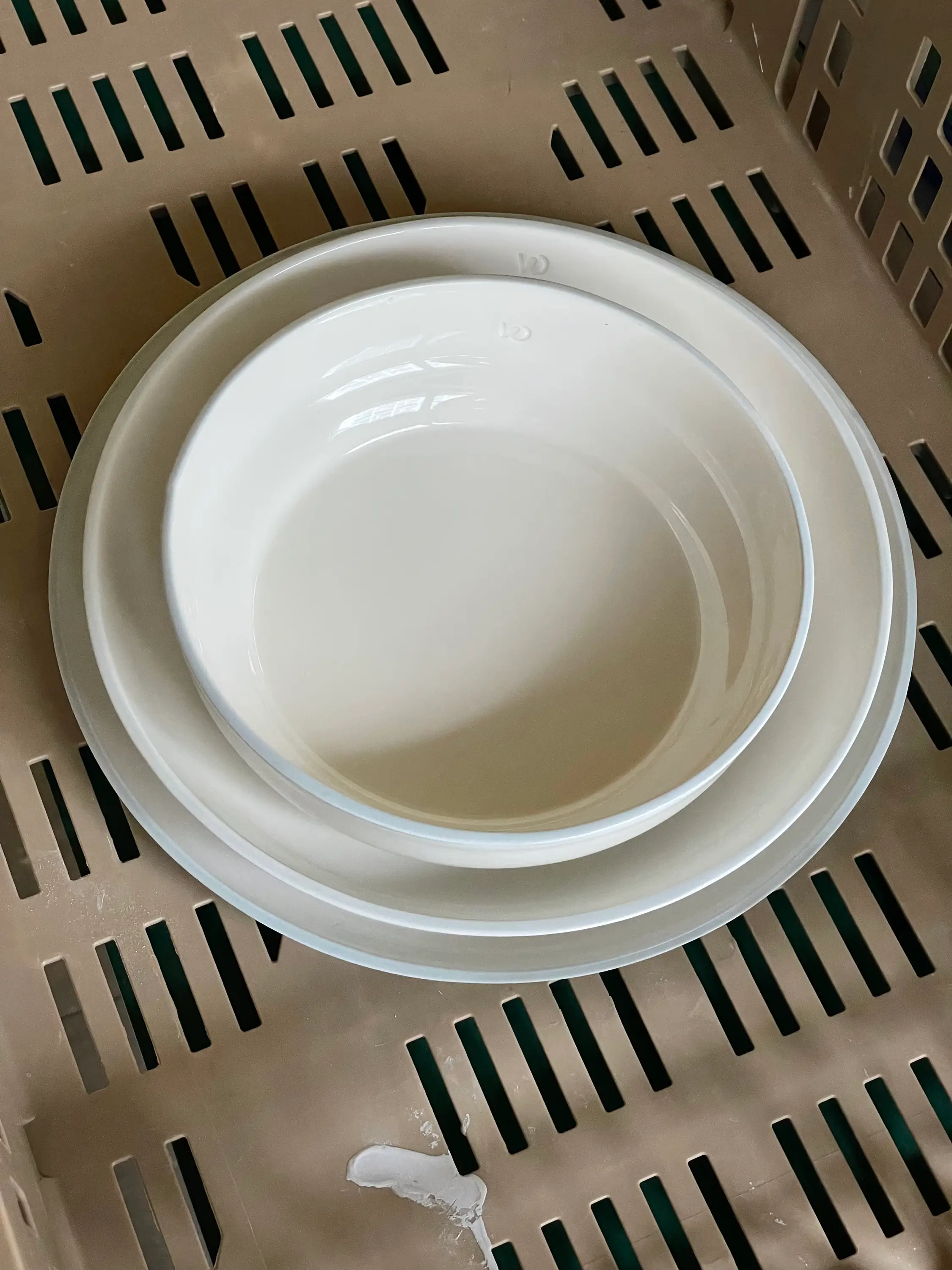
Ceramic: Studio Sediment
Paper: Colorplan Pale grey & Mid Green
Font: GT Flexa & GT Flexa Mono by Grilli Type
I am a Swiss designer with a passion for thoughtful design and sustainable solutions. My focus is creating and visually implementing concepts that are not only aesthetically pleasing, but also long-lasting and effective – from small to large businesses.
My design approach combines clarity with creativity, conceptual rigour with playfulness. I work closely with my clients to develop individual visual identities or diverse design solutions within an existing brand in the wonderful diversity of visual communication.
A selection:
Carpet
Das Dazwischen
Franziska von Hoff
Go Snow
le bread sourdough and coffee
Leitner Messebausysteme
Nikkol Rot
NOLD Skateboards
Pfeffer/Verbeek
Die Schweizerische Post
Pro Velo Schweiz
Restaurant Wöschi
Schweizerischer Blinden- und Sehbehinderten Verband (sbv)
Schweizerisches Rotes Kreuz (SRK) Kanton Bern
Schweizer Tourismus-Verband STV
Stiftung WBM Madiswil
Swiss Coffee Festival (Swiss SCA)
Transa Backpacking AG
Varem Development AG
WWF Schweiz
Zuriga
Pia Fleischmann
Schwarztorstrasse 3
3007 Bern
hey@piafleischmann.com
Code: Roger Burkhard
Please send me an email so that I can respond to your questions, suggestions and comments as quickly as possible. © 2025