Nikkol Rot – Corporate & Book Design
Clarity, Heart, and Aesthetics in a Square: This is Nikkol Rot
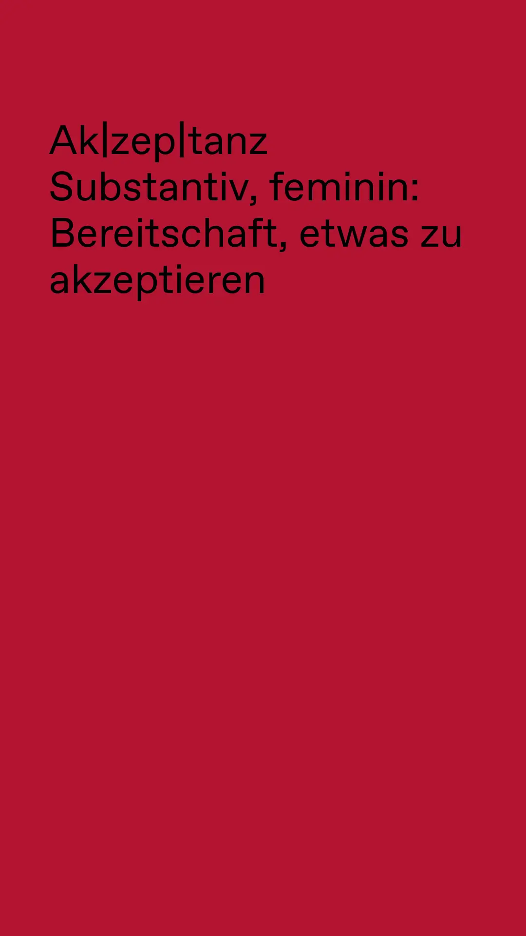
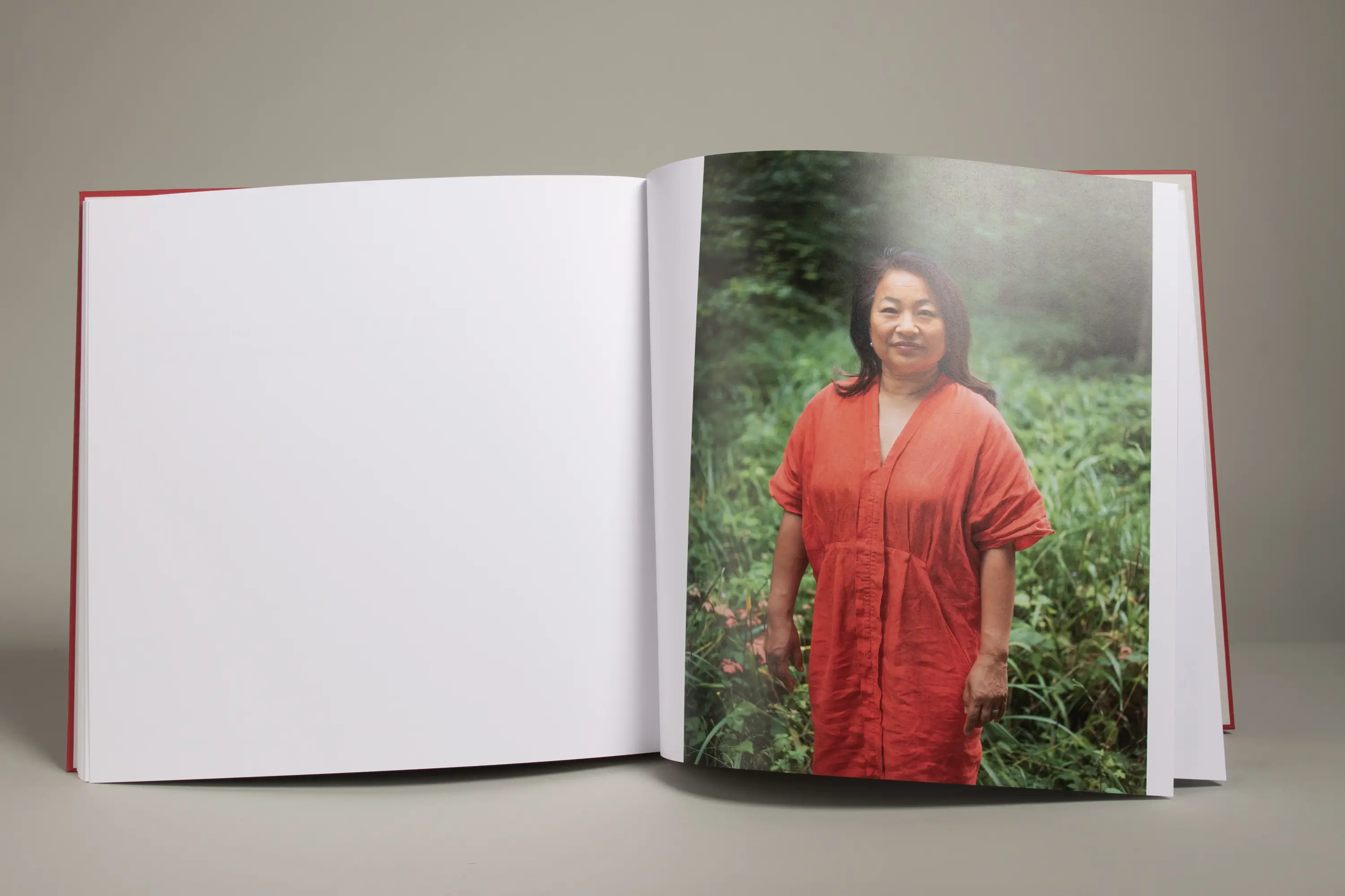
With these ingredients, Nikkol Rot creates a distinctive visual language. With these ingredients, her new visual identity was born. In her work, Nikkol celebrates diversity and makes acceptance visible. The result is always unique—constantly simmering, transforming, and evolving with new ideas.
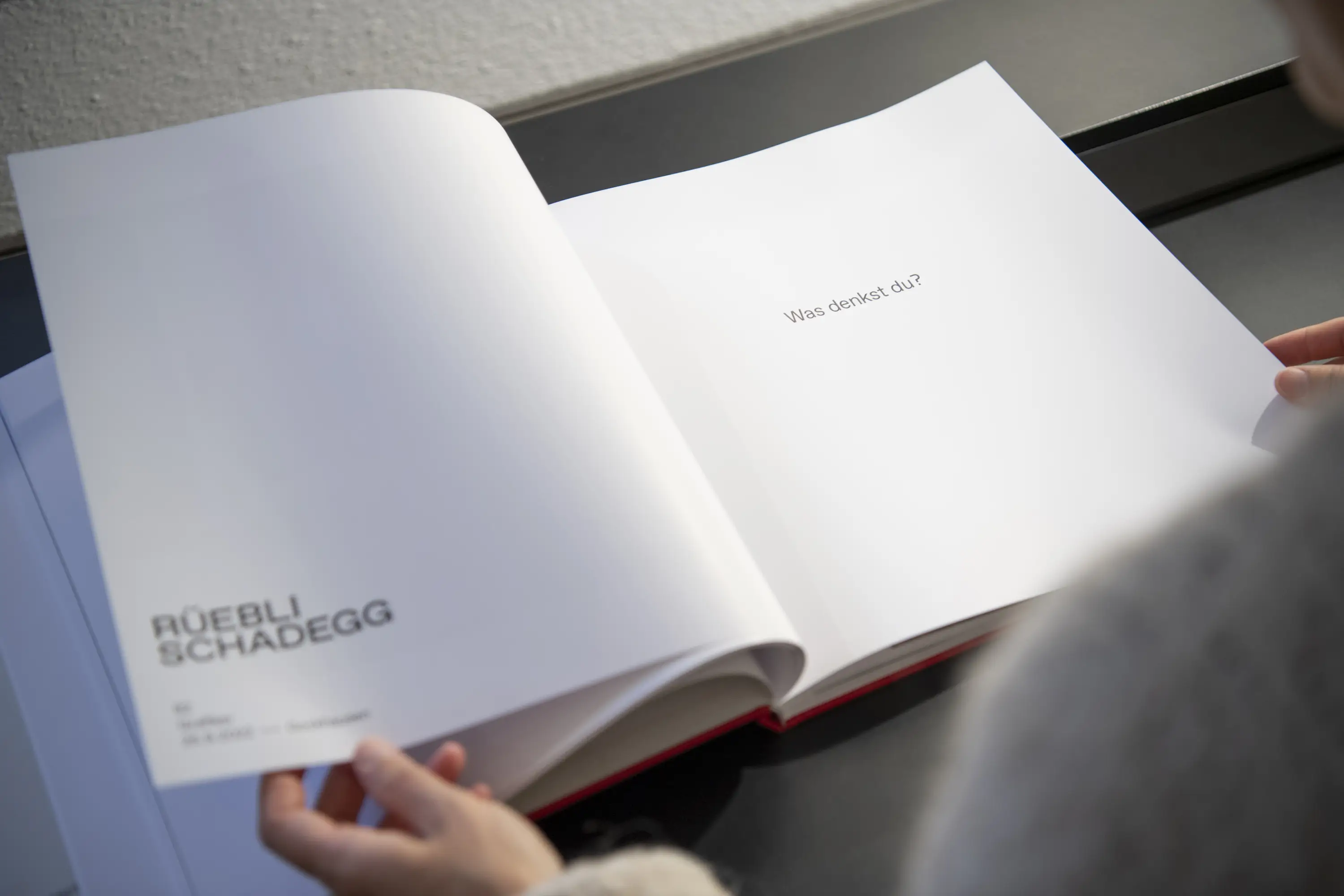
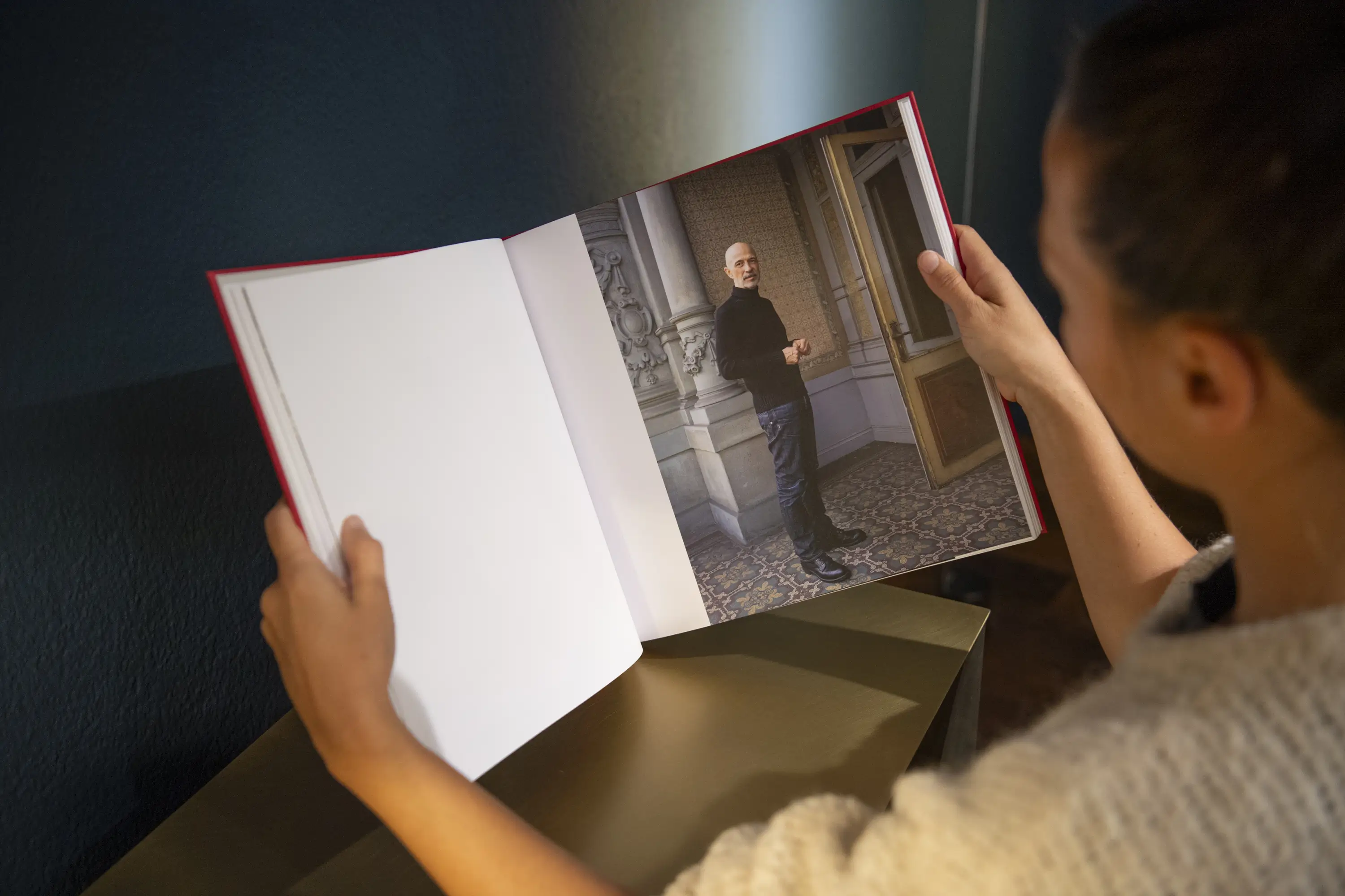
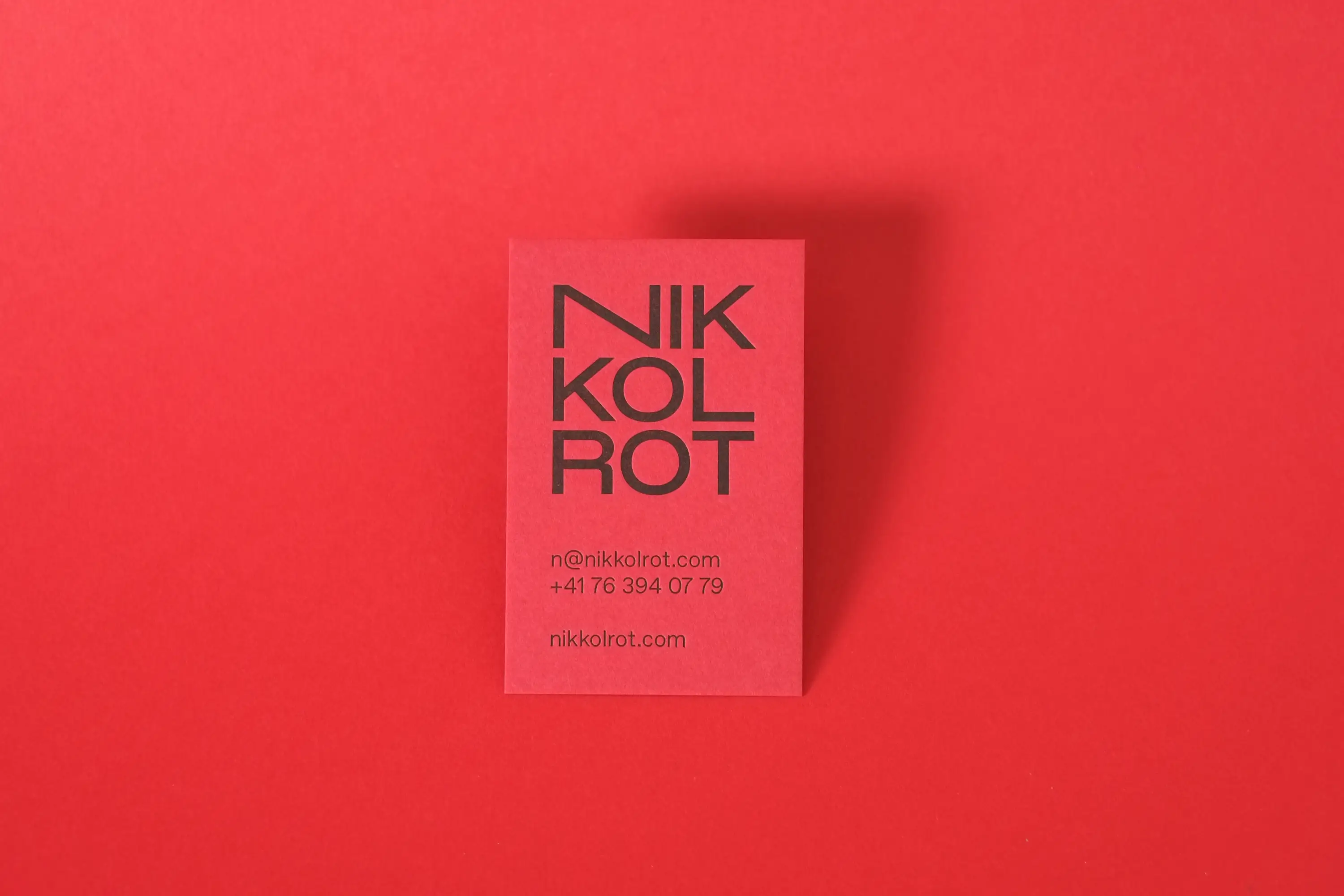
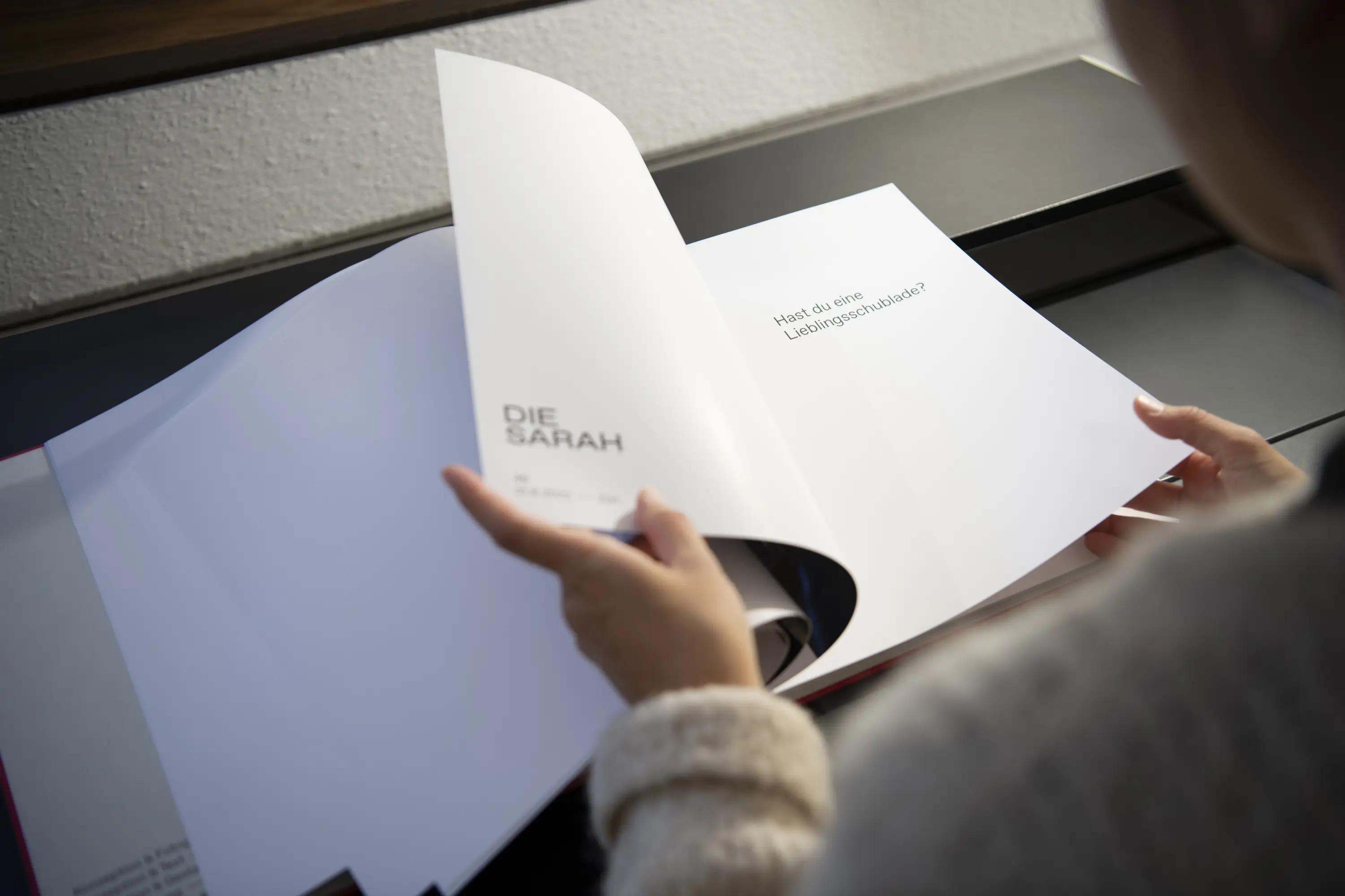
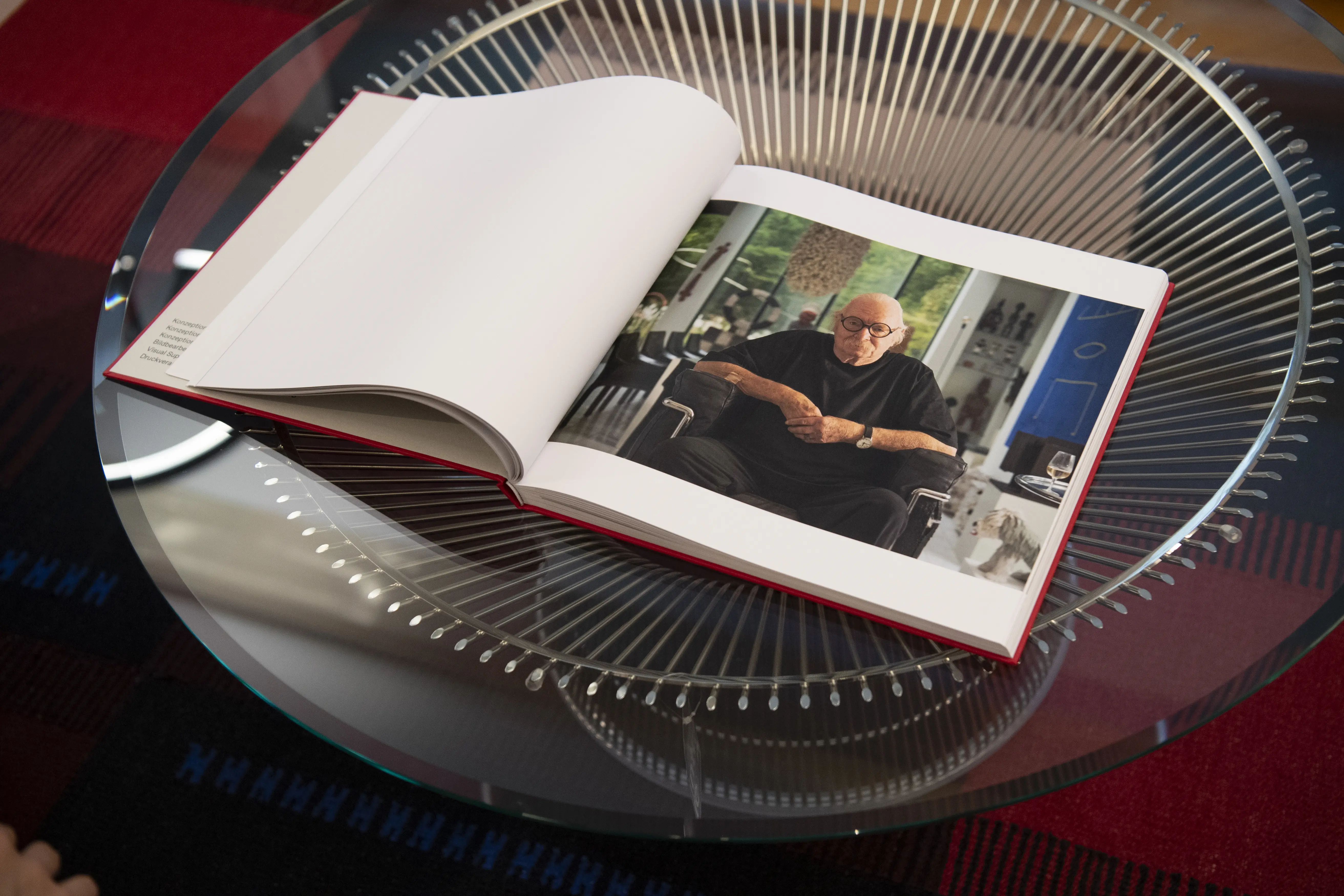
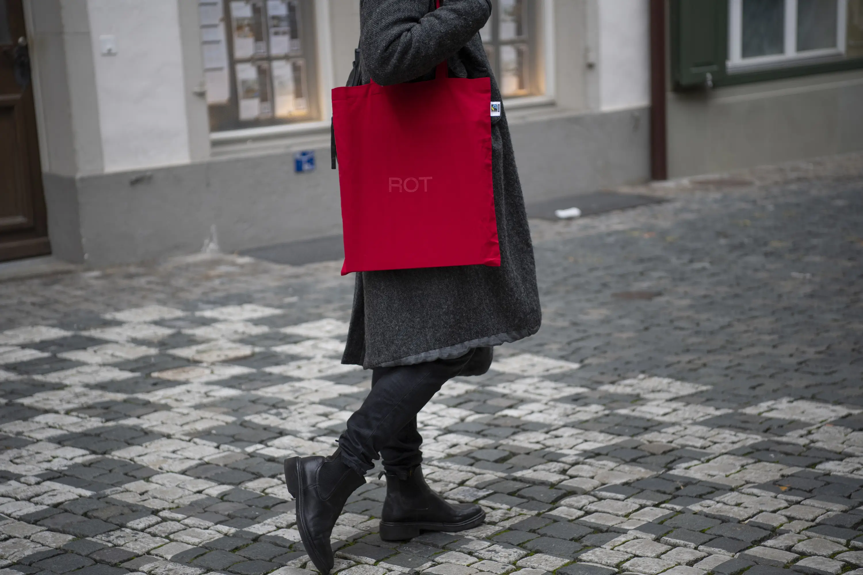
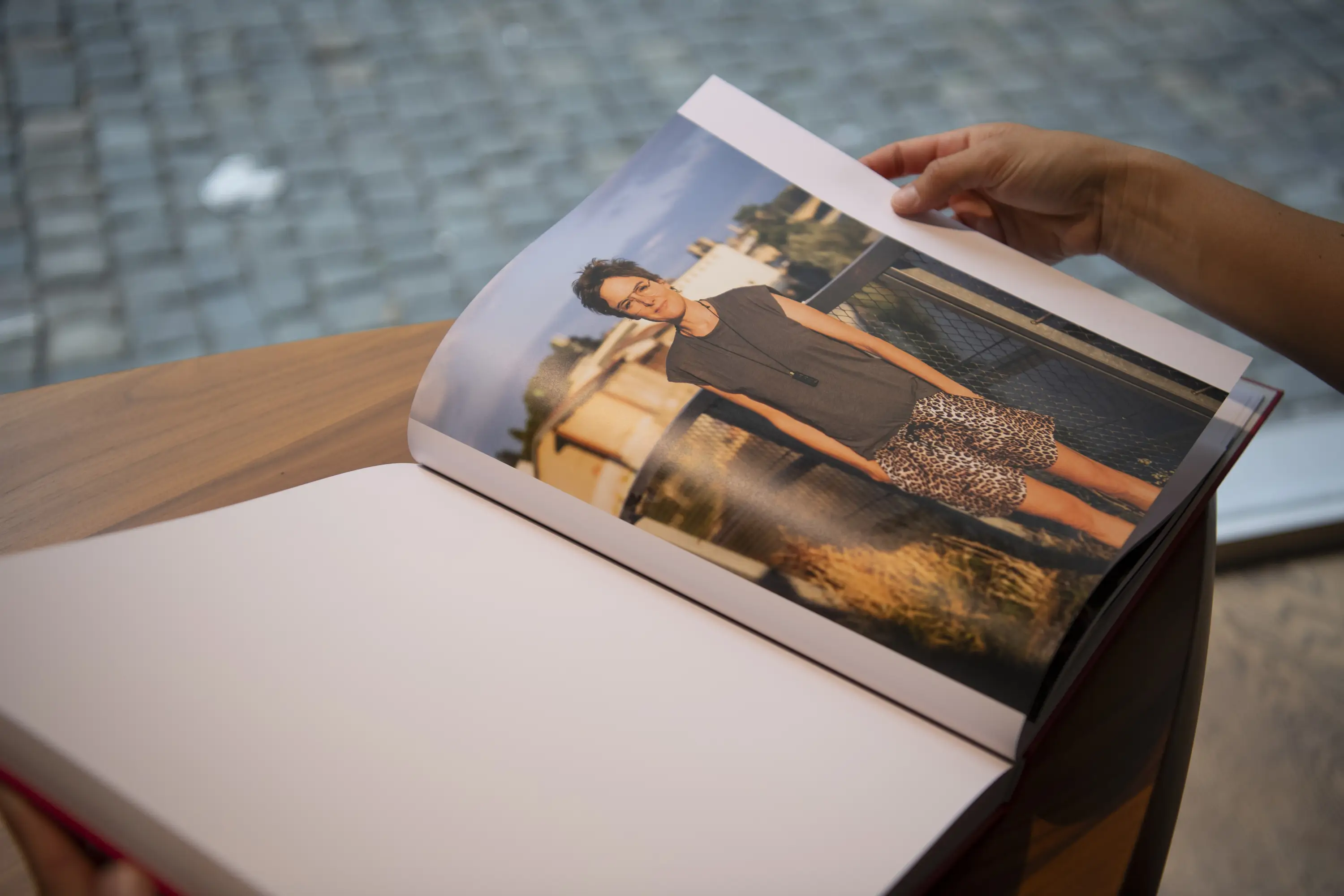
Together, Nikkol and I developed her individual, powerful, and confident presence: a business card with texture and aesthetics, printed by Jürg Brunner on his letterpress machine—minimalist yet with a striking fiery touch. A glimpse into her heartfelt and authentic book project—available on her website or Instagram profile. Or printed invitations for the two exhibition openings in Bern and Zurich.
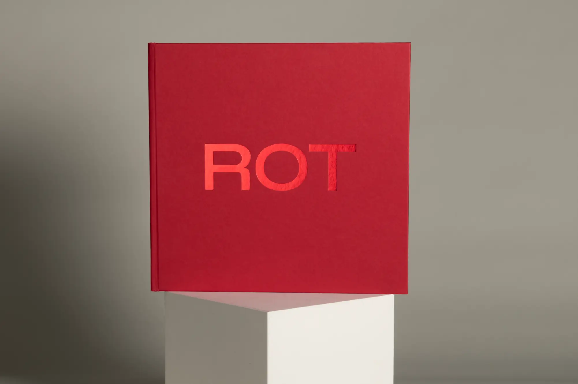
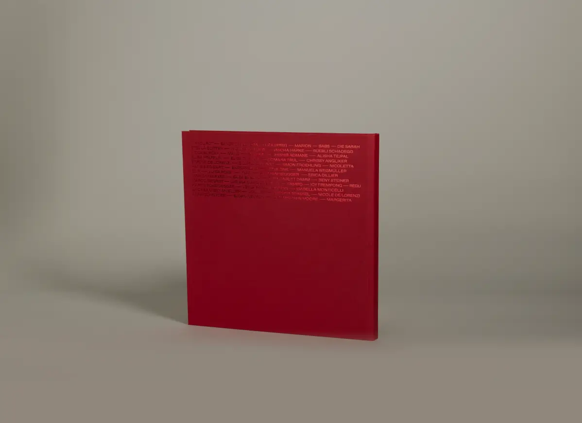
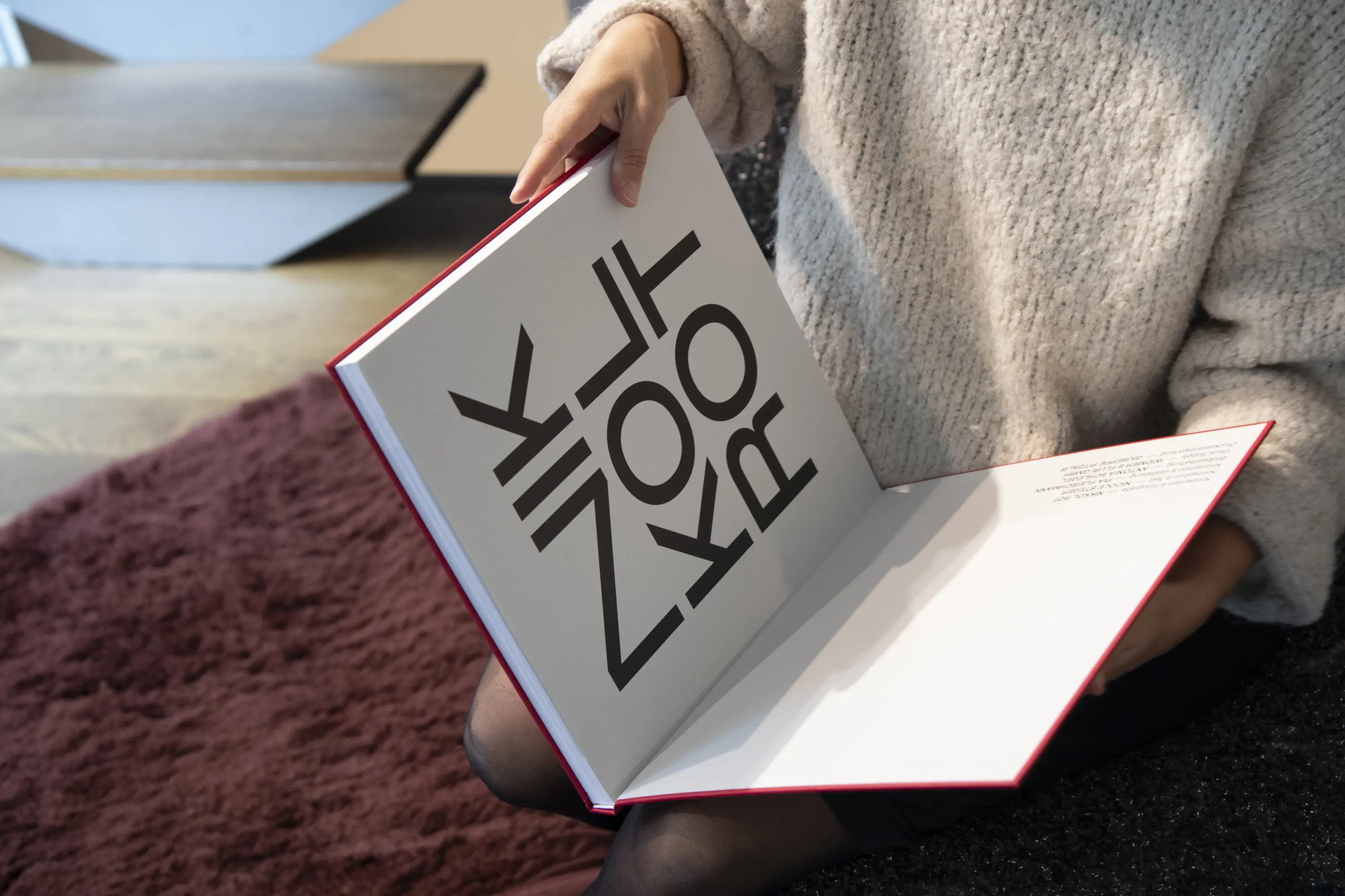
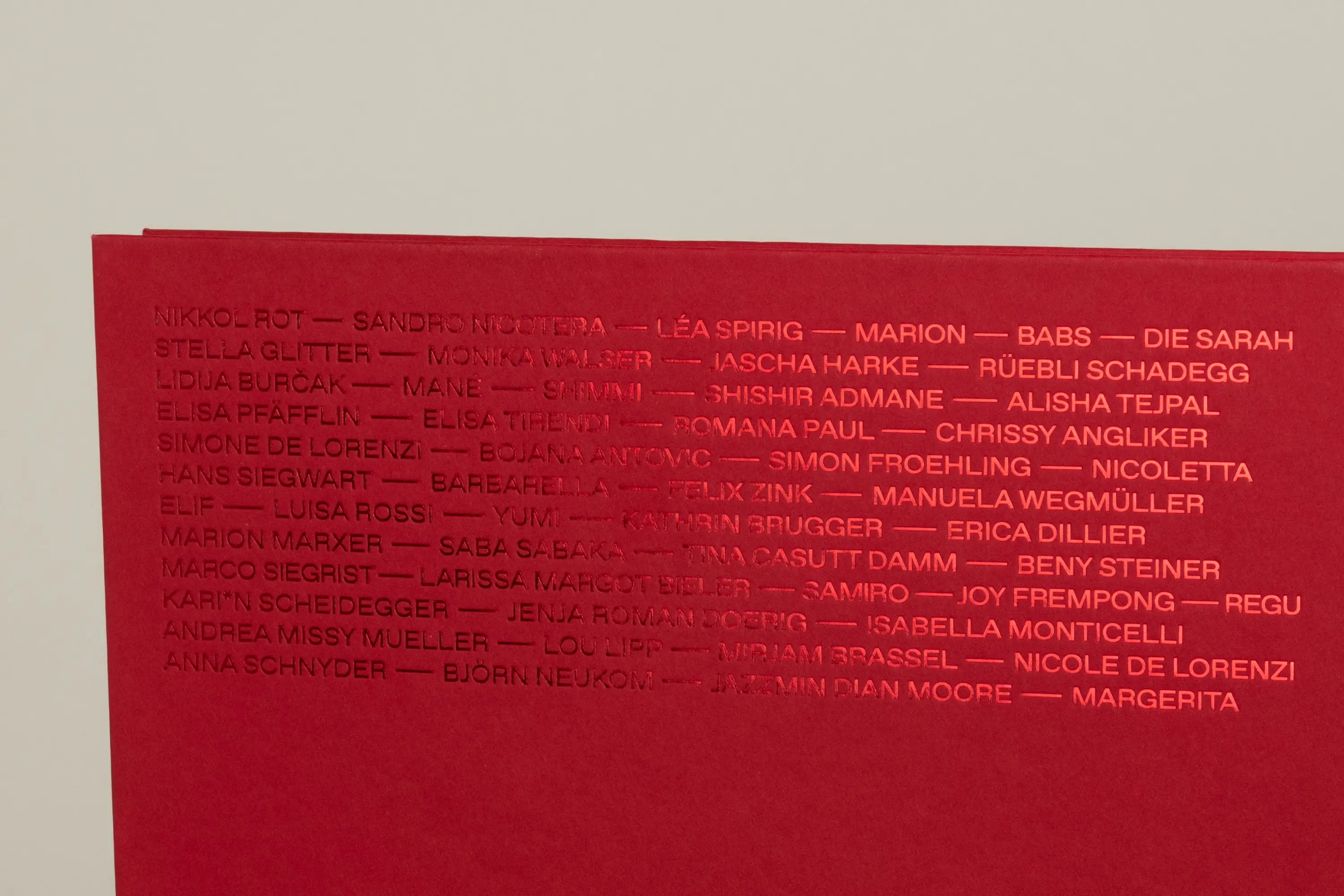
Our creative kitchen continues to simmer. But Nikkol has already served up something remarkable, proving that not everything has to be round—sometimes, it’s meant to be square. Her book ROT comes in the original format of her beloved Hasselblad X1DII camera. Nothing and no one is hidden in this wonderful work, thanks to the conceptual ideas brought to life by Nicole Steger, Nikkol Rot, and me. It was—and still is—an immense honor to have been part of this favorite project.
Printer Businesscards: Druckerei Brunner, Wohlen Bern
Printer Book: Kasimir Meyer, Wohlen Aargau
Bookbinding: Pagina, Hittnau
Image processing: Antonia Schlegel
Visual Supply: Widmer & Fluri
Printing responsibility Book: Giuseppe Pitzalis
Used fonts in the book: ABC Favorit von ABC Dynamo
Book Wrappaper: Wibalin Natural Cherry
Book Endpaper: Colorplan Pale Grey
Content Paper: Profi Extra
Concept & Photography: Nikkol Rot
Concept & Text: Nicole Steger


Swiss Post
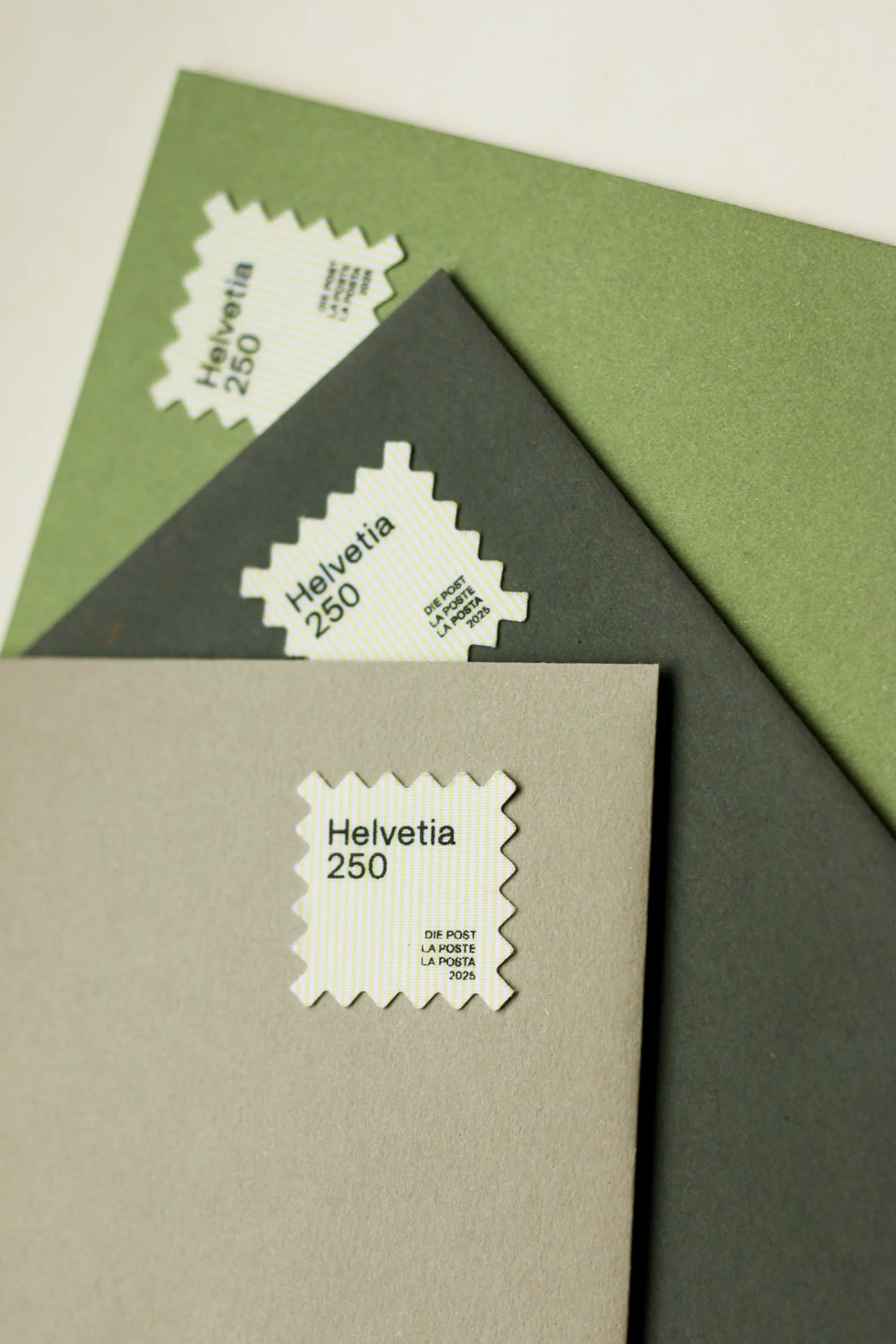
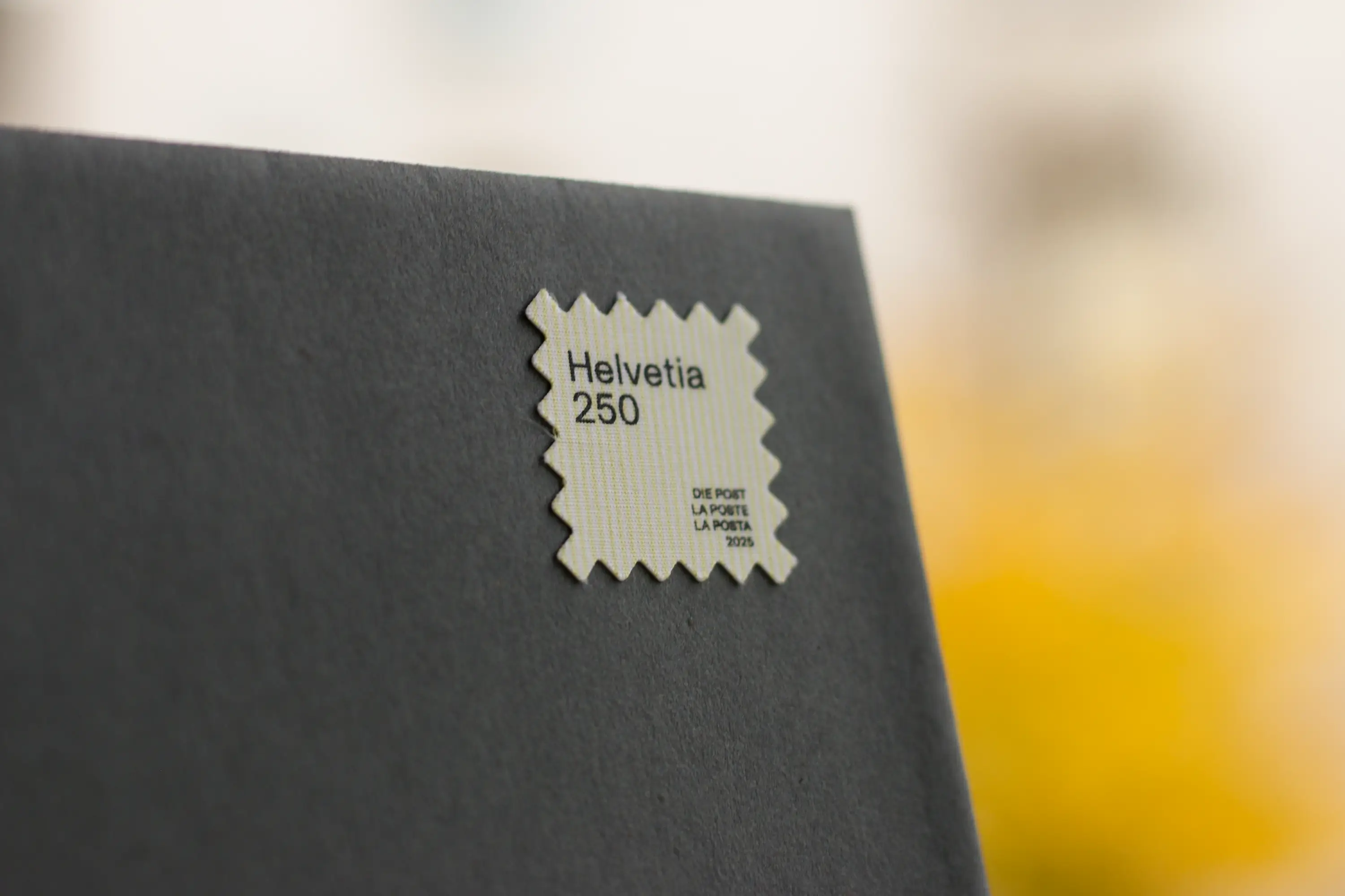
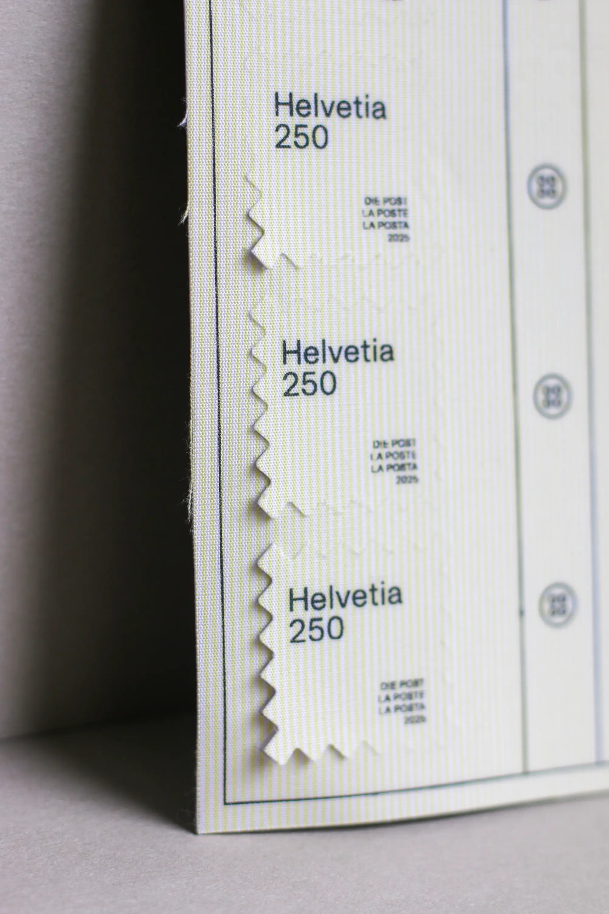
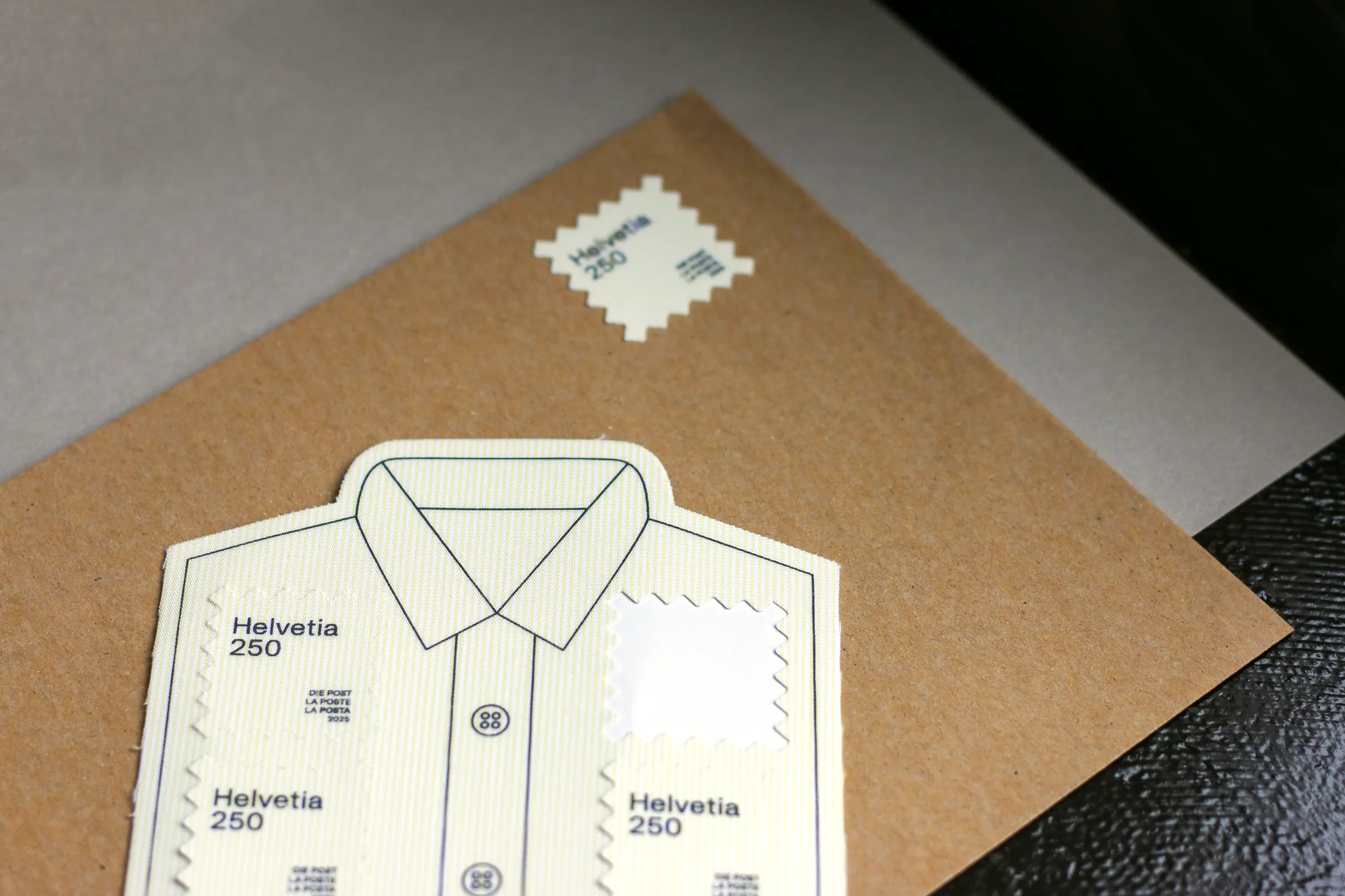
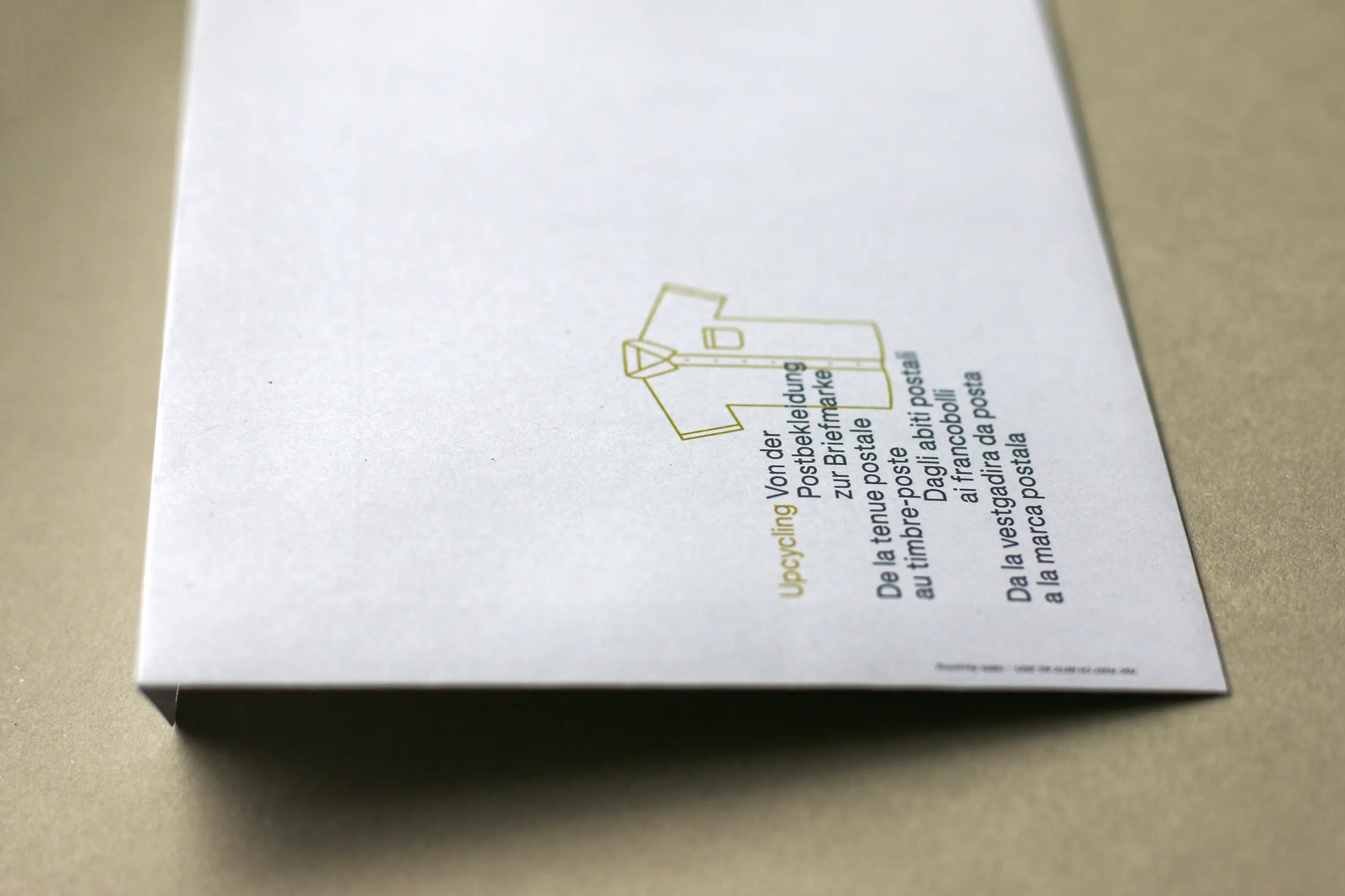
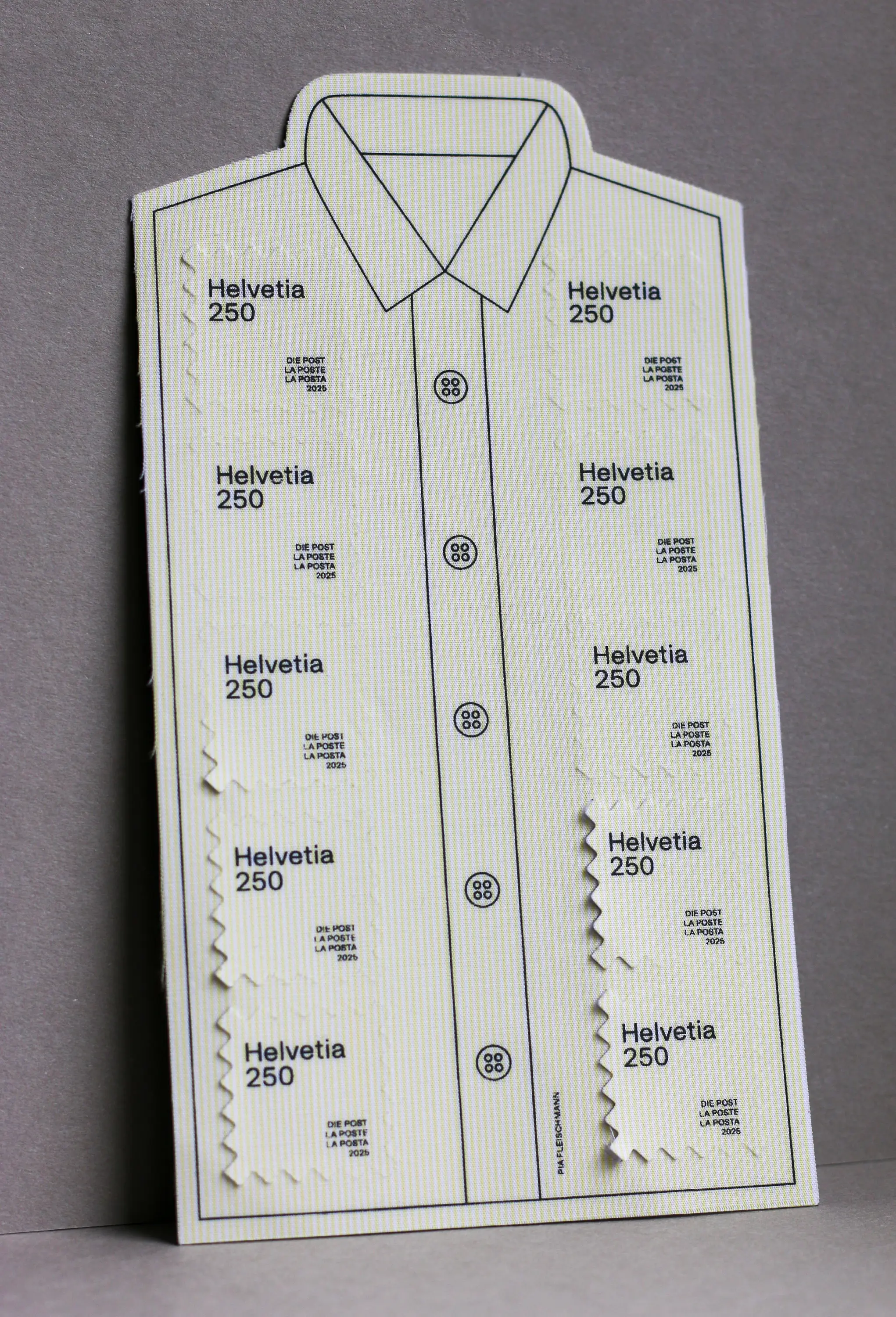
Upcycling – from Postal Uniform to Postage Stamp
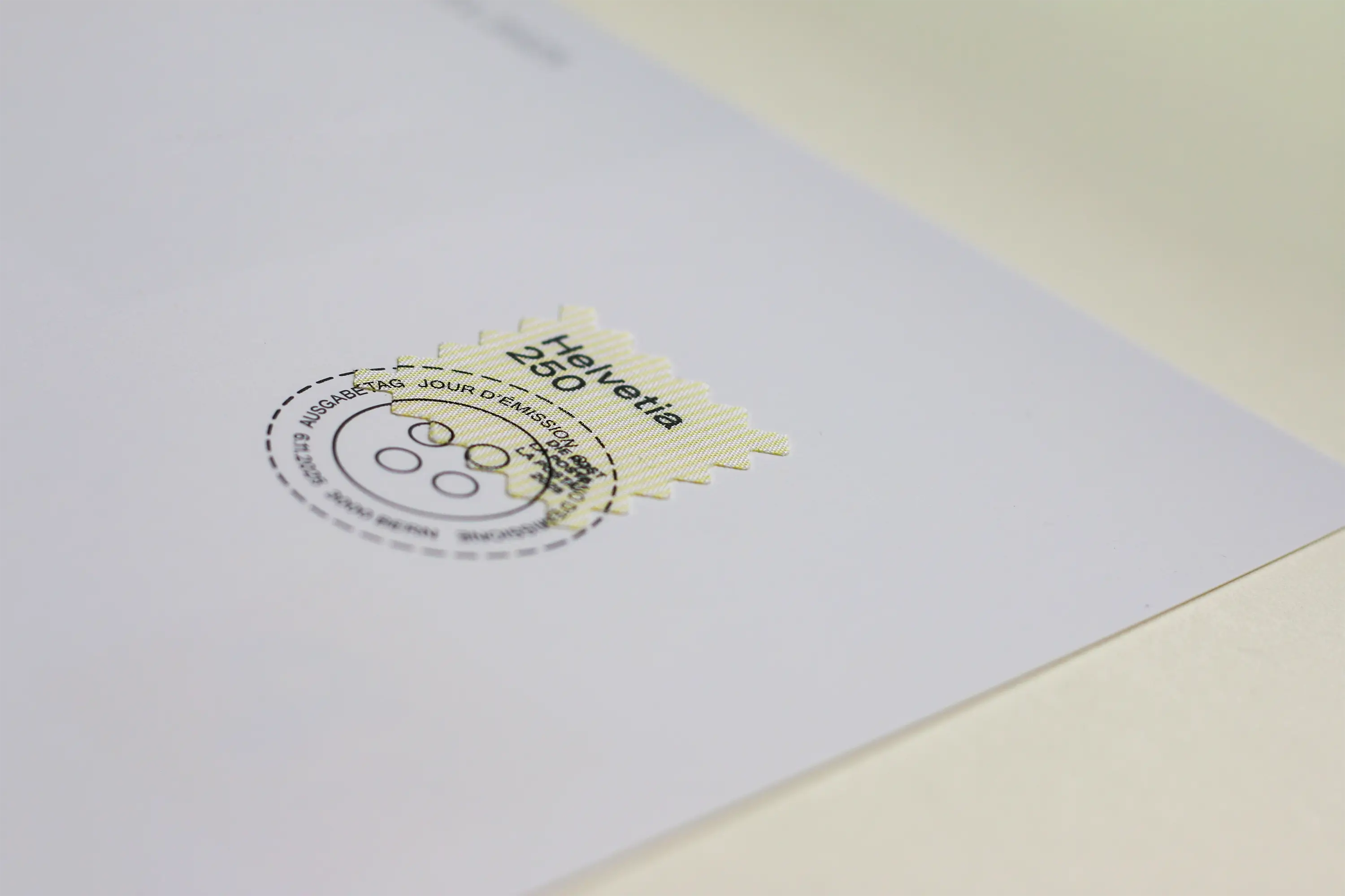
Experience Swiss Post up close: What served as workwear for postal employees for over 20 years is now getting a new life. Together with the committed and open-minded team at Swiss Post, I had the pleasure of designing the special stamp “Upcycling – from Postal Uniform to Postage Stamp.”
At the heart of the project was the idea of creating a tribute to the recognizable look and strong sense of belonging among employees. The fabric of the familiar light-yellow shirt is now setting off on another journey – this time as a postage stamp.
The design incorporates characteristic elements of the postal uniform: the print recalls the anthracite-colored blazers that were once part of the outfit and celebrates the diversity of the people who wore them with pride every day.
Typography plays an essential role as well. The stamp features OTR Grotesk by Marc Zennhäusern – a contemporary workhorse typeface rooted in Swiss design, combining legibility, precision, and character. A perfect complement to the theme.
In close cooperation with the postal service team, I was given the opportunity to design the sheet layout, including the stamps, the first day postmark and the motif for the first day cover.
The shape of the stamp is also distinctive. As if cut out with fabric scissors, it visually extends the idea of upcycling. Sales start on November 6th. For anyone who’d like to secure a small piece of fabric and memory: available at Swiss Post.
Used Font: OTR Grotesk from MZ Type by Marc Zennhäusern

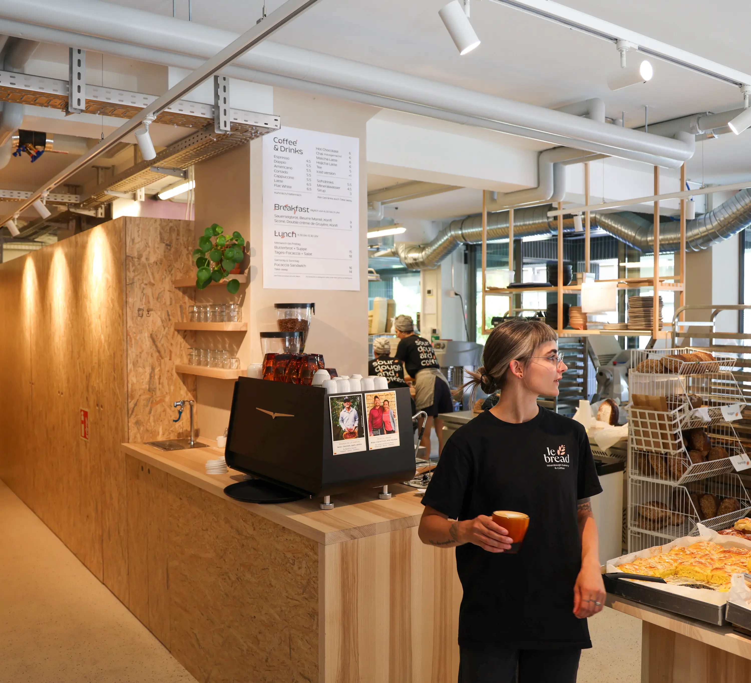
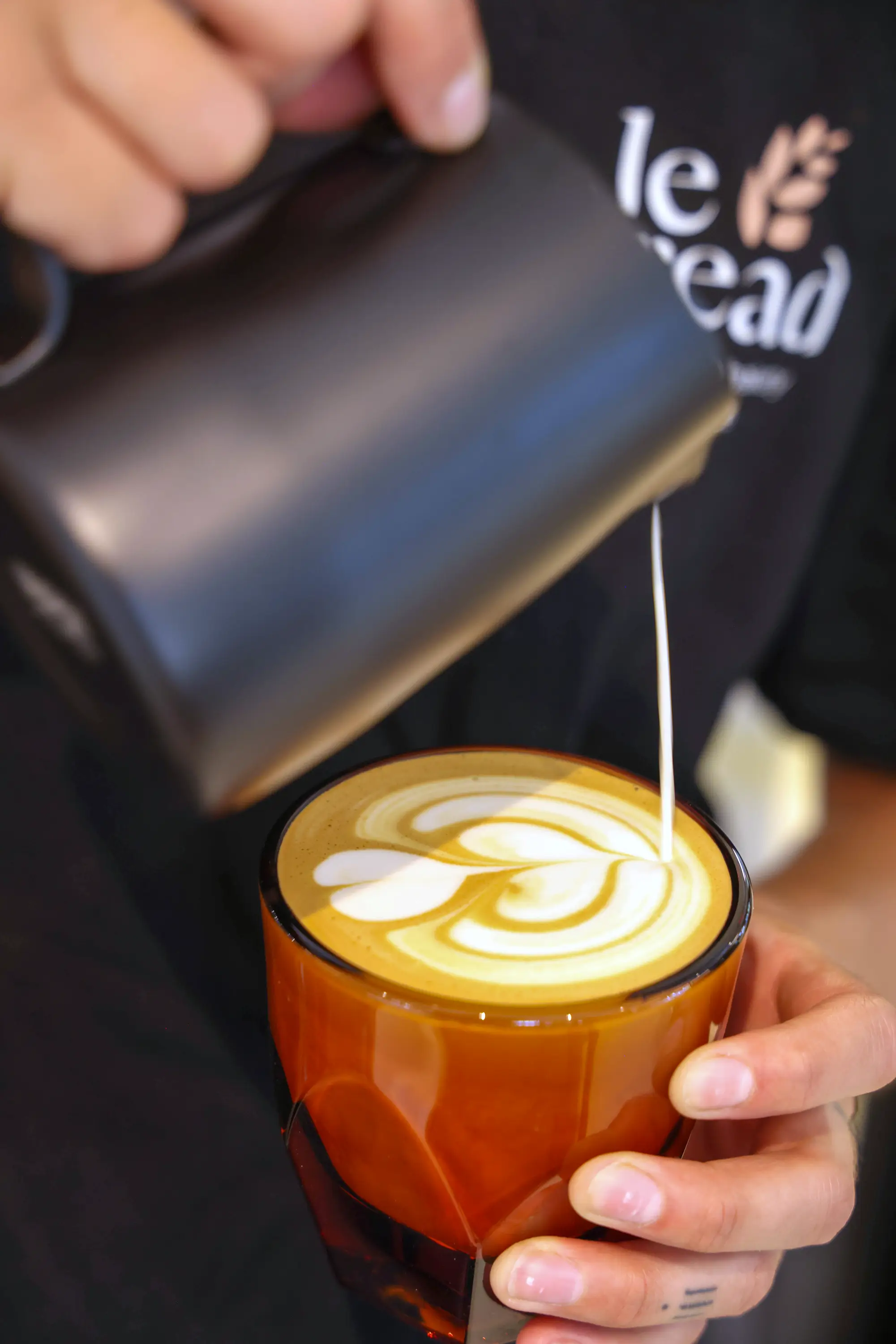
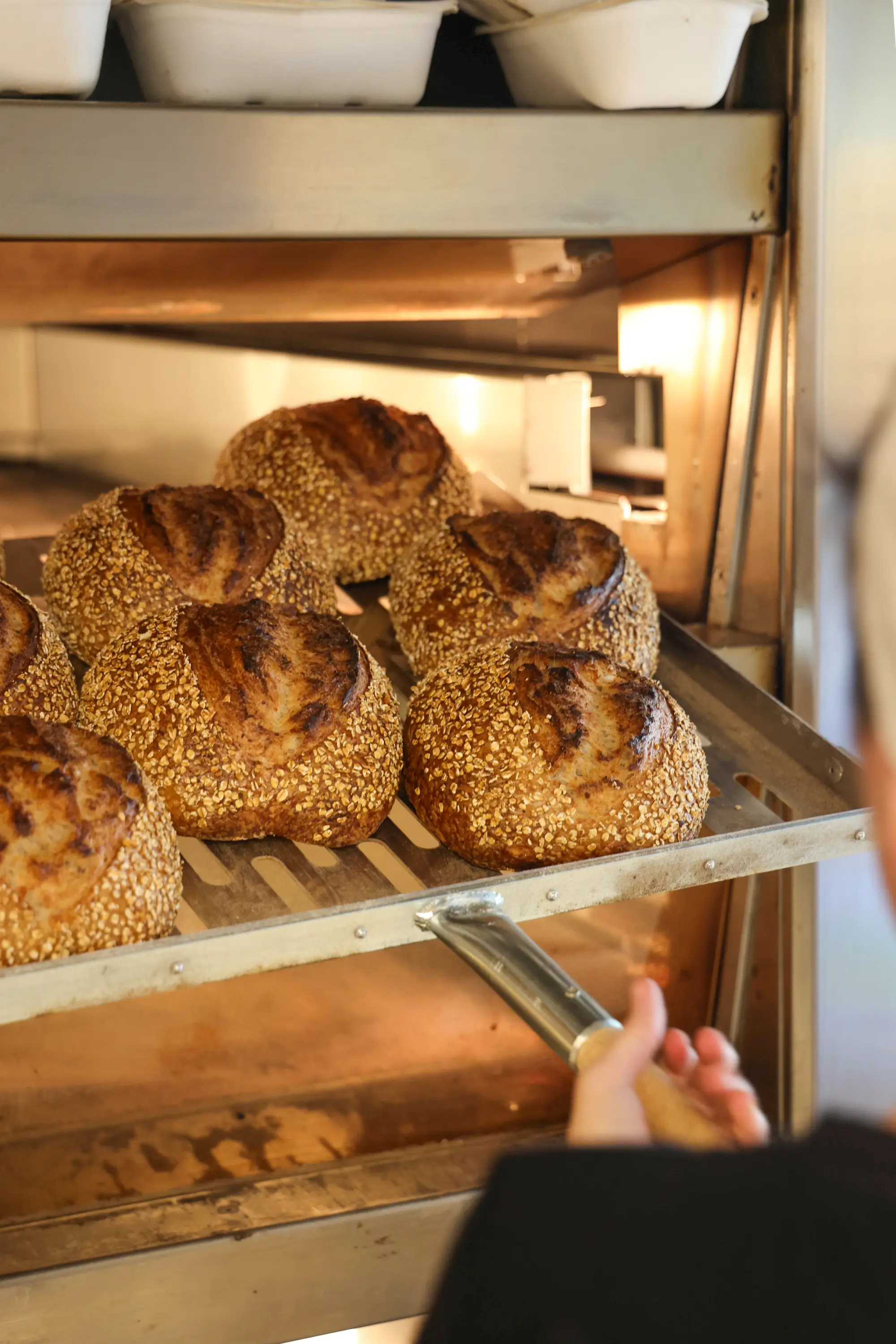
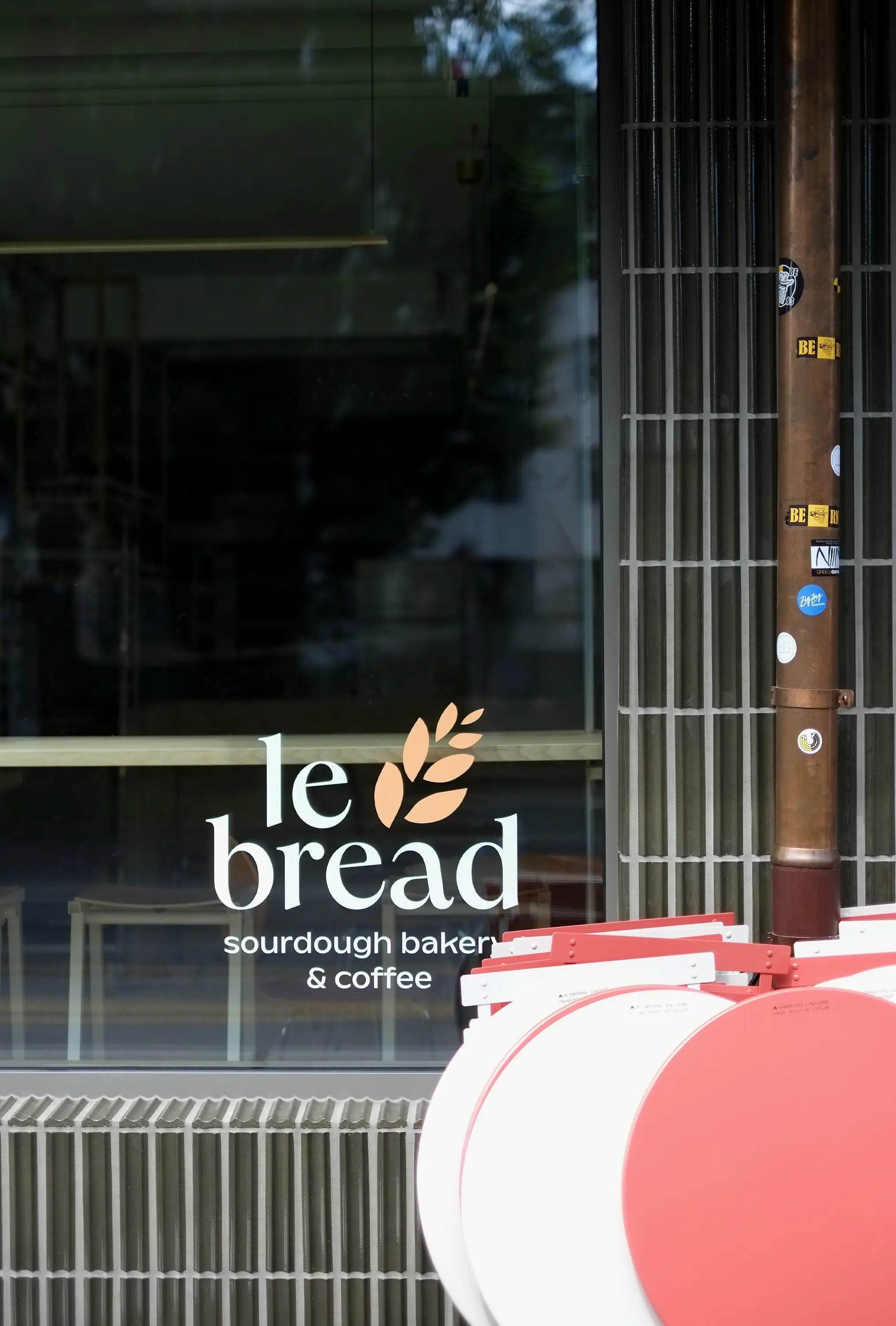
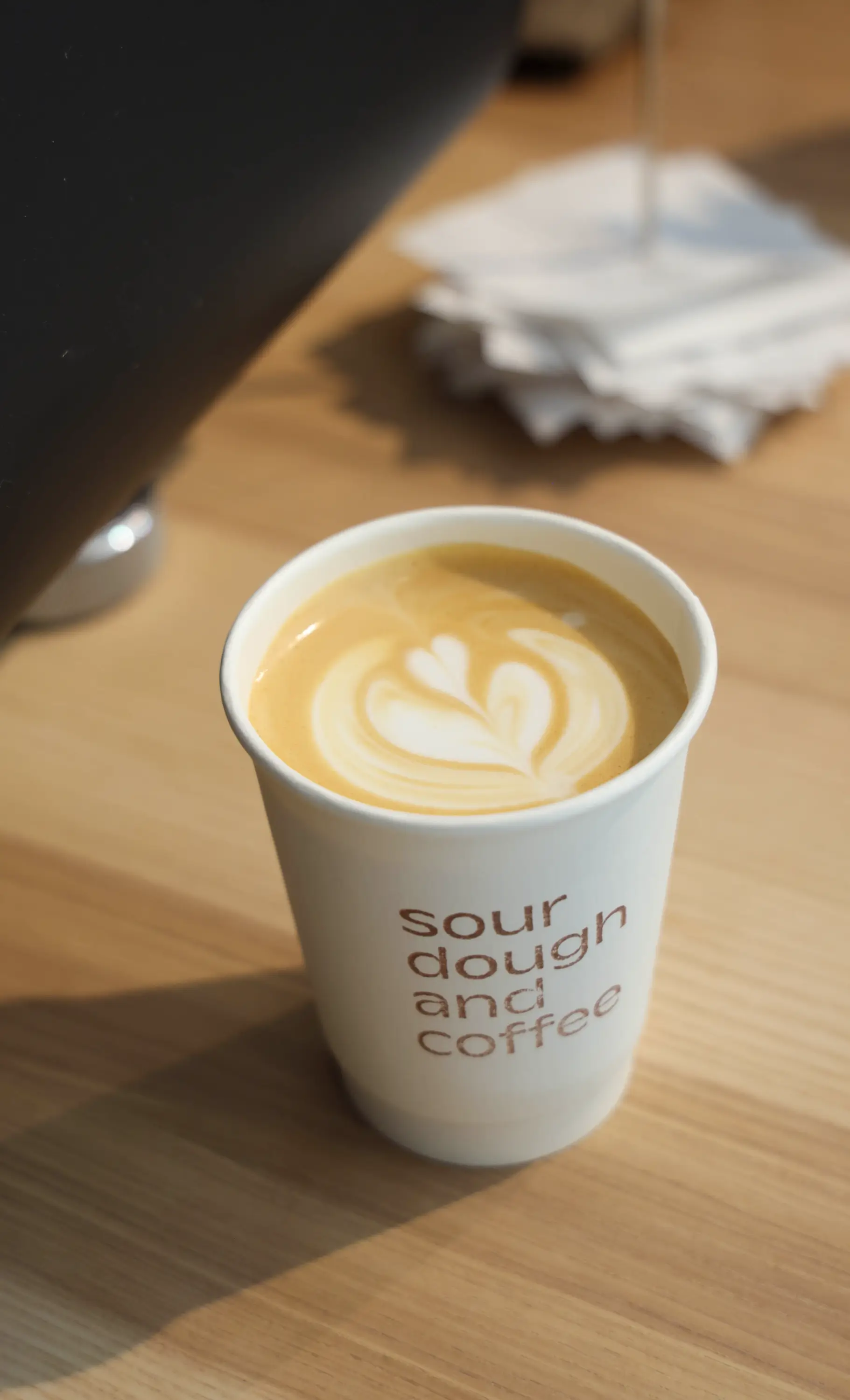
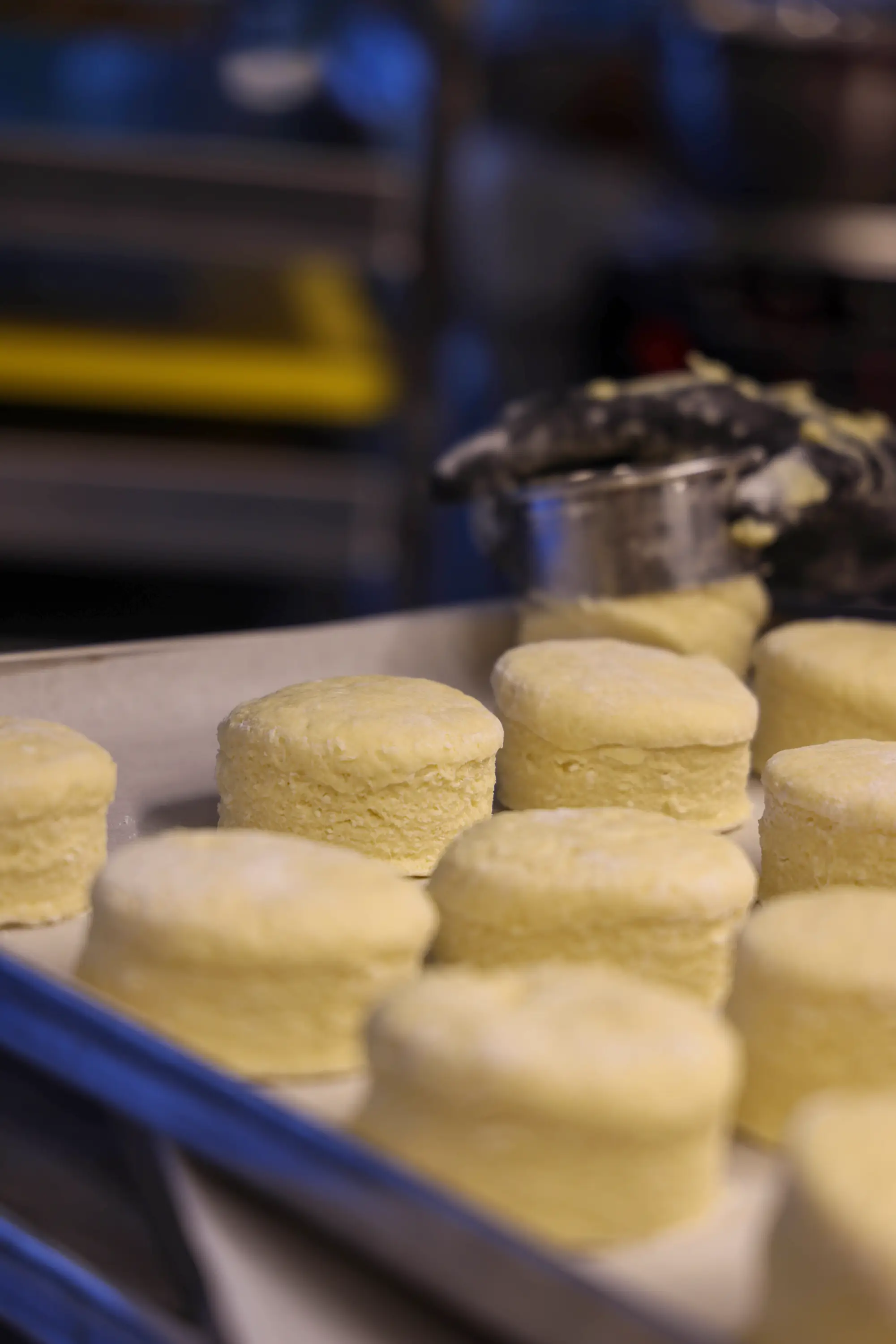
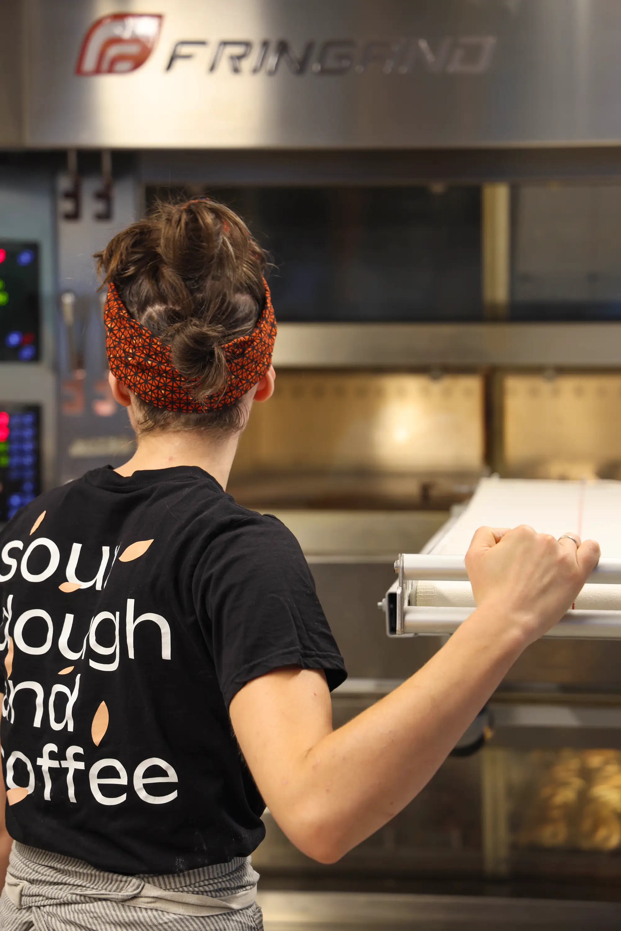
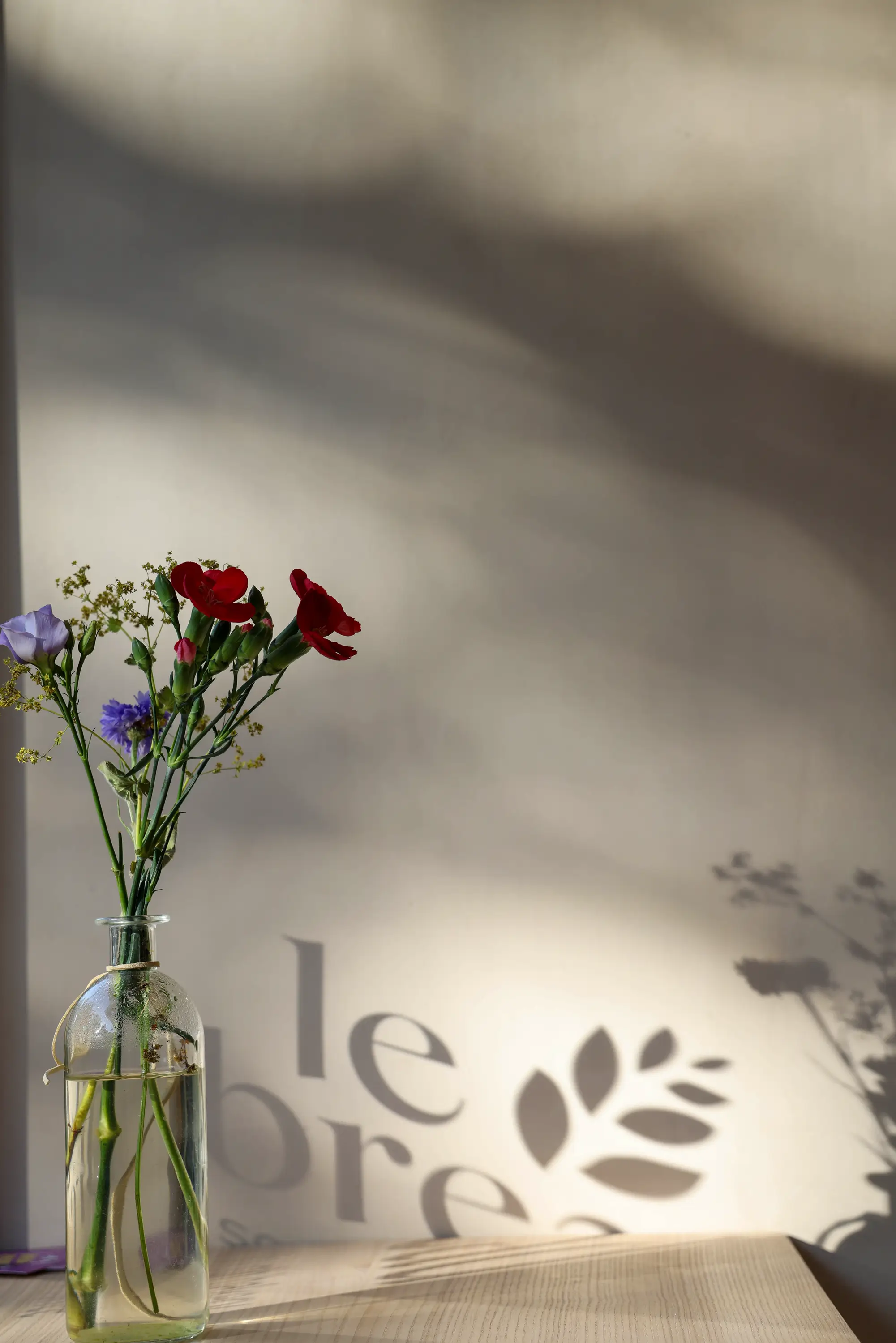
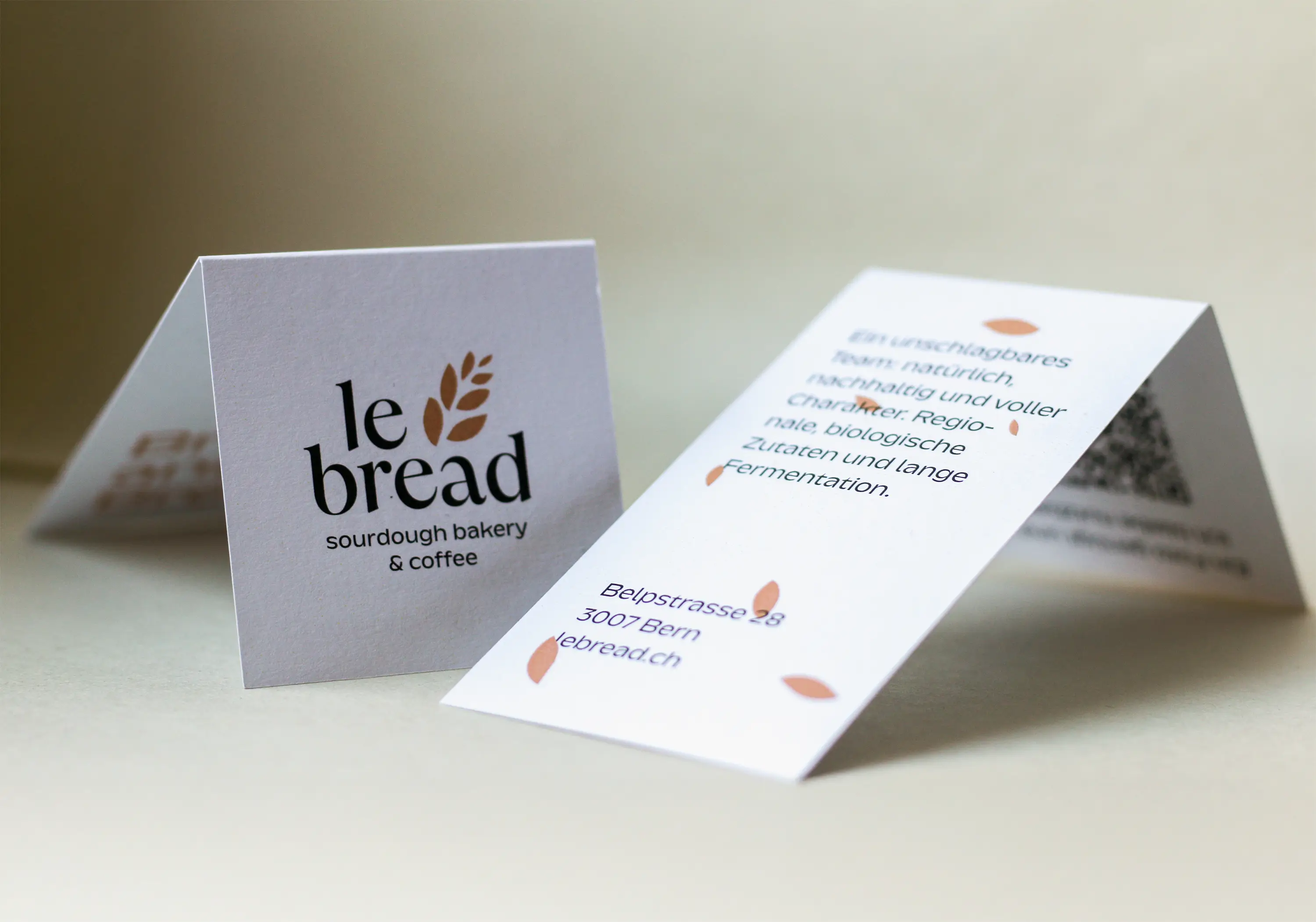
Sourdough and coffee enjoyment
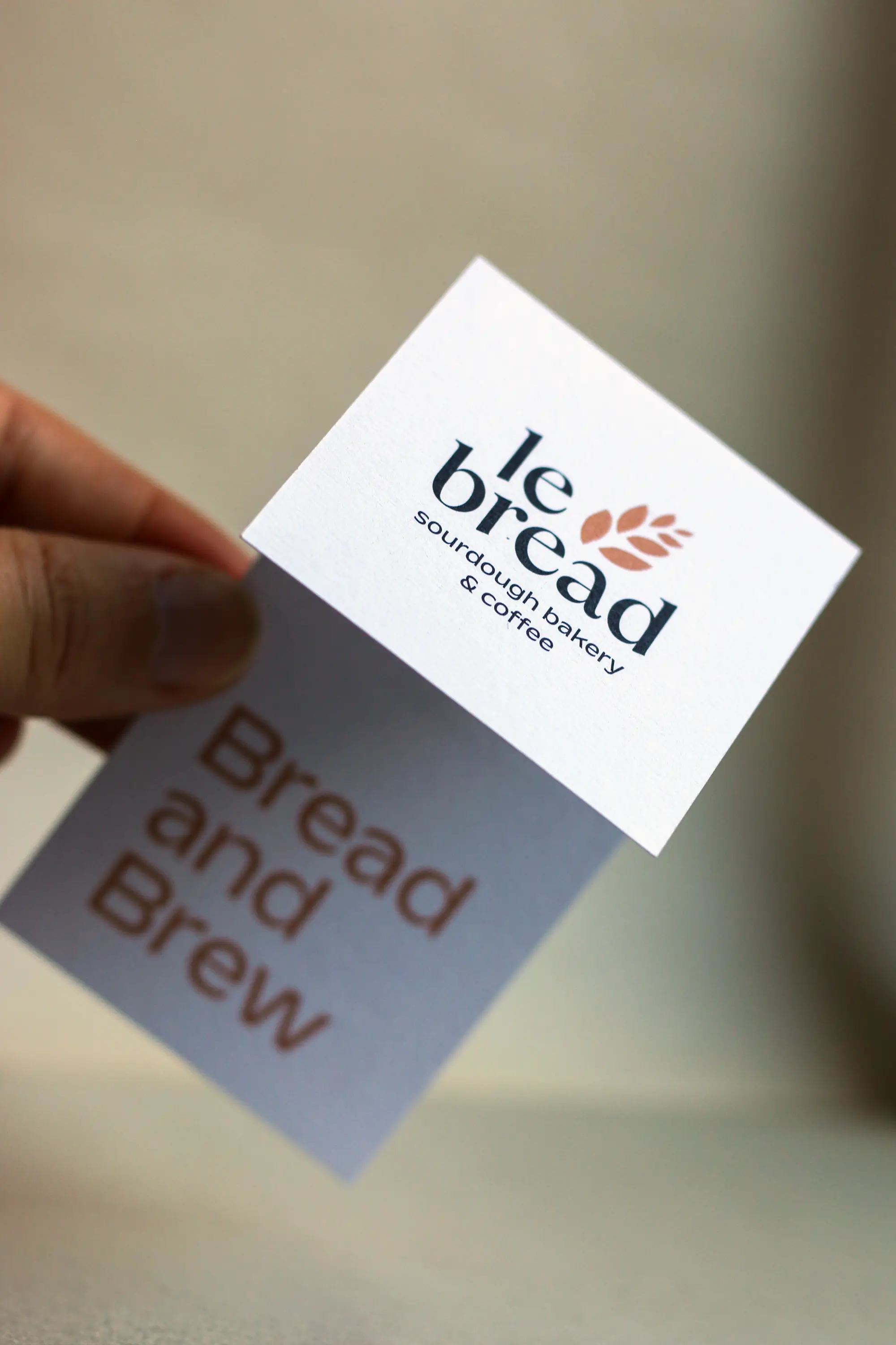
le bread: creativity and dedication
When you get to be part of an inspiring transformation – and experience so much fun, passion and trust in the process – then tackling new projects, recreating, collaborating and decorating windows is twice as much fun!
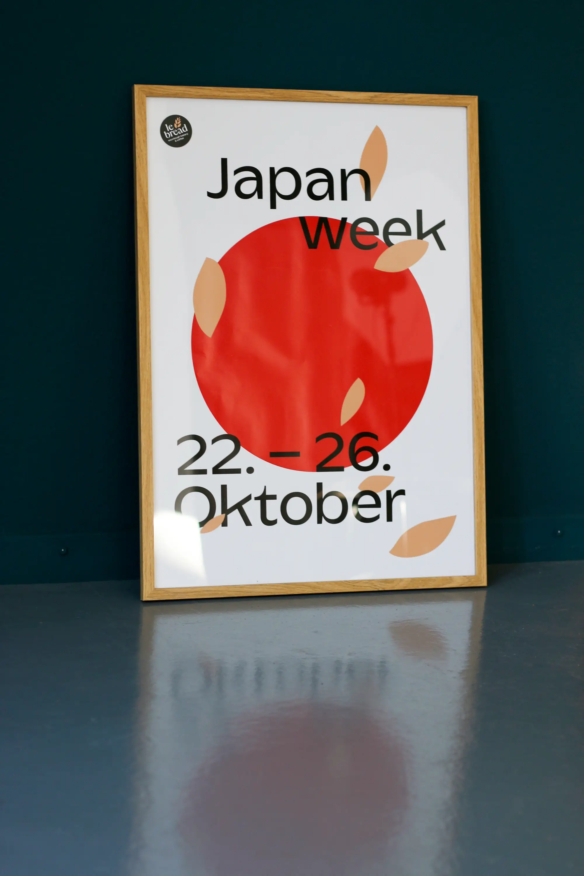
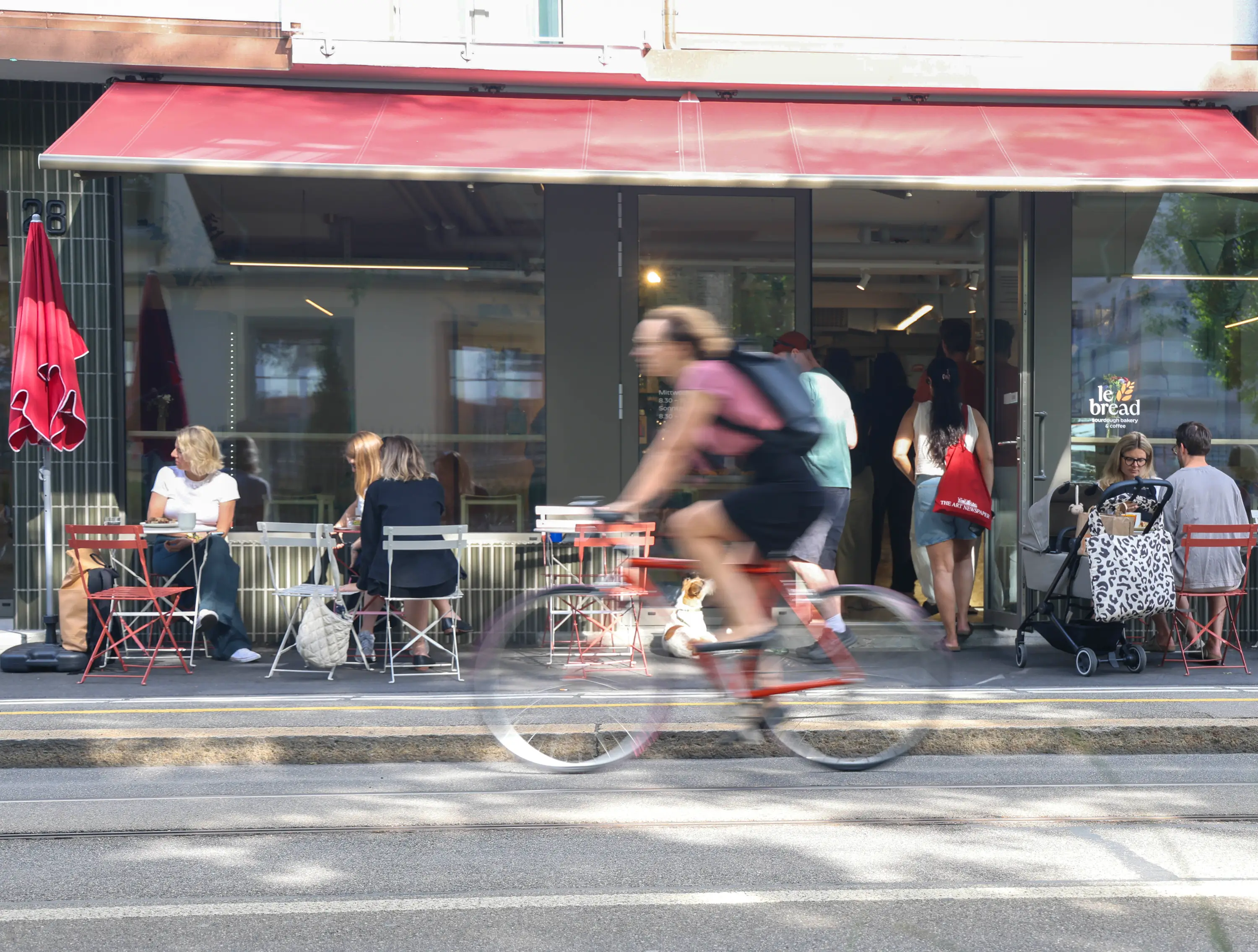
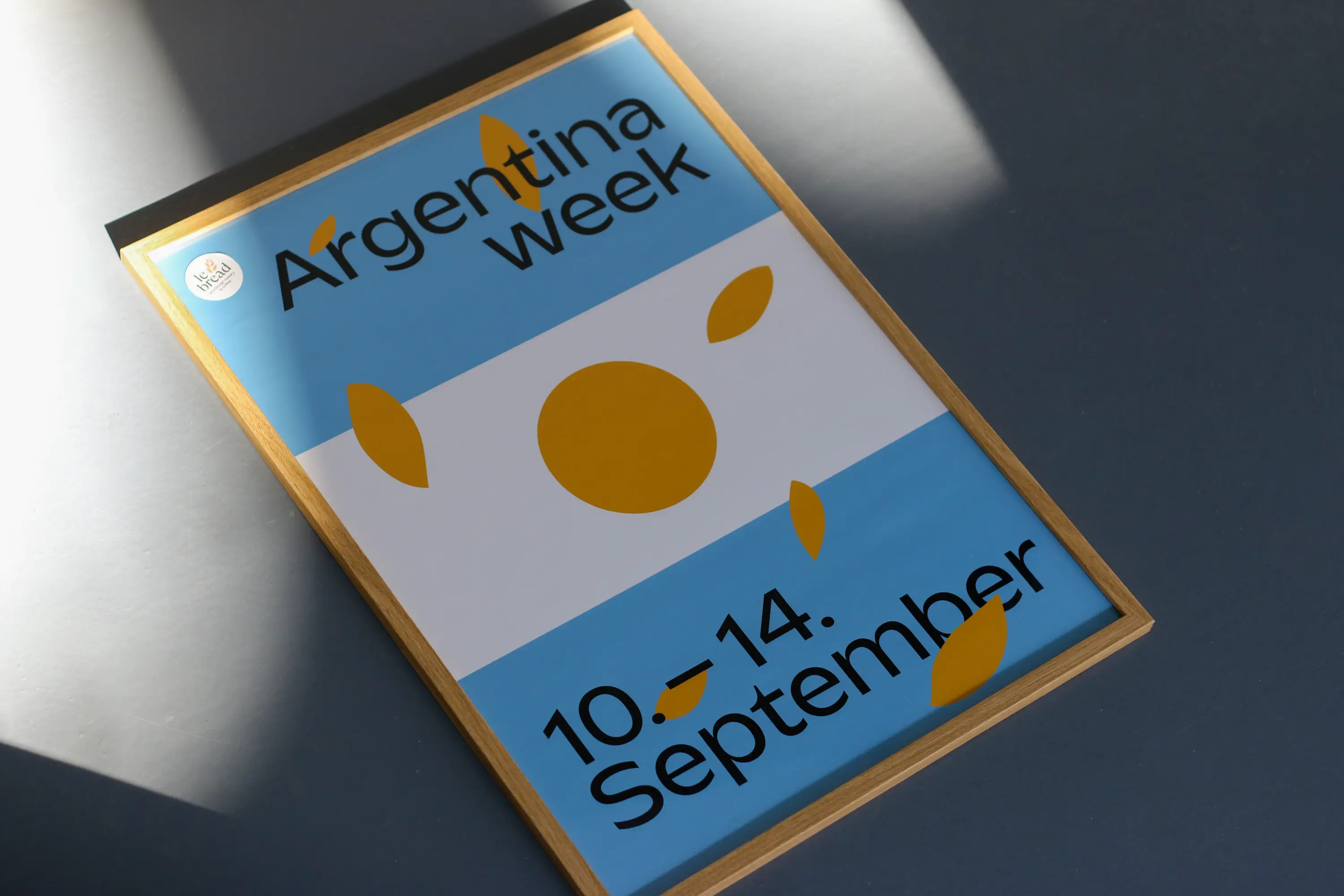
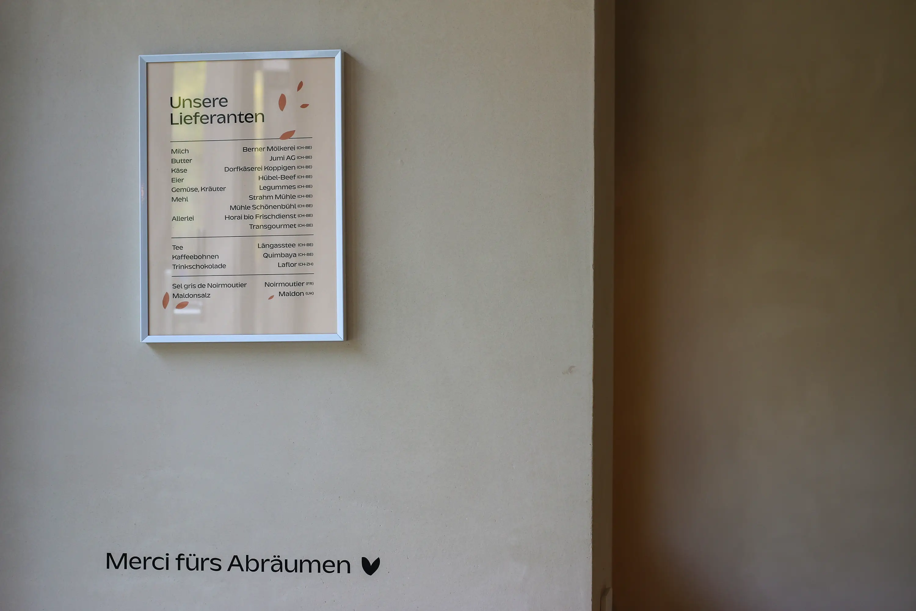
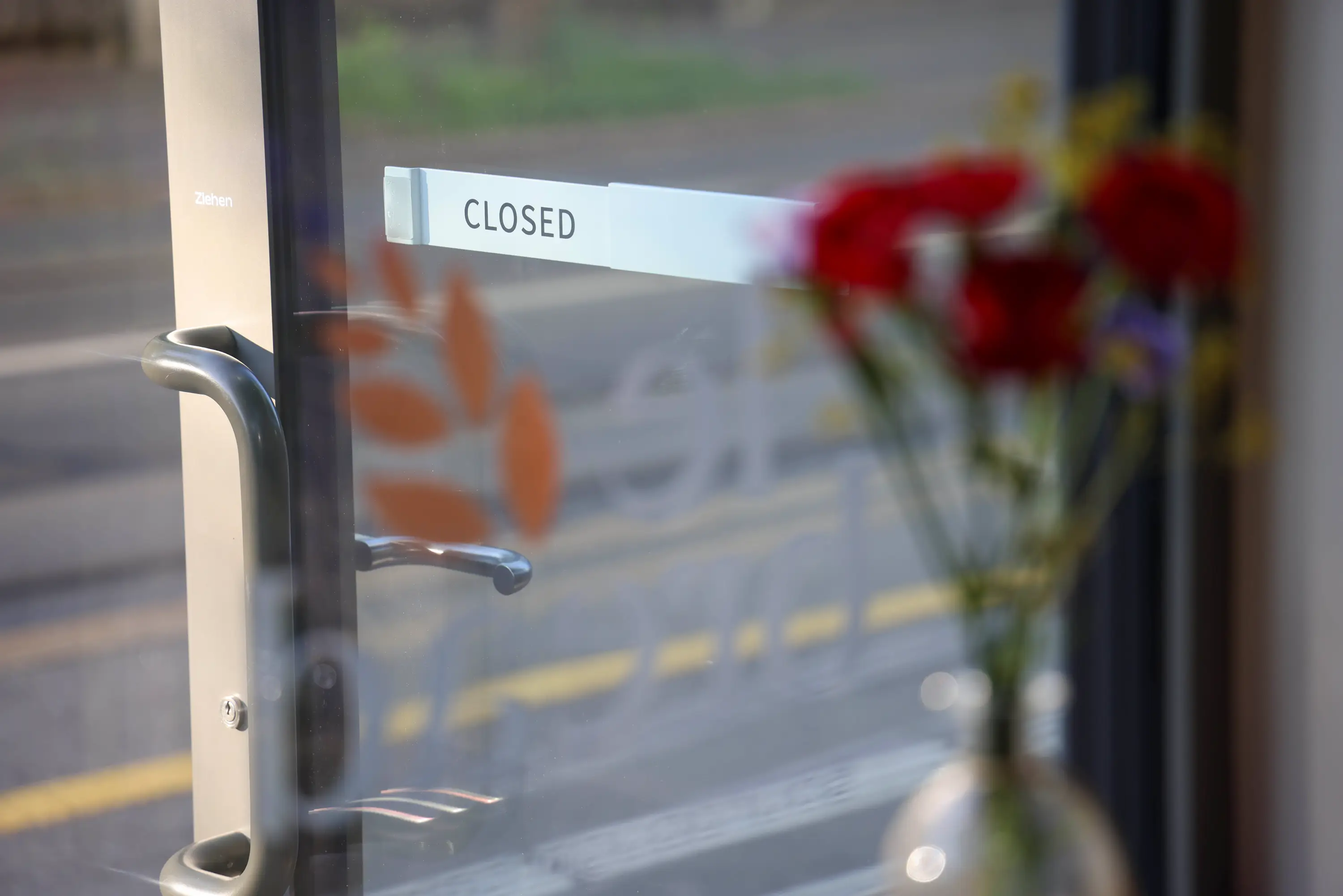
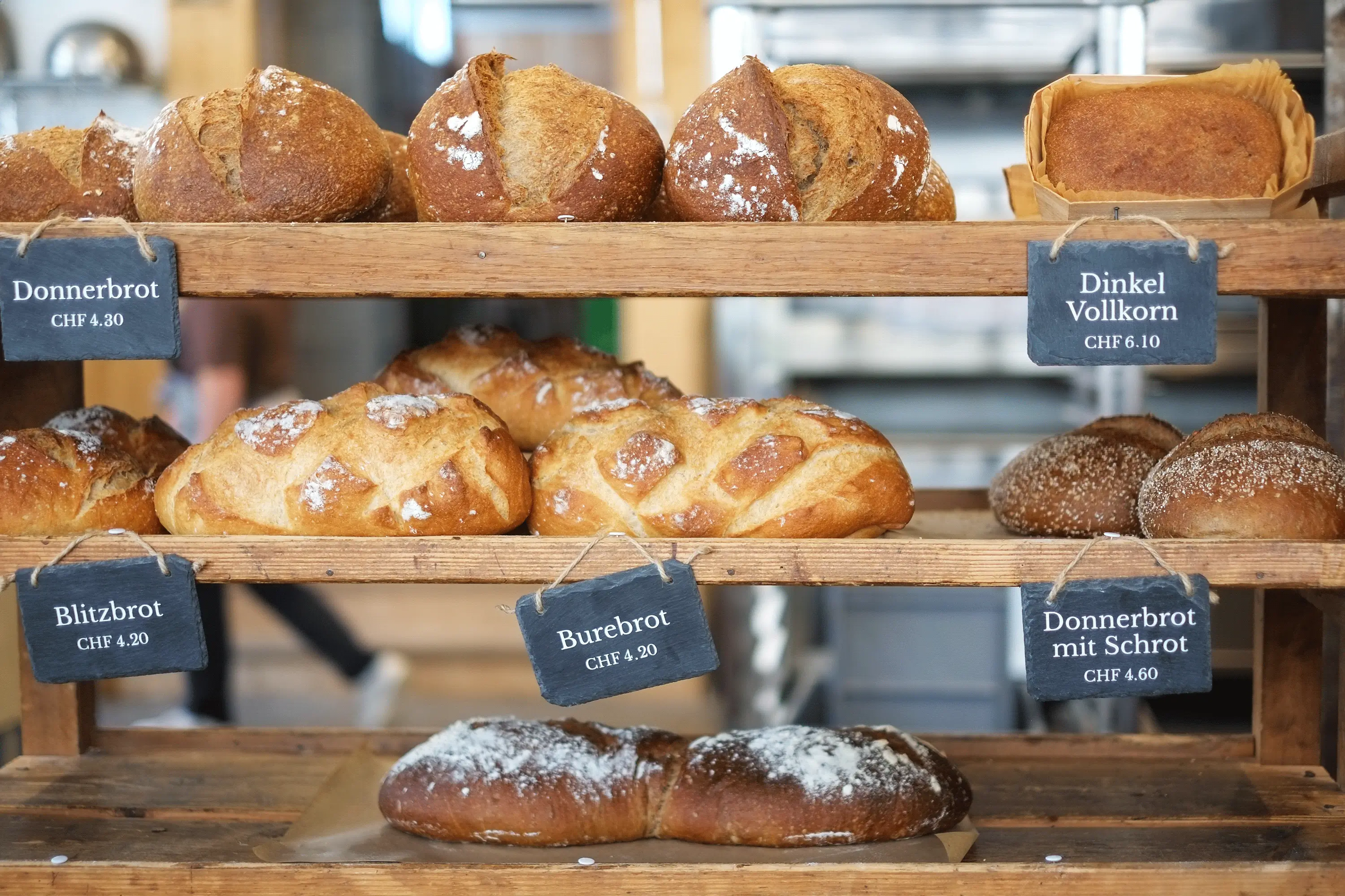
Le bread has evolved from a microbakery into a comprehensive and diverse sourdough paradise in Bern. With the move to Belpstrasse 28 in Bern came the desire for a new, adapted yet recognisable brand identity. Step by step, the logo, the lettering on the windows, the bread rack, the walls, the packaging, the team’s T-shirts and rechargeable vouchers were redesigned. And each implementation underlines the love of regionality, of lived team spirit and of discovery and creation.
This exciting collaboration has already produced some great results and continues to bubble and grow. Just like the many doughs that Bojana and her team nurture and process with love and passion. Thank you, Bojana, for your wonderful sourdough bakery and your tireless enthusiasm.
Rechargeable vouchers: Vögeli Druck, Langnau
Poster printing Special Weeks: Jordi, Belp
Font: Kaio from Lift Type
Paper Voucher: Genesis White from Fischer Papier
Sustainable service
Repair sample cards for Transa
Transa Repair Workshop ensures that favourite outdoor items can be worn and cared for longer, putting sustainability into practice.
For a few years now, I’ve had the pleasure of supporting transa in shaping their visual identity – across a wide range of exciting areas. And every time, I’m amazed by the drive of this vibrant team, their ideas, and the values they bring to life.
So I was all the more delighted to create sample cards showing the various repair options and zip colours for their repair workshop. The cards serve as a visual aid for the repair team and customers and as a basis for straightforward communication.
Printer: Kasimir Meyer, Wohlen Aargau
100% recycled paper Muskat from Fischer Papier
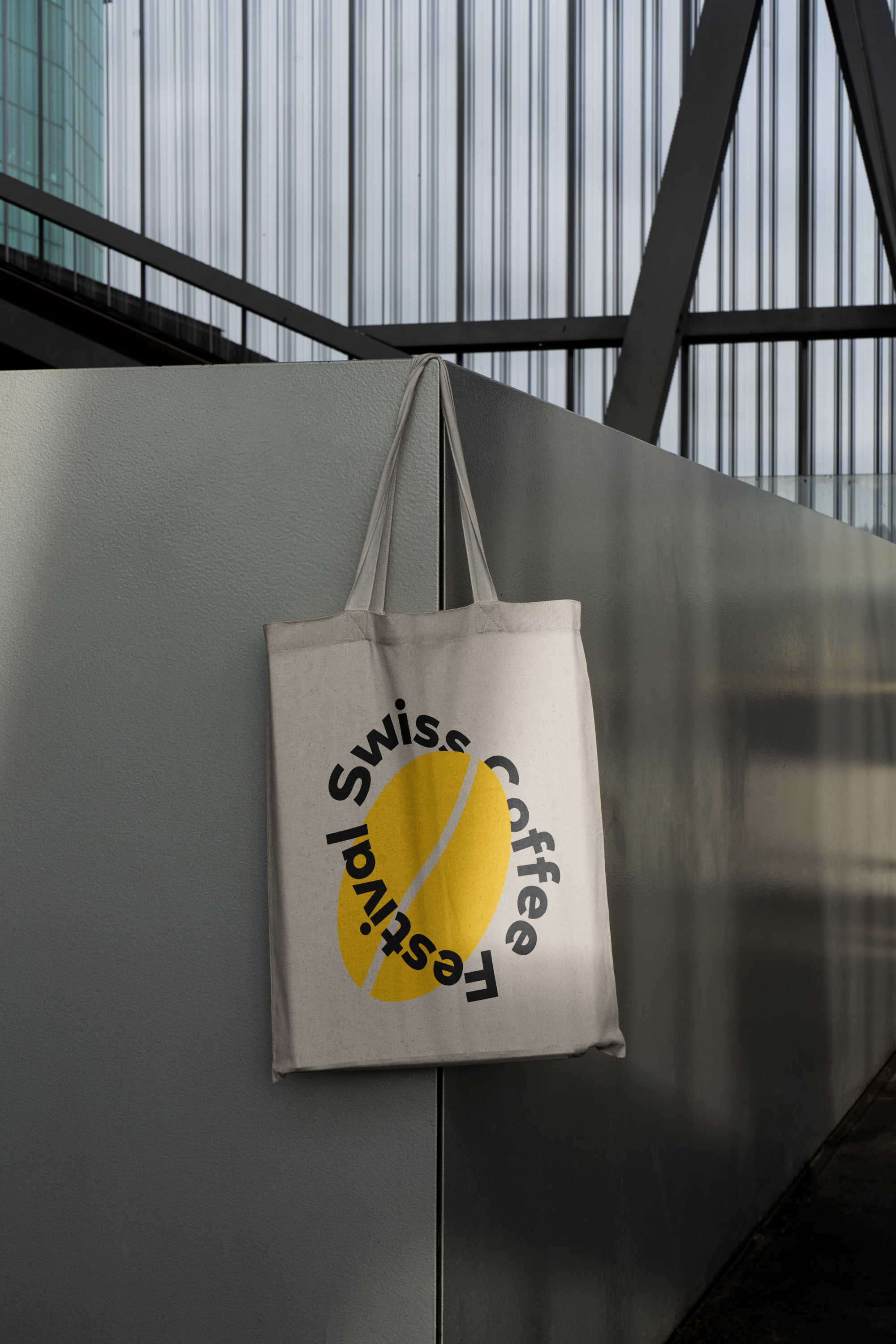
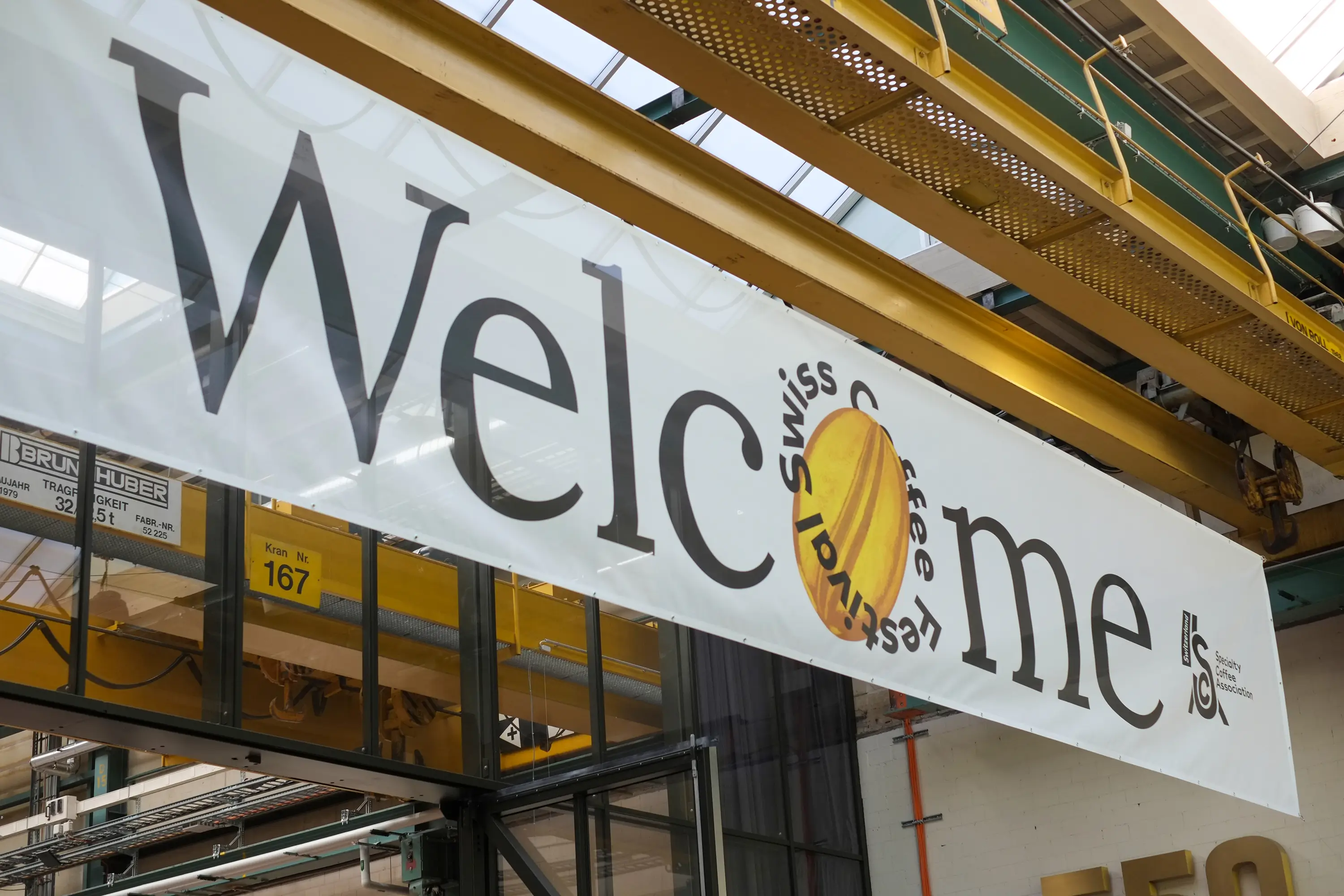
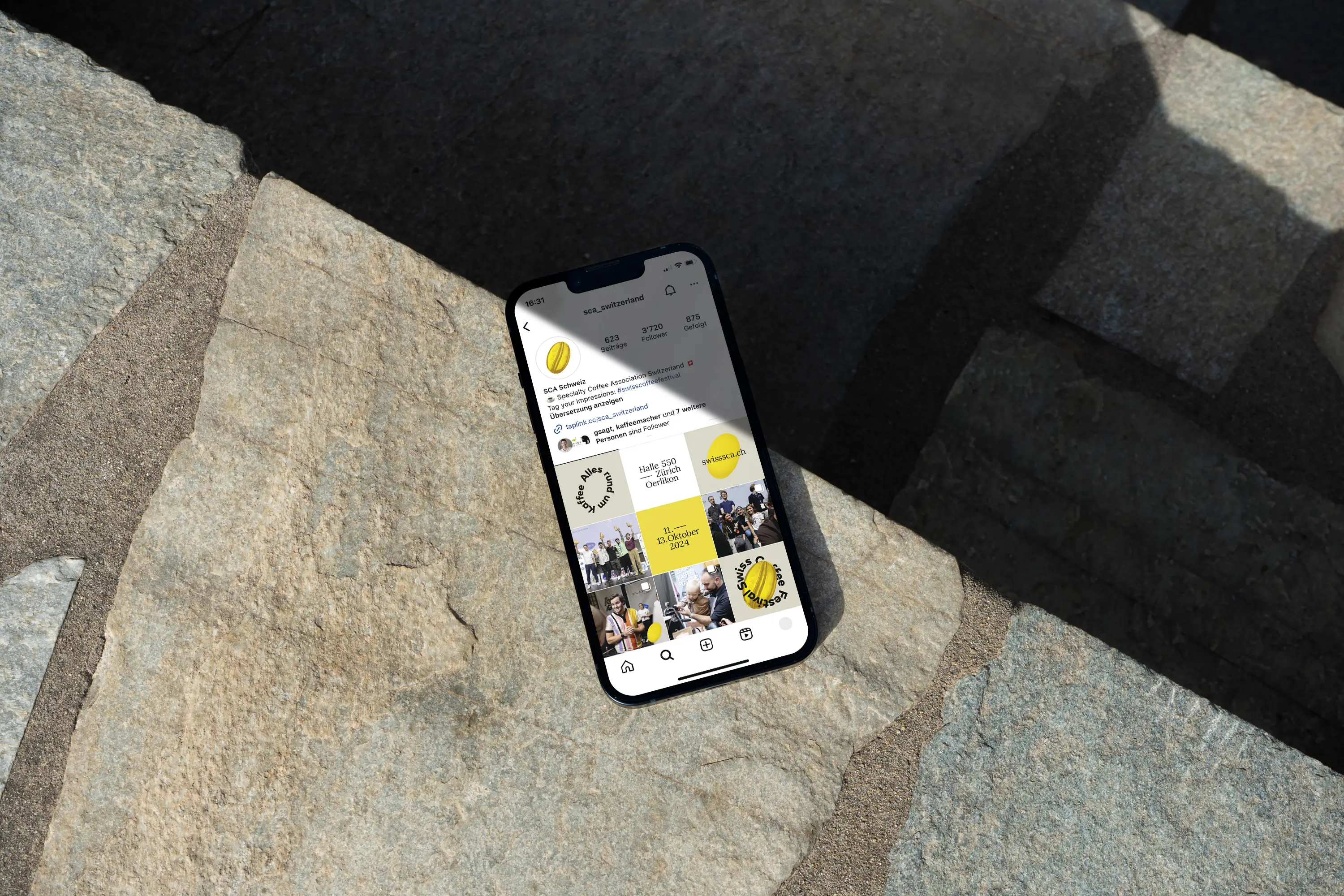
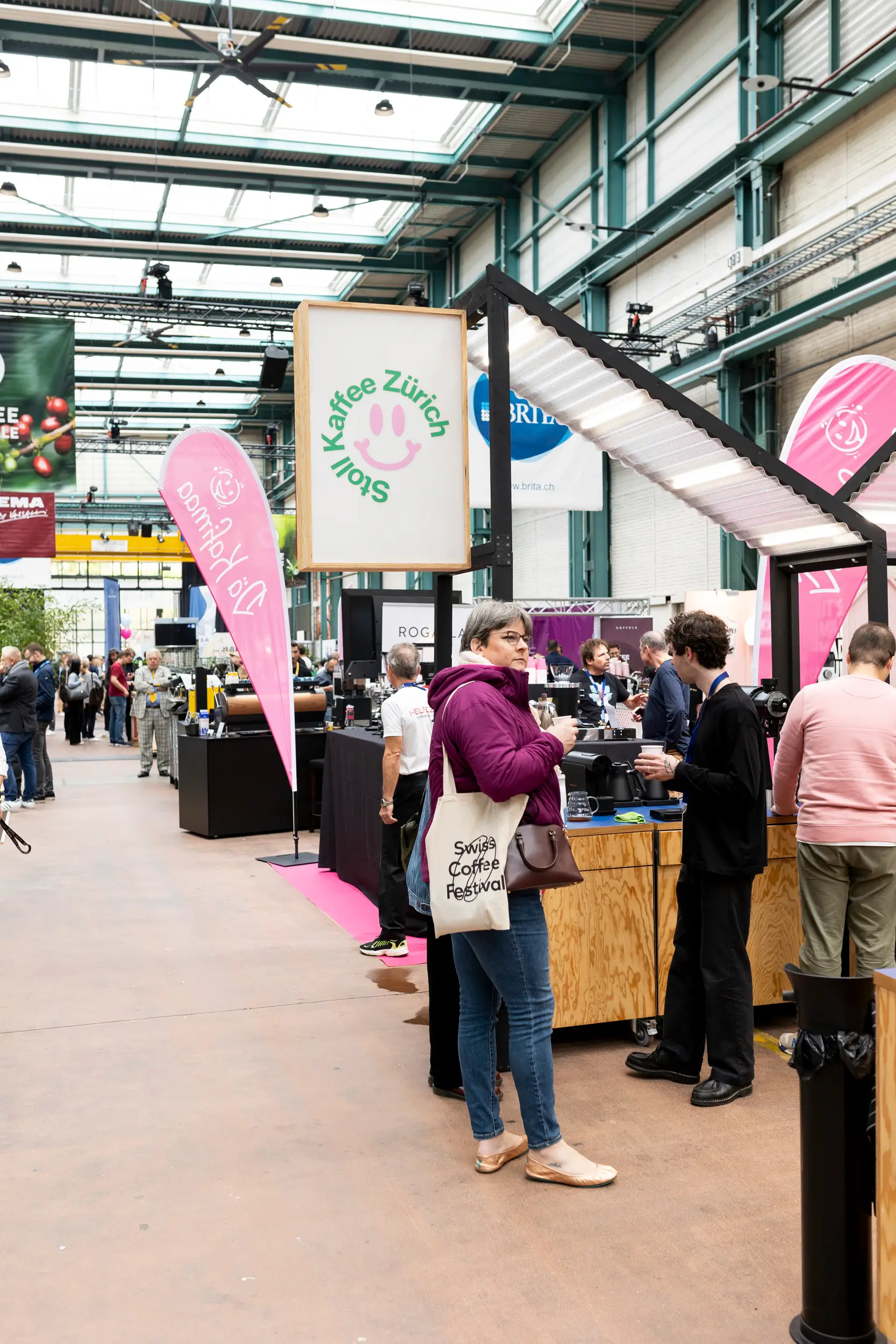
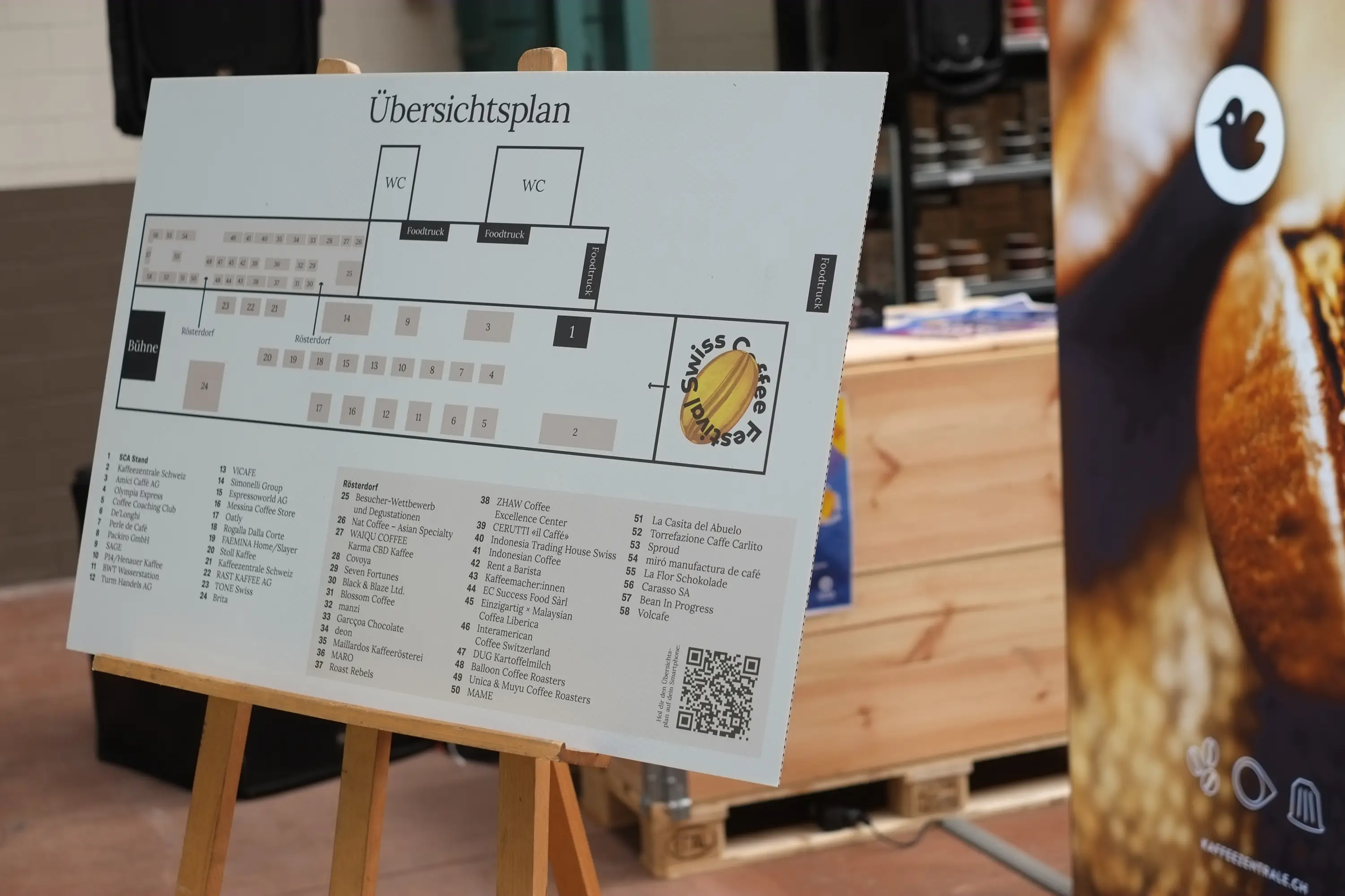
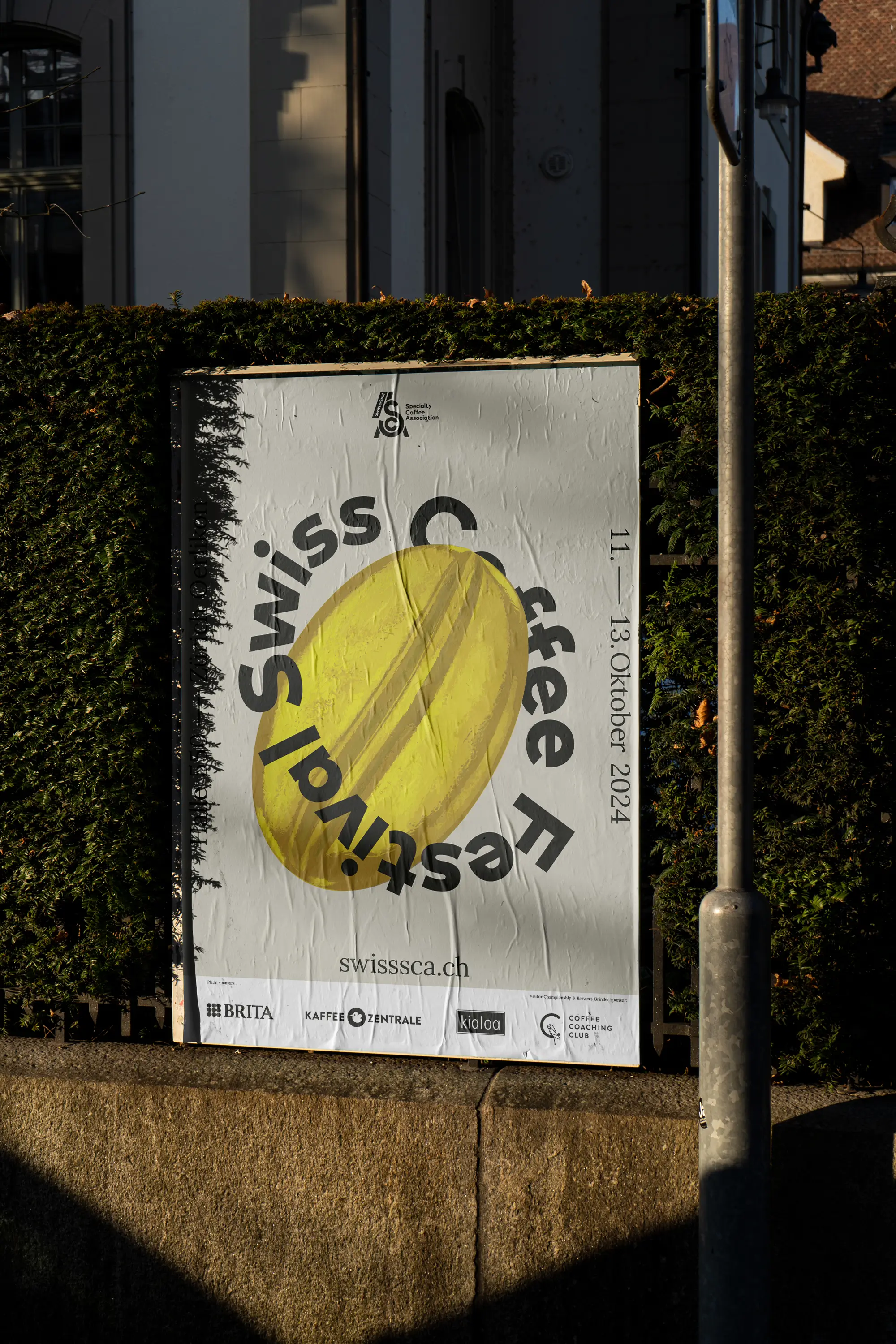
Coffee Fair in Zurich
Swiss Coffee Festival
A meeting point for coffee lovers, producers, roasters, equipment manufacturers, and more.
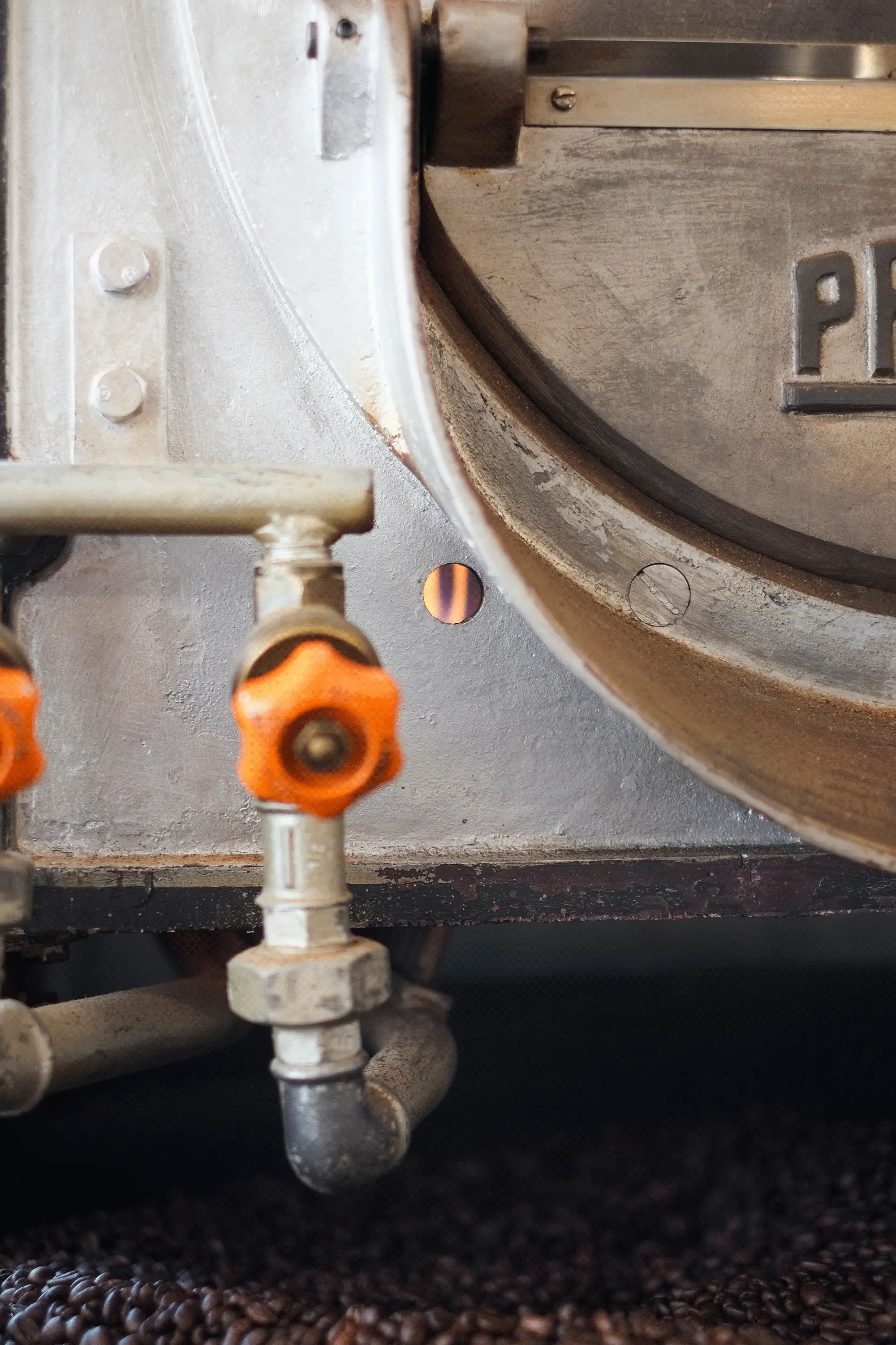
When an impressive hall in Zurich fills with coffee lovers and the air is filled with delightful aromas at every corner, you know it’s that time again: The Swiss Coffee Festival is captivating its visitors! The Swiss Coffee Festival is a three-day coffee fair organized by the Specialty Coffee Association in Zurich. It transforms Hall 550 in Oerlikon into a lively meeting point for coffee enthusiasts, producers, roasters, equipment manufacturers, and more. The vibrant exchange within the coffee community also invites attendees to follow the exciting Swiss Coffee Championships.
For the third time, I had the pleasure of supporting the festival team at sca switzerland with various visual measures for the festival. At the heart of the design is the essence of every great coffee: the bean. Year after year, the team and I have worked to make the festival’s communication more sustainable and reusable. For instance, with the expertise of our partner Aroma Schweiz, we created great alternatives and solutions for banners and roll-ups that can be used in the coming years or recycled.
60 volunteers pour their heart and soul into the event every year, ensuring a smooth and passionate festival experience. Everything about coffee—and so many fascinating people—at the Swiss Coffee Festival!
Exhibition Measures and Trade Fair Planning: Aroma Schweiz
Printed Products: Wir machen Druck


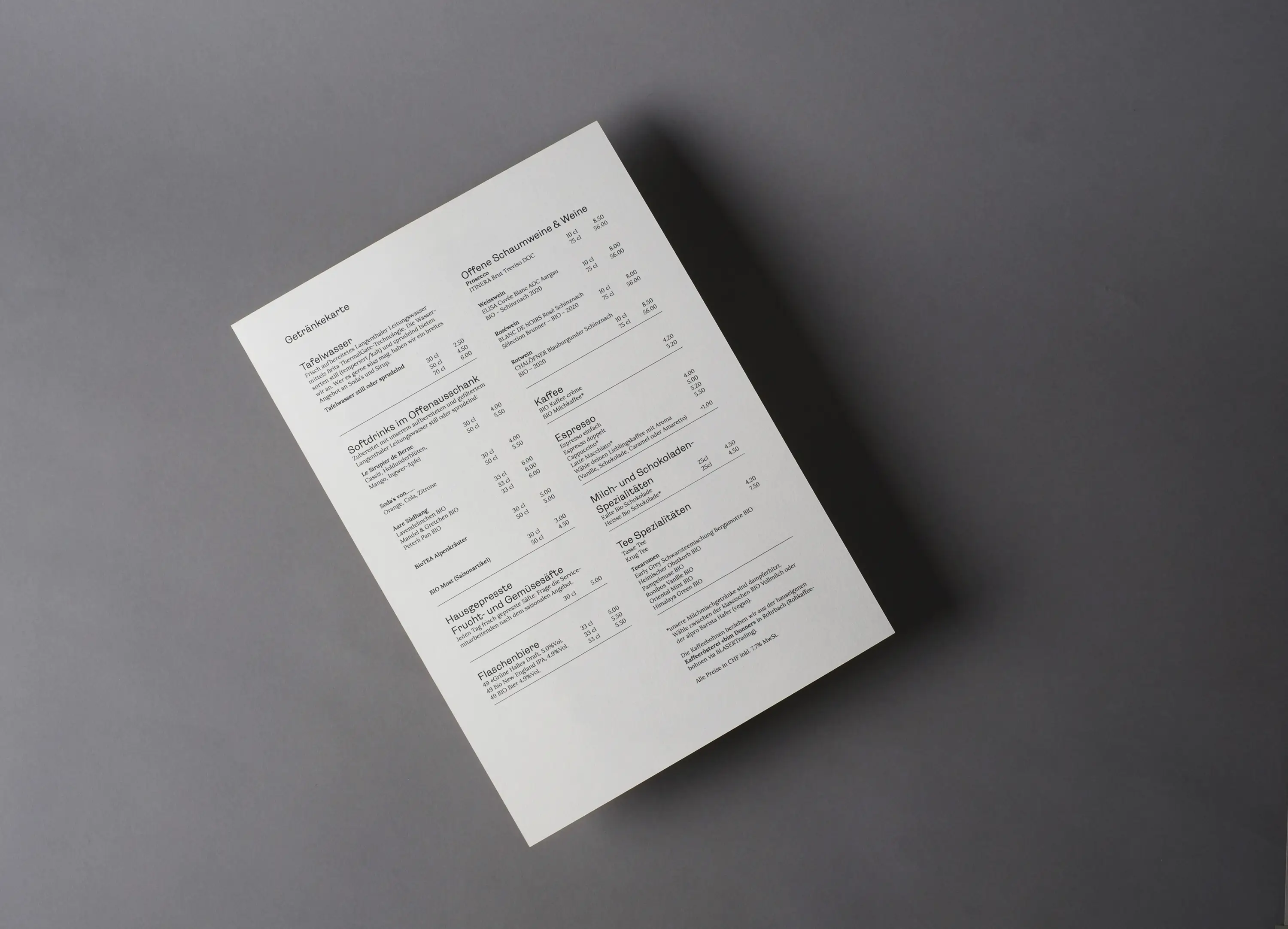
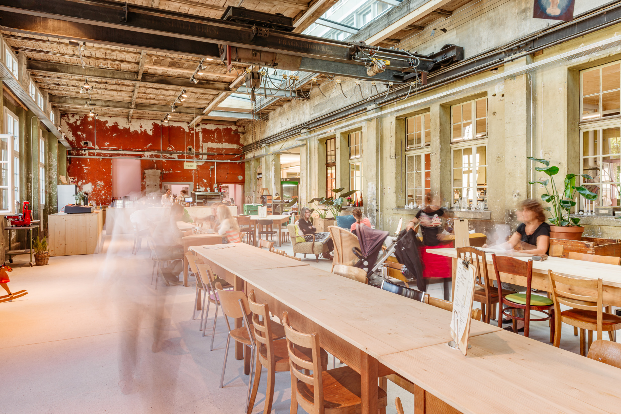
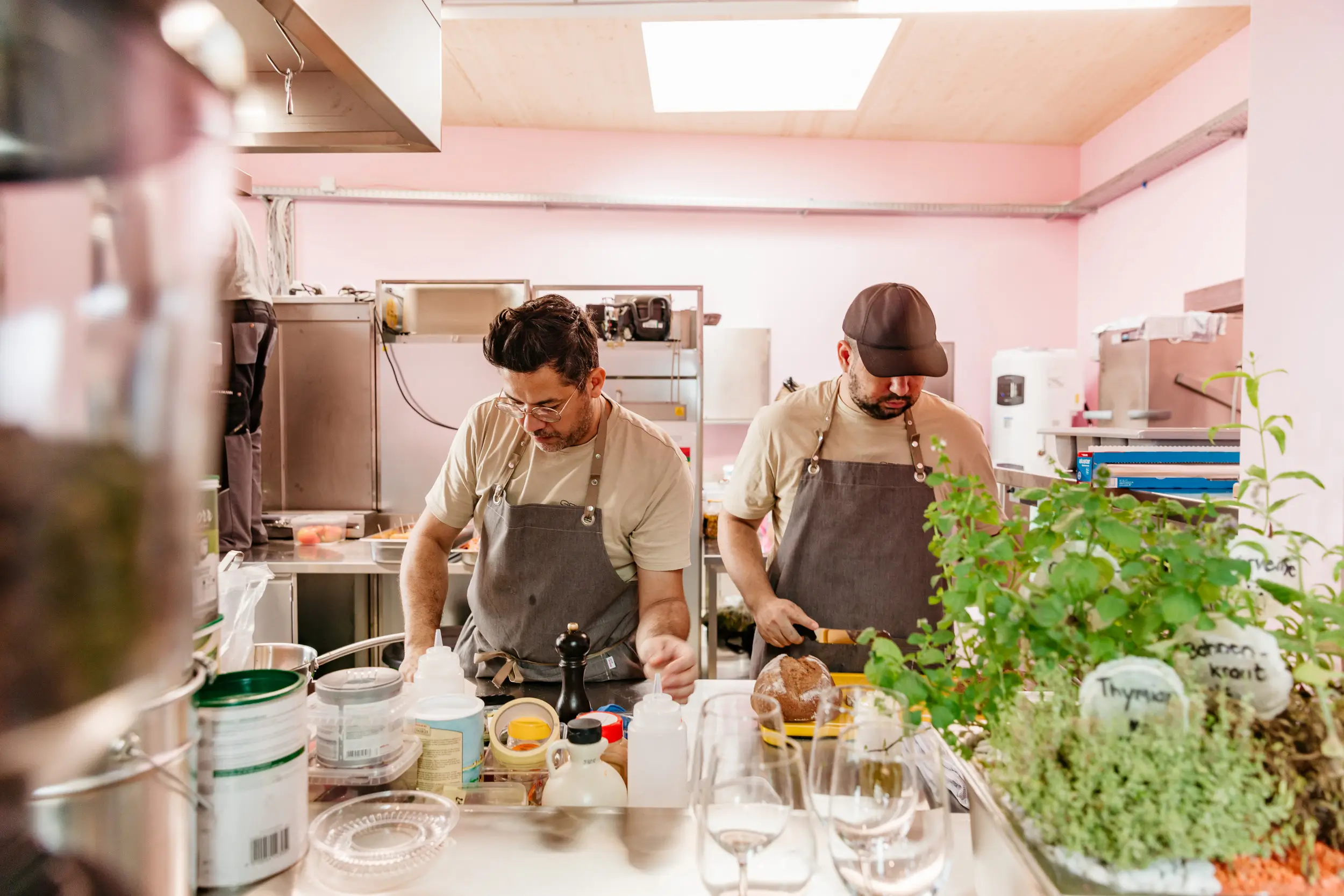
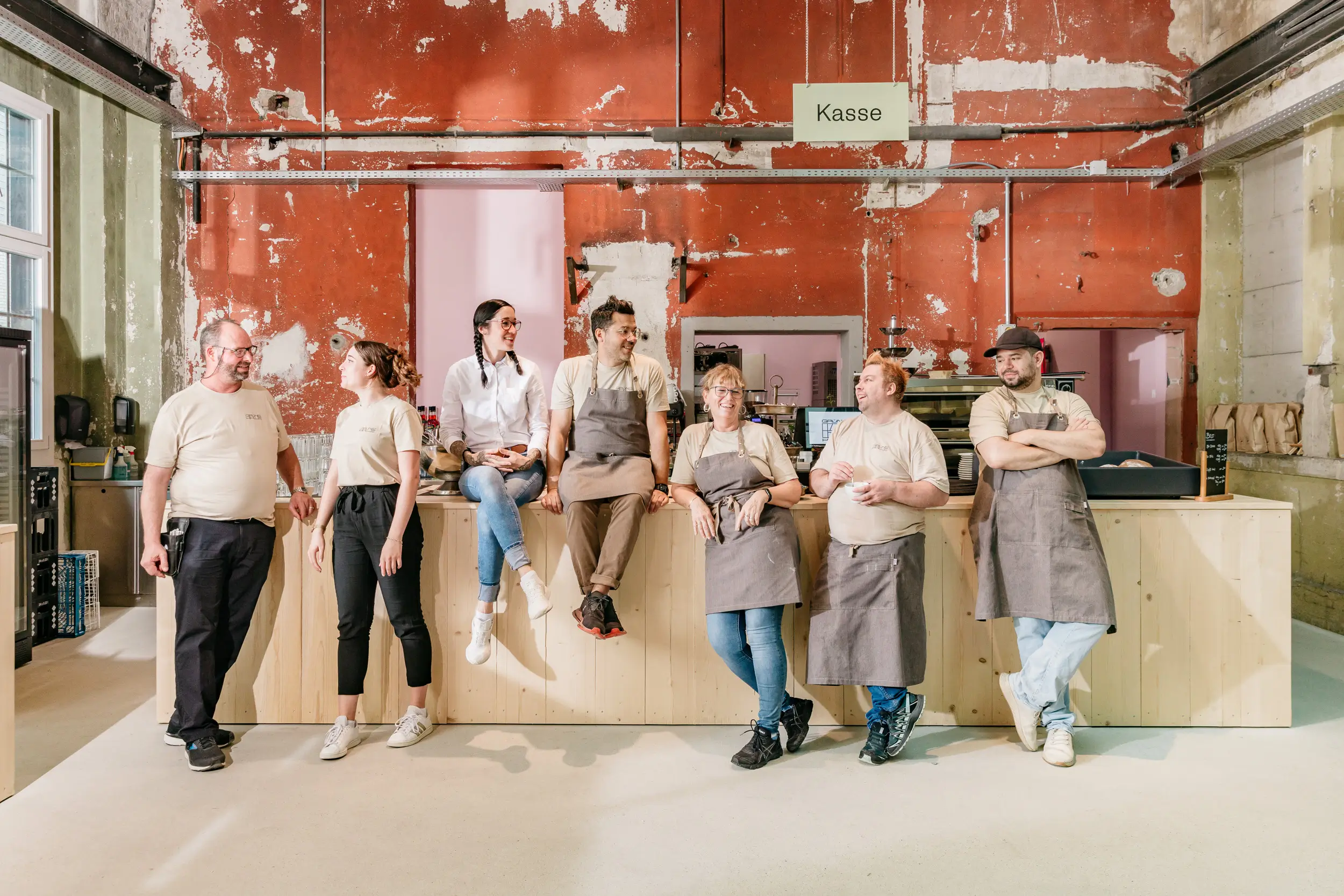
Heart and Passion in Langenthal
Meaningful Culinary Delight
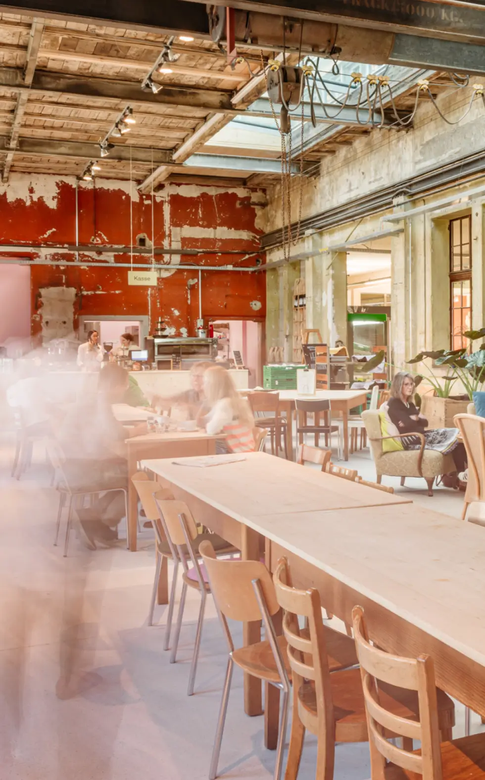
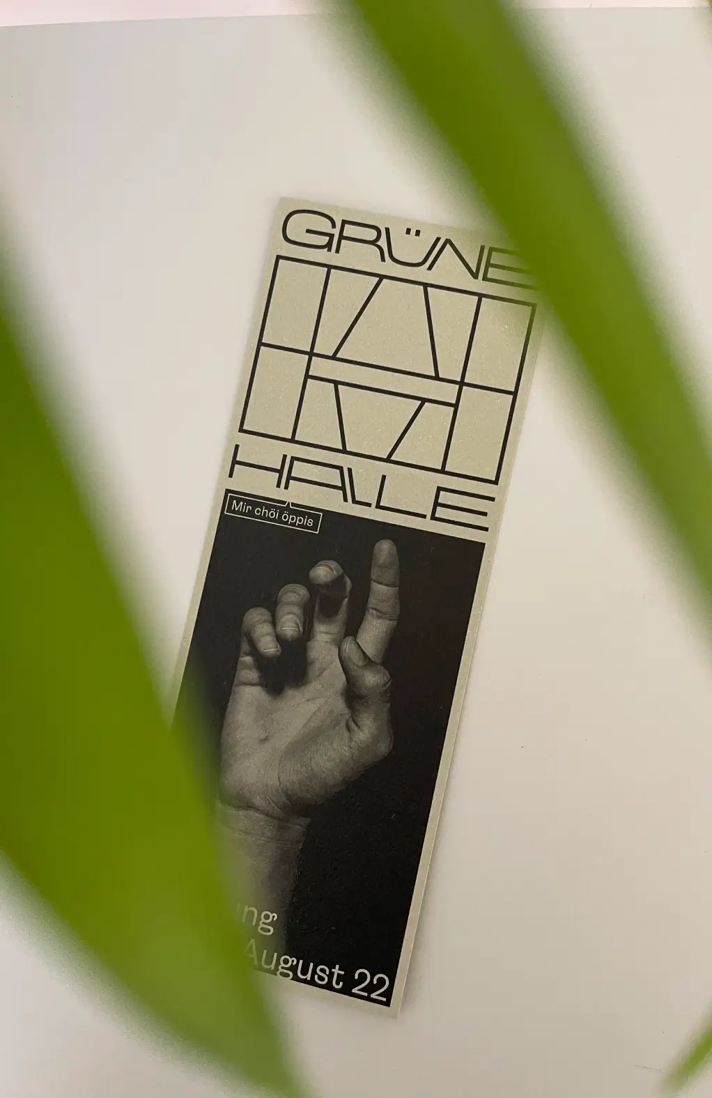
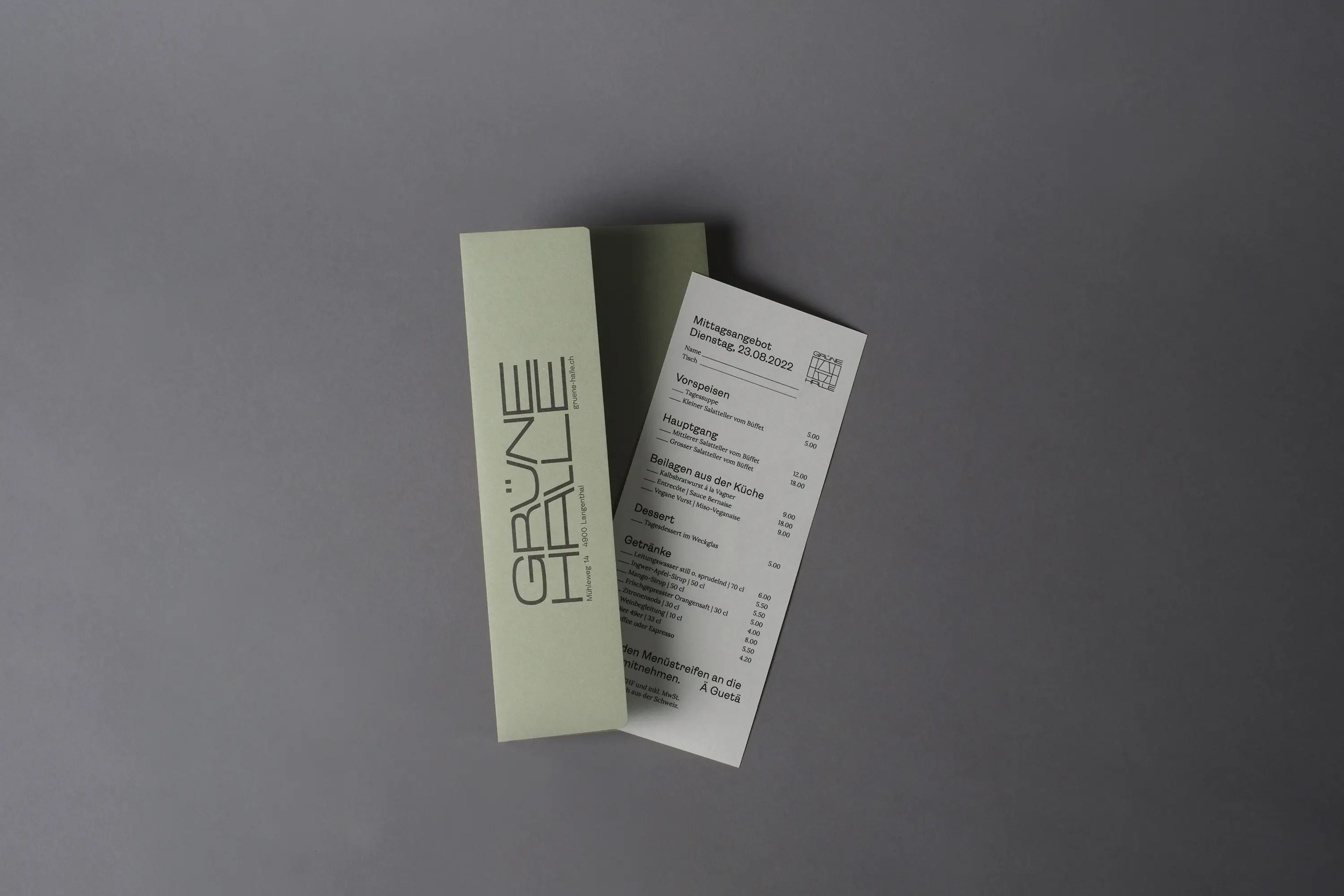
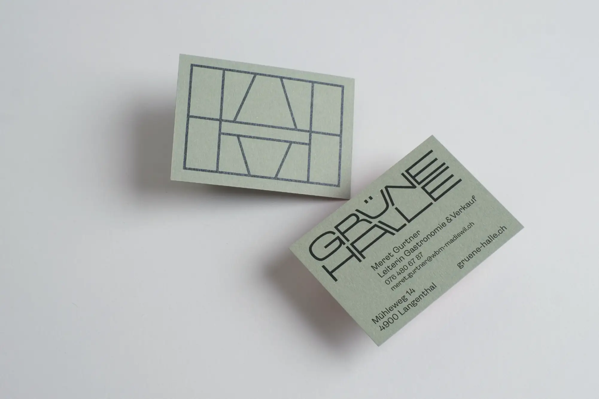
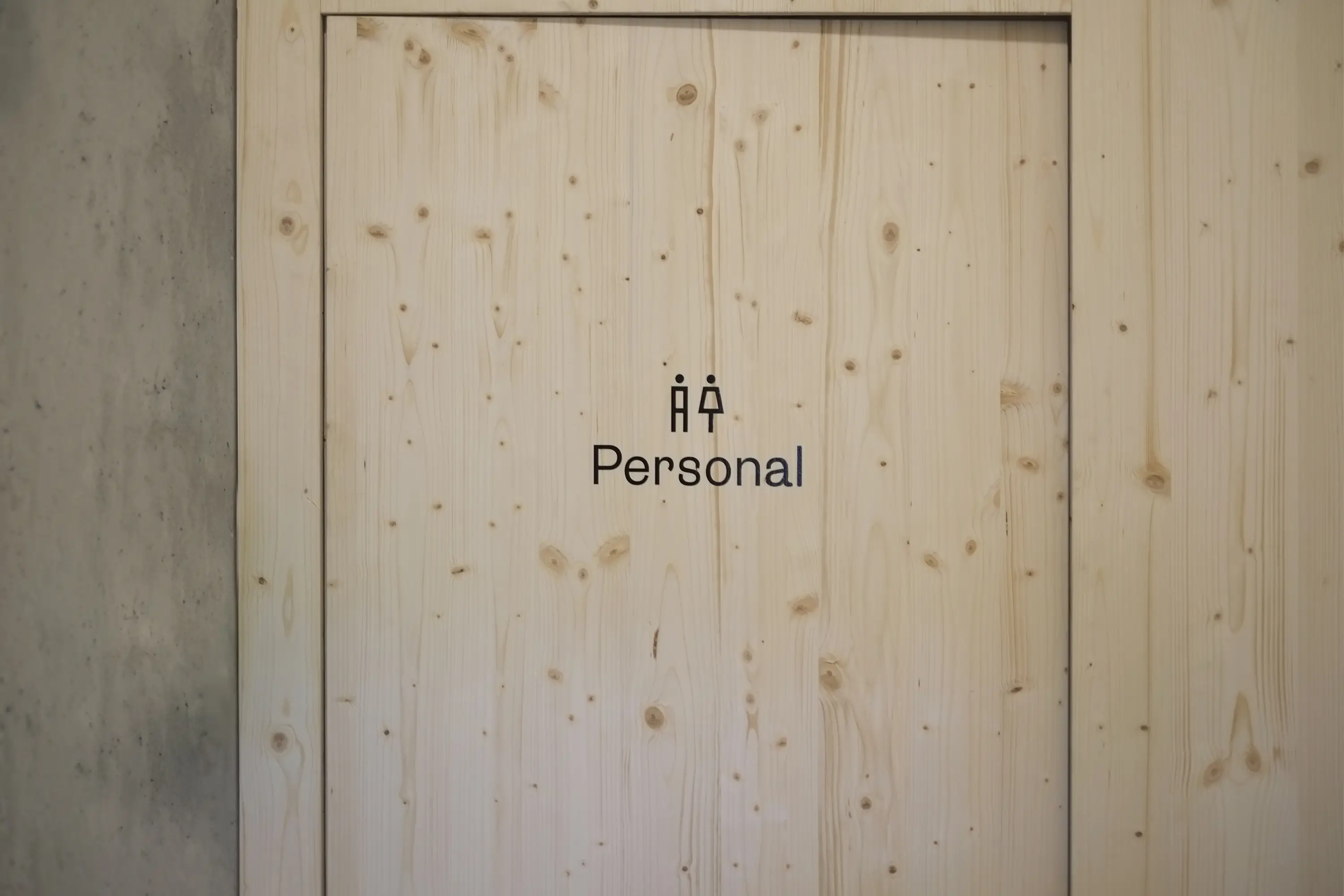
In the old Ruckstuhl Hall in Langenthal, the WBM Madiswil Foundation created an exciting place of well-being with a fantastic restaurant (led by Vagner Aguiar) and handcrafted products made by people with support needs in the foundation’s studio. Meaningful work with visible processes, encounters, and high-quality products—that’s what the Grüne Halle stands for. It’s a natural meeting point for people with and without disabilities, bringing them together effortlessly in society.
For the visual identity, I had the privilege of developing a distinctive and striking look that carries the charm of the hall and its interior outward, welcoming guests and participants in a tangible, confident, and open way. The typical exposed beams of the outer facade became the hallmark of the Grüne Halle. The beauty of uniqueness is expressed and lived through the flexible and free wordmark. Paired with the peeling colors on the old hall walls, the identity of the Grüne Halle was completed. This constructed visual mark also serves as the foundation for the design grid and ties back to the industrial history of the Grüne Halle.
Since the beginning of 2024, Emmenpark AG has been running the Grüne Halle, but the visual identity continues to thrive under their leadership.
Printed Products: Merkur Druck, Langenthal
Implementation of Signage: Xseh, Langenthal
Font: Lora by Googlefont
Paper: Materica Limestone, Verdigris, Terra Rossa & Clay
Ruben Ung, Bern

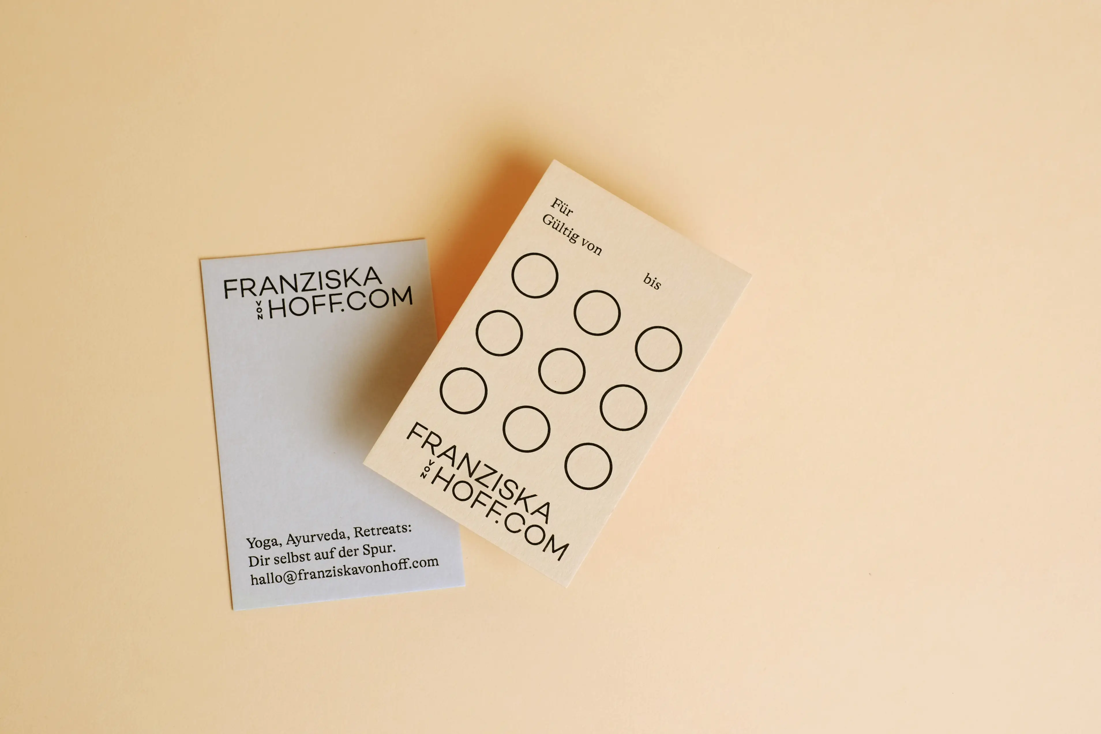
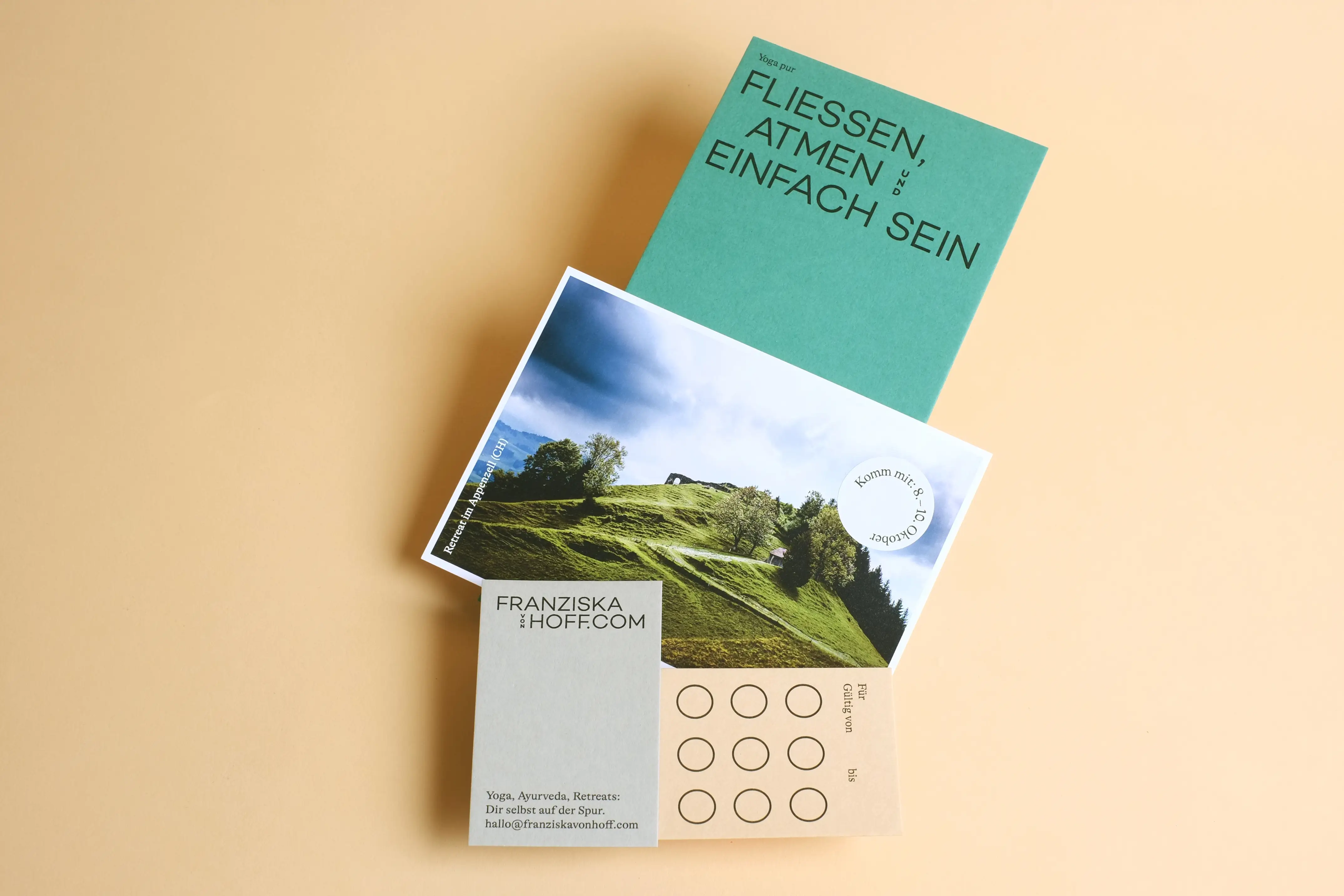
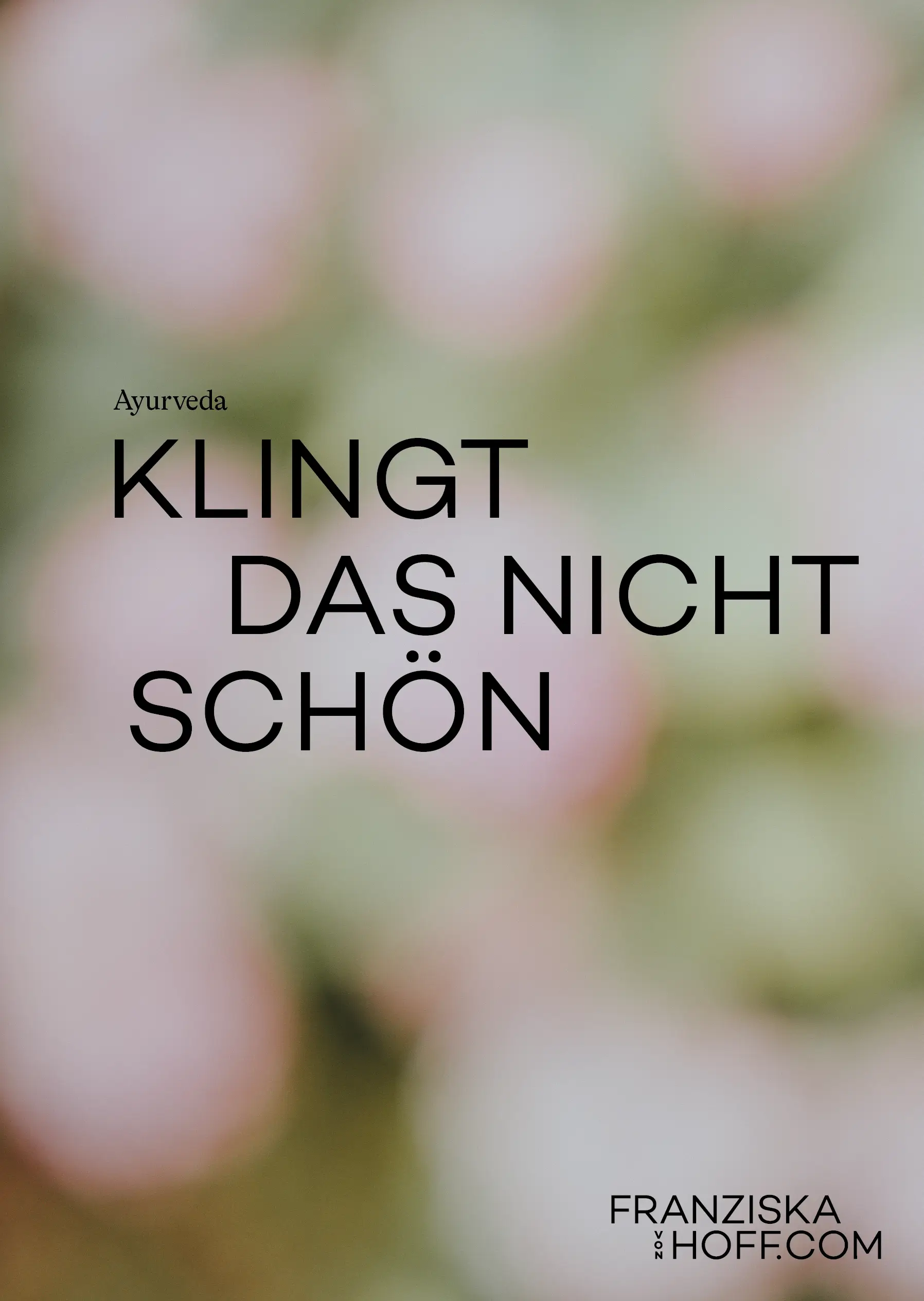
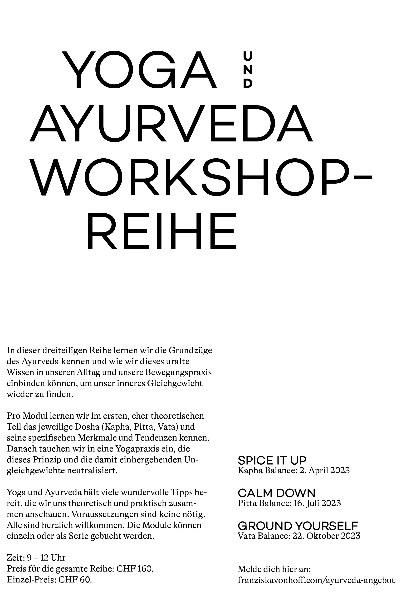
Yoga – Ayurveda – Retreats
Flowing with Franziska
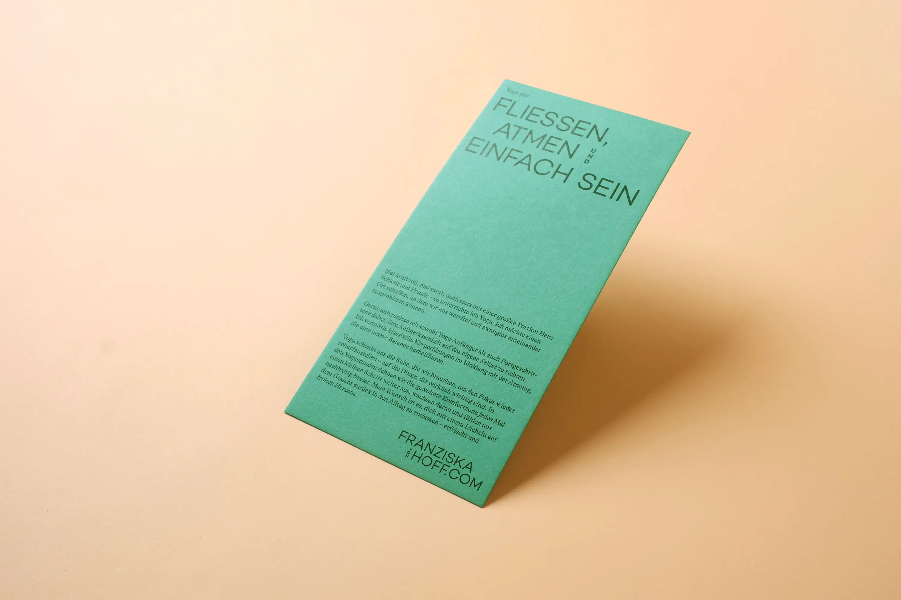
Powerful at times, gentle at others, yet always full of warmth and joy—that’s Franziska von Hoff: When eyes and ideas sparkle, you can be sure that Franziska is at the table. With her aesthetically vibrant energy, the tidy, enduring, and clear identity for her feel-good spaces was created. She offers her expertise and knowledge in the fields of yoga, Ayurveda, health, and well-being.
A unified identity for her diverse offerings was needed. Flexible and adaptable—from the online yoga class to the retreat in Marrakech or the Appenzellerland, to a growing shop in the background. To give each area its own space, we created a set of essential communication materials: an information flyer on yoga, a rotating postcard series for retreat invitations, a yoga stamp card, and the classic business card, putting together a joyful communication package.
The stamp card is filled with motivating phrases for each yoga session:
Supergut, WellDone, WeiterSo…
and many more, sparking curiosity in participants and getting them back on the mat even faster.
Business Stationery: Druckerei Brunner, Wohlen (BE)
Post Cards: Printzessin, Belp
Fonts: Work Sans von Google Fonts und GT Alpina von Grilli Type
Papers: Colorplan von Künzli


A project of the WBM Foundation
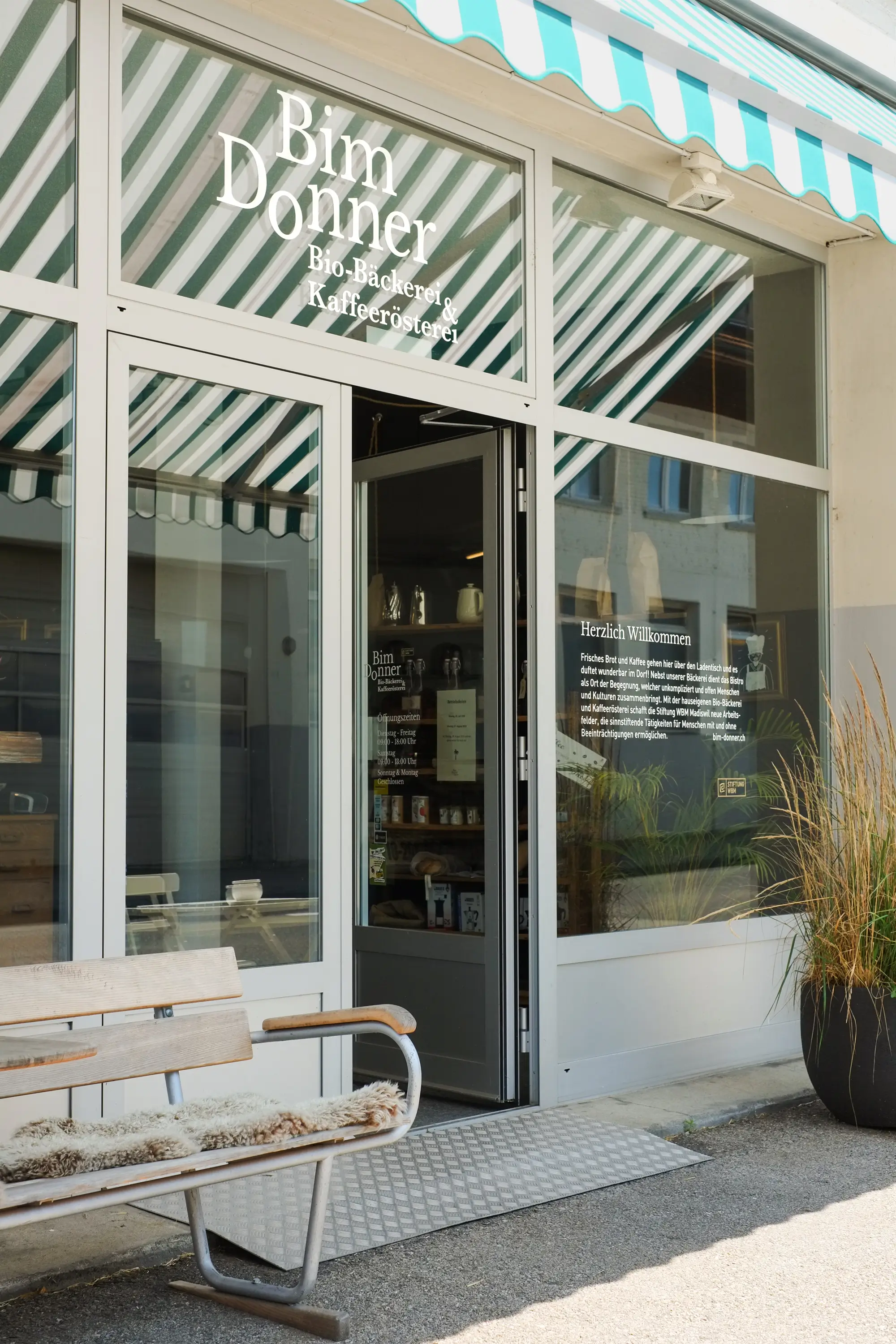
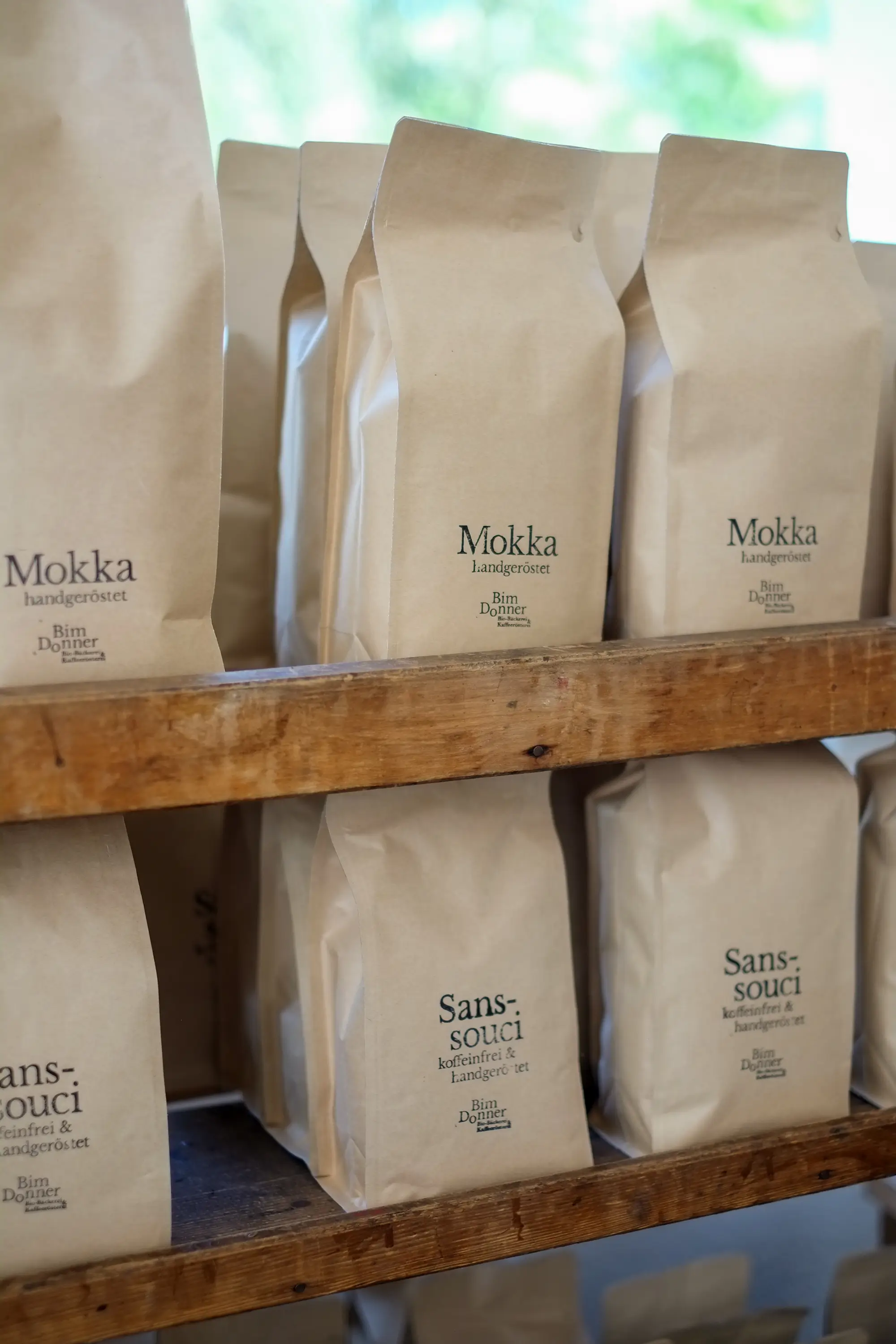
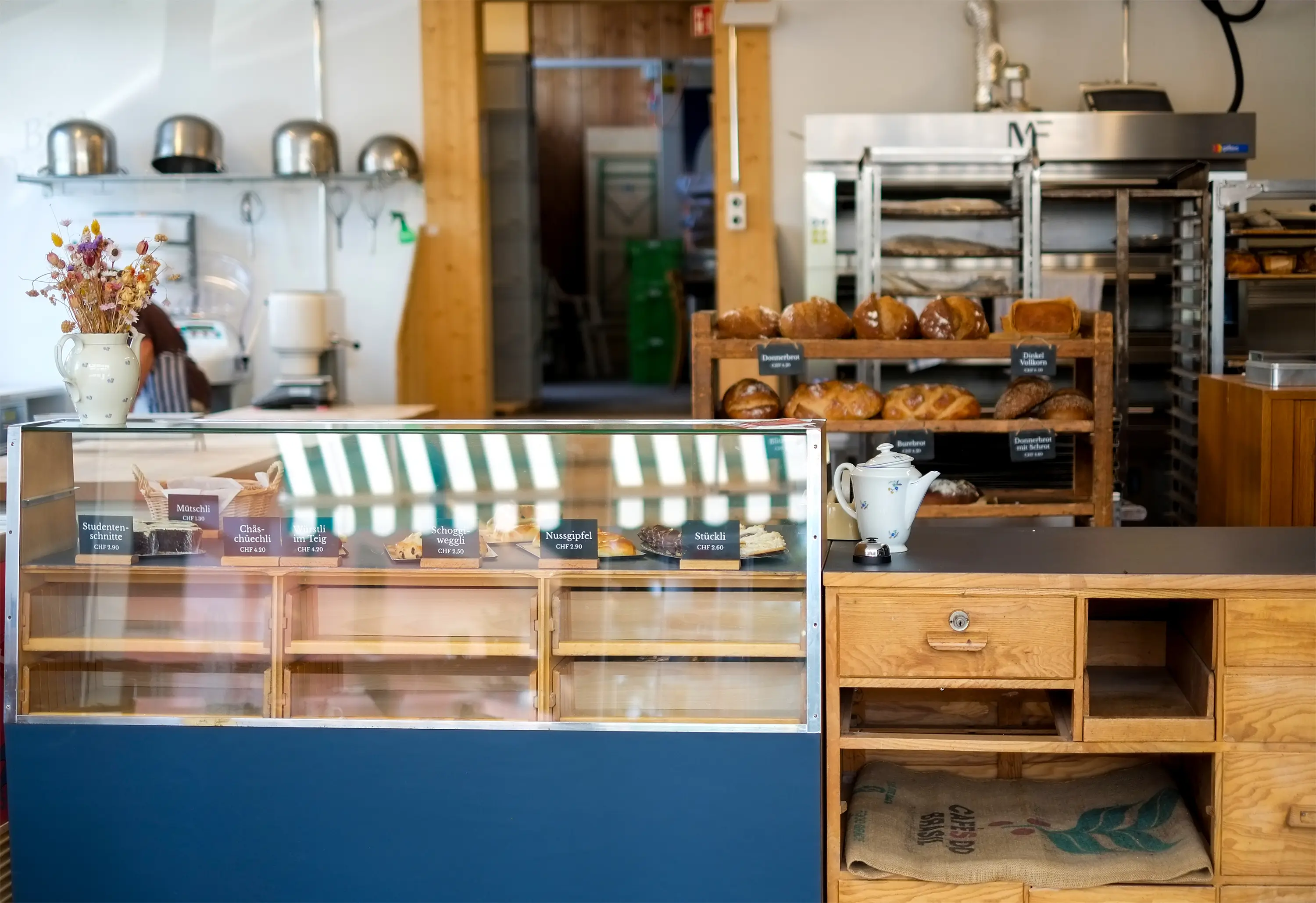
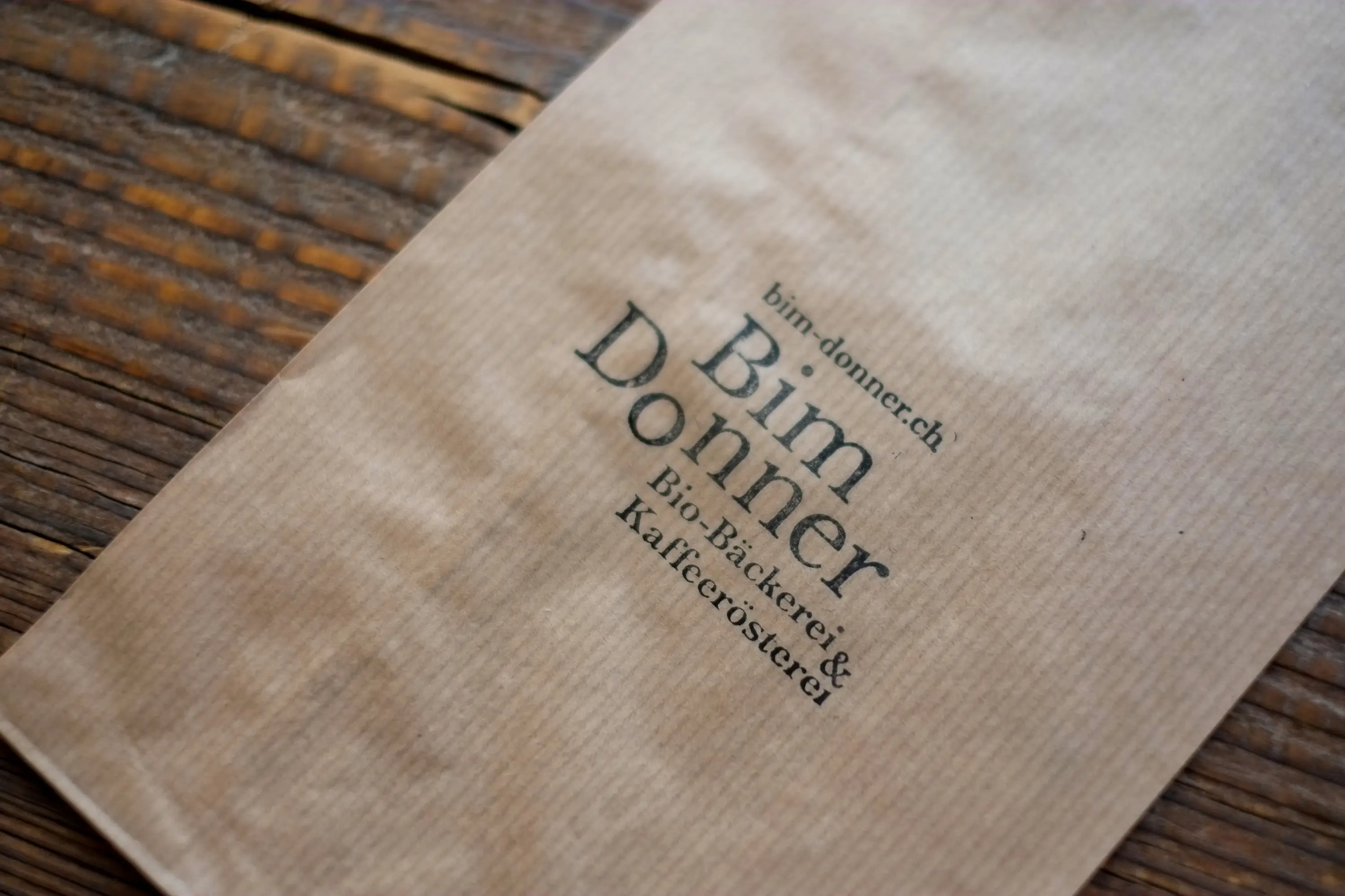
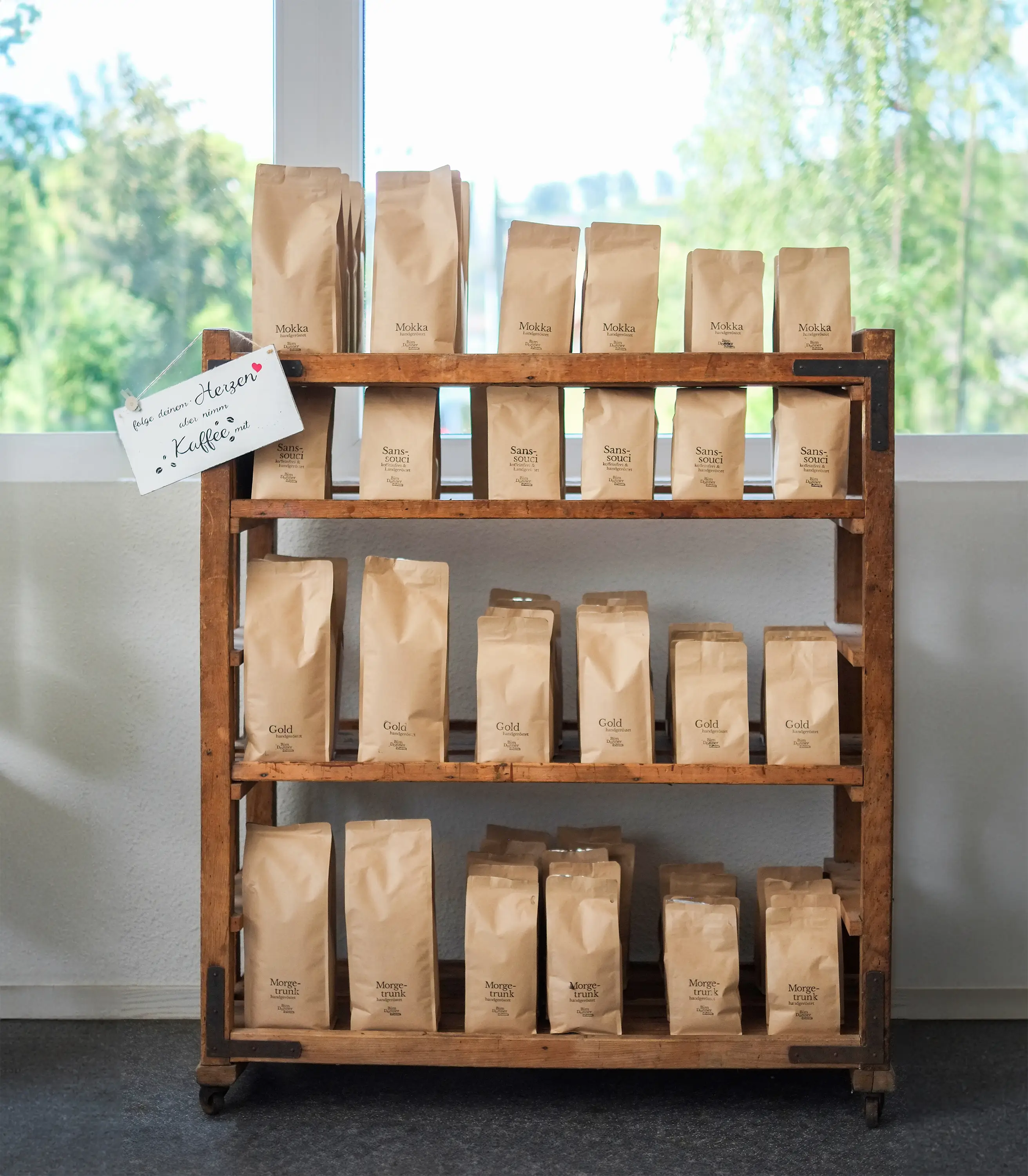
Organic Bakery & Roastery Bim Donner
What’s better than the smell of freshly baked bread and roasted coffee? My answer: Being able to implement a complete redesign for a company that dedicates itself to this passion with full heart. From the logo to the signage, coffee packaging, and vehicle lettering.
Bim Donner is a project of the WBM Foundation in Madiswil, not only ensuring a delicious aroma in Rohrbach but also providing work integration for people with and without disabilities.
A professional, warm, and open identity was designed and created together with the team from the WBM Foundation. Many measures were developed so that the staff at Bim Donner could quickly and independently engage with the branding. Organic quality with heart—that’s what you’ll find in Rohrbach with the friendly Bim Donner team.

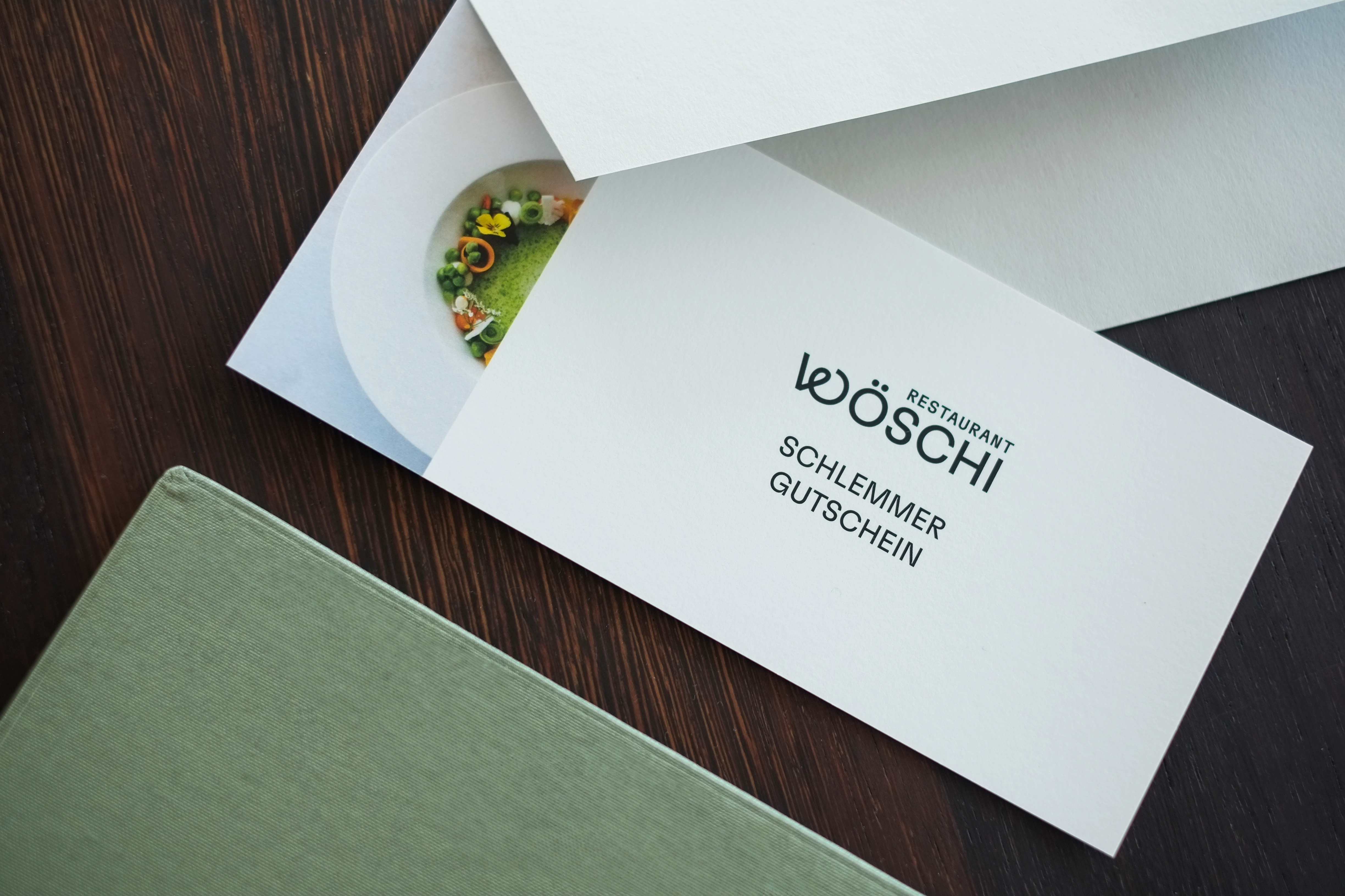
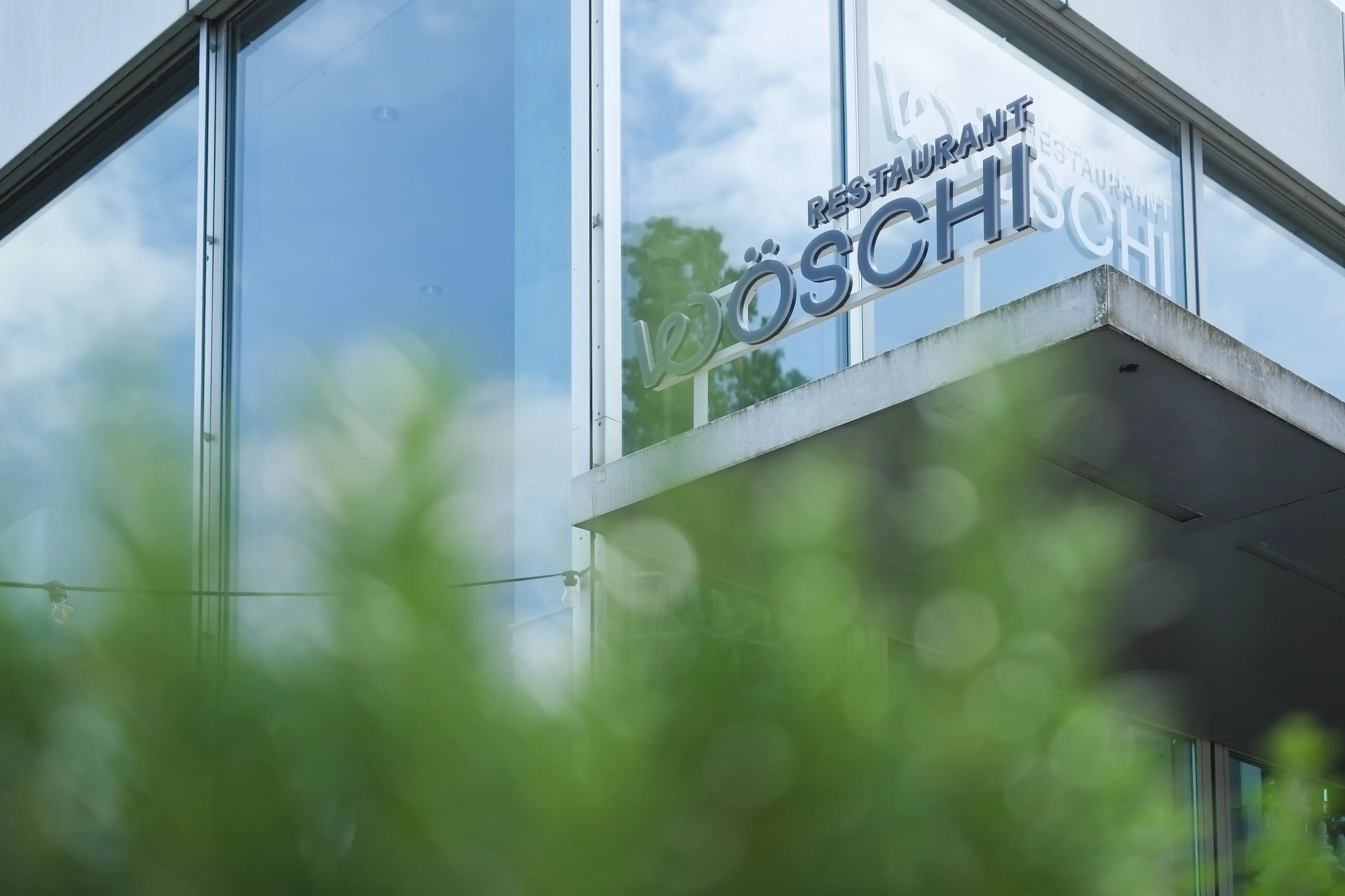
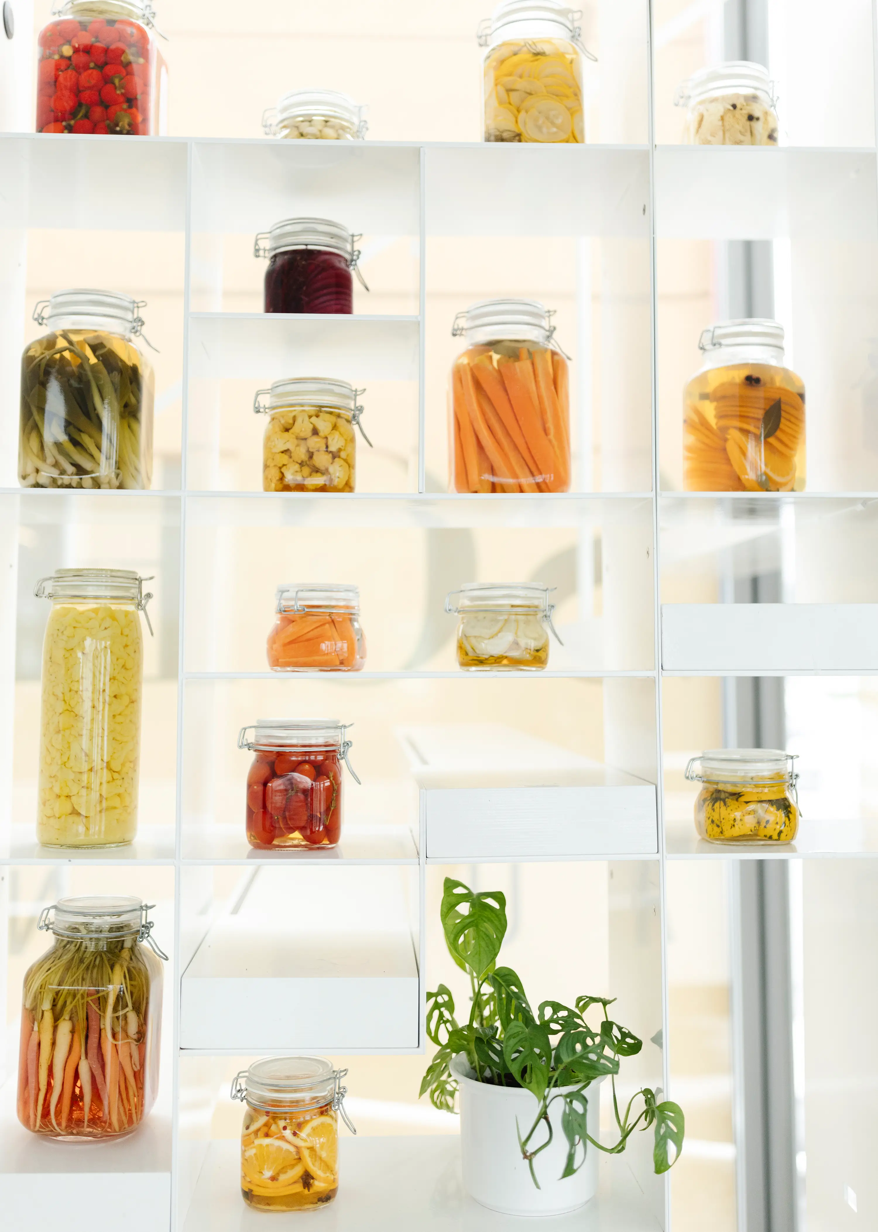
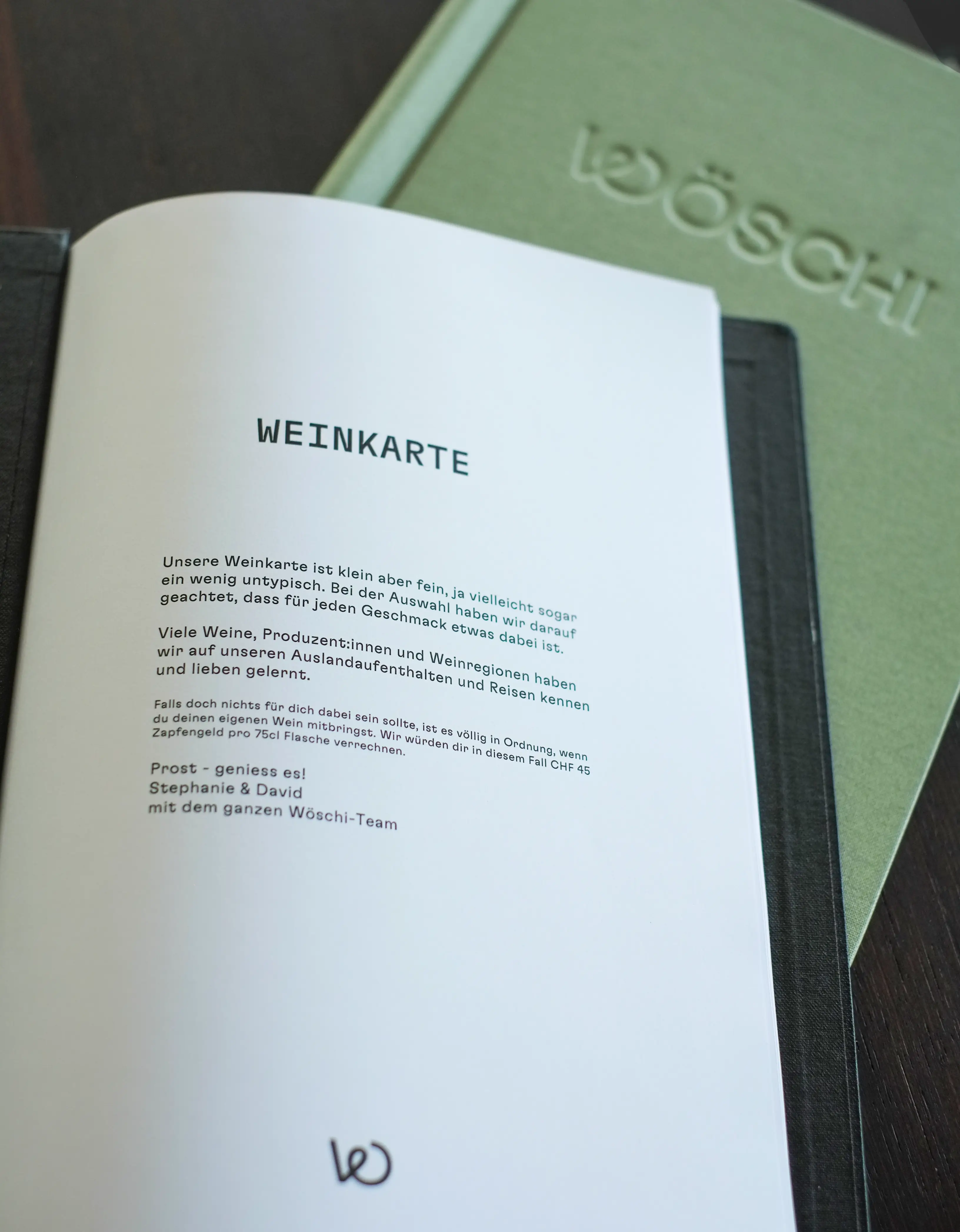
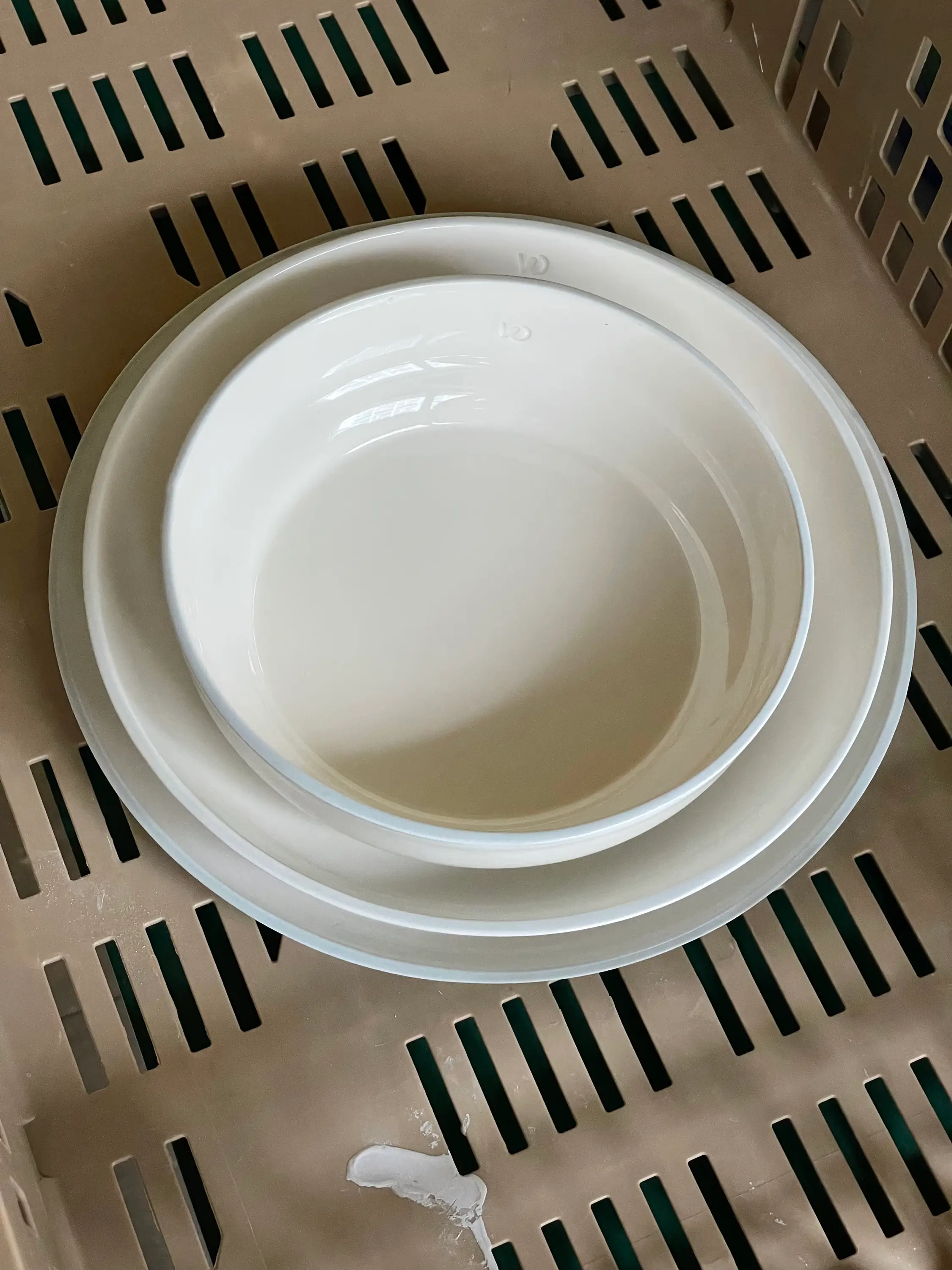
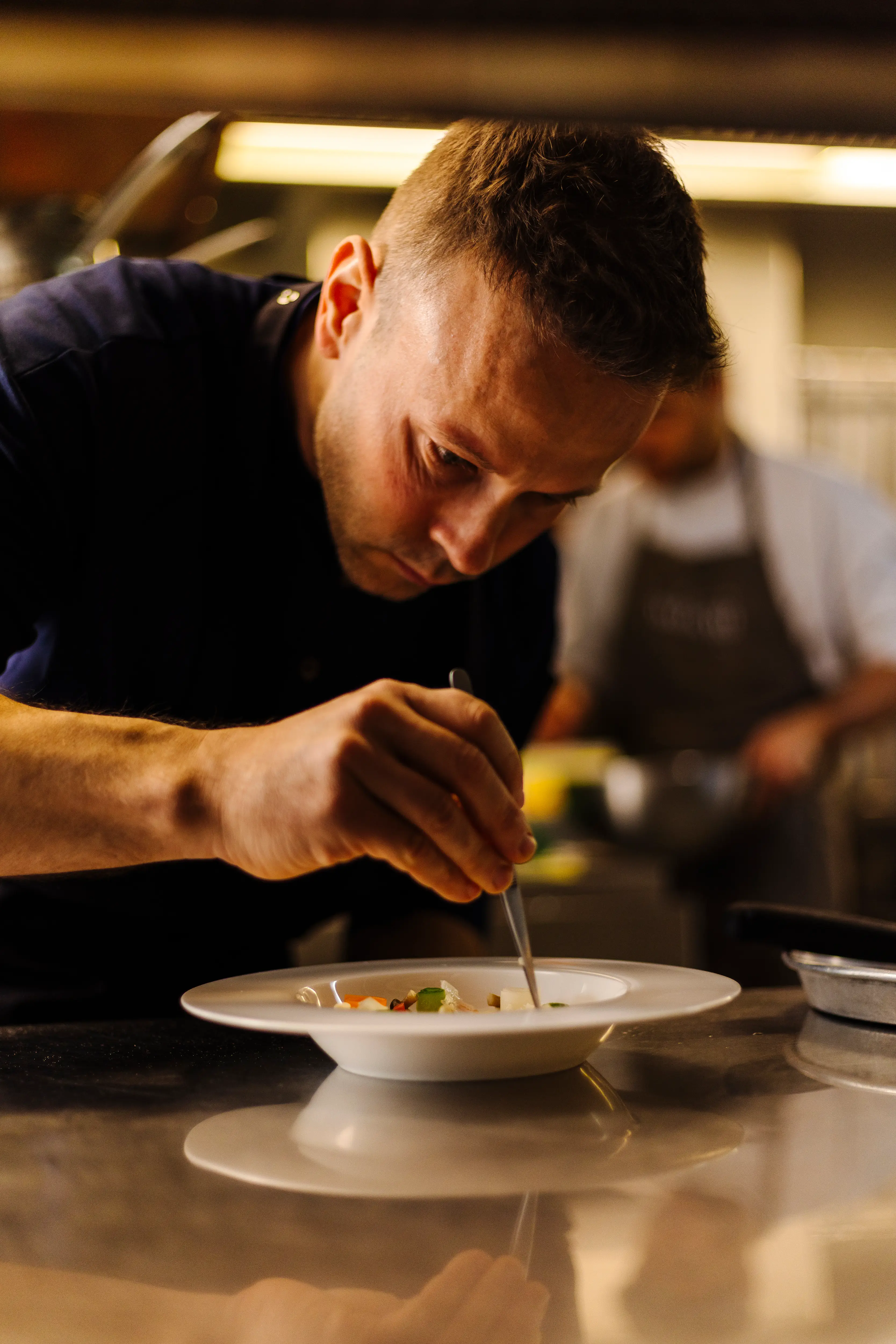
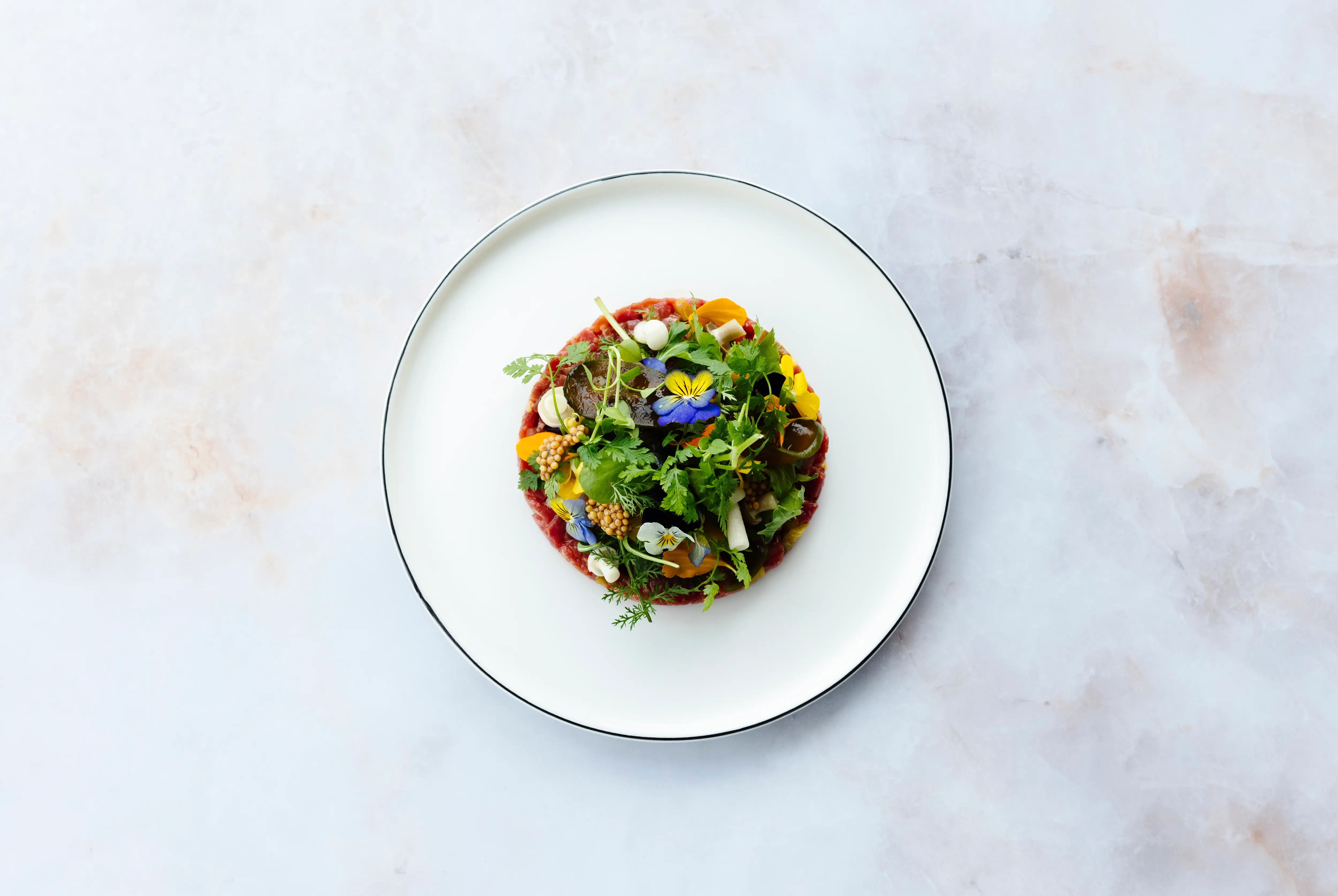
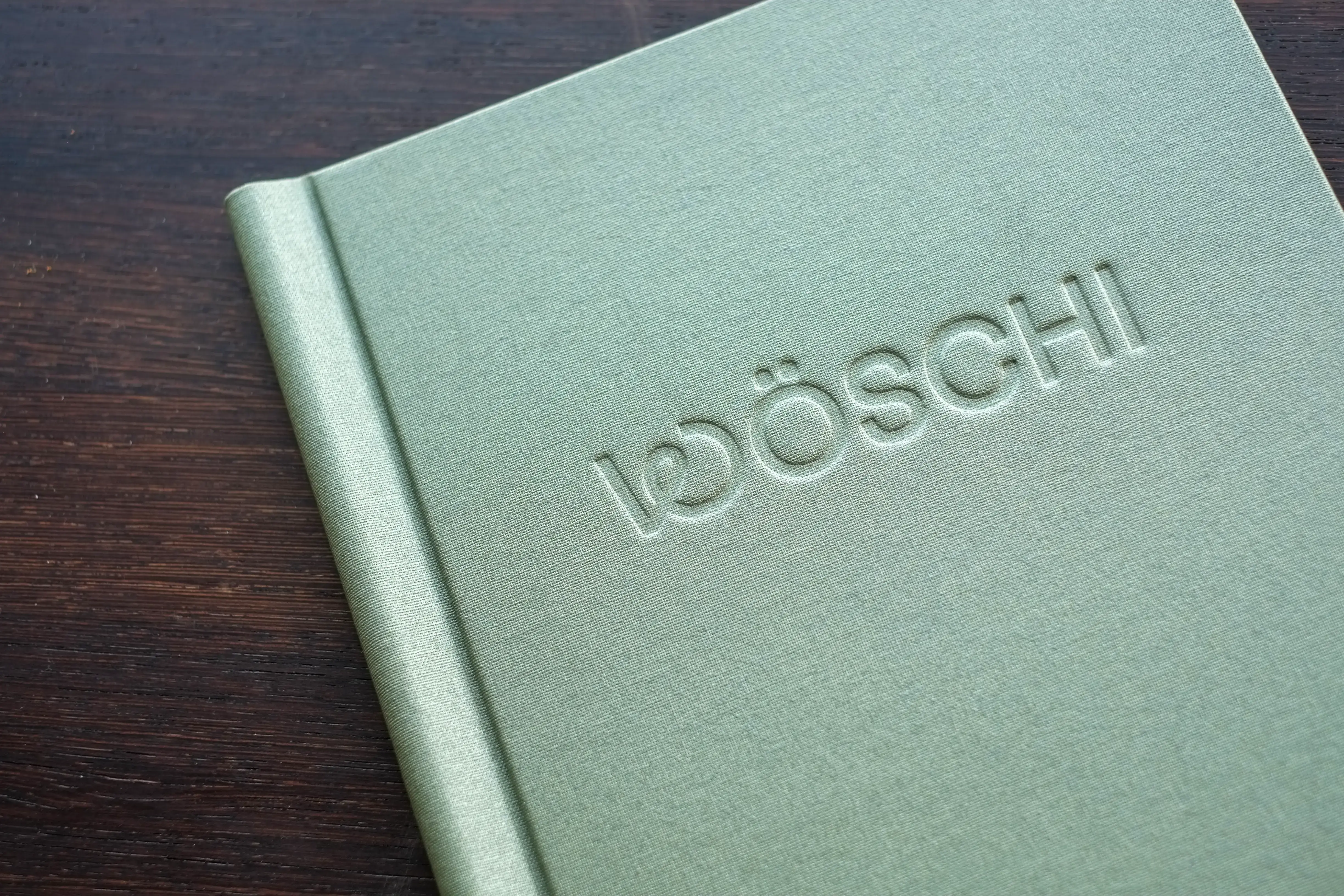
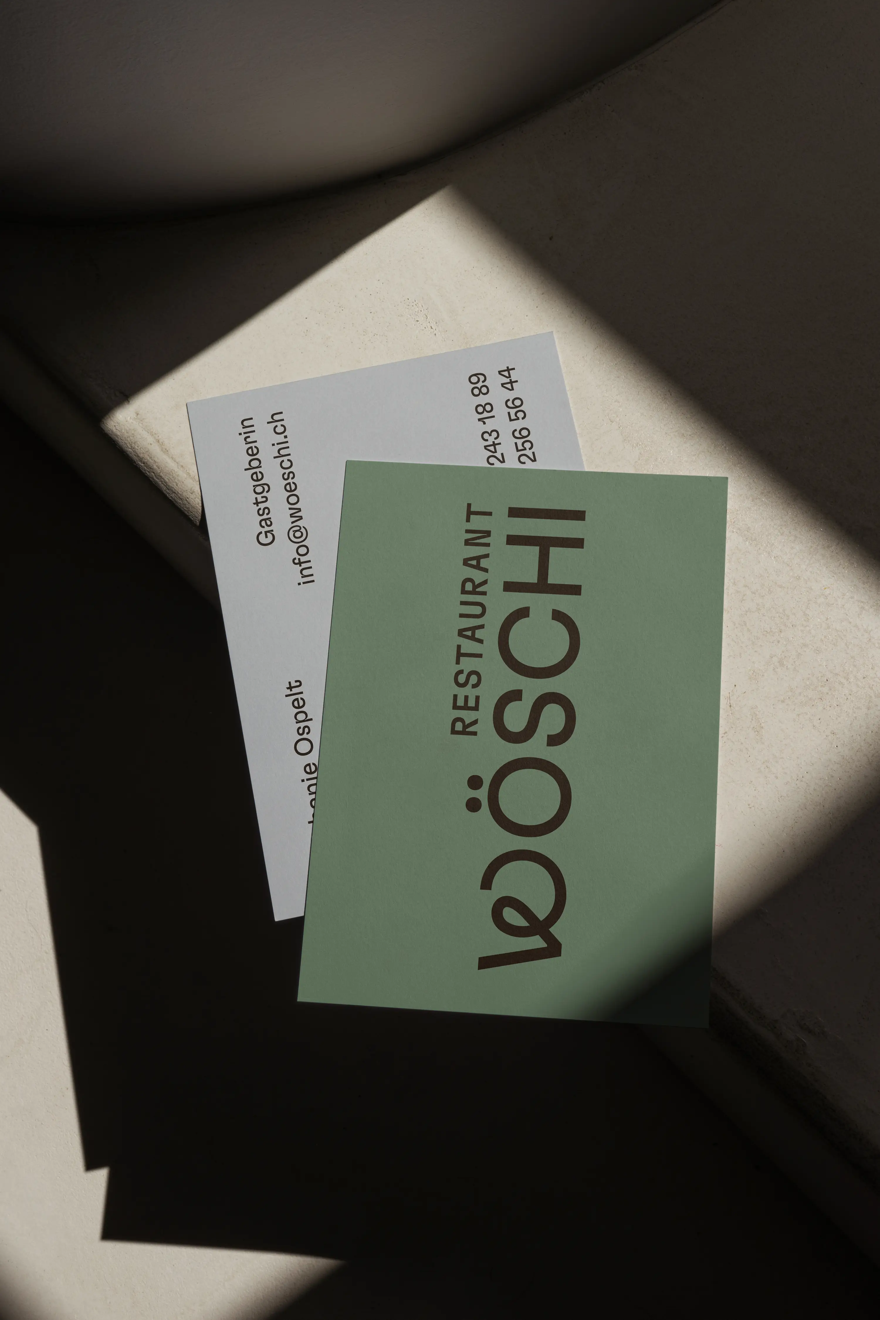
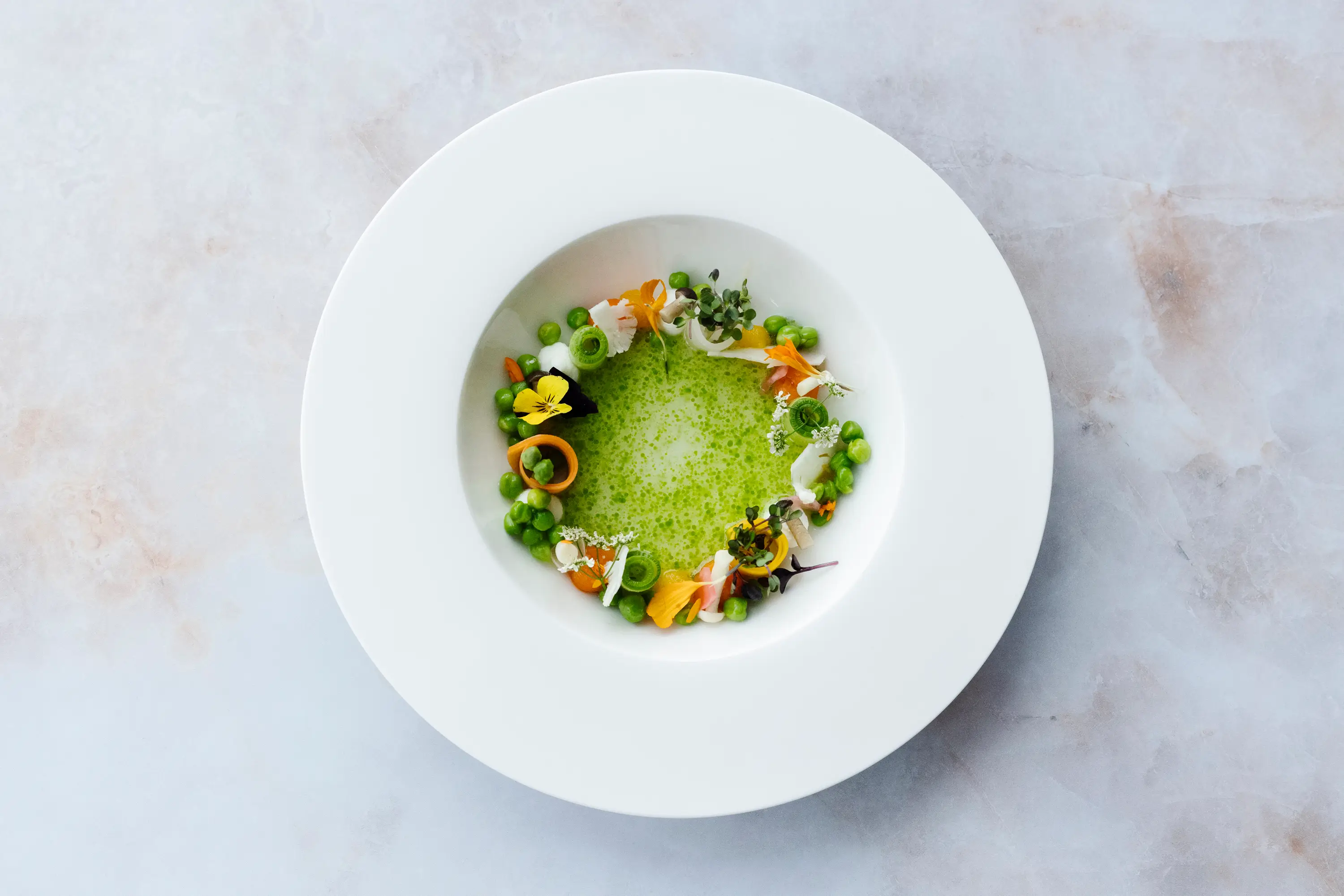
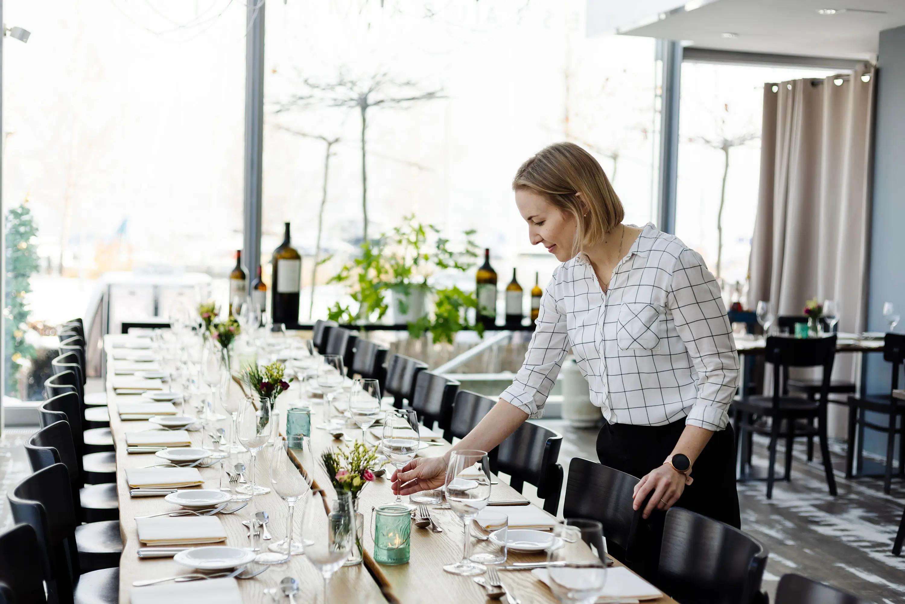
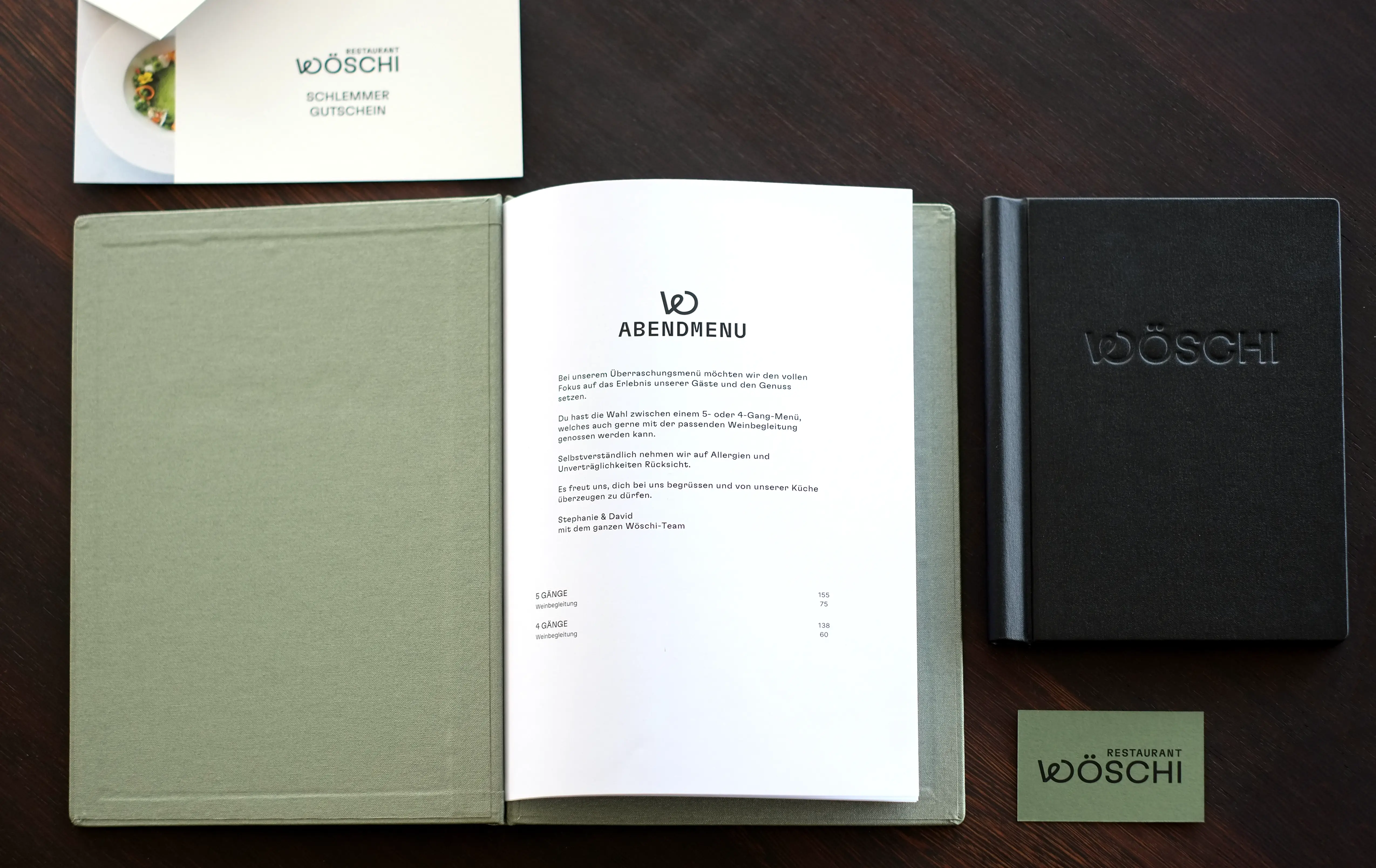
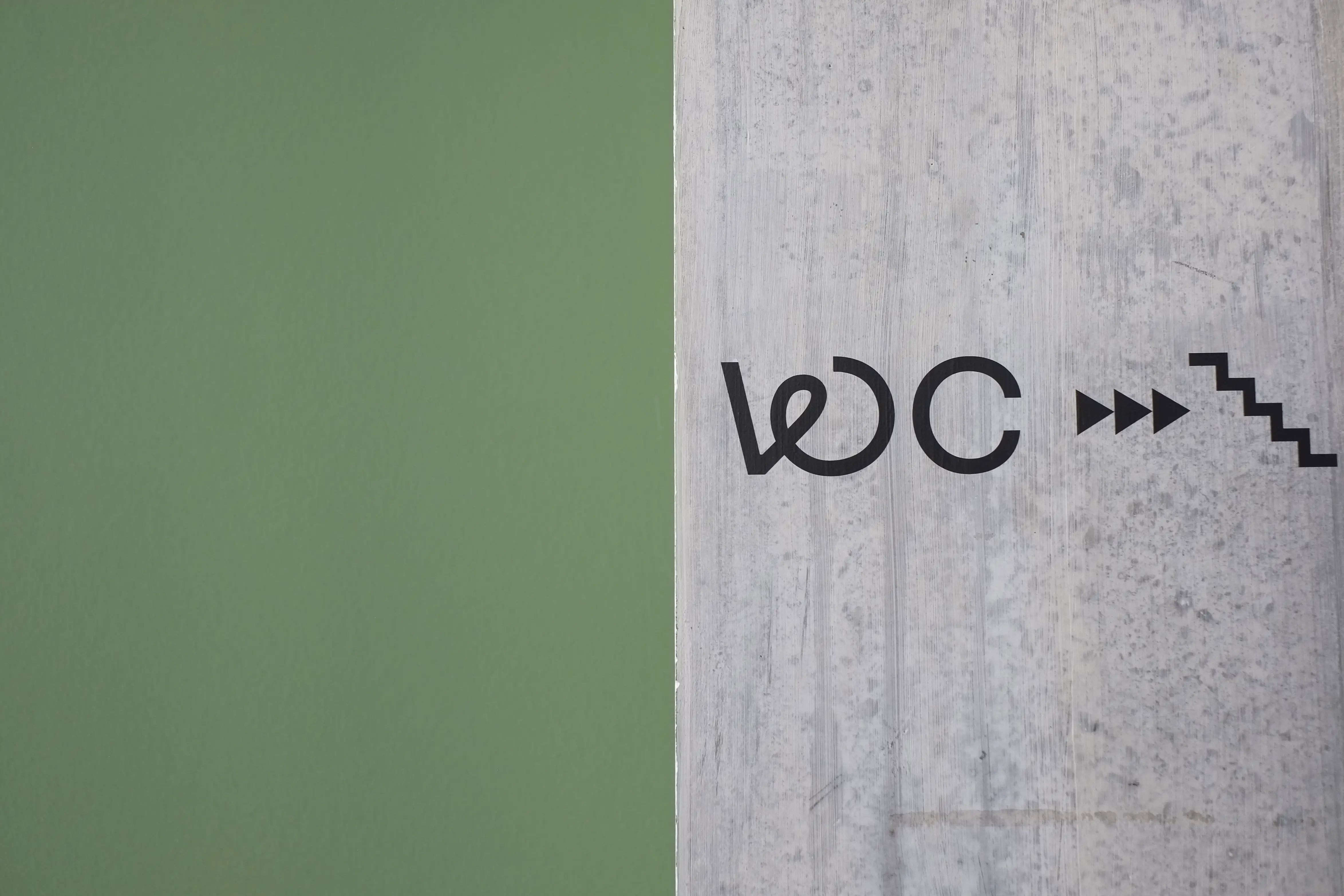
Casual Fine Dining at Lake Zurich
Visual Identity for the Michelin Restaurant Wöschi
A refined and uncomplicated kitchen. A breathtaking view. A host couple that is fully dedicated to you. Welcome to Restaurant Wöschi!
This is how Wöschi presents itself under the leadership of head chef David Klocksin and hostess Stephanie Ospelt and their team. The power couple not only enchants with the ultimate feel-good place right by Lake Zurich but also delights guests with both visual and culinary treats. This is not just my opinion: in October 2023 and 2024, David was awarded a Michelin star for his creations at Wöschi.
Always in motion, with swirling ideas and bubbling minds, this is how I got to know the dynamic duo. These qualities laid the foundation for Wöschi’s visual identity—fresh, aesthetic, delicious, and unique.
The identity is minimal yet playful, leaving space for the passionate work of the Wöschi team and impressing with its light, playful simplicity.
Business Cards & Voucher Print: Drucksalon Zürich
Food- and Mood-Photography: Aly Aesch
Ceramic: Studio Sediment
Paper: Colorplan Pale grey & Mid Green
Font: GT Flexa & GT Flexa Mono by Grilli Type
I am a Swiss designer with a passion for thoughtful design and sustainable solutions. My focus is creating and visually implementing concepts that are not only aesthetically pleasing, but also long-lasting and effective – from small to large businesses.
My design approach combines clarity with creativity, conceptual rigour with playfulness. I work closely with my clients to develop individual visual identities or diverse design solutions within an existing brand in the wonderful diversity of visual communication.
A selection:
Avital Cohen – Beet-Up – Biketeh GmbH – Büro a+o – Carpet – Céline Stemmer – Cin Cin – Das Dazwischen – Franziska von Hoff – Go Snow – Hey Lotta Yoga – Kaskade Bier – le bread – Leitner Messebausysteme – Medienart AG – Nikkol Rot – NOLD Skateboards – PETITPEU – Pfeffer/Verbeek – Post CH – Pro Velo Schweiz – Restaurant Wöschi – Schlafberatung Vera Knoblauch – Schweizerischer Blinden- und Sehbehinderten Verband (sbv) – Schweizerisches Rotes Kreuz (SRK) Kanton Bern – Schweizer Tourismus-Verband STV – Stiftung WBM Madiswil – Swiss Coffee Festival (Swiss SCA) – Tanja Frieden – Transa Backpacking AG – Weingut Bieglmayer – Varem Development AG – von Meiss Architektur – WWF Schweiz – Zuriga
Pia Fleischmann
Schwarztorstrasse 3
3007 Bern
hey@piafleischmann.com
Code: Roger Burkhard
Please send me an email so that I can respond to your questions, suggestions and comments as quickly as possible. © 2025